Link Guidelines
A link is a control or a text piece that, when clicked, takes the user to another page.
Applies to:


Types
Links can be used in many different situations. Depending on the situation, they will be styled slightly differently.
A stand-alone link
A stand-alone link will usually take users to a different page.

Links in a paragraph
Sometimes you will have links in a paragraph of text that, when clicked, will take the user to another page with more information about a topic.

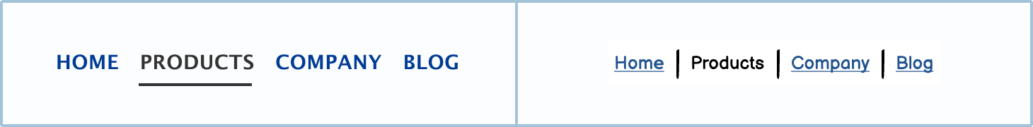
Links in the primary navigation
Links are usually used in the primary navigation of most sites. These links will allow the user to move around the site.
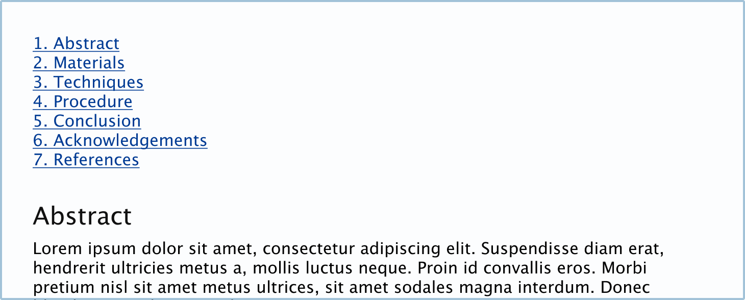
Anchor links
Anchor links are links that help the user navigate through the current page, as opposed to taking them to a different one. These are often used in single-page websites and in long articles or case studies.
States
Links change their state or appearance so that users know what to do. These little visual cues also let the user know what the system is doing.
Normal
The normal state is how a link will usually appear, and it means that the link is clickable.

Disabled
The disabled state is when the user isn’t able to click the link. This will usually be because of business rules or because the users need to click something else first to make it active.

How to in Balsamiq
Change the link’s state using the State dropdown in the control panel.

DIY states in Balsamiq
You can also create your own states.
Hover
The hover state is when you mouse over the link and it changes state to let you know the link is clickable.

Active
The active state is how the link will appear immediately after being clicked. Usually, this will indicate to the user that the system has registered their click and is waiting for the next page to load.

Visited
The visited or clicked state indicates that the user has previously clicked the link.

Best practices
There are a few best practices when it comes to links. Overall, you want to make it as clear as possible where the link will take the user before interacting with it.
Link text should always be able to stand alone
The text link should always be able to stand alone from any other copy. Try making the link as descriptive as possible without relying on other text.

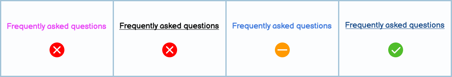
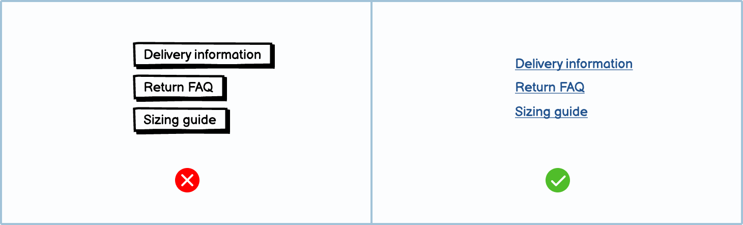
Make links look like links
While it may be tempting to remove the underline or change the color, rather keep links looking like links. You may have more freedom when creating the final product; however, when creating wireframes, stick to a design that clearly communicates that it’s a link.
When to use a link
Links should be used to help users navigate your website.
When you should use a link:
- If it’s not an action within the interface. Examples of actions would be ‘Start video,’ Create new,’ Edit,’ etc.
- If it will take the user to a new page or help them navigate the current page.
Links vs. buttons
A button, like a link, is clickable and changes the screen. However, buttons and links tend to be used in different contexts.
When you should use a button:
- If it’s an action or it will create something new.
- If it submits information.

External links
When you have a link that goes to an external site, you may use an external link icon. This lets the user know that they will be leaving the site that they’re currently on.

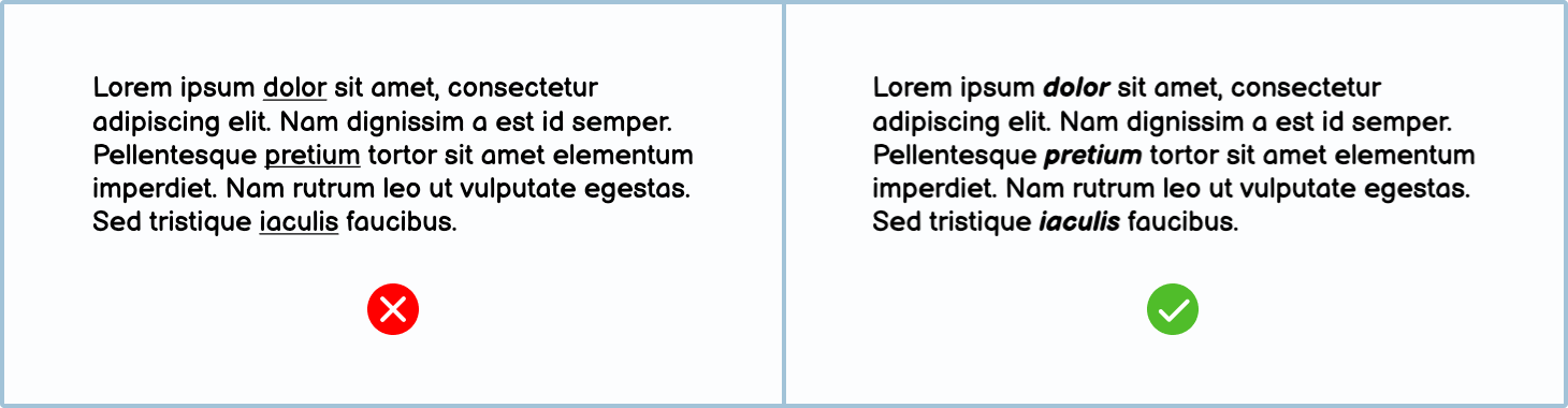
Don’t style normal text like links
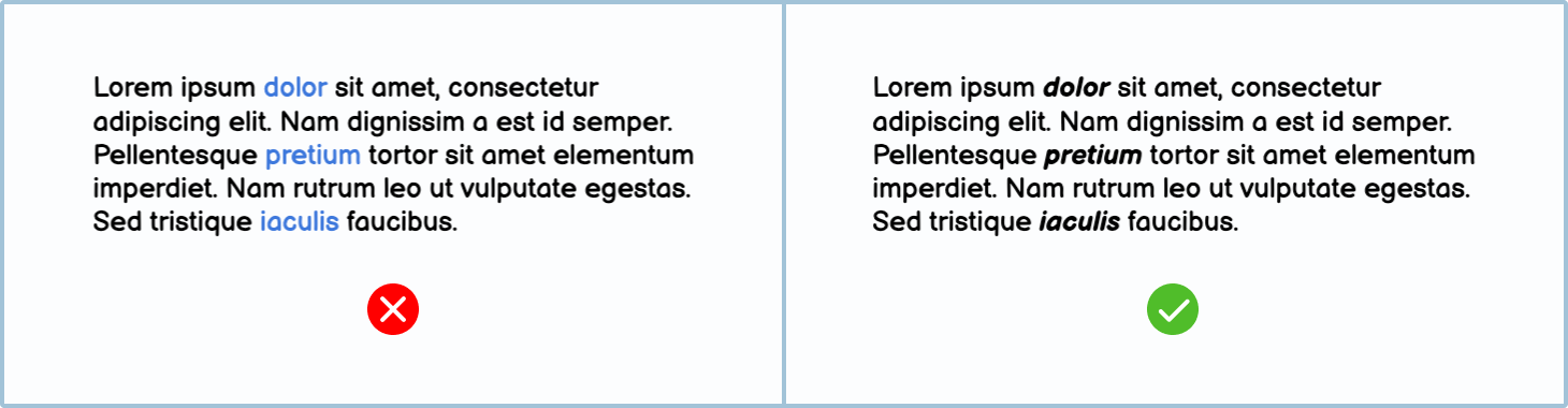
To avoid confusing the user, never underline text that isn’t a link. To show emphasis, it's better to use bold or italics.
The same goes for coloring text, especially if that color is blue. Use bold or italics to call attention to text instead.
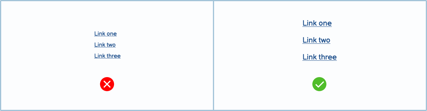
Don’t use a small font for links
When you make the touch target size of links too small, it becomes challenging for users to tap. Instead, stick to a bigger size and leave at least 8px between touch targets.
Jargon: Fat Finger Syndrome
When links are too small and too close together on a touch screen, sometimes users inadvertently tap the link by mistake, which they blame on their “fat fingers”.
Variations
There are many different variations of links. Using more specific styles makes it more apparent to the user what will happen when they click it.
Controls included in Balsamiq
Balsamiq offers a wide range of pre-made controls. Use the ‘Quick add’ tool to find the one you need, then drop it directly into your wireframe.
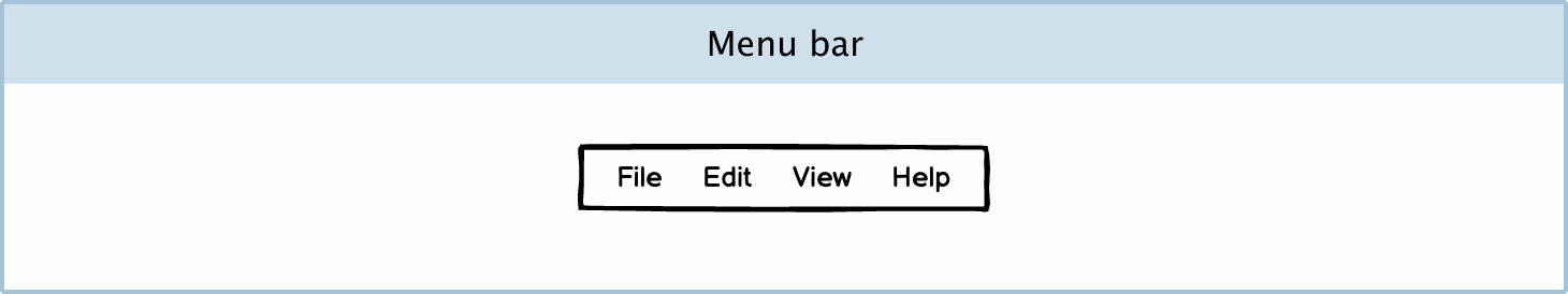
Menu bar: A menu bar is a group of links used to navigate a site’s main pages.
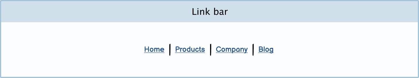
Link bar: A link bar is a collection of links. You can use it at the top of the page as primary navigation or at the bottom of a page, like a footer.
Breadcrumbs: Breadcrumbs let the user know where they are on a site. They should help the user navigate through a page’s hierarchy.

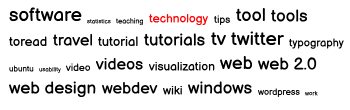
Tag cloud: A tag cloud is a collection of tags found on a website — usually a blog or news site. These individual tags, when clicked, take you to a page with a list of all the posts (or pages) with those tags.

DIY Symbols
You can make your own custom link symbols in Balsamiq.
Creating a link: You can create your own link in a text or label component. Learn more about creating text links.
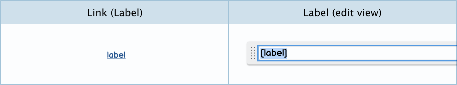
Icon with link: You can create more attractive-looking links by just using the icon with label control. Just select a relevant icon from the icon search, and make sure to put square brackets around the text in the edit view.
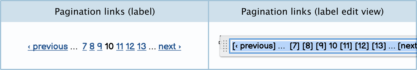
Pagination links: You can create pagination links using a label control. Just put square brackets around the words and numbers you want to be linked. Remember not to make the current page a link so that it’s clear that you can’t navigate to it.
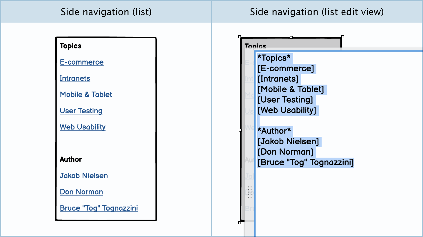
Side navigation: You can create a side navigation symbol using a list control. Make sure to use square brackets around the links so that they’re interactive.
 By Tess Gadd
Got questions or feedback? Email learn@balsamiq.com.