
Tess Gadd
Product designer @ Learning Sandbox
I'm a product designer specializing in edTech, with a focus on building intuitive, inclusive experiences that support how people learn. My approach blends UX strategy and UI craft, rooted in a deep belief in human-centered design and accessibility.
From early research to final polish, I care about the details that make products not just usable, but genuinely helpful—especially in education, where design can remove barriers or create them. I work across the full product design process and thrive in spaces where thoughtful interaction design meets real-world impact.

❤️ Most loved
Dropdown menu (combo box) guidelines
Articles
Dropdown menu (combo box) guidelines
A Dropdown menu (or Combo Box, Pull Down menu, Picker) gives you a list of items to select from. It’s a common element in forms, setting pages, and quizzes.
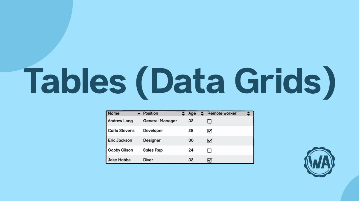
Table guidelines
How to design data tables: different styles (zebra stripes, free-form, ruled grid / rows / columns), common cell types, tables on mobile, and best practices.

Button guidelines
Buttons are common elements of every interface and are used to execute an action. It must be apparent what that action will be, to avoid any mistakes or confusion.
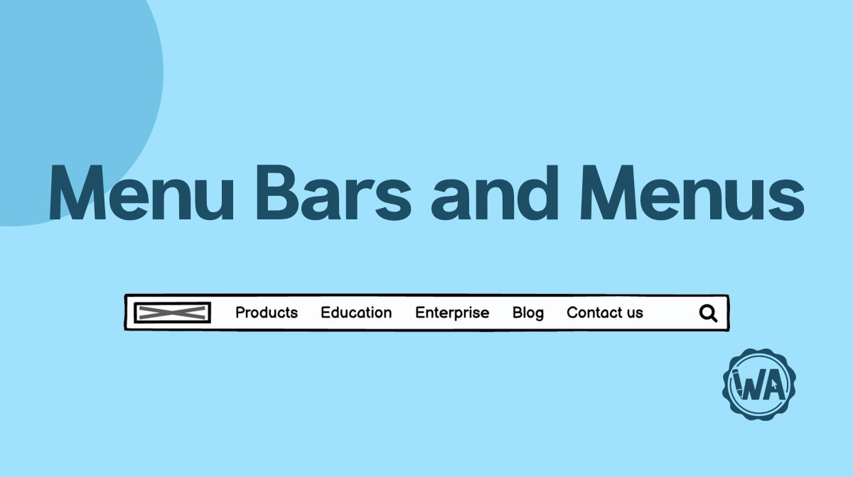
Menu bar and menu guidelines
Menus contain links and buttons that help you navigate to different pages and features. Choosing what goes in the menu can be critical for your users' experience.
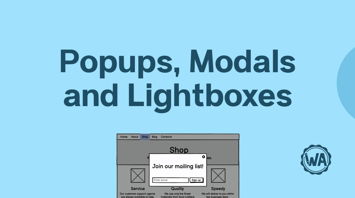
Pop-up, modal, and lightbox guidelines
Pop-ups usually display marketing messages. Modals are activated by the user. Lightboxes are used to enlarge images. All of them pop up onto the user’s screen.

Text input guidelines
Text input fields allow keyboard input from the user. They are frequently used with other types of input UI elements in a form, but can be used on their own.

Checkbox guidelines
Checkbox elements allow users to select items from a list when multiple selections are valid. Read more for tips, best practices, and different use cases.
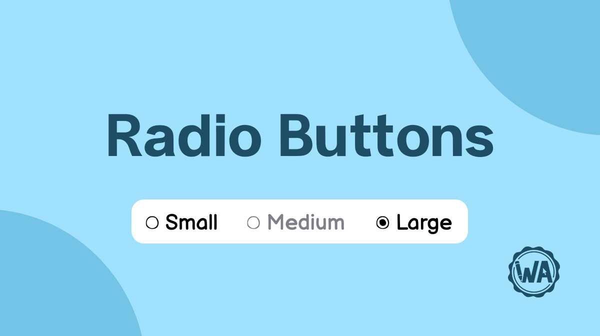
Radio button guidelines
Radio button elements allow users to select items from a list when only a single selection is valid. Find out when you should use them and some best practices.

Site map guidelines
A site map is a high-level overview of a product’s navigational structure. It has a vertical or horizontal hierarchy and can be also used as index in a wireframe.

Scrollbar guidelines
Scrollbars are used when there is more content than can fit on a screen or in a container. The most common types are used for long web pages and maps.
Icon guidelines
Almost every interface design uses icons to communicate with the user. They can be used for navigation, as a toggle, to give feedback, to assign a like, and more!
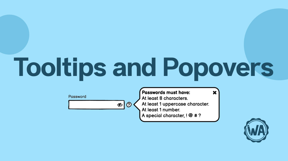
Tooltip and popover guidelines
Tooltips and popovers in user interface wireframes help your users complete a task or learn more about something. Find out the best practices on how to use them.

Link guidelines
Links are a very versatile element. You can use them for your primary navigation, for navigating through a page, to bring users to a more detailed page, and more!

Tab guidelines
Tabs are a form of navigation that allows users to move between different subsections of a page. You can use them to group information and as category filter.
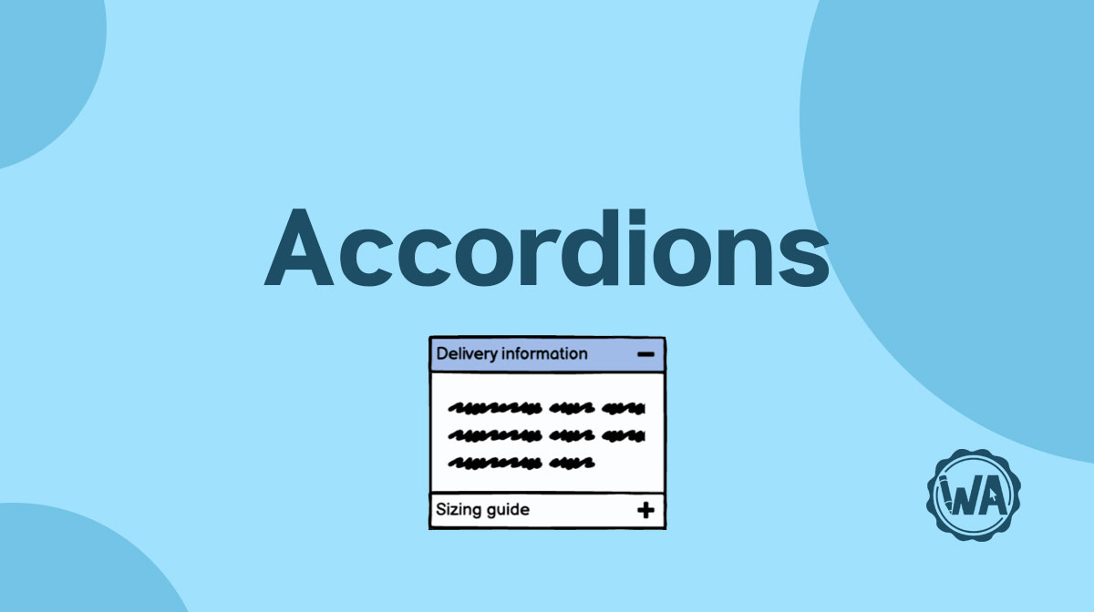
Accordion guidelines
You can use accordions for 2 primary uses: to show and hide information, and to navigate. Remember to only put non-critical information inside this type of UI element.
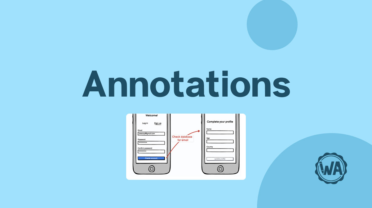
Annotation guidelines
Annotations are critical to convey information that is not visible in your wireframes. They should explain how things work, the user journey, and edge cases.
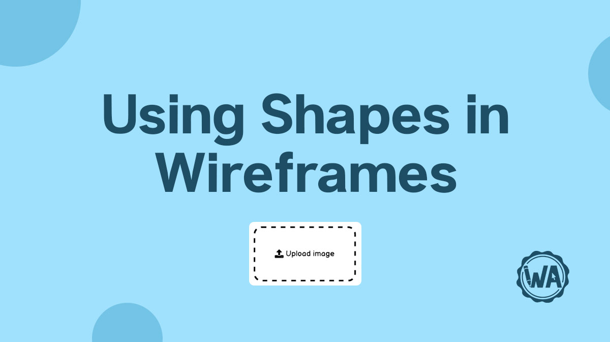
Shape guidelines
In wireframes you can use shapes for different reasons; rectangles are often used as containers, circles for buttons, diamonds as steps in a flow diagram, etc.
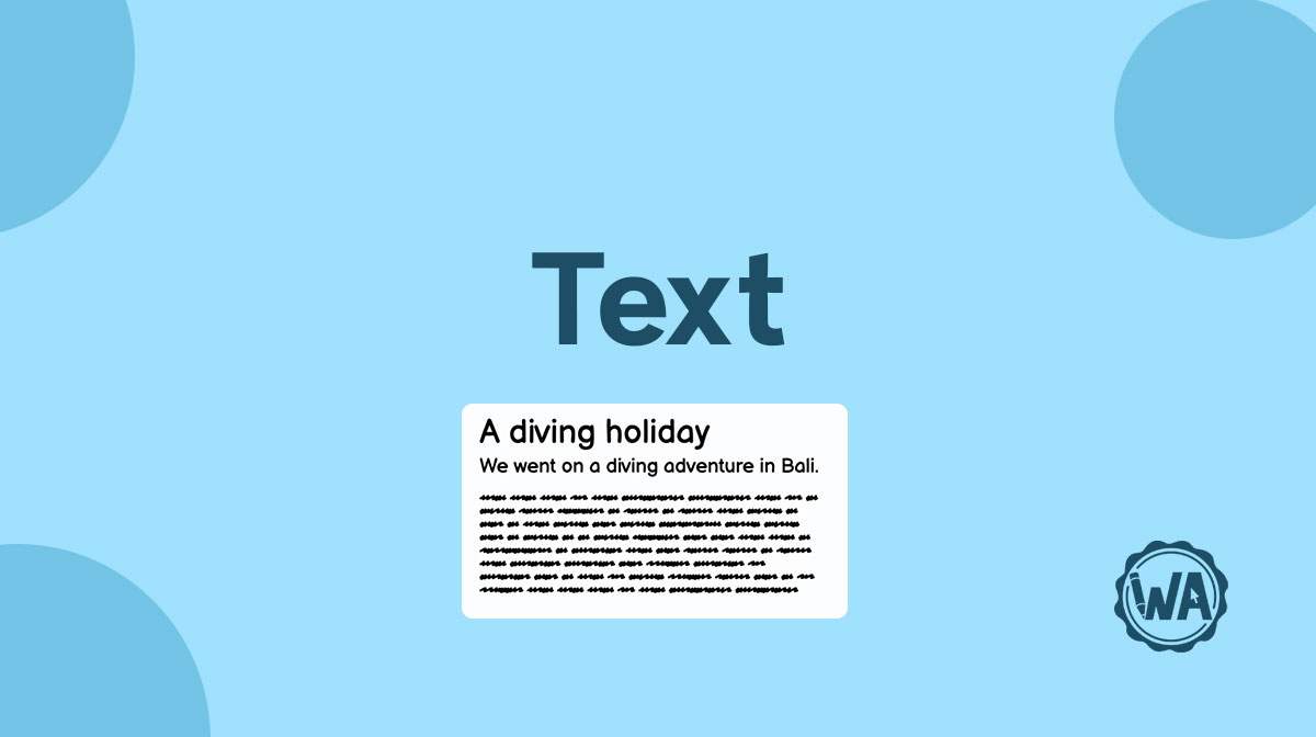
Text guidelines
Text guides users along their desired journey on your website or app through input labels, page titles, body copy, feedback messages, and more.
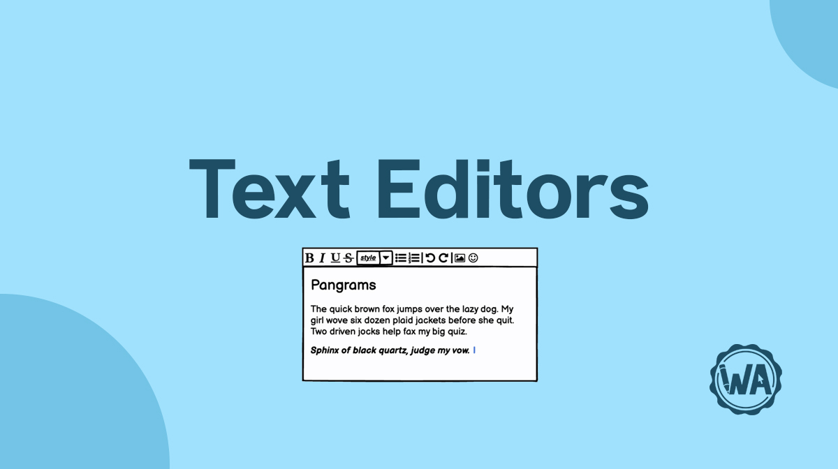
Text editor guidelines
To format their text and better convey their message, users need a text editor with the most common text styling features available, like bold and italics.
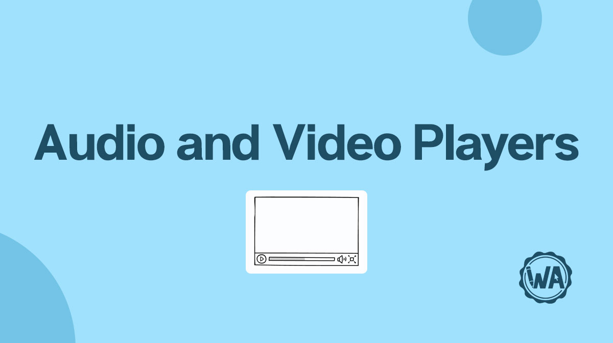
Audio and video player guidelines
How to design audio and video players for your digital product’s user interface. Don’t forget to add accessibility features like subtitles and closed captions.
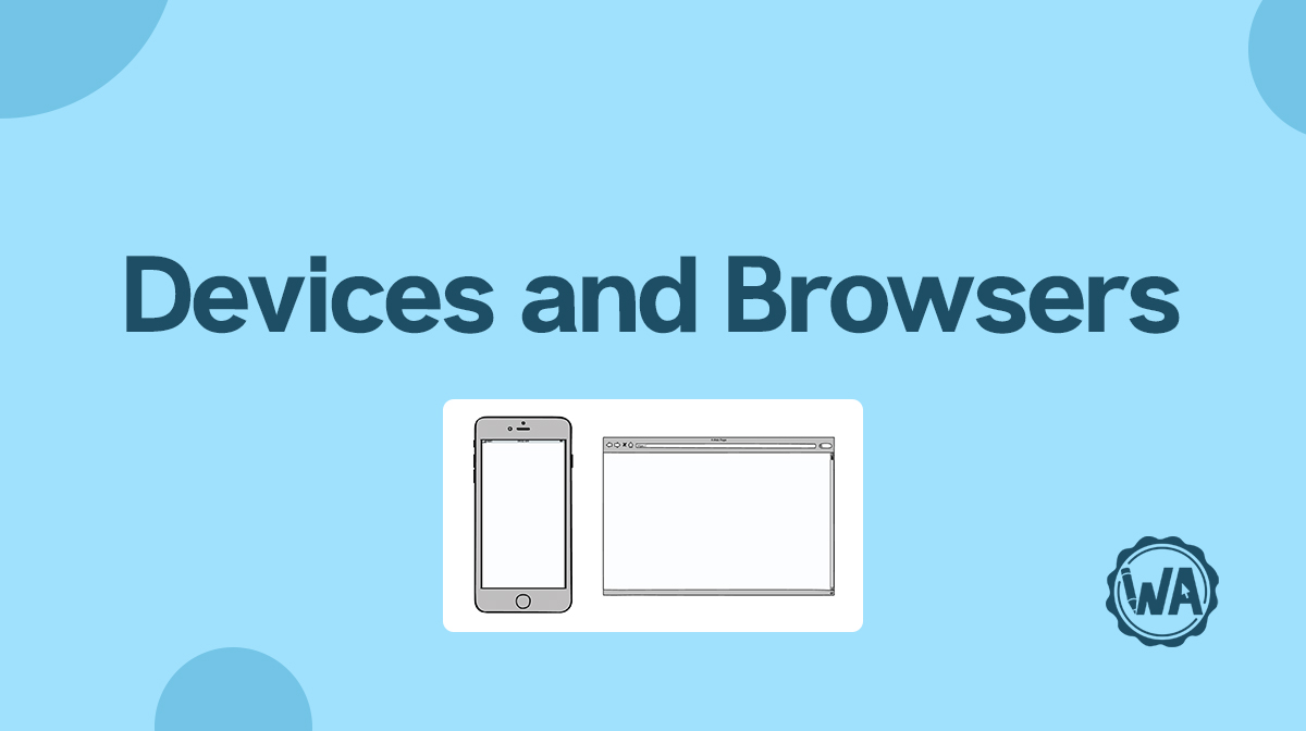
Device and browser guidelines
You may need to wireframe your digital product for mobile phones, tablets, or as a web app. There are differences in those devices and apps you should be aware of.
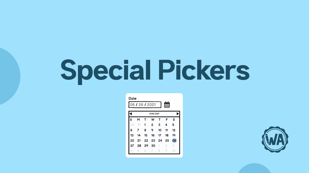
Special picker guidelines
Use a special picker in your wireframes when you want the user to be able to select a time or a date. It’s also used to identify or assign a color to an object.
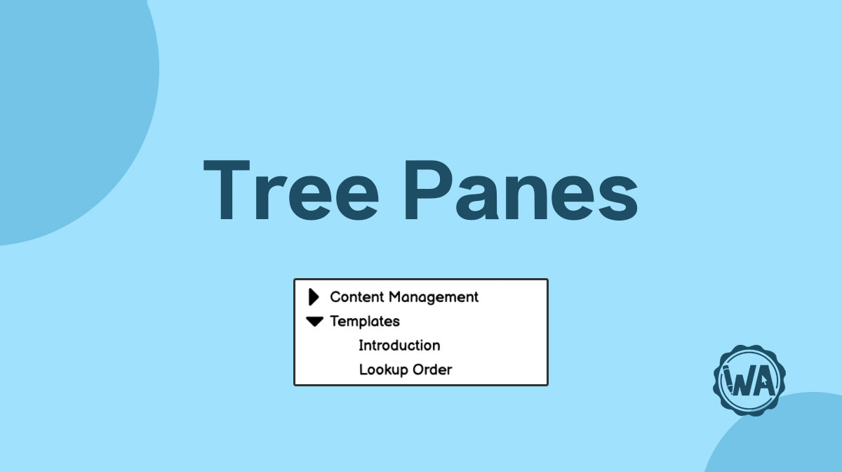
Tree pane guidelines
Tree Panes are a great option when there are multiple levels of navigation or many navigation categories. They should sit on the left of the screen and show nesting.

Image guidelines
How to use images in your wireframes and all their use case scenarios: from hero image to company logo, profile pictures, featured images, covers, and more.
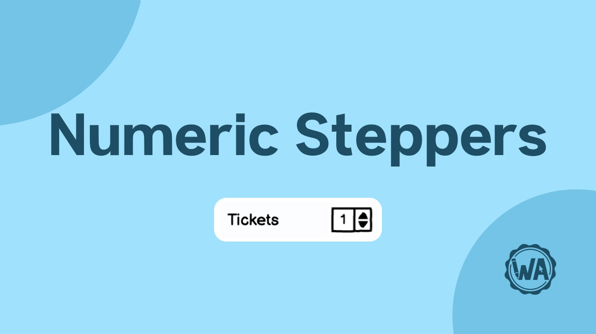
Numeric stepper guidelines
A numeric stepper is a UI element that works well for clicking through numbers with a small value. For anything higher than 10 you should use a different UI element.
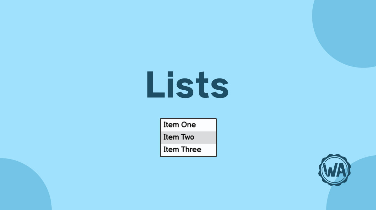
List guidelines
Lists contain rows of text, which allow for easy scanning. You can use them for static display, to preview a content, or to help users with navigation.

Chart guidelines
Charts show data in an easy-to-understand graphic. They can be pie charts, line charts, bar charts, column charts, or dashboards — each with its own peculiarities.

On/off switch guidelines
On/off switches are great for settings areas, but you should avoid using them in forms. Read on for more information about toggle switches and best practices.

Breadcrumb guidelines
Breadcrumbs are a chain of links used on websites with hierarchical navigation. They allow users to orientate themselves as they move throughout the platform.
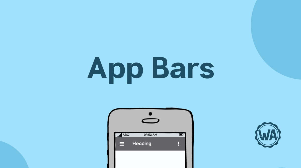
App bar guidelines
An app bar helps users navigate through a website or an app on smaller devices. It could have the form of a hamburger menu, a dropdown menu, or a kebab menu.

Map guidelines
A map in a UI can be used for directions to a location or searching for places. The UI elements you need to use when designing one are pretty standard nowadays.
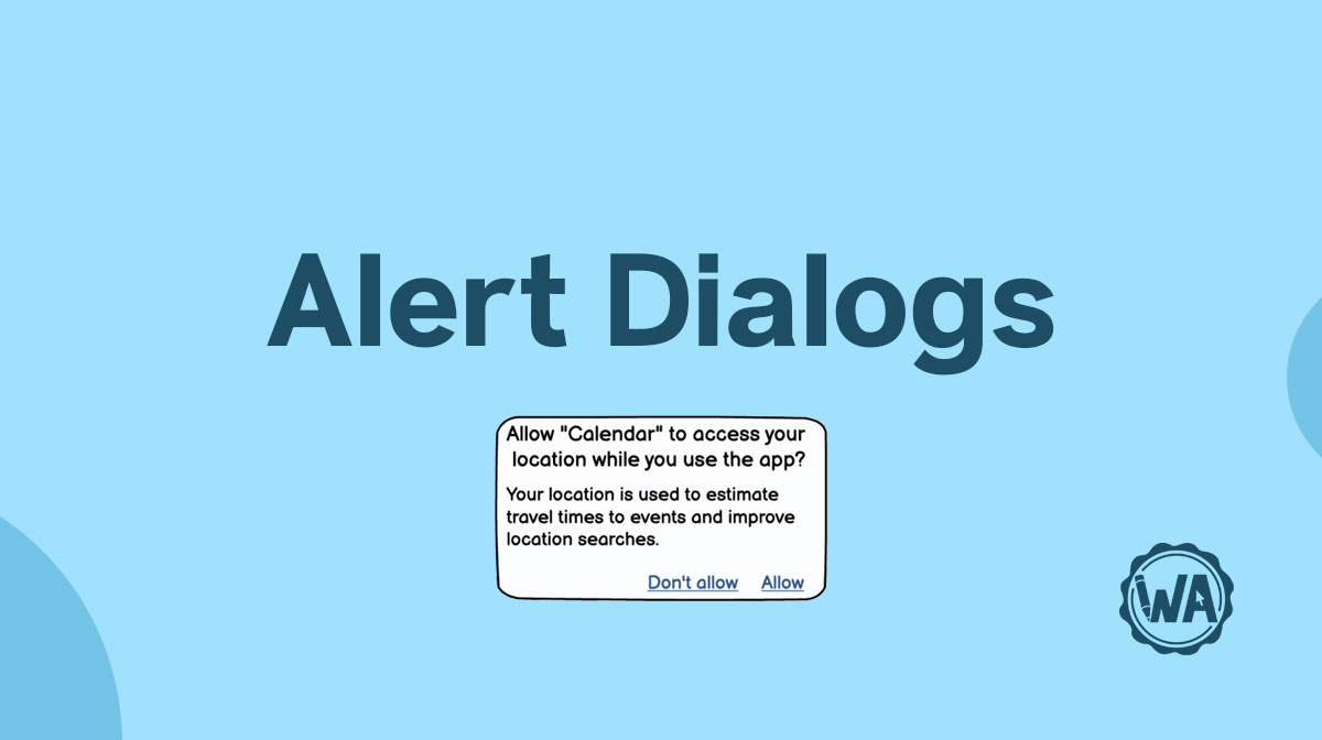
Alert dialog guidelines
Operating systems communicate through pop-up messages for asking permission, for destruction confirmations, for system problems, or other notifications.
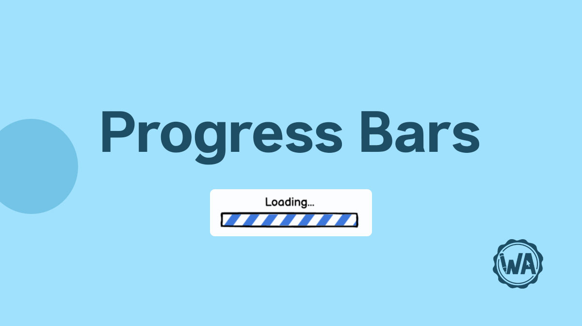
Progress bar guidelines
Progress bars let the user know that a page or component is busy loading. Without this little UI element they may think that the system has frozen or is broken.

Slider guidelines
With a slider you can graphically see you selection relative to the minimum and maximum options. For a tiny UI element, there are a lot of best practices to know!
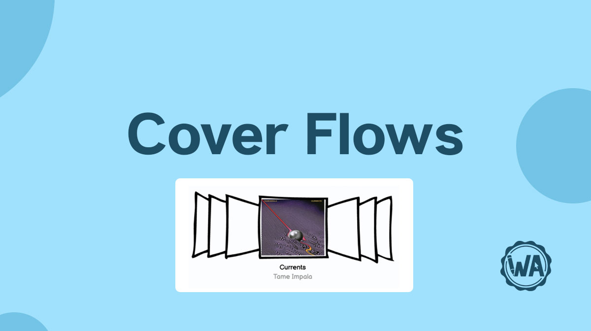
Cover flow guidelines
Cover flow lets the user scroll through content. It works best with large amounts of visual content, while it’s less helpful with folders or other file types.
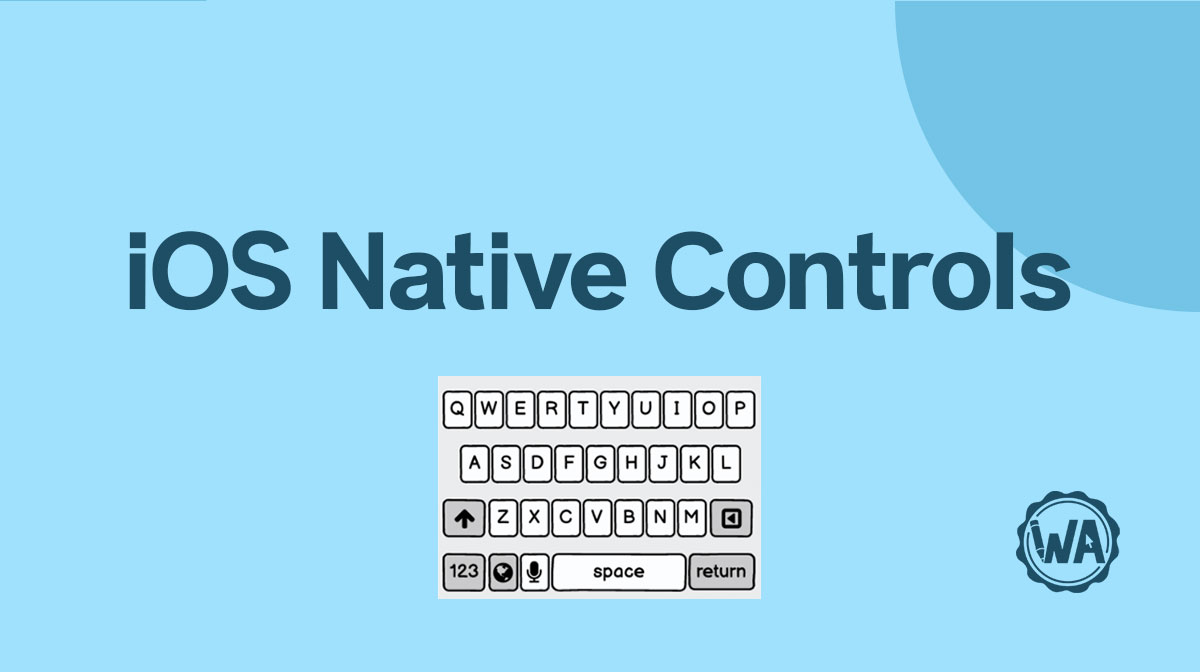
iOS element guidelines
When designing for mobile, you need to consider the operating system. iOS for iPhone and iPad has its own style when it comes to user interface elements.
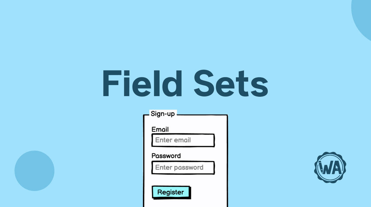
Field set guidelines
The most common use for a field set is as a container component. It can house different elements and components to improve the page’s hierarchy and the user’s flow.

Splitter guidelines
Splitters are a practical solution for screens without enough space. They allow users to arrange their workspace and focus on their current task.
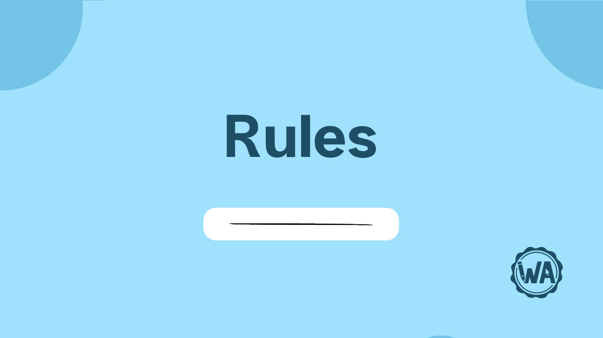
Rule guidelines
Rules are an aesthetic tool used to divide areas and content. You can use them to separate sections on a page or item in a list, or to create visual contrast.

Camera guidelines
If you have to add a camera to your UI, here are all the elements you need for your wireframes: for taking a photo or a video, for a video call or live recording.