Buttons guide users through your product, help them make decisions, and move them toward their goals.
And when you’re designing for action, buttons should be your first choice. That’s what they’re built for—and it’s what users expect. Following user expectations and established UI patterns is the most reliable way to create effective, user-centered products.
Great button design goes beyond color and shape. It’s about clarity, consistency, hierarchy, placement, and even the words you choose. When you get those right, users move through your product with confidence.
Here, we’ll walk through the key principles of effective button design—from making buttons look clickable to writing button copy that builds trust. You’ll also learn how to wireframe buttons early in your process, so you can map out smart, intuitive flows before you ever touch code.
Let’s get started!
Button structure & hierarchy is everything
At a glance, users need to know what’s clickable and what’s not. Most people scan a screen quickly and subconsciously, looking for visual cues to help them take action.
Your button design should clearly communicate, “Hey, you can click me!” And thankfully, you don’t need anything fancy to get there. A few foundational design principles—like hierarchy, color, shape, and contrast—can do most of the work.
Good news: users already have mental models from using other websites and apps. Lean into that familiarity. When your buttons follow common patterns, users don’t have to think twice about what to click.
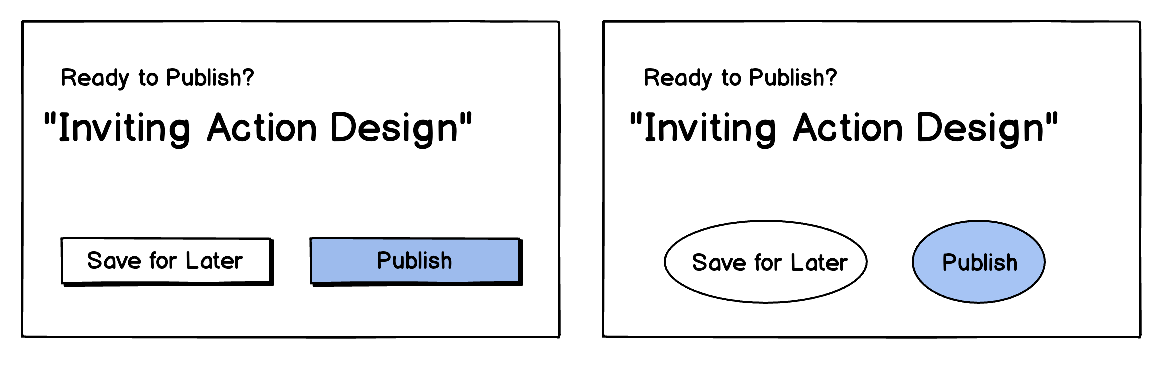
1. Make buttons look like buttons
Users already know what a button looks like. You don’t need to reinvent it. In fact, you shouldn’t.
Over-styled or ambiguous designs might look pretty in a mockup, but if a user can’t immediately tell something is clickable, you’re adding friction. Make sure buttons have familiar visual cues: dimensionality, contrast, padding, and hover or active states.
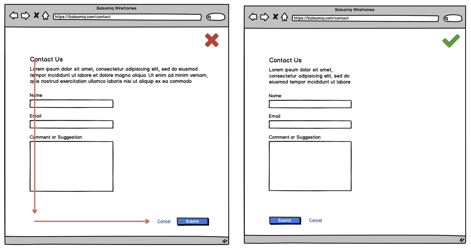
❌ Don’t: Style your CTA like body text.
✅ Do: Make it visually distinct and obviously clickable.
Oh, and quick reminder: buttons ≠ links. (We’ll get to that in a minute.)
2. Primary and secondary buttons should look different
In any given interface, one action should stand out as the next best step. That’s your primary button. It could be “Sign Up,” “Save Changes,” or “Get Started.” Whatever it is, it deserves visual priority.
Secondary actions—like “Cancel,” “Skip for now,” or “Back”—should be styled to reflect their lower priority. You’re not hiding them, just making sure they don’t pull attention from your main CTA.
Ways to create visual distinction:
- Use a bold or branded color for primary buttons
- Use outlines, lighter fills, or grayscale for secondary buttons
- Maintain consistent sizing, but vary the weight or prominence
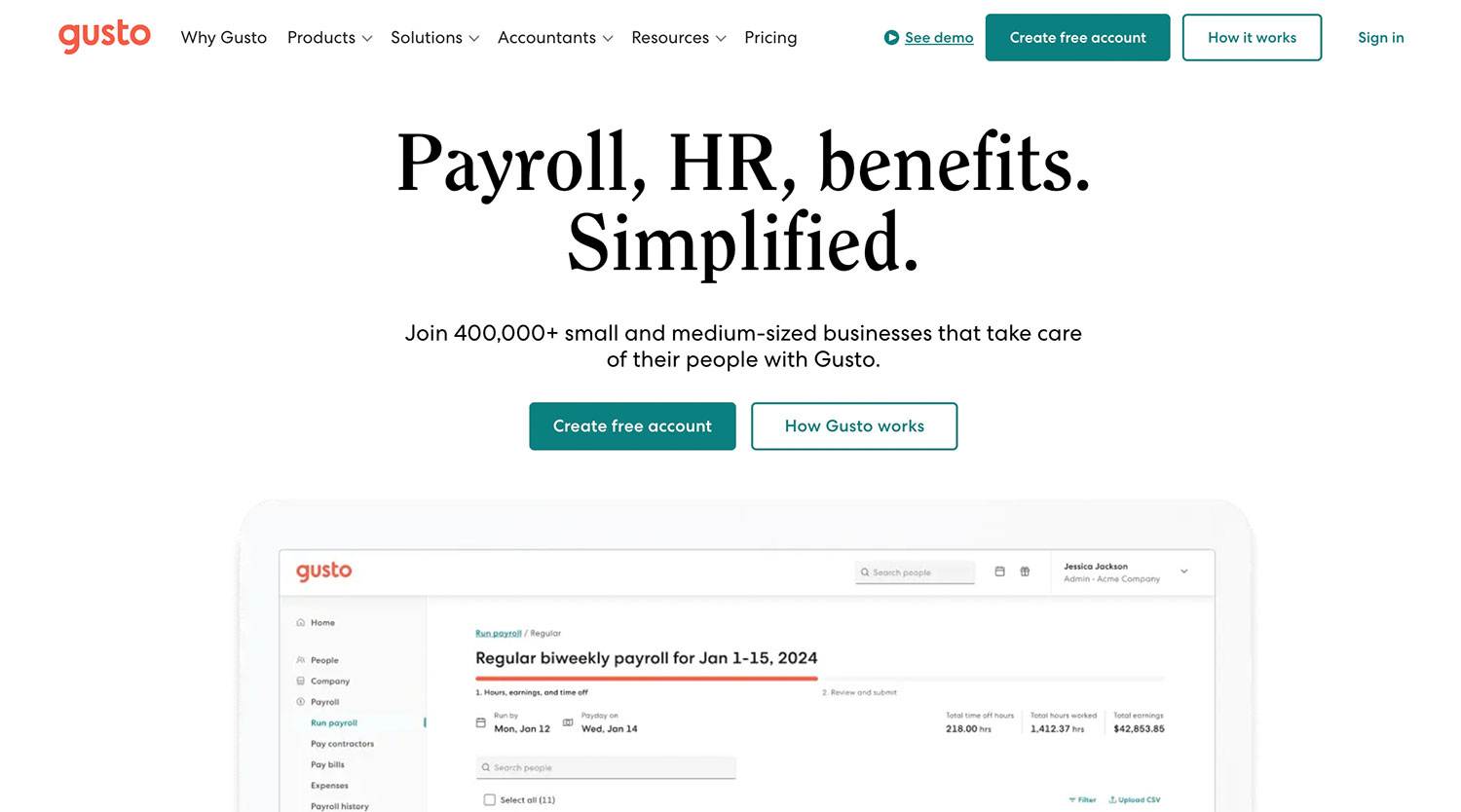
On the Gusto homepage, the primary and secondary calls to action are clearly differentiated through button styling. The “Create free account” button uses a bold, high-contrast color to stand out as the primary action, while the “How Gusto works” button is outlined, signaling a secondary option. This hierarchy guides new users toward the preferred next step—signing up—while still offering an easy path to self-education.
The same structure appears in the navigation bar: “Create free account” remains the bold, primary action, while “How it works” is styled with the outline again and “See demo” is also linked as a tertiary option.
Visual hierarchy isn’t just about aesthetics—it’s about nudging behavior.
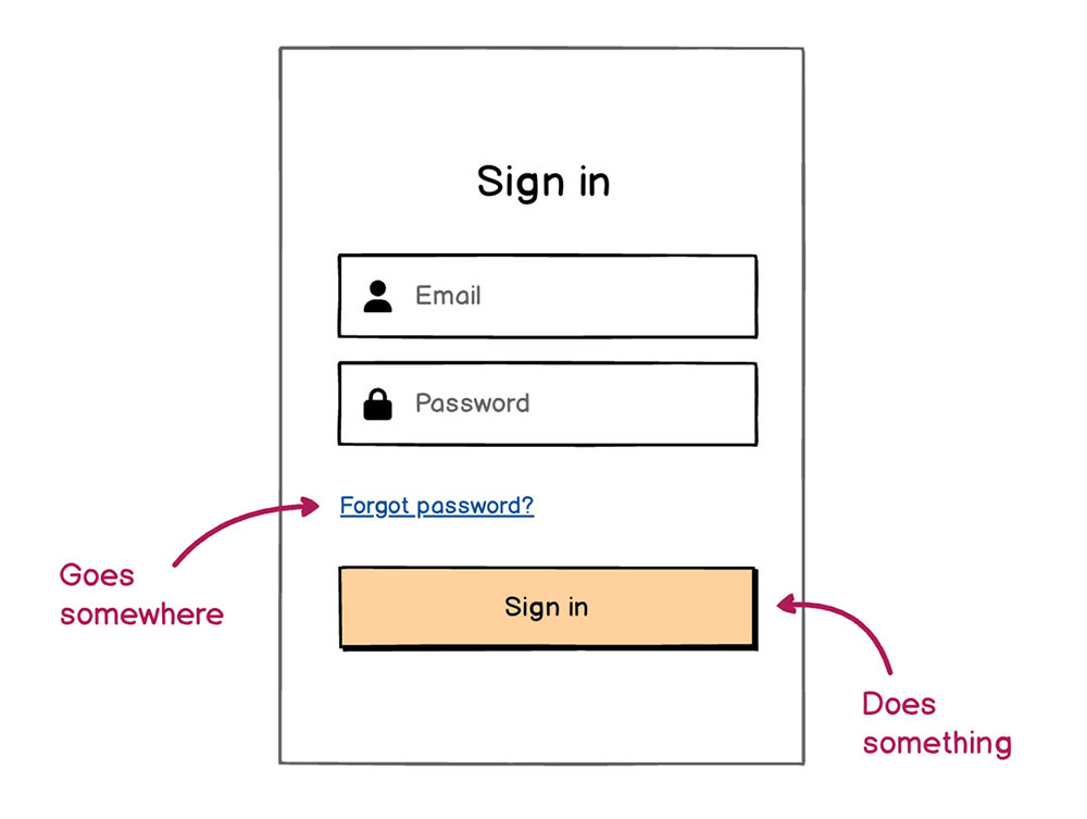
3. Buttons are not links
Buttons and links are not interchangeable—and treating them like they are is a fast way to confuse your users.
Buttons initiate actions: submitting a form, starting a process, opening a modal.
Links are for navigation: jumping to another page or section.
Styling them the same way leads to hesitation or misclicks. Users shouldn’t have to pause and wonder: “Is this going to take me somewhere or do something?”
Clear distinctions help:
- Buttons = solid fills, rounded corners, hover animations
- Links = underlined text or basic text styles, no container
If your UI uses one where the other makes more sense, you’re adding invisible friction. Over time, these tiny moments compound and frustrate users—especially on mobile.
4. Don’t have more than one primary action button on the screen at a time
Let’s be clear: your UI can have more than one button. Just not more than one primary button.
The whole idea of a primary action is to focus user attention. If every button screams for attention, none of them get it. Instead of guiding the user, you overwhelm them.
This is especially important on small screens. On mobile, you often have just one or two seconds to direct someone’s attention. If they see three competing buttons, they’ll either get stuck or tap the wrong one.
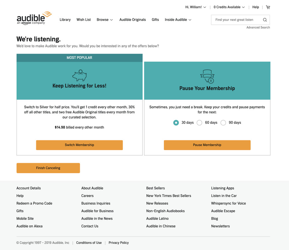
Audible is an infamously poor example of this. On their cancel account page, every button is styled as primary. It’s intentional: they want you to second-guess the cancellation process. As a user, it forces you to slow down, read closely, and hope you don’t click the wrong one.
Good UX builds trust. Confusing button hierarchy breaks it.
Button placement should feel natural
You’ve got a beautifully designed button—now where does it go?
Button placement isn’t just about layout preferences or aesthetics. It’s about flow. A well-placed button supports the natural progression of a task and keeps users moving forward. A misplaced one creates friction, confusion, or even abandonment.
Let’s talk about where buttons should live and why.
5. Place primary actions where users finish their task
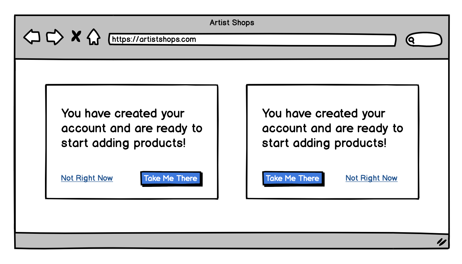
Users expect the most important button—your primary action—to appear at the end of the process or form. That might be at the bottom of a modal, the right side of a two-button pair, or the last step of a multi-page flow.
It’s a small detail with a big impact: putting the button where users already are when they’re done thinking makes it easy to act.
Look at this scanning pattern, which do you think is easiest?

6. Avoid floating or disconnected buttons
Buttons that float in strange corners or appear far away from the task they relate to can confuse or frustrate users. Keep your calls-to-action (CTAs) close to the action. Simple enough.
In long forms or mobile views, fixed buttons (that stay anchored to the bottom of the screen) can reduce friction and improve task completion rates. But they should never block content or be too aggressive.
When used right, sticky CTAs make interfaces feel faster and more fluid.
Related Article: SaaS website design: Lessons from real users
Button wording needs to build confidence
Design gets attention. Wording earns the click.
No matter how visually perfect your button is, it’s the words that ultimately seal the deal. The right label gives users the clarity (and confidence) to move forward. The wrong label? It can cause hesitation, drop-off, or worse… accidental actions.
While you don’t need final content, thinking through wireframe website copy—especially button text—early on helps map out a stronger user experience.

Let’s walk through how to write button copy that’s clear, helpful, and user-friendly.
7. Keep it short (and specific)
Button copy shouldn’t be a sentence—it should be a signal.
The most effective buttons are 1 to 3 words max, using direct, specific verbs. The tighter the copy, the easier it is to scan, process, and click with confidence.

This isn’t about being robotic—it’s about reducing friction. Say just enough to guide the action, and let the surrounding context do the rest.
If your button needs a paragraph of explanation, your UI flow might be doing too much.
8. Say exactly what happens next
Your button text should describe the result of clicking. Vague labels like “Submit,” “OK,” or “Click Here” don’t tell the user anything about what’s coming.
Instead, use action-oriented language that sets the right expectation. If your button label could work on any page of your site, it’s probably too generic.
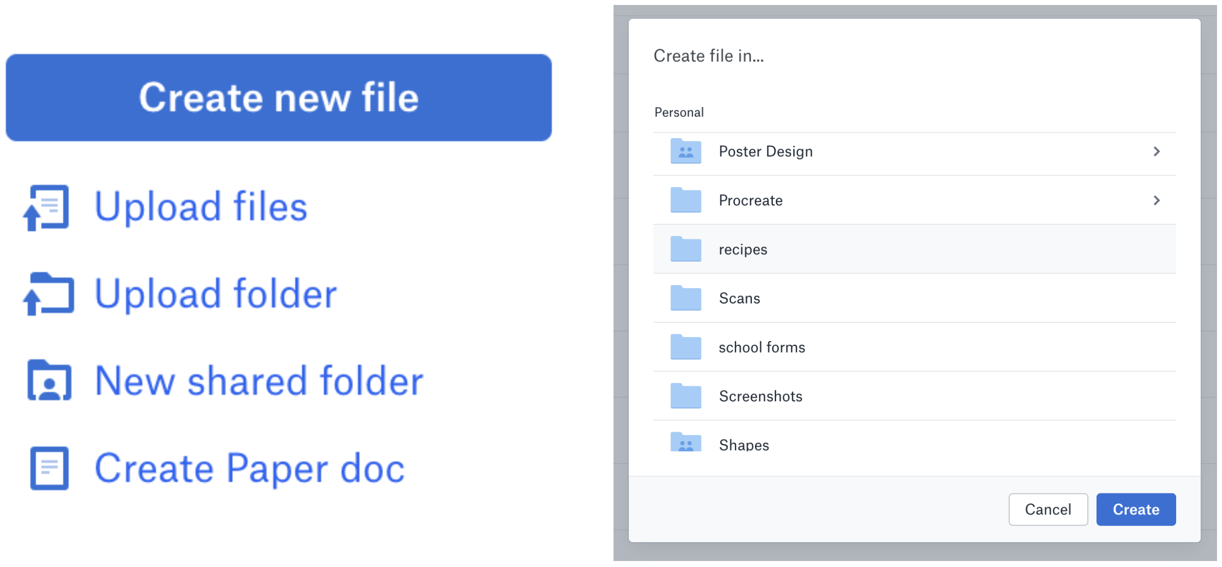
Take Dropbox for example. To create a new file, you click on the Create New File button. The next step is to choose where the file will be saved. Once you select a folder, you click on the “Create” button. It’s very clear what actions you are taking based on the text used.
9. Match the button to the moment
Your primary button should align with what the user is doing right now—not what you think comes next in your flow.
If a user is filling out a download form, don’t label your button “Next.” Label it “Download Report.” It gives the user confidence that they’re completing the task at hand—not getting pulled into something else.
This is especially critical in multi-step forms, confirmation screens, or modals. The more aligned your button copy is with the action, the smoother the experience.
10. Avoid words that can potentially cause confusion
If your button performs a destructive or irreversible action, it needs to say so, clearly.
❌ Bad:
- “OK”
- “Yes”
- “Confirm”
✅ Better:
- “Delete Account”
- “Remove File Permanently”
- “Cancel My Subscription”
When a button could have big consequences, your wording should slow users down just enough to be sure. Bonus points if you include an undo option or confirmation step.
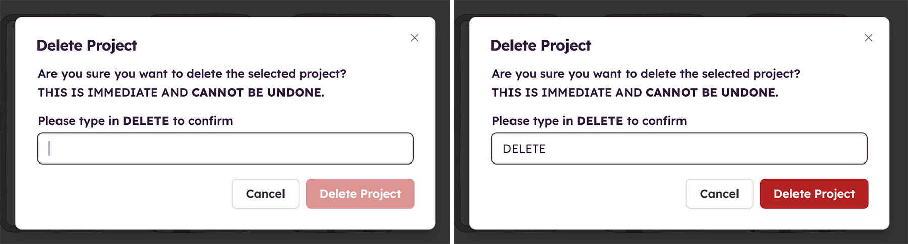
At Balsamiq, deleting one of your projects is a huge deal. We make users take the extra step of writing the word DELETE to ensure they really want to delete a project. This allows users extra time to think through their actions and avoid mistakes.
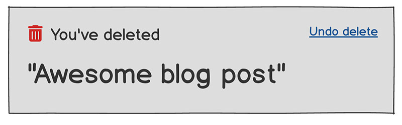
If you can’t go the extra step of having a user write the word DELETE, adding a simple Undo command after the deletion will go a long way in helping avoid paying for a hasty mistake.
11. Speak the user’s language, not yours
Avoid product jargon or internal terminology. Your team may know what “Enable Smartflow” means—but your users probably don’t.
Instead, write button text in plain language your audience already understands. Use verbs they’d naturally say out loud when describing the action.
TL;DR button wording should feel obvious.
Button size & spacing matters
You’ve nailed the look. The label is clear. But is your button easy to actually click—especially on mobile?
Button size and spacing play a huge role in usability. Too small? Users will miss it or mis-tap. Too close together? They’ll hit the wrong one. Give your buttons the space they need to feel touch-friendly, intentional, and frustration-free.
12. Design for fingers, not cursors
On desktops, users have a precise pointer. On mobile? They’re using their thumbs and that’s not always easy.
A good rule of thumb 😉:
Touch targets should ideally be 44x44 pixels.
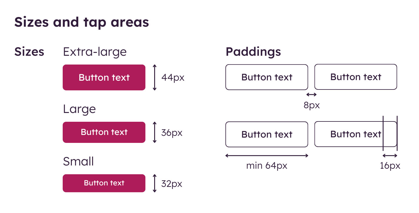
This size gives enough surface area to press comfortably without precision. A button that’s too small to tap on the first try is too small, period.
And yes—this goes for icons too. If an icon is acting as a button, it needs to be finger-friendly.
13. Use padding to create comfortable tap zones
It’s not just the button size—it’s the space around it that matters, too.
Even if your button shape is relatively small, generous padding inside the element (and margin between buttons) can create a forgiving touch zone. Think of padding as a buffer that helps the button feel solid and pressable.
❌ Bad:
- Tightly packed rows of tiny buttons
- Minimal or no spacing between CTAs (especially on mobile)
✅ Good:
- A clearly defined button with internal padding
- Adequate margin between it and nearby elements
Button color isn’t just about looks
Color does more than make buttons look nice. It tells users what’s important, what’s safe, and what happens when they click.
Whether it’s a bold primary button or a subtle hover state, color and contrast help users scan, understand, and take action faster. But too much or too little styling? That’s where confusion creeps in.
Here’s how to use color and contrast intentionally, without overwhelming the interface.
14. Give color meaning
The color of your button should tell users something. It’s not just for brand alignment—it communicates priority and purpose.
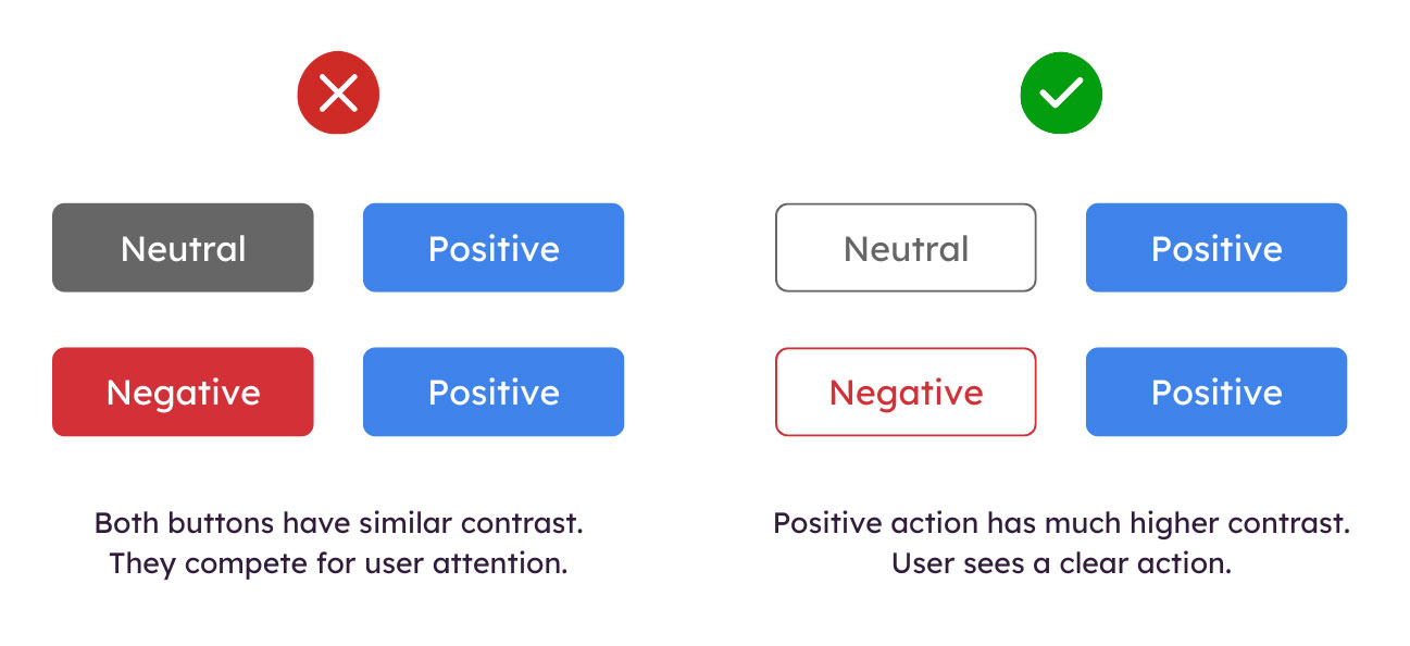
Here’s a common button color hierarchy:
| Button type | Example color use |
|---|---|
| Primary | Brand color |
| Secondary | Neutral or outlined |
| Destructive | Red or high-alert tone |
| Disabled | Muted or ghost button |
Be consistent. If blue means “primary action” on one screen, it should mean the same thing everywhere. That way, users learn what to expect and act faster. More on that a little later.
15. Use contrast to make buttons stand out
Your button text needs to be readable. And your buttons themselves should stand out just enough to be seen immediately, but not so much that they overshadow everything else.
Also make sure you check all button states—default, hover, focus, disabled—for readability.
Aim for high contrast between:
- Button background and its container
- Button text and the button background
💡 Pro Tip: Use tools like WebAIM’s contrast checker
Button consistency is key
When buttons look and behave the same across your pages, users don’t have to stop and think—they just know what to do.
Consistency isn’t just a nice-to-have, it’s one of the most important principles of effective wireframes.
In button design, consistency helps build user trust, improves usability, and reduces friction across different screens and workflows. Whether someone’s creating an account, saving a form, or dismissing a message, your buttons should feel familiar.
16. Keep the same styles across screens and flows
A primary button on your dashboard should look the same as a primary button in a modal. Same goes for hover states, disabled states, and loading states.
Look for consistency in:
- Shape (rounded corners? pill-shaped?)
- Color
- Font size, weight, & capitalization
- Padding and alignment
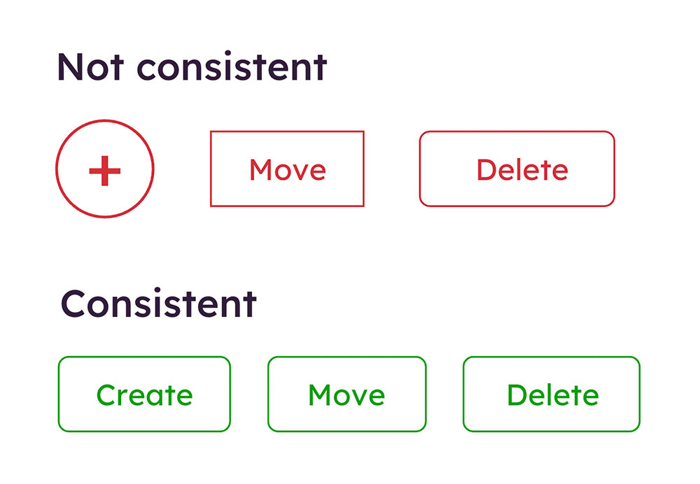
17. Avoid styling buttons differently “just because”
Not every new feature or page needs its own button style. In fact, the more custom button styles you add, the harder it becomes for users to trust what’s clickable—and for your team to maintain consistency.
When in doubt, reuse what already exists. Your design system (or even a shared Balsamiq wireframe) can help make that decision easier.
Good design systems are made of reusable parts, not one-off choices.
Better buttons, better Experiences
Designing for action is one of the most important parts of any user interface. Your buttons guide people through tasks, help them make decisions, and move them closer to their goals.
When buttons are confusing, inconsistent, or poorly placed, users hesitate—or worse, they bail. When buttons are clear, consistent, and easy to use, everything flows.
Whether you’re designing a sign-up form, an e-commerce checkout, or a simple settings panel, thoughtful button design makes the difference between “I think this is right…” and “Let’s go.”
A good button isn’t just a design element—it’s a moment of clarity.
🎓 Want to dive deeper into how design influences behavior? Check out our course on The Psychology of UI Design.
Designing buttons just got a lot easier
Try Balsamiq Cloud free for 14 days. Map out your screens, test button placement and wording early, and give your team a clear direction—before a single line of code. It’s the fastest way to build interfaces that feel intuitive from the first click.
FAQs
What are the best practices for button hierarchy?
Use visual cues like size, color, and placement to make the primary button stand out. Secondary and tertiary buttons should be more subtle, using lighter colors or outlines to signal lower priority without distracting users from the main task.
What is a key principle for designing effective buttons?
Clarity is key. Users should instantly understand what a button does—whether it's submitting a form, starting a download, or moving to the next step. Use clear labels, strong visual contrast, and familiar placement to make buttons feel intuitive.
How many buttons is too many for one screen?
There's no clear-cut answer, but if users have to stop and think about which button to press (or tap), you've probably got too many. Stick to one primary action per screen, and group other related options to prevent decision fatigue.
What makes a button look clickable or tappable?
A user will interact with a button when it stands out from its surrounding elements. A good button will also follow patterns, like having a distinct shape, label, and hover state. Adding subtle shadows, borders, or color contrast is another way to make a button feel interactive.
Should all buttons be the same size?
Not necessarily. Primary actions should stand out, while secondary or tertiary buttons can be smaller or less prominent. Just make sure they're still easy to click or tap, especially on mobile.