There is an old adage from the 90s and the early internet design era: "Buttons are for actions and links are to go somewhere."
Every button and link is a conversation with your user, communicating importance and driving action. By understanding their differences, when and where to place them, and design best practices, you’ll be equipped to build interfaces that feel predictable and effortless for users to navigate.
Let’s dive in!
What's the difference between a button and a link?
Buttons are clickable boxed areas that trigger actions, whereas links are stylized text that take users to a different page. Use buttons for doing, and links for going.
Choosing between a button or a link might feel like a small thing, but it makes a big impact on how people move through your interface—whether it's a website, mobile app, or desktop app.
Knowing the difference helps you guide users clearly and consistently.
Buttons
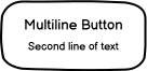
Buttons are a boxed area designed to trigger actions. Unlike links, the entire area of a button is clickable—not just the text.
Use buttons when something needs to happen or to signal: “This will do something.”
Common button actions include:
- Signing up for a free trial
- Adding an item to a cart
- Submitting a form
- Saving changes
- Sharing a file
Buttons are great for calls-to-action (CTAs) and can be styled in different ways to match the importance of the action.
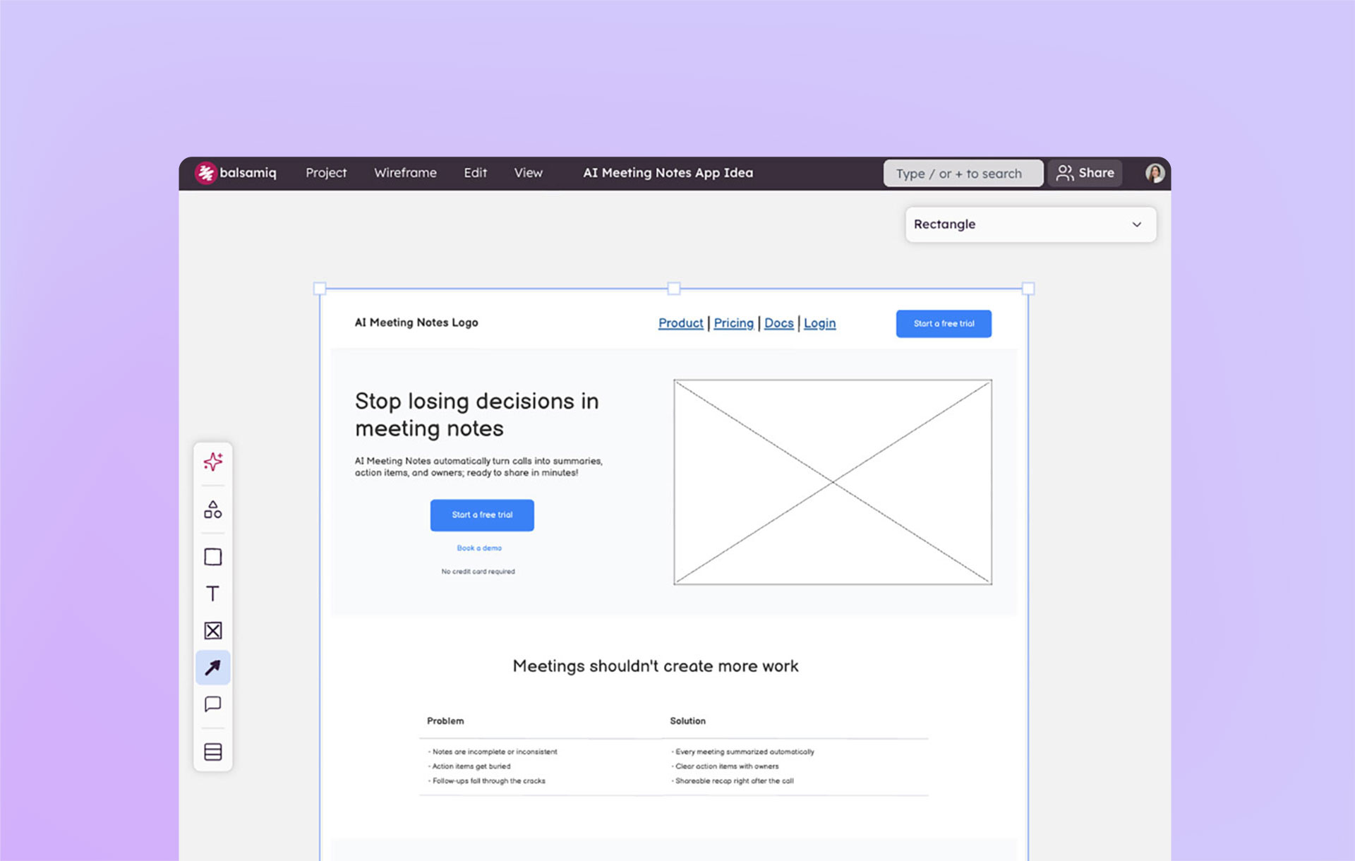
Button examples found in Balsamiq


Button styles
When using buttons, you also have a lot more flexibility in terms of their design. You can be creative with your button design across:
- Background color
- Border color
- Font color
- Button shape
- Icons
- Size
Links
Links are typically styled as underlined or colored text. They’re made for navigation—getting users from one place to another.
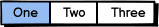
Link examples found in Balsamiq


Use links when you’re sending users somewhere else, such as:
- Navigating to another page or website
- Opening a password reset page
When to use buttons vs. links?
In order to decide on which element to use, you need to think of the screen action hierarchy.

Before you start building your wireframe, decide on the primary action that you want the user to take on each screen. This will help you determine how to organize information on each screen.
While you may have multiple buttons within a screen, there should only be one primary action per screen. We call this the Primary Call to Action.
Secondary actions can also be buttons, but you shouldn't have tertiary actions as buttons. Items that are low effort or not as important should be links.
Links shouldn’t change the state of an application. Avoid using links for actions like delete or save—they should never add, update, or remove data.
A quick rule of thumb:
- Does it do something? Use a button.
- Does it go somewhere? Use a link.
Buttons vs. links example: E-commerce
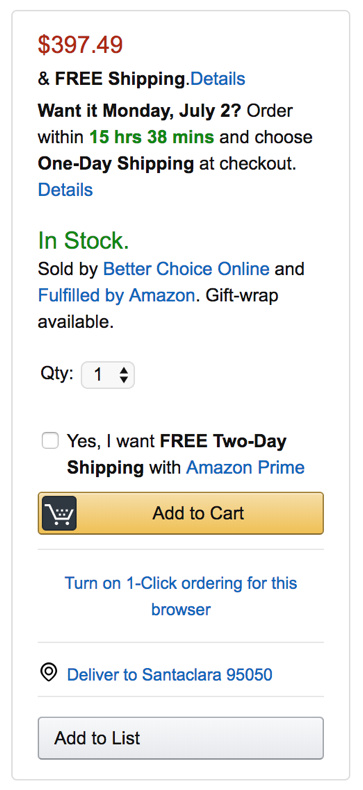
In e-commerce, buttons and links are used so consistently that users instinctively know what to expect. On Amazon, for example, the bright yellow “Add to Cart” button stands out as the primary action.
Secondary actions like “Add to List” use a different color, while tertiary actions—like viewing shipping details or seller info—are presented as links. These visual cues help users prioritize what to do next without thinking twice.
Buttons vs. links example: Menus
Another common example where you might find yourself needing to use both buttons and links is when building menus. These are a collection of buttons or links for the purpose of having a primary set of actions to navigate a website or app.
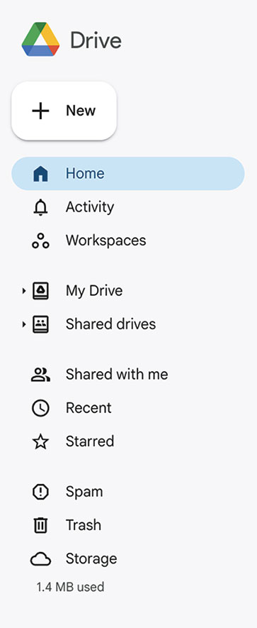
Now, look at the menu above from Google Drive. This consists of one primary button, which is highlighted in color and multiple links. But, the links have icons to the left of the text. Like buttons, links can be styled as well.
Keep in mind that a menu that uses just icons can be confusing and decrease usability for users. It’s best practice to always use text with icons if you’re going to use icons.
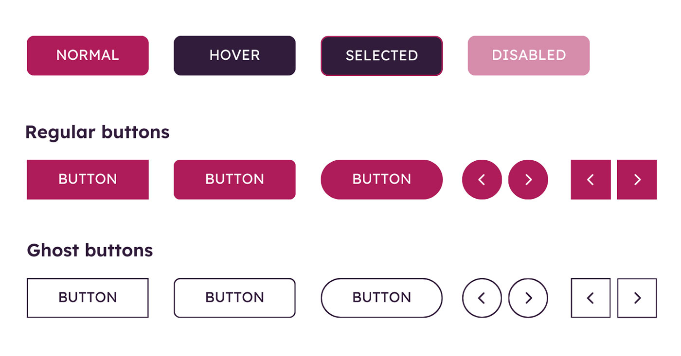
Button and link states
Buttons and links have different interactive states depending on the interface. Understanding these states will allow you to create a more predictable and user-friendly experience.
Buttons usually have 4 states:
- Normal (or default): The button is active and clearly clickable.
- Focus: On desktop, this is triggered when a user hovers over the button or tabs to it with a keyboard. On mobile, this is triggered when you place and hold your finger on a button. It provides visual feedback, like a shadow or cursor change, to show it’s interactive.
- Selected state: Indicates that the button has been clicked. On slower systems, this visual feedback helps confirm the action to the user.
- Disabled state: button is visible but inactive. This often appears when required fields haven’t been completed—for example, a grayed-out “Submit” button on an incomplete form.
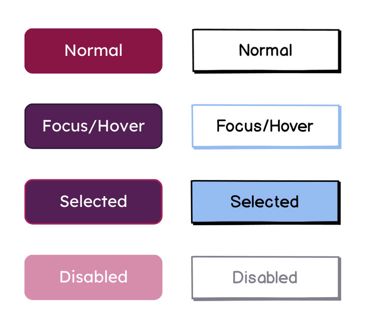
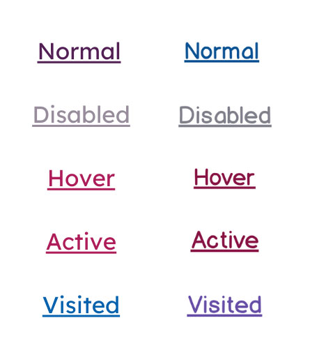
Links usually have 4 states as well:
- Normal: How a link normally appears, often with a different font color and/or an underline to show it’s clickable.
- Hover: On Desktop, this occurs when you hover over the link and your cursor changes to indicate that the link is clickable. On mobile, this is triggered when you place and hold your finger on a link.
- Visited: After the link has been clicked, its color usually changes to show it’s been visited.
- Disabled: The link is visible but inactive. This often means another action is required before it can be clicked.
In some cases, you may dip into a bonus link state, which is external links. This is visualized by adding an external link icon to let users know they’ll be taken to another website.

Best practices for buttons and links
1. Avoid generic text for buttons and links
We've all seen links that say "click here" or "read more" and buttons that say "learn more." This approach isn’t great for users because:
- It's a generic phrase that doesn't give context to what you’re about to interact with.
- It isn’t accessible. For those who are visually impaired, they don’t have a lot to go off of.
- It’s not an enticing CTA for buttons. After all, you want to drive action and strong copy is a part of that.
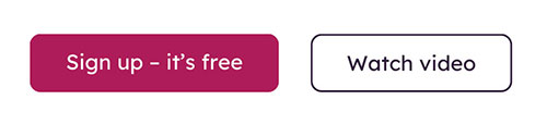
Buttons
✅ “Buy Now with 1-Click” is an excellent phrase for a button. It’s clear, action-oriented, and sets the expectation for what will happen.
❌ “Buy” isn’t as strong. What happens after clicking? Will there be a confirmation?
Links
Link text should always be able to stand alone. So, be sure to make it as descriptive as possible without relying on other text.

2. Be consistent with your designs
Consistency builds trust. When buttons and links aren’t designed with consistency, users have to stop and think, “Is this clickable?” That tiny moment of confusion adds friction.
A consistent visual language helps users feel confident as they navigate your product.
Some ways to maintain consistency include:
- Stick to one color for links throughout your interface. If some are blue, some are black, and others are underlined, users may not recognize them as links.
- Use the same shape and style for buttons—including padding, font, and corner radius. You can still play around with color, but don’t change too much.
- Use hover and active states consistently so users always get the same feedback when they interact with buttons and links.
- Don’t reinvent the wheel. Following common patterns makes your UI easier to learn and use.
Small differences might not seem like a big deal, but they add up. Consistency is one of the easiest ways to improve usability.

3. Group buttons with related components
Where you place your buttons and links—especially in relation to one another—matters. When you group your buttons with related components, it gives users a visual clue about what the button is connected to—and what will happen when they click it.
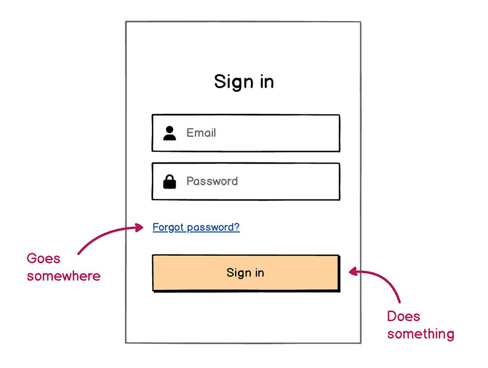
This helps users understand what action they’re about to take, without needing to overthink it. For example, a “Sign in” button should be visually connected to the login form—not floating somewhere else on the screen.
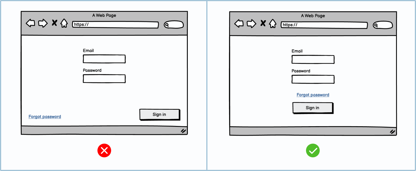
❌ The “Forgot password” link and “Sign In” button are too far from the inputs. That separation creates uncertainty and forces the user to pause and double-check.
✅ The link and button are grouped near the form fields. It’s clear that they belong together.
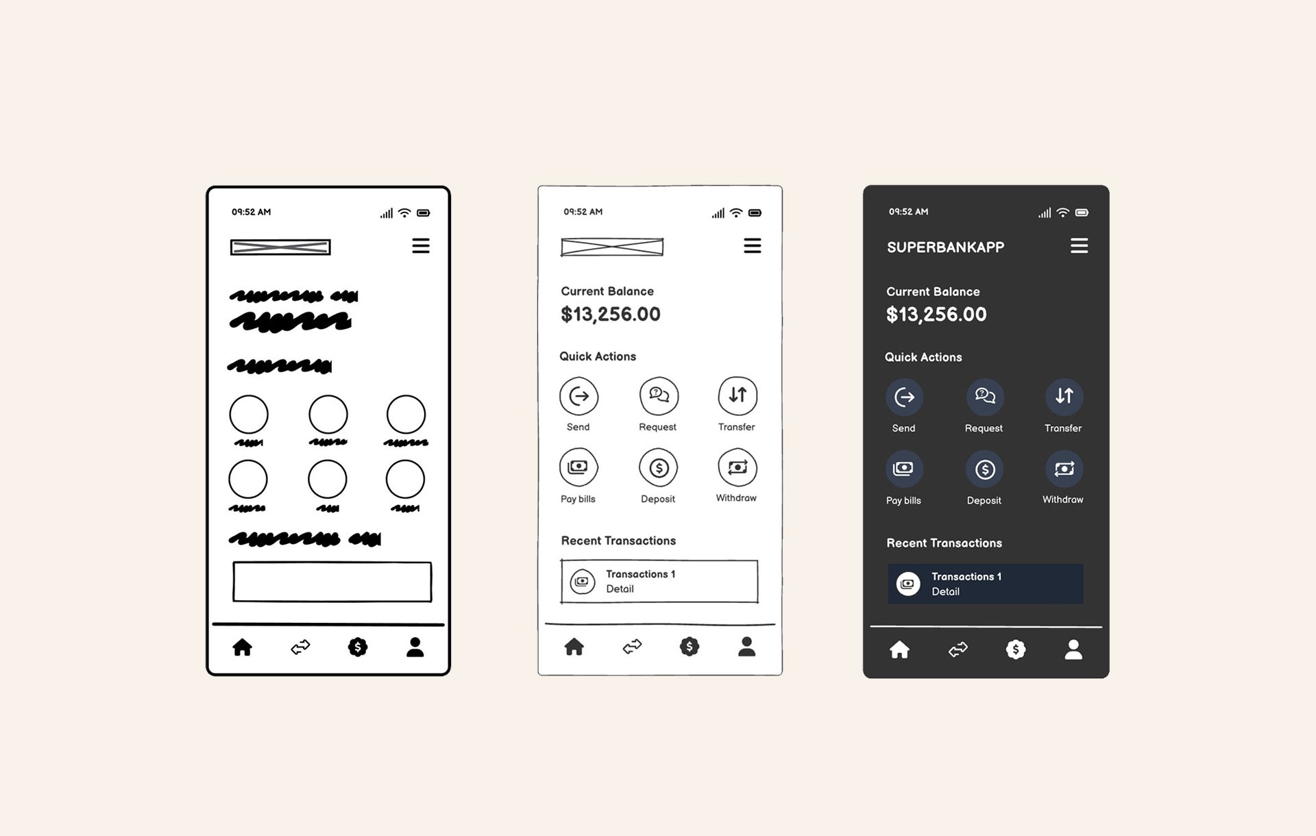
4. Start with low-fidelity wireframes
Don’t invest all of your time and resources into building final interfaces before having a plan in place. Test out button and link placements in a low-effort, low-life environment with low-fi wireframes. Try Balsamiq free for 14 days and start building fast.
Build with clarity in mind
Buttons and links may seem like small details, but they shape how people experience your product. By keeping your designs consistent, grouping elements logically, and understanding when to use a button versus a link, you’re already on your way to building more intuitive interfaces.
And as you would go about designing everything from low-fidelity wireframes to fully functioning apps or websites, build with clarity in mind.
Additional resources
- Course: Introduction to User Interface Design Through Wireframes
- More about Buttons and Links
- Designing for Action: Best Practices for Effective Buttons
FAQs
What's the basic rule for choosing between a button and a link?
Simple: buttons are for actions, links are for navigation. Use a button if the user is doing something (submitting a form, opening a modal, or triggering a process). Use a link if they're going somewhere (another page or section).
Can a link look like a button?
Visually, yes. CSS lets you style links to look like buttons, but that doesn't change their function. Just make sure the behavior matches the appearance—users expect buttons to do something, not take them somewhere.
Why does misusing buttons and links hurt accessibility?
Screen readers and keyboard users rely on semantic HTML to understand what an element does. If a link is styled like a button but doesn't behave like one, it can confuse users and break predictable navigation. Always match the role to the action.
What's the best way to style buttons and links so users know what to click or tap?
Use visual hierarchy. Make primary buttons bold and prominent, secondary buttons more subtle, and links clearly styled as text. Consistency across your UI helps users build trust and navigate with confidence.