Content-first design is an approach that uses the content of your website or product to determine its design.
In order for your website or application to succeed, you need to have the right content to meet your goals. By starting with a content-first mindset, you will ensure that proper time is given to understanding what you want to say and how to say it. Otherwise you may end up trying to cram content into a website that cannot hold it properly and your message will be lost on your users.
Content is design: the type of content you use, the tone of it, the length of it. All of this plays a big role in shaping your user’s experience. Focusing on what users will consume on your site — before sketching a wireframe, or writing a line of code, will allow you, the creator, to focus on what really matters — delivering content to the user in a clear, concise and hopefully delightful way.

What is "content-first" design?
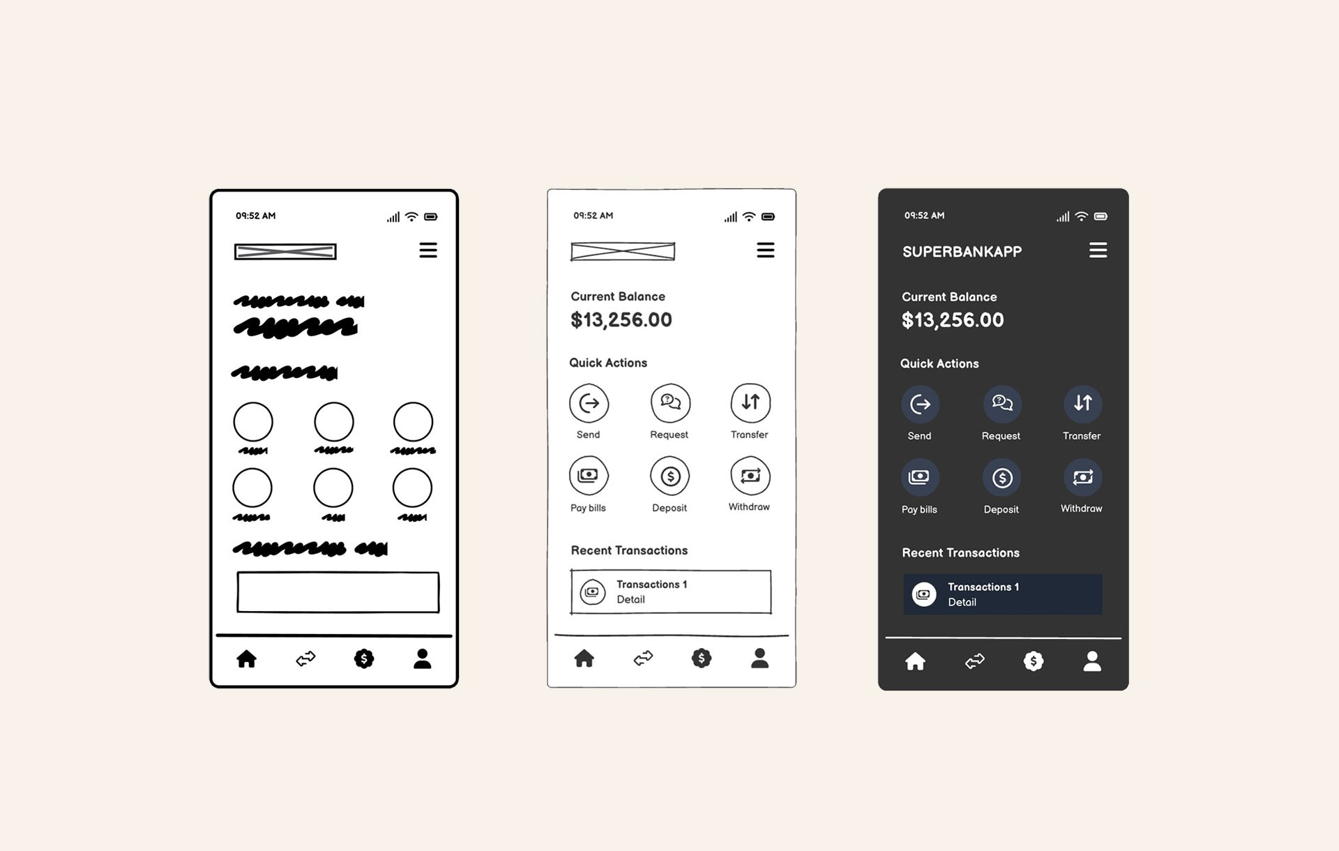
Content-first design is an approach where the content for your project determines the design of the site. Think text, photos, charts, tables, lists… any element that can go on the page or screen is the content. Start your project by taking inventory of what needs to go on each page. Are you creating a dashboard with charts and tables? Or a marketing site with eye-catching photos or illustrations, plus supporting text?
The more you know about what will go into the site, the better you can plan the design to fit the content. Think of it as building a house. Your architect will want to know how many bedrooms you will need before starting construction. Try to know as much as you can before starting to design.
Working on a new project
If you're working on a new project, try to answer these questions:
- What are we trying to communicate to our audience?
- What story are we trying to tell?
- What actions are we hoping our users will take on the site?
You can use your answers to help generate an outline to structure your site and build a site map. Site maps are a great way to identify all the pages / screens you will need. Which helps identify what content will be needed to fill your site.
A site map is a visual representation of the pages in a site. It details the basic structure and determines the hierarchy of all the pages. This is a handy way to determine the design of the navigation and what templates may be needed.

Read more about working with sitemaps.
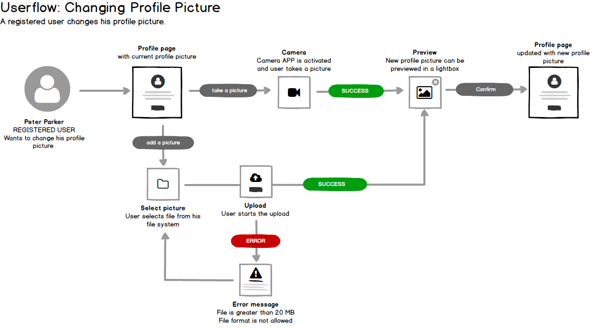
If you are designing an application try creating a Process or User Flow.
A process flow is a documentation of the users’ paths through a product. It highlights the steps taken to achieve a desired goal, calls out key tasks, and user needs.
Another great exercise to try is a Competitive Analysis. At the start of any design project it's beneficial to explore competitors websites or applications. This research can help you gain a better perspective for what you want your project to be. You can use this analysis to see how your site features stack up to others, or to simply discover what else is out there. Are there things that work well? Aren’t working? Look for ideas you may want to incorporate, and one that you would not like to add. It could be copy or an interaction. Dig into the details!
Below is a checklist you can follow.
Competitive analysis checklist
- What message are they trying to communicate?
- What are their key differentiators / features?
- Who is their target audience?
- How do they use visual design to communicate their brand?
- Finally, look for positives and negatives of each competitor from your perspective.
There are lots of ways to create a competitive analysis document. Starting with a simple spreadsheet to document each competitor is a great way to understand what each has to offer.
You can view and use this competitive analysis template.

If you want to better understand what offerings your competition has, a competitive analysis matrix is a great way to visualize it.

Redesigning an existing site / app
Does the content on your current site help answer the questions we asked in the Competitive Analysis Checklist above? If not, what’s missing? Also, is the content update-to-date? Relevant? Duplicated anywhere else in the site?
A simple way to help answer these questions is by conducting a content audit.
A content audit is the process of documenting and analyzing all the content on a website or application.
Knowing what you are working with is a great starting point. It will help you understand what you want to keep, and what you want to change. From here you can start thinking in terms of templates.
Content audits are typically created with a spreadsheet too. These can also be very simple. It consists of breaking down your site with the purpose of bringing out the text to a format where you can focus on the text only. Read your headlines, body text, captions and look for places where you can be more clear in your words, or for places where you are repeating yourself. If you have a large site, you likely don’t have to go through everything, but just the more recent work.
Here is an example:

Download the content audit template here.

To recap
- Answer some background questions about your project
- Create a site map
- Conduct a Competitive Analysis and/or a Content Audit
You will now have a much better understanding of what content will go into your project and can start thinking about how you want to design it.
Templates
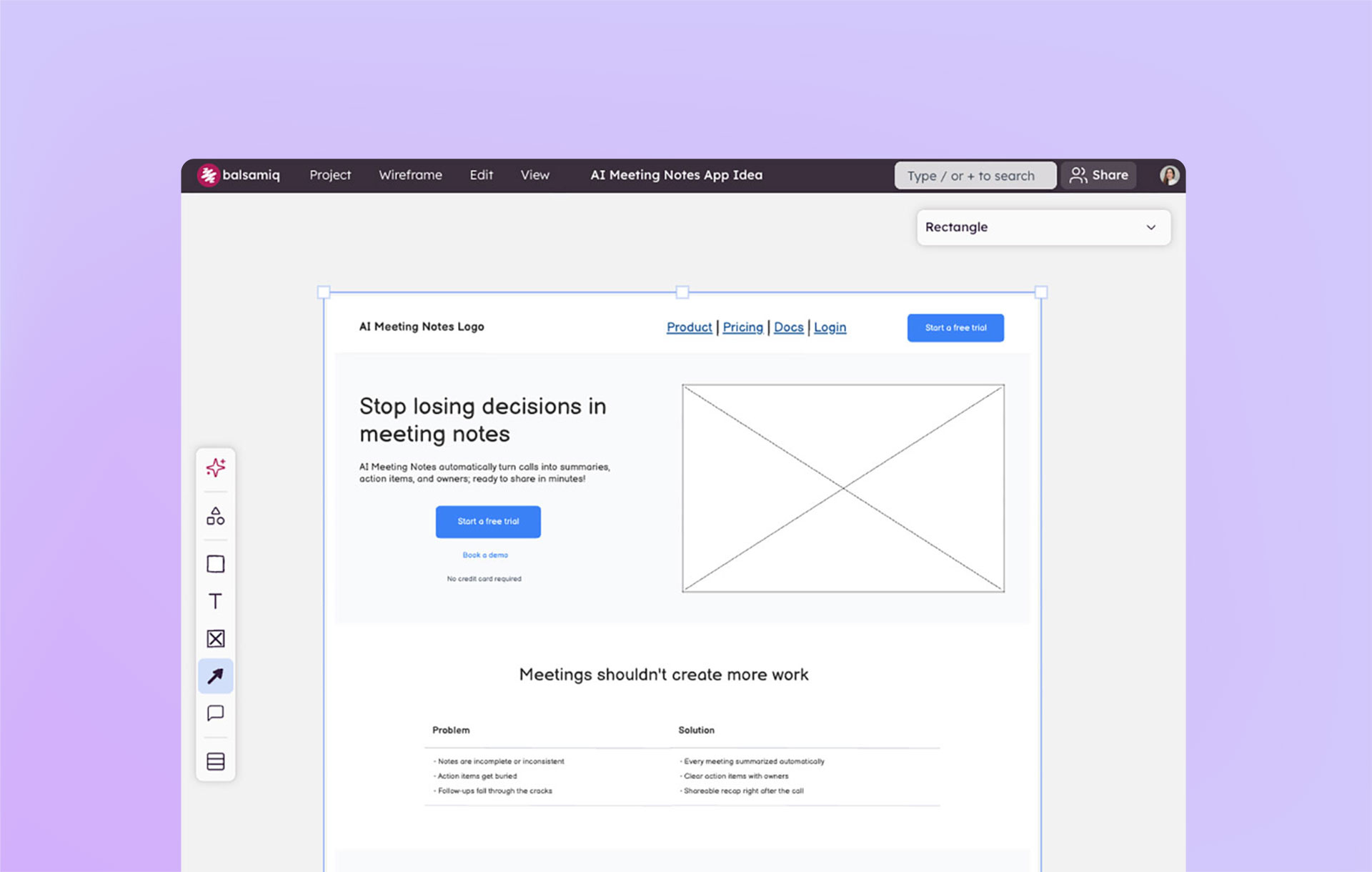
Once you’ve spent time diving into what content your project will need, it’s time to move on to creating templates. Most websites are designed and developed using a limited number of page layouts called templates.
Large websites typically use only 5-7 templates to support hundreds or even thousands of pages of content. Templates are a great way for users to become familiar with your site. It improves their ability to navigate and find what they need more quickly. Also, it is far easier to develop and support a limited number of page types that each hold different content.
To get started creating templates, take all of the work you’ve done and begin to look for similarities in content between pages. For example if you are creating a blog, all article pages should follow the same format. For a marketing site, your features page could look similar to a pricing page.
Another way to think about it is, “How many of these pages should follow the same format?”A good way to start looking for similarities is by sketching thumbnails of your templates. This will help you understand if you will need a template to hold 3 images and lots of text, or 20 images and not a lot of text, or both.


If you’d like to learn more about creating templates, checkout out our chapter on Templates in our Introduction to User Interface Design Through Wireframes course.

You are now pretty far along in the design process and can start creating full wireframes of your new site. You also have a good idea of how much content you will need to account for in your designs, so you won’t have to try to squeeze content into a page not designed for it.
Further reading
If you are interested in exploring more about how content can impact a website's design, check out Joanna Wiebe on wireframing for copywriters, our interview about Starting a project content first, or the video lesson about Content First and Accessibility.
If you would like to see some of the topics we covered in action, watch the first video in this live wireframing session with non-profit organization Bellies Abroad.
Webinar: Content-first design with wireframes
Watch the recording of our webinar about content-first design.