When you’re building a product, it’s easy to get caught up in features, timelines, and polish. But before you ship, there’s one question worth asking: Is this actually usable?
Usability heuristics help you answer that simple question.
If you’re unfamiliar, heuristics act like shortcuts for spotting common UX issues before they become real problems. And while designers use them all the time, they’re just as useful for product managers, developers, or anyone building a product (you).
Let’s break down what usability heuristics are, how they’re different from design principles, and how you can use them to build better products faster.
Usability heuristics vs. design principles
If you’ve ever Googled “UX best practices,” you’ve probably run into both of these terms. And if they seem to be interchangeable in your research, you’re not alone.
But here’s the thing: when people blur the line between heuristics and design principles, they either end up ignoring one of them in their explanations or try to capture both concepts at once. That leads to confusion, overthinking, and design paralysis.
Those are three pretty terrible things for anyone trying to ship great products fast. So, let’s clear up the differences.
Design principles
Design principles are big-picture ideas. They guide your overall approach to design—how you think about users, how you prioritize features, and how you make decisions.
At Balsamiq, our design principles act as a basis for decision making when designing our products. These principles ensure that across our team, we have a unified design philosophy, and more importantly, a unified user experience.
Our design principles aren’t a checklist—they’re philosophies that shape how our team builds.
Here’s a quick look at a previous draft of our internal design principles document that have influenced our work on a daily basis:
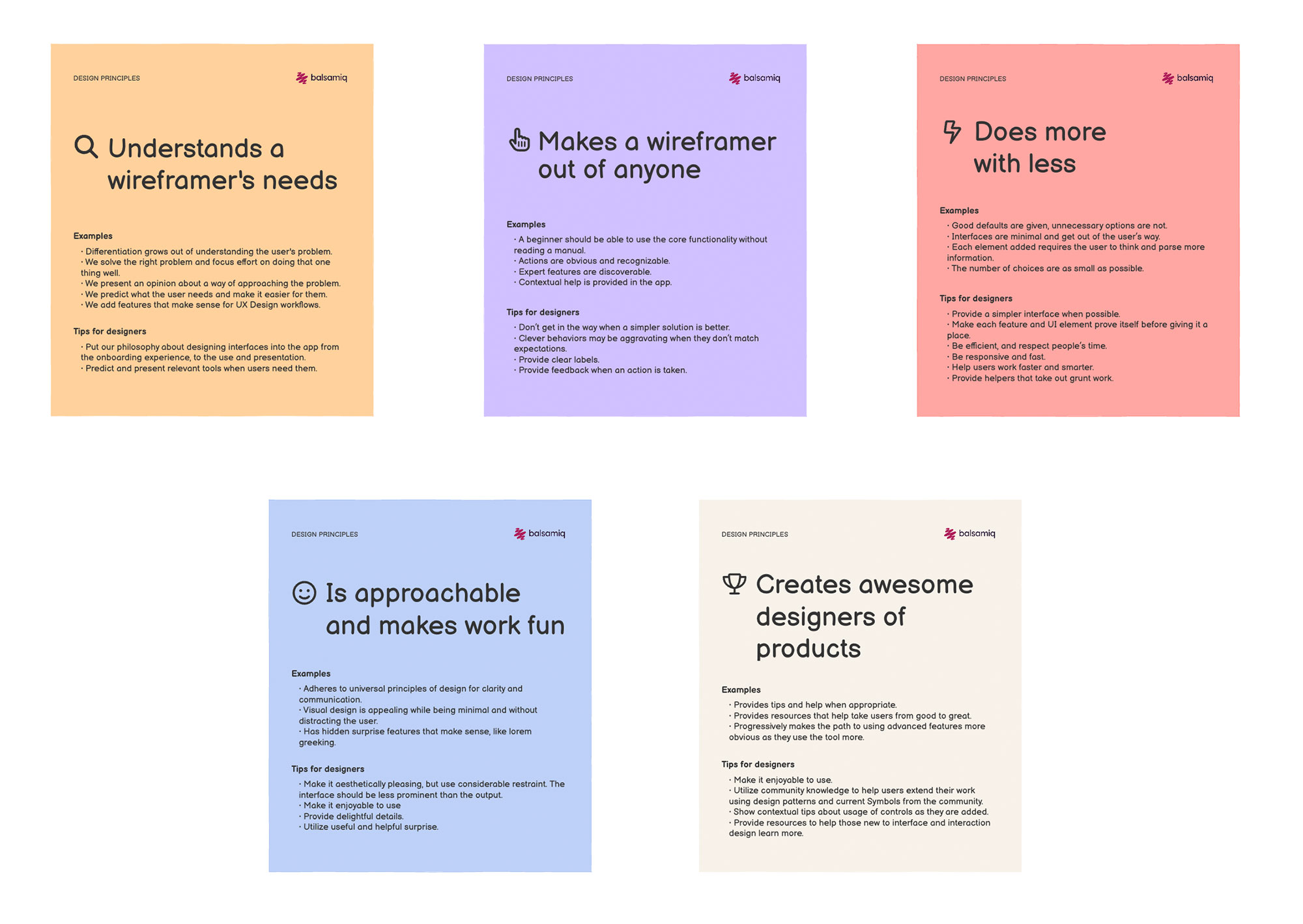
Balsamiq’s design principles in action
At Balsamiq, we believe in keeping things simple and focused. Our design principles are baked into how we build—and how we help you wireframe. These are three we come back to again and again:
Hierarchy
Make sure users know what to look at first.
Alignment
Keep things tidy. It builds trust.
Clarity
Every element should have a reason to be there.

Again, these are just three, so be sure to check out Wireframing For Everyone (it’s free!) for the full set. It’ll take your wireframing game to the next level.
Usability heuristics
Heuristics are more tactical. They’re experience-based guidelines that help you evaluate a design and catch common usability issues.
Think of them as a gut-check before you ship new code. They’re used in cognitive walkthroughs, usability inspections, and quick design reviews. Jakob Nielsen’s 10 Usability Heuristics are the most well-known, and we’ll dig into those in a minute.
Quick comparison: Usability heuristics vs. design principles
| Usability Heuristics | Design Principles | |
|---|---|---|
| Definition | Specific, research-backed rules of thumb for evaluating usability | Broad guidelines that shape overall design decisions |
| Purpose | Spot usability issues early | Guide overall design philosophy |
| Scope | Focused on practical usability and interaction issues | Encompass overall aesthetics, consistency, and accessibility |
| Examples | Nielsen’s 10 heuristics, Shneiderman’s rules | Apple Human Interface Guidelines, Google’s Material guidelines |
| Who uses it | Usability evaluators, designers during reviews | Design teams, product owners throughout development |
How heuristics help you catch UX issues early
When you’re sharing or receiving feedback on wireframes, wireflows, or prototypes, the word “heuristics” likely isn’t a part of the conversation. Instead, you’re asking questions like:
- Why are users confused by this screen?
- Is this form too complicated?
- What am I missing before I share this with others?
Heuristics are especially useful when decisions need to be made with limited time and resources. They act as a lightweight checklist for spotting common UX problems—things like confusing navigation, unclear feedback, or inconsistent layouts.
For product managers, developers, and other non-designers, heuristics offer a shared language to evaluate designs and give meaningful feedback. You don’t need to know design theory. You just need to know what makes a screen usable.

Heuristics frameworks to improve usability
Heuristics frameworks offer a fast, structured way to spot usability issues—without needing a full research cycle. Let’s start with the most widely used set: Jakob Nielsen’s 10 Usability Heuristics.
Jakob Nielsen’s 10 Usability Heuristics
In a nutshell, Jakob Nielsen’s 10 Usability Heuristics are the gold standard. They’re not rigid rules, but flexible guidelines that apply across platforms, products, and user types. Think of them as a UX gut-check: if something feels off, these heuristics help you name it, fix it, and move it forward.
They’re especially useful when:
- Reviewing wireframes or prototypes
- Giving feedback in cross-functional teams
- Prioritizing usability fixes before launch
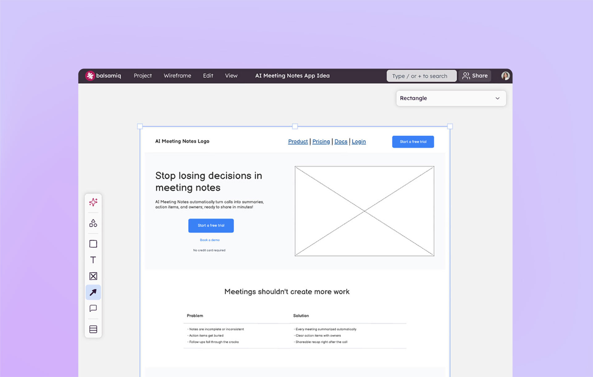
Here’s three of the 10, with wireframe examples you can build in Balsamiq:
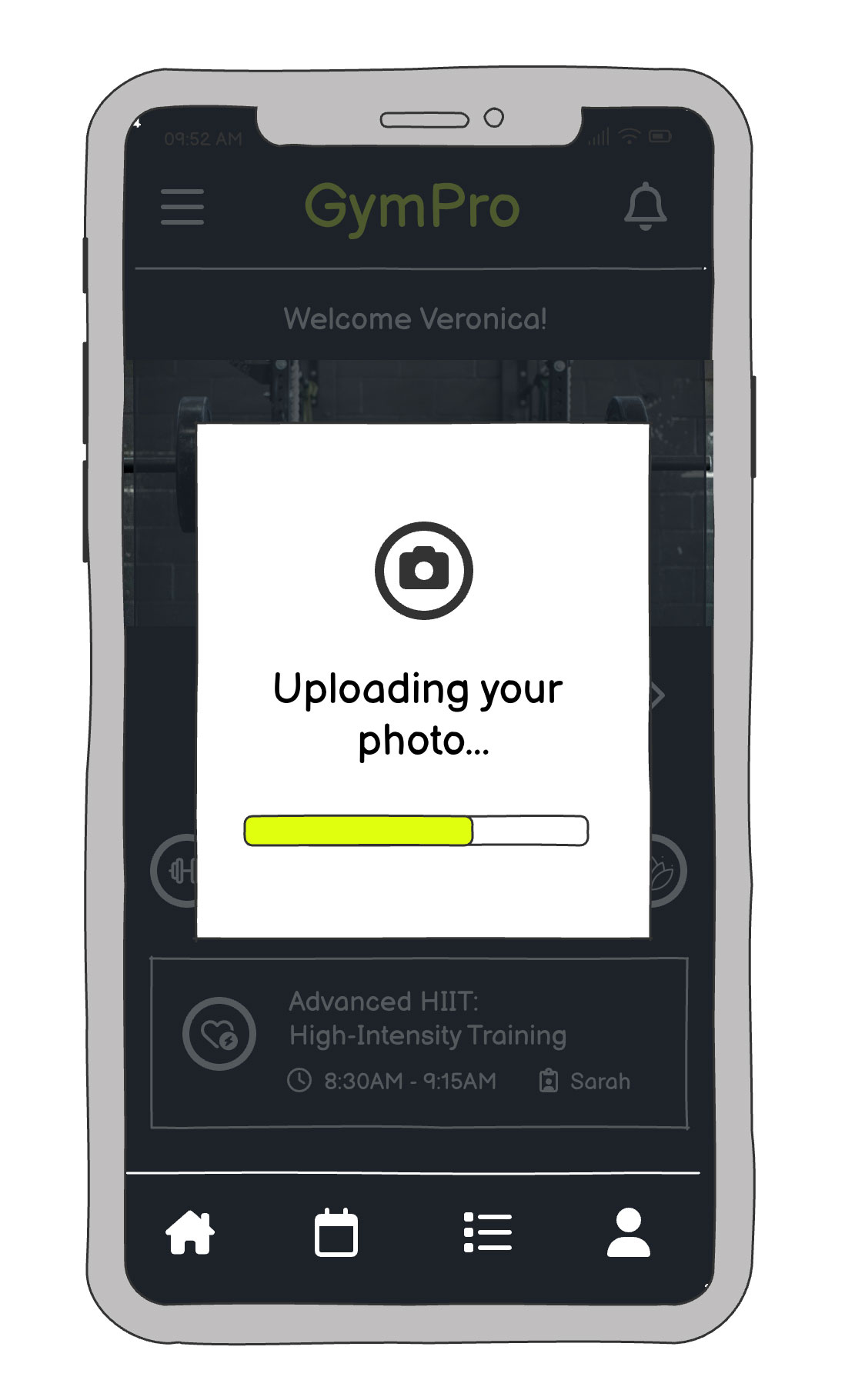
1. Visibility of system status
What it means: Keep users informed about what’s happening. Whether it’s loading, saving, or syncing—feedback should be timely and clear.
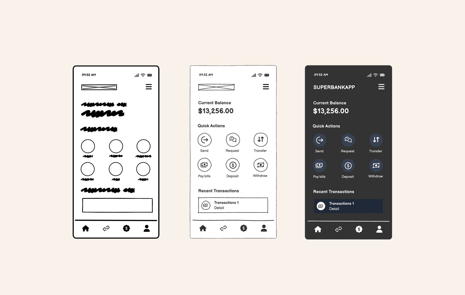
2. Recognition rather than recall
What it means: Make options visible so users don’t have to remember things from one screen to the next. Reduce cognitive load.
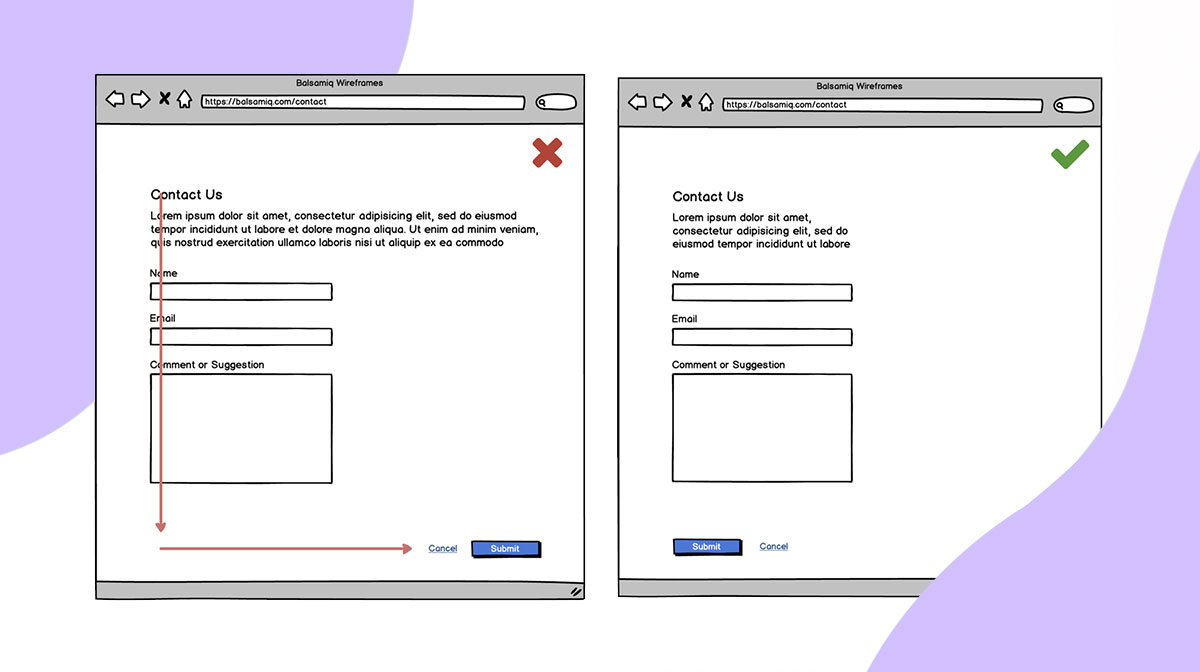
3. Error prevention
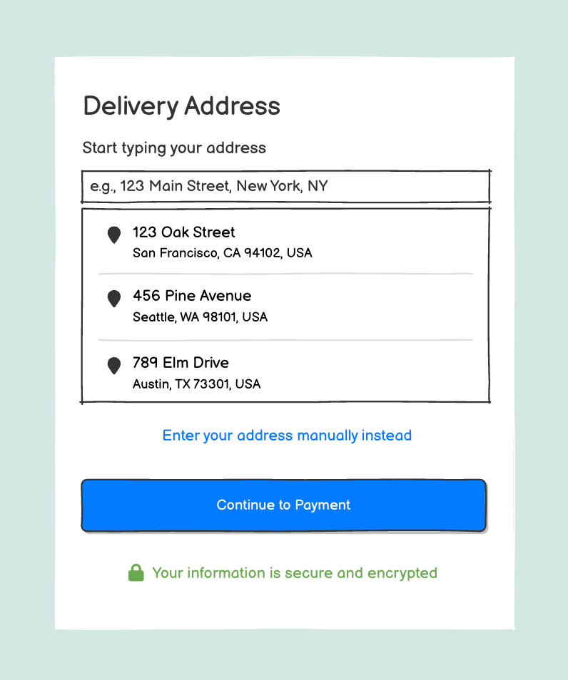
What it means: Design interfaces that help users avoid mistakes before they happen. Good UX anticipates errors and gently guides users away from them.
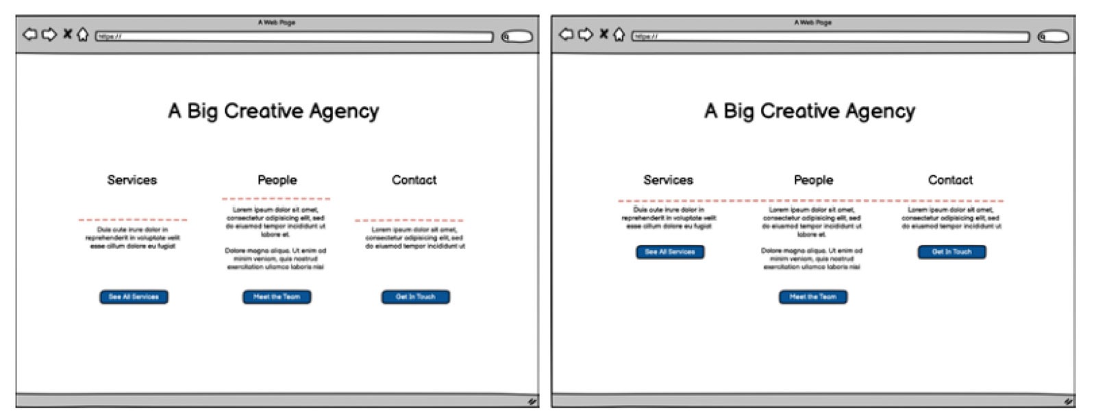
Ben Shneiderman’s 8 Golden Rules of Interface Design
These rules are similar to Nielsen’s but come from a slightly different angle—more focused on interface consistency and user control.
Schneiderman’s 8 Golden Rules include:
- Consistency: Using consistent icons, colors, call-to-actions, page layouts across every product, page, or feature you launch.
- Shortcuts: Support experienced users with keyboard shortcuts, autocomplete, and saved presets so they can work faster once they’ve learned the system.
- Informative feedback: Every user action should trigger a clear, timely response. Whether it's a loading spinner or a success message, users should never be left wondering what just happened.
- Dialogue: Group actions into clear sequences with a beginning, middle, and end. Let users know when a task is complete through confirmations or visual feedback.
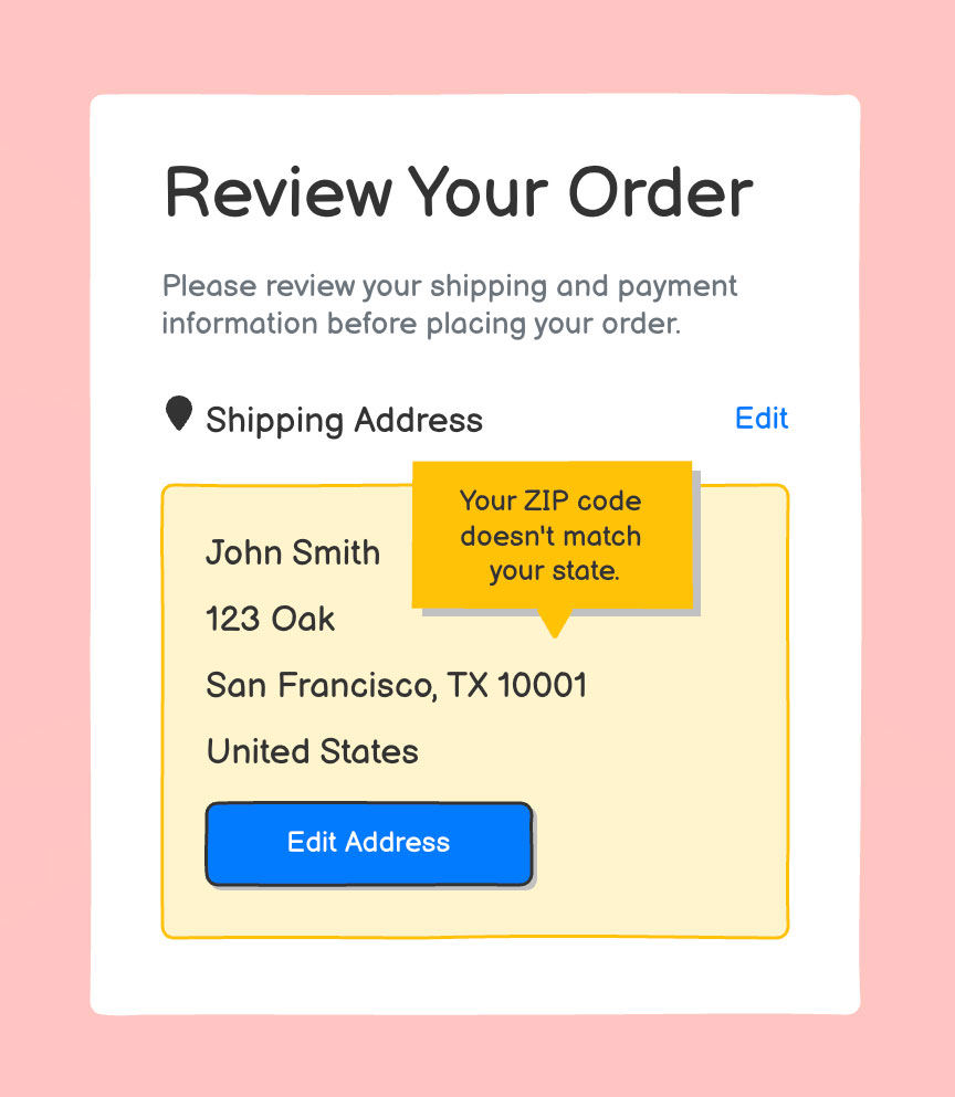
- Error handling: Design to prevent errors before they happen—disable unavailable actions, use clear labels, and provide real-time validation. When errors do occur, explain what went wrong and how to fix it.
- Permit reversal of actions: Allow users to undo, cancel, or go back. This encourages exploration and lowers the risk of irreversible mistakes.
- Support internal locus of control: Make users feel like they’re driving. Let them initiate actions and stay in control of the system, rather than feeling like the system is controlling them.
- Reduce short-term memory load: Don’t make users remember things from one screen to the next. Keep relevant info visible, reuse familiar patterns, and simplify workflows to free up mental space.
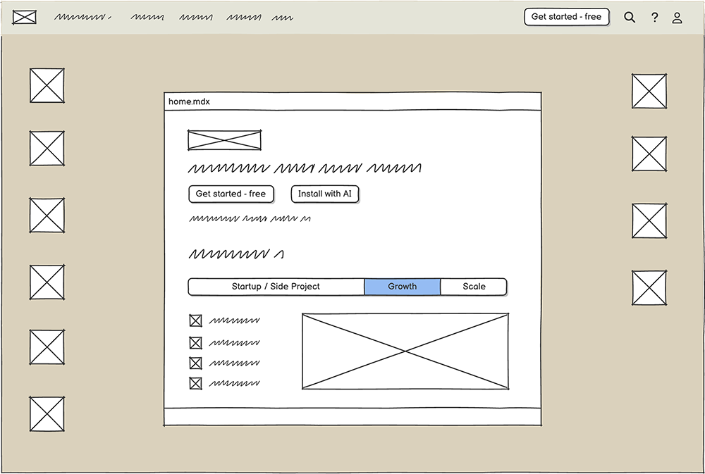
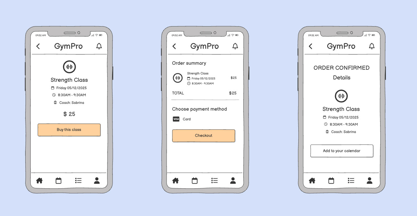
To show the principle of consistency, you could mock up a few screens where the “Back” button stays in the top left of the user’s screen, making it easy to find wherever they are in the flow. It’s a simple way to show how predictable placement builds trust.
Bruce Tognazzini’s First Principles of Interaction Design
As one of Apple’s early employees, Tognazzini made fundamental contributions to Apple’s Human Interface Guidelines. As an interaction design expert (seriously), Tognazzini recognizes that even industry leaders like Apple can make mistakes too—which he references in his principles to help us learn:
“Apple has made many revolutionary breakthroughs in interaction technology, a trend I fully expect will continue. They also make mistakes, fewer than most, but because I use Apple products almost exclusively, I suffer from them daily. While composing this document on my various Apple devices, it’s only natural that I extract examples from what I see here and now.”
If you’re designing and building more complex systems, Tognazzini’s principles are a great fit because they go deeper into interaction design and user behavior.
Tognazzini’s framework includes 18 core principles. These aren’t static rules; they evolve as technology and user expectations shift.
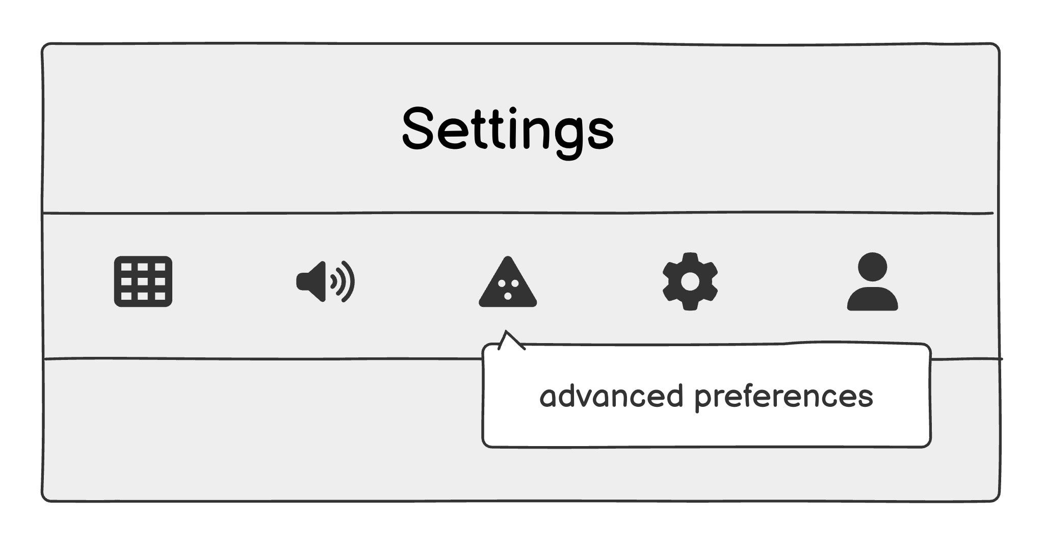
One standout principle is Efficiency of the User. It emphasizes the importance of giving users clear, immediate responses to their actions—especially when something might be confusing or unexpected.
One way to visualize this is with a tooltip that appears when hovering over an unfamiliar icon. That small interaction reassures the user, clarifies intent, and prevents unnecessary friction
Build products that people actually understand
Usability heuristics aren’t just for designers. They’re for anyone who wants to build products that make sense to real people.
At Balsamiq, we’re here to help you move fast, stay focused, and build with clarity. Whether you’re sketching your first screen or reviewing your tenth iteration, wireframes are the fastest way to spot what’s working—and what’s not.
Ready to try it for yourself?