Designing a mobile app demands juggling limited screen space, short user attention spans, and platform-specific navigation standards.
For a lean product team (especially if you’re short on dedicated design resources), wireframing is a powerful way to clarify how your mobile app should look and function before investing in full design or coding resources.
Whether you’re a product manager, startup founder, or developer wearing many hats, mobile wireframes keep you laser-focused on what truly matters:
- A coherent user flow
- User-friendly interactions
- Minimal friction on tiny screens
Let’s get started!
Step 1. Discover your users’ top priorities
A bit of user research ensures you aren’t guessing what matters most to your audience.
When it comes to mobile design, people often use apps on the go or in short bursts, so speed and simplicity generally rank high. Even three quick user interviews can reveal whether you should invest in advanced gesture controls or if people just want an easy, step-by-step flow.
For example:
If you’re building a workout-class booking app, hosting a few quick chats with real users might confirm that they want near-instant search and booking—no more than two or three taps. When it comes to mobile, each extra tap is a potential exit point.
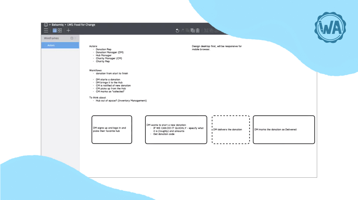
Step 2. Map a lean, mobile-friendly user flow
Why build a user flow first?
Mobile screens don’t allow much room for extraneous features or complicated side journeys. Outlining a step-by-step user flow, sometimes referred to as a wireflow, helps you trim any “nice-to-have” features that might clutter small screens.
Here’s an example flow:
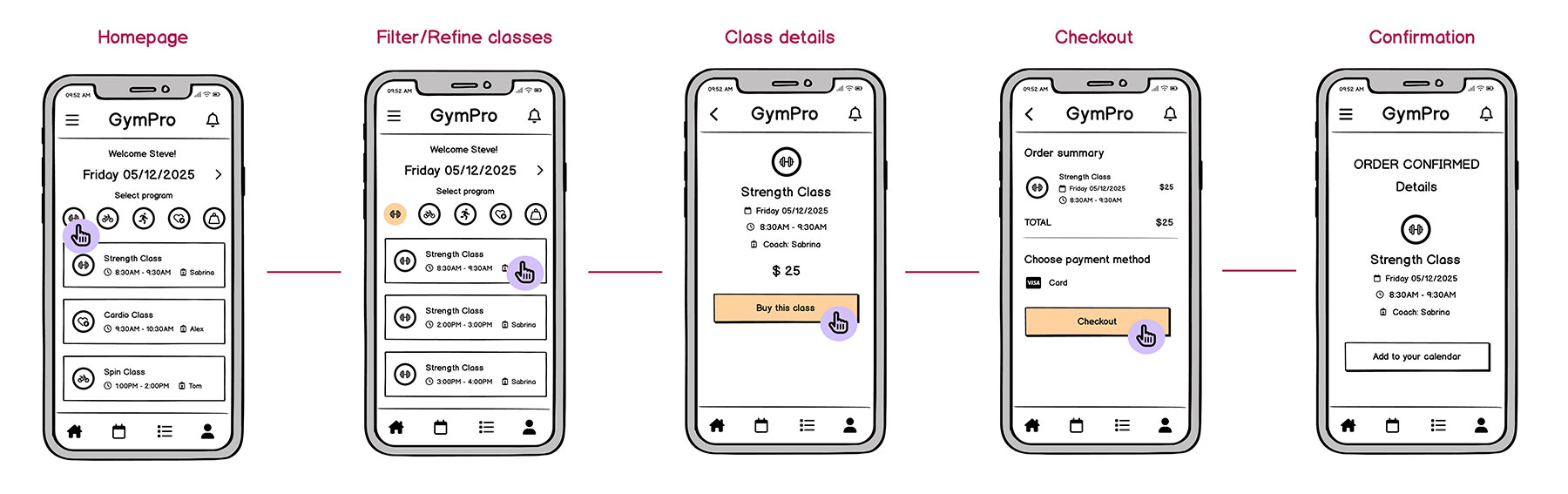
For a class-booking app, the minimal sequence could be:
Home → Filter/Refine → Class Details → Checkout → Confirmation
Designing fewer steps reduces cognitive load on a device where space is limited. If you realize you need a password-protected login, just place that into the flow without losing sight of your MVP (Minimum Viable Product)—the most stripped-down version of your app that still delivers real value to users. It’s your fastest path to launching and learning.
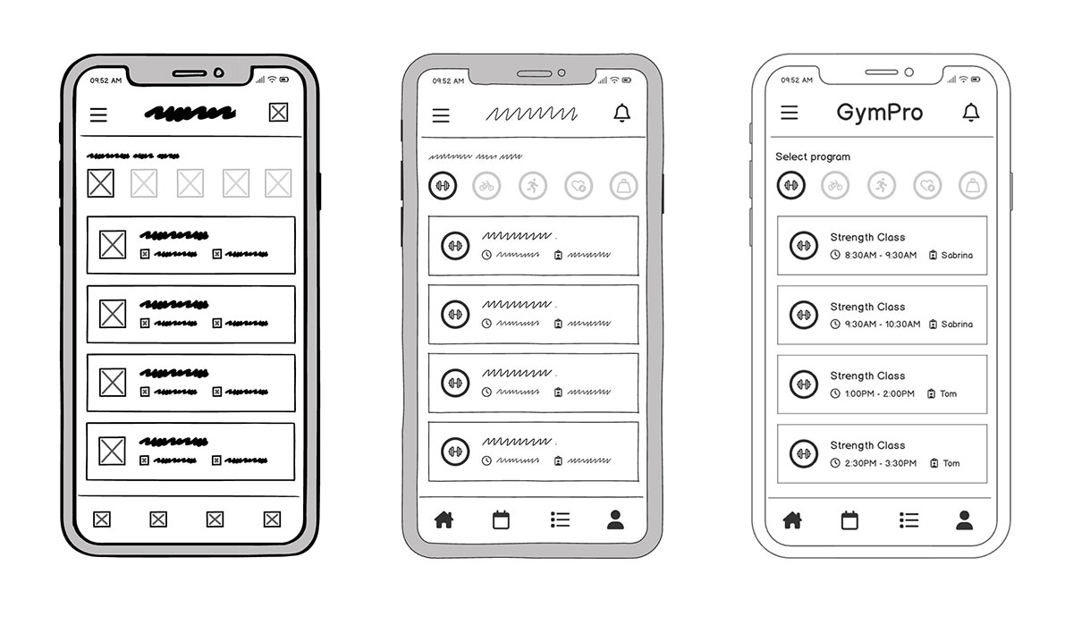
Step 3. Sketch without worrying about perfection
At this stage, you’re not building the final product. You’re simply figuring out where things go and what’s essential on a small screen. Quick sketches (on paper, a whiteboard, or even the back of a receipt) help you explore layout options, spot potential issues early, and get feedback without wasting time on polish.
Focus on clarity over aesthetics. Ask yourself:
- Where does the main CTA live?
- Is it reachable with a thumb?
- Is the most important info visible without scrolling?
Button placement matters a lot on mobile, especially when screens are small and actions need to be obvious. Don’t get hung up on the details. You’ll refine later. For now, speed is everything.

Why does this matter?
When you start putting the elements in your head onto an actual sketch or wireframe, issues surface fast. You’ll quickly spot if:
- A promotional banner is taking up valuable screen space.
- A filter button is placed too high for comfortable one-handed use.
- The flow from one screen to the next isn’t as intuitive as you imagined.
Mobile design doesn’t leave much room (literally or figuratively) for guesswork. Sketching helps you catch layout and usability problems early, when they’re easy to fix.
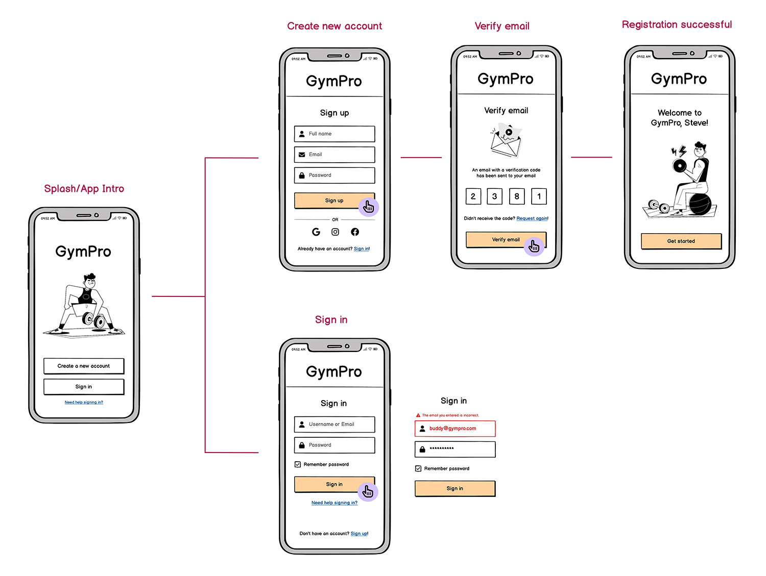
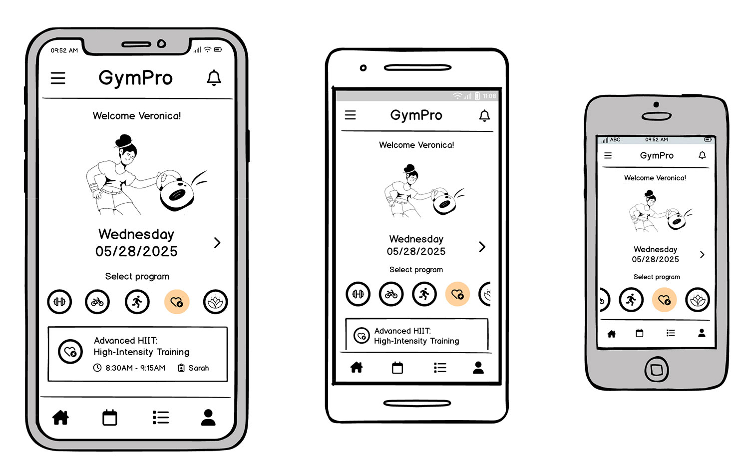
Step 4. Move to low-fidelity wireframes that match mobile standards
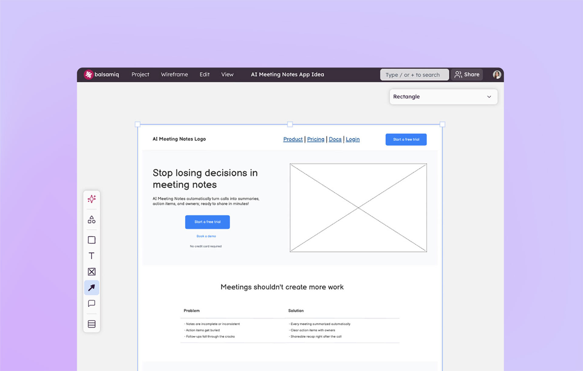
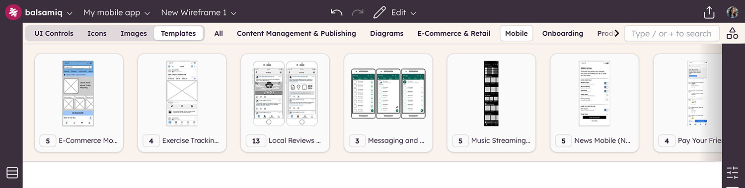
Once you’re happy with the rough flow, transitioning your concepts into low-fidelity wireframes (using a tool like Balsamiq) gives you a clearer view of spacing, tap zones, and basic navigation elements. Think of this step as your safety net. If you spot layout or interaction issues here, you can fix them in minutes.
- iOS vs. Android: If you’re leaning toward iOS, consider the standard tab bar or iOS “swipe from left” to go back. For Android, a bottom navigation bar or hamburger menu might feel more natural.
- Hand Positioning: Many modern phones are quite tall; placing your primary actions (like “Book Now”) near the bottom aids thumb reach, particularly in one-handed use.
Creating low-fidelity mobile wireframes with speed
Design your wireframe at a standard phone dimension, like iPhone or Google Pixel, to respect typical mobile boundaries.
You can also tap into Balsamiq’s built-in mobile templates and UI elements, as well as your icons and images when you import them. These elements are already sized and styled to match common mobile guidelines, so you don’t have to memorize every detail.
Just drag and drop the relevant nav bars, buttons, or tab bars from Balsamiq’s library, and your wireframe quickly reflects the platform conventions you need.

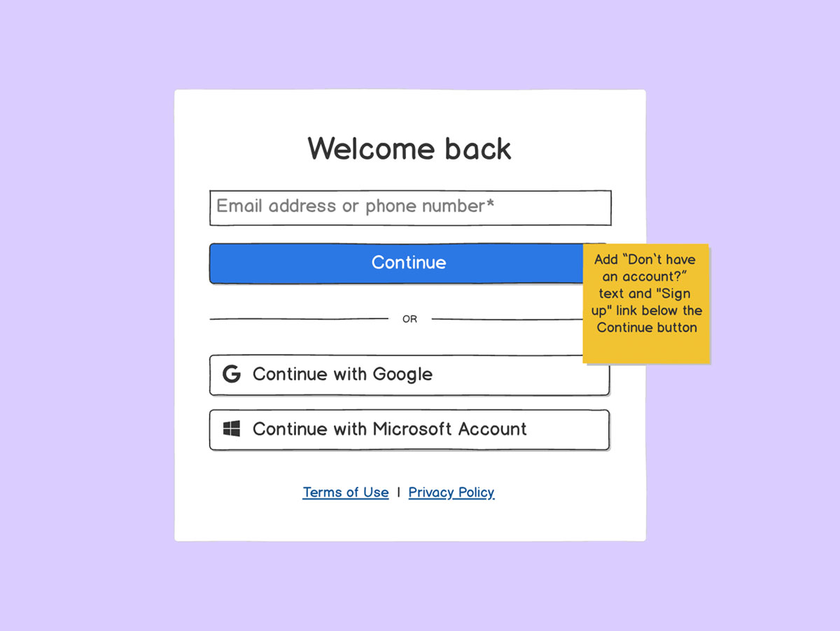
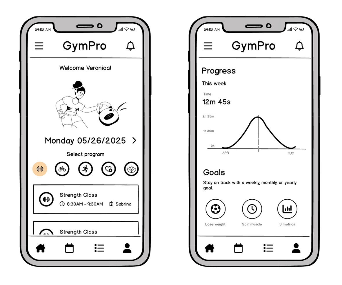
Step 5. Start plugging in real copy and data
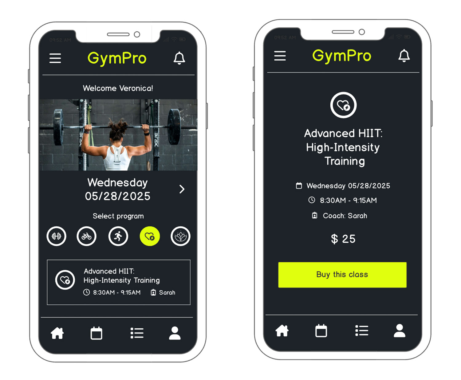
Placeholder text can hide layout issues until it’s too late. In mobile apps, “too many words” or awkwardly truncated labels can ruin the user experience. Going back to our example from earlier, you can see how real copywriting and data ensures you see how an instructor name, class times, or descriptions fit in the card or list layout.
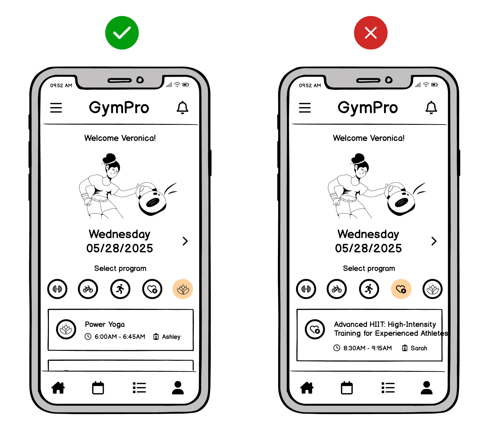
For example:
“Power Yoga: 6:00 AM – 6:45 AM” might be fine, but “Advanced HIIT: 45-Min, High-Intensity Training for Experienced Athletes” could break your layout. Spotting that now is cheaper than refactoring your coded screens later.
Step 6. Optimize for various phone sizes and orientations
It’s tempting to design just for a popular mobile device, but not all users update regularly. A quick check on older or smaller screens reveals if your essential buttons or text get clipped.
And if you plan to support both portrait and landscape modes—common for video apps and mobile games—make sure your wireframes adapt gracefully. Sometimes that means re-stacking columns or hiding secondary info behind a collapsible panel.
Why does this matter?
An MVP that looks great on the latest iPhone might be awkward on a smaller Android device. Mobile usage is famously diverse, and you don’t want to alienate part of your audience right away.
Balsamiq helps here too: you can easily duplicate a wireframe and change the dimensions or orientation, then leverage the same UI components. That quick duplication ensures you validate multiple device sizes without re-building everything from scratch.
Step 8. Test, iterate, and listen to feedback
Show your clickable mobile wireframes to a small group of users or internal stakeholders. In a lean team, this might happen informally over Zoom or Slack. Rapid iteration matters:
Too many modals?
Mobile users can’t juggle multiple popup overlays—maybe a small dropdown or integrated filter is kinder to your flow.
Unclear terminology?
If the word “Refine” confuses your users, rename it “Filter Options” or “Narrow Results.”
Because you’re still at the wireframing stage, changes remain cheap and easy to do. Even big layout shifts cost only a few minutes of drag-and-drop, not days of re-coding.
Don’t ignore mobile design best practices
Even if you lack formal design training, certain mobile-specific principles keep your wireframes on track:
- Tap-friendly zones: Buttons around 44px by 44px prevent frustrating mis-taps.
- Thumb-friendly layout: Place vital actions near the bottom for one-handed ease, especially given today’s tall devices.
- Simplify text and visuals: Mobile screens are small, so you’ll want to avoid jamming everything onto one screen. Maneuver less critical details into sub-menus or collapsible panels.
- Use familiar navigation: For iOS, a bottom tab bar or standard “Back” gestures are second nature. Android typically expects a bottom nav or hamburger menu for deeper flows.
- Orientation awareness: If your audience might rotate their phones (e.g., gamers or video watchers), test quickly to confirm your layout adapts well.
Balsamiq makes best practices simple
Balsamiq’s library includes platform-ready UI elements—like native-looking toggle switches, scroll bars, tab bars, and more—so you can incorporate best practices by simply dragging and dropping. That means you spend less time researching pixel-perfect sizes and more time mapping out the right experience for your users.
Create your mobile app faster with wireframes
Wireframing ensures your mobile app respects small screens, user impatience, and best-practice navigation. By focusing on real data, minimal steps, and platform conventions, you skip debates over “the wrong details” and zero in on shipping an MVP that users will actually embrace.
Balsamiq is built for this!
Balsamiq helps you move fast—sketching out ideas in minutes and turning rough thoughts into clear building blocks for your next great mobile app. No design skills needed, no wasted time debating the little stuff.
Ready to see if wireframing is your missing piece?
Try Balsamiq Cloud free for 14 days. Show your team exactly what to build, align on the big idea before code, and watch your revision cycles shrink. That’s how the smartest teams do mobile apps without burning precious resources.
FAQs
How are mobile wireframes different from desktop wireframes?
Mobile wireframes need to account for smaller screens, touch interactions, and limited space. That means prioritizing key actions, simplifying navigation, and stacking content vertically. You're designing for thumbs, not mice.
Do I need to wireframe every screen in my app?
Not always. Focus on key screens that drive the user flow—like onboarding, home, and core interactions. You can skip repetitive or minor screens and add them later.
Should I wireframe for different screen sizes or devices?
Yes—especially if your app will run on both phones and tablets. Start with your primary device (usually mobile), then adapt the layout for other screen sizes. Wireframing across breakpoints helps you catch layout issues early and plan for responsive design.
What's the best tool for mobile app wireframes?
We might be biased, but Balsamiq is a great choice for non-designers and fast iteration. It's built for low-fidelity wireframing, so you can sketch mobile app ideas quickly, share them easily, and keep the focus on usability.