Imagine having a fresh new idea for a website, app, or dashboard, but no clue of how to start… That’s why wireframes exist.
Wireframes are your blueprint: a simple, visual guide to quickly lay out your ideas and show how everything fits together. Before diving into colors, images, or final design details, wireframes help you map structure and functionality so nothing feels out of place.
Even if you haven’t worked with wireframes before, we can help you get up and running in no time with Balsamiq Academy. This free resource teaches you how to turn your ideas into clear, actionable layouts—no formal design training necessary.
What is a wireframe?
A wireframe is the skeleton of your digital project. Think of it as the foundation for your website, app, or dashboard. It focuses on layout, and content placement—not on colors, fonts, or any visual polish.

In other words, especially during the initial phase, wireframes focus more on the “what” than the “where.” This approach lets you concentrate on the core functionality and structure of your design. You can even think of it like sketching an outline before painting a masterpiece, or the 10-50-99 methodology for constructive feedback.
The benefits of wireframes
Wireframes are super helpful because they directly address common design challenges:
Clarify structure: They help you pinpoint what major components—like headers, navigation, and content areas—should be included. This clarification can ease anxiety over the “big picture” of your site, app, or dashboard.
Communicate ideas: Wireframes serve as a simple language to share early concepts with teammates, stakeholders, or clients. It’s much easier to discuss functionality and flow when you’re not distracted by design details like colors and fonts.
Improved feedback: When there’s something tangible to look at, it becomes easier for key stakeholders to provide meaningful feedback. They have something to comment on, rather than vague ideas to comment about. Best of all…wireframes take care of those impossibly long page requirements.
Save time and money: By identifying problems early, wireframes prevent costly revisions and code rewritings. They’re quick to create and modify—making sure you don’t invest too much into details before the idea is fully baked.
Faster path to launch: Wireframes help you confirm ideas before you commit to building. Instead of spending weeks developing something that might miss the mark, you can sketch it out, share it, and quickly iterate.
But the benefits don’t stop there…

Who is responsible for creating wireframes?
The primary reason for wireframing is to generate and communicate ideas, so making wireframes isn’t limited to any single role or specialization in an organization.
Here are some roles that commonly make and use wireframes:
Founders and business owners use them to communicate or pitch their product or app ideas to investors or product teams.
Product Managers and Business Analysts use wireframes to translate requirements into visual specifications for designers or developers.
Developers use them to sketch out user interfaces when they don't have a designer or when working directly with clients.
UX Designers use them to explore and refine concepts before moving to high-fidelity.
Marketers and Copywriters use wireframes to explore landing page concepts and visualize the placement and size of copy on the page.
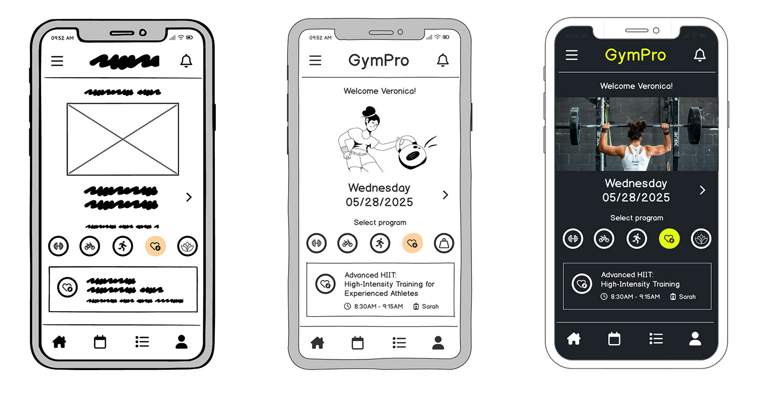
Types of wireframes: low-fidelity vs. high-fidelity
Wireframes come in different levels of detail, often described as “low-fidelity” and “high-fidelity.” Fidelity refers to how closely the wireframe resembles the final product.

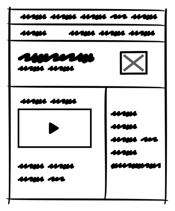
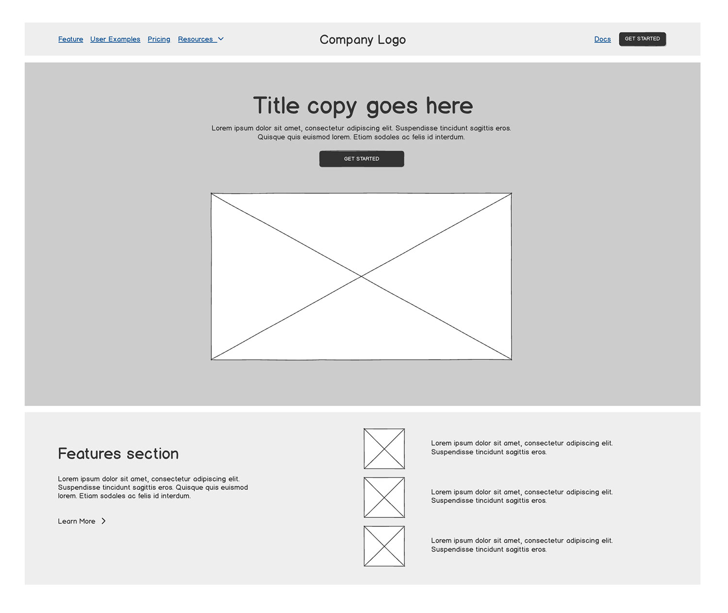
Low-fidelity wireframes
- What they are: Basic sketches or block diagrams.
- Focus: Emphasize layout, information hierarchy, and overall structure.
- Appearance: Typically simple black-and-white or grayscale, keeping visual distractions to a minimum.
- Perfect for: Teams who need to validate ideas before jumping into code or high-fidelity design tools like Figma.
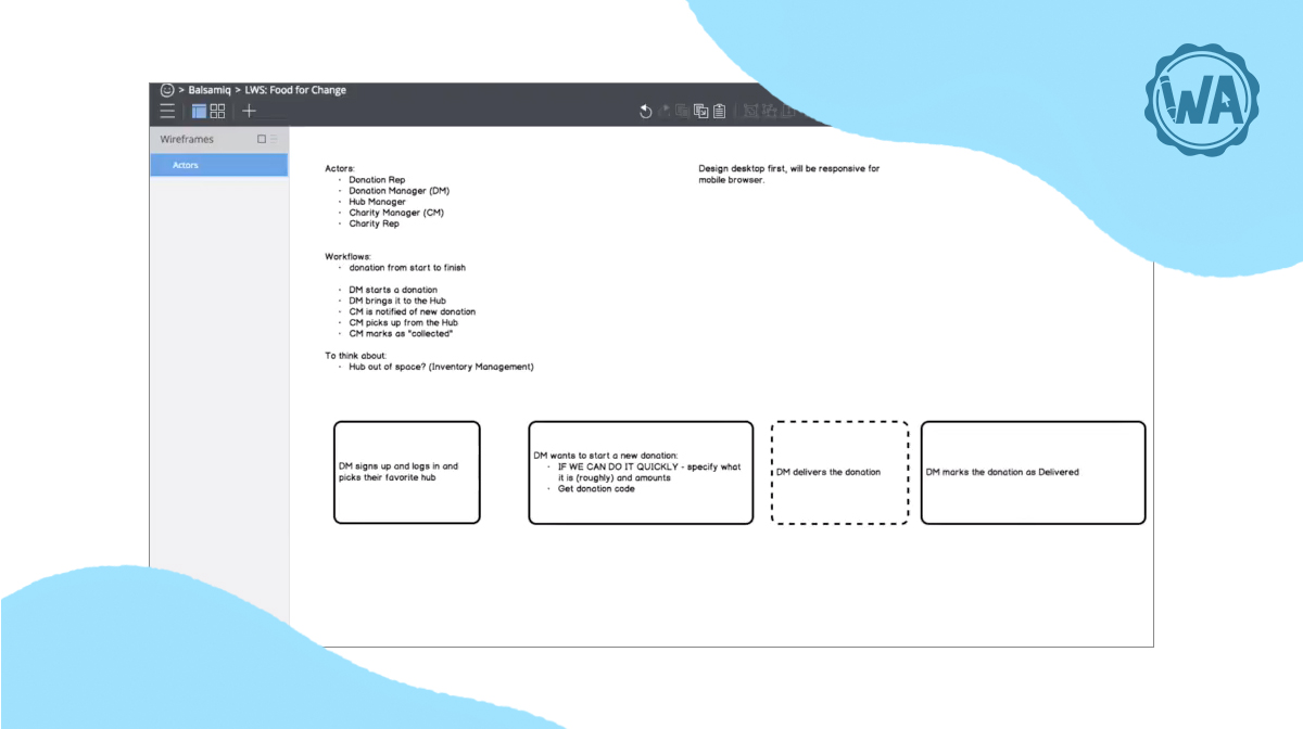
A low-fidelity wireframe (also referred to as lo-fi wireframe) is a simple, rough sketch of a user interface. It’s not about visual design or interactivity—it's all about layout, structure, and functionality.
Think of it as the digital equivalent of drawing on a napkin. It uses basic shapes like boxes and lines to represent things like buttons, text, and images, without worrying about colors, fonts, or brand styling.
The goal is to communicate ideas quickly and clearly, so you can focus on how things work, not how they look.
Your lo-fi wireframes are the starting points—the rough and ready versions of your concept.
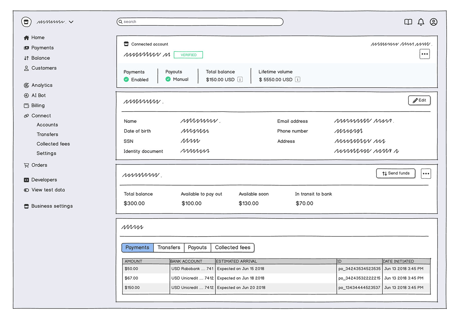
High-fidelity wireframes
- What they are: More detailed representations that include placeholder text, images, and even interactive elements.
- Focus: While they’re closer to what the final product will look like, they still prioritize structure over complete visual design.
- Appearance: Often resemble the finished product more closely, which helps you to visualize content placement and how on-screen elements interact with each other.
- Perfect for: Teams preparing for design handoff, user testing, or refining layouts before moving to prototypes.
A high-fidelity wireframe (also referred to as hi-fi wireframe) is a detailed, polished wireframe that more accurately represents your user interface. Unlike low-fidelity wireframes—which look more like rough sketches—high-fidelity ones are closer to the final design in both appearance and interactivity.
Think of these as evolving sketches that are beginning to mimic real interactions without being the final design.
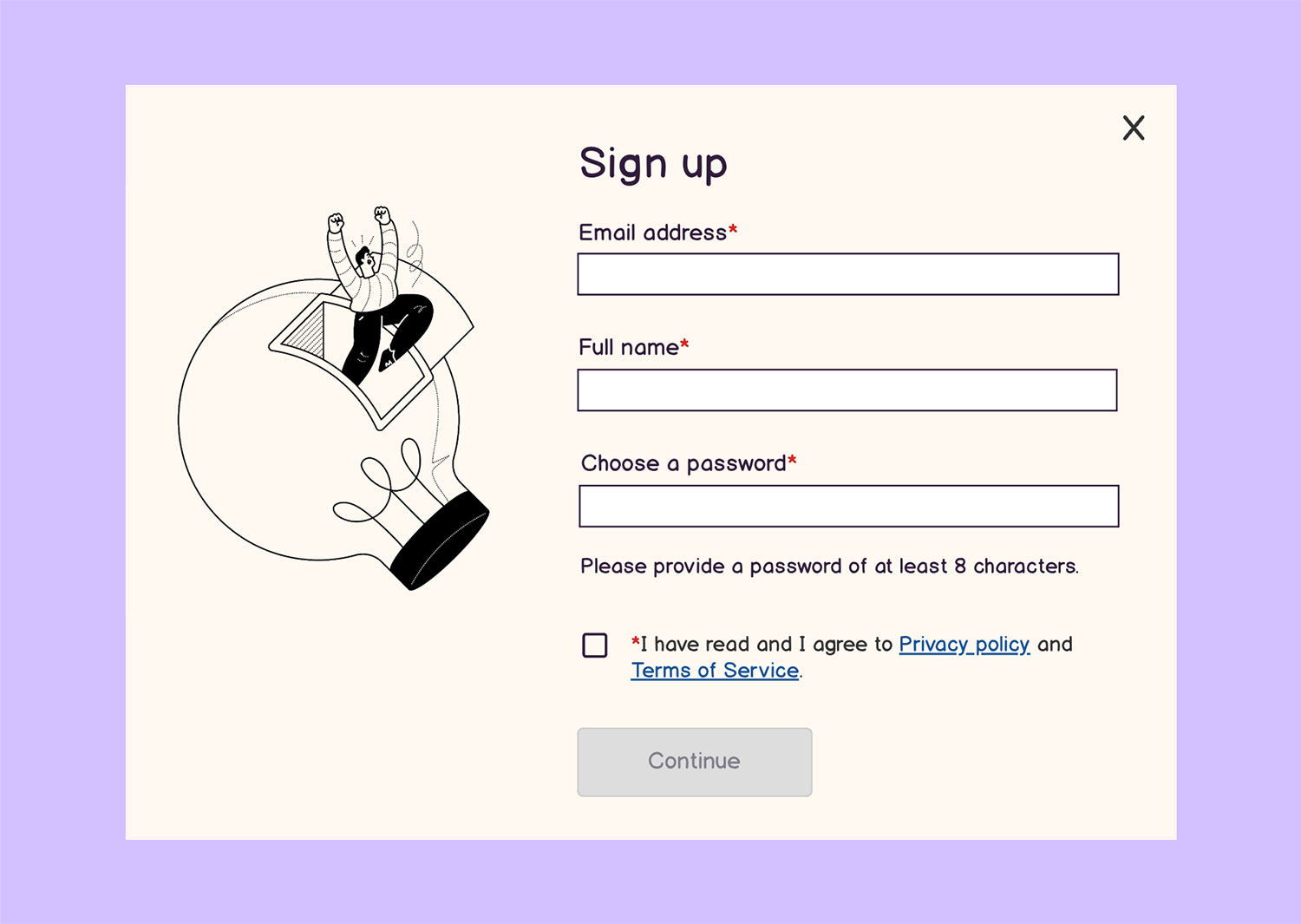
Unlike lo-fi wireframes, this more detailed approach includes:
- Real content (instead of lorem ipsum placeholder text)
- Accurate layout and spacing
- Typography, colors, and brand elements (it feels closer to your finished product)
- Responsive behavior for different screen sizes
Wireframe vs prototype
To understand where wireframes fit in your design process, consider this simple comparison:
| Wireframe (lo-fi design) | Prototype (hi-fi design) | |
|---|---|---|
| Purpose | Structure and layout | Close simulation |
| Level of detail | Low | High |
| Interactivity | Minimal | Yes |
Prototypes are high-fidelity designs intended to pass as a realistic representation of the final product. The viewer of a prototype should feel as if they’re in front of a real product and any interaction with it should mimic the intended behavior.
A wireframe, in contrast, is like a sketch of a digital product. It doesn’t include all of the details of a final product and it wouldn’t be mistaken for one.
While prototypes let users engage with a close simulation, wireframes are all about building that essential framework quickly and efficiently. Because they’re faster to create and modify, wireframes should always be created before prototypes.
How to create a great wireframe in 5 steps
Creating an effective wireframe isn’t about getting every detail right—it’s about planning the user’s journey and ensuring that your ideas are clearly communicated. Here’s a simple 5-step approach:
1. Define the goals
Like with any project, you need to understand the why behind what you’re building. Before you start working on your wireframe, you need to understand what your users are trying to achieve on each screen. What actions should they be taking? What problems are you solving for them?
2. Sketch layouts
Get your ideas out of your head and onto screen (or paper). It’s okay to start rough. You can use boxes to represent images, lines for text, and simple shapes for buttons. Let your ideas flow without getting stuck in the details.
3. Map navigation
Put yourself into the mind of your user; imagine their journey. Visualize how they’ll move from one screen to another. Consider paths, links, and the overall flow of the app or website. Make the process feel smooth for somebody making their way around your product.
4. Add key elements
Think of essential components like headers, calls-to-action (CTAs), search bars, and menus. Add these to your layout in a way that makes sense. If you have a hard time finding it, odds are your user will have a similar experience.
5. Iterate and test
Share your wireframes with teammates early in the process. Their feedback will help you refine the layout and ensure the UX is functional and intuitive. Sometimes it can be difficult to get outside of your comfort zone, but honest feedback from real people is the best way to improve.
Tips for better wireframing
Start simple: Resist the urge to perfect every element right away. A simple structure is your best friend in the early stages.
Focus on usability: Center your design around the users' needs, shaping the interface around essential actions.
Use real content early: Even rough headlines or CTAs can ground your design better than “Lorem Ipsum” copy.
Ask for feedback: Remember, wireframes are communication tools, not just a design step. Gather input from people you trust to ensure your ideas are coming across clearly.
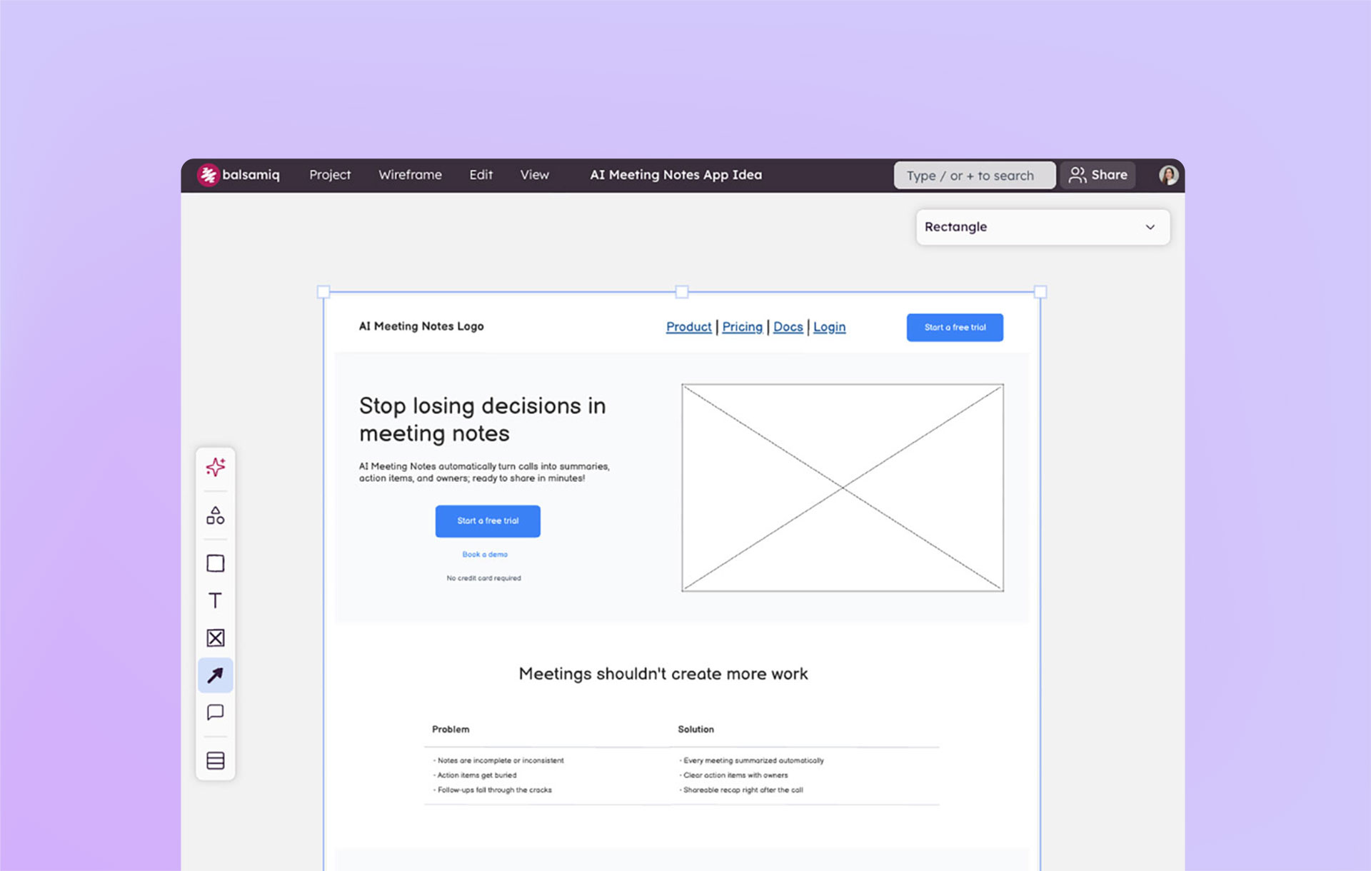
Speed up the process with Balsamiq AI by generating wireframes from text, sketches, and screenshots. You can also use Balsamiq AI to quickly edit existing wireframes too.
Real-world wireframe examples
To give you a better picture, here's a few typical wireframe examples you might encounter:
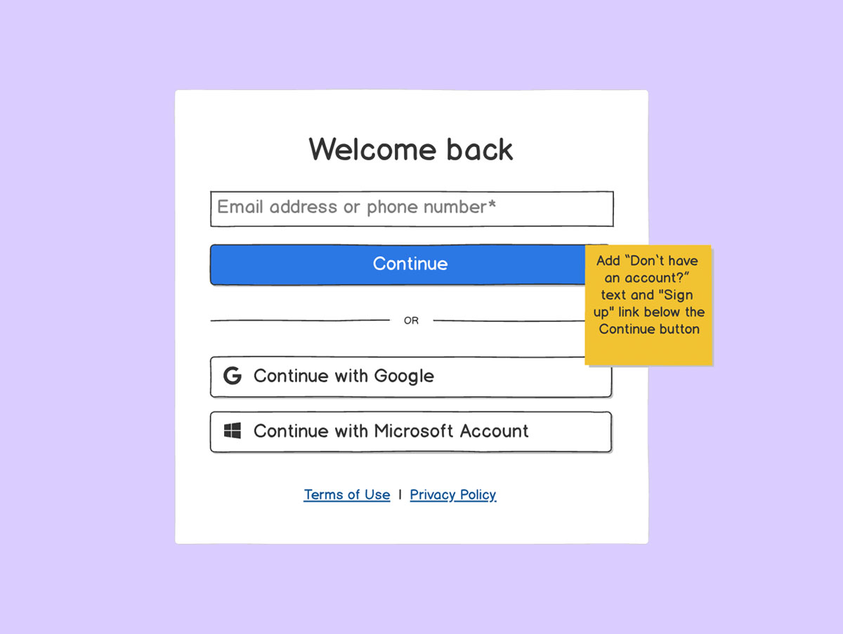
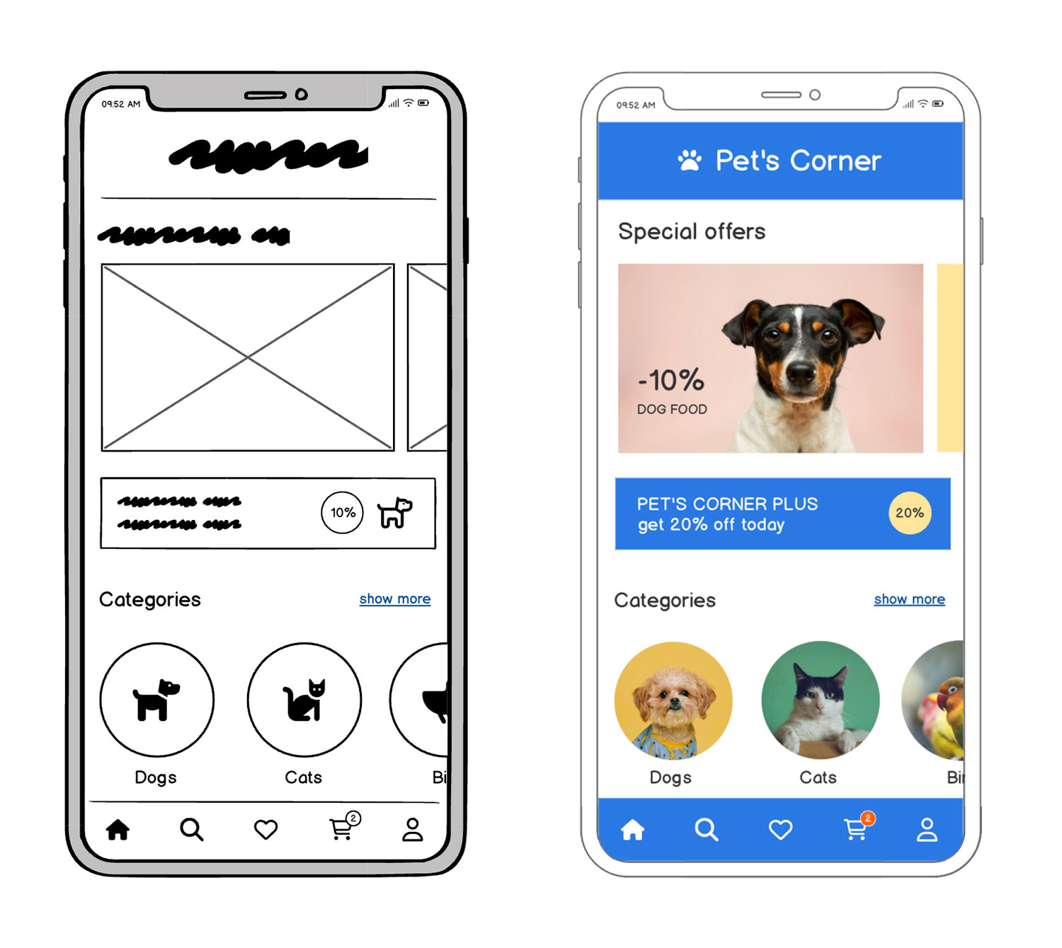
Signup form wireframe
A clean design with clearly defined input fields, a submit button, and minimal distraction so users can easily sign up.
App dashboard wireframe
Consider a dashboard with a sidebar for navigation, content cards that highlight key data points, and a primary action button to encourage engagement.
Homepage wireframe
Imagine a layout with a prominent logo, navigation menu at the top, hero section to grab attention, and a clear CTA.
Exploring wireframing tools
One of the benefits of wireframes is that you can create them using lots of different tools, many of which you already have. However, there are clear benefits to using a tool that’s optimized for wireframing.
The most popular tools for making wireframes are:
Pencil (or pen) and paper: Great for quick sketches.
Presentation software: Tools like PowerPoint or Google Slides can be adapted for simple layouts.
Diagramming or whiteboard software: Excellent for creating process and flow charts.
UX prototyping tools: These help you create more refined designs.
Wireframing-specific software (like Balsamiq—OMG that’s us): Optimized for rapid wireframing, making it easy to learn and use right away.
For many, Balsamiq stands out because it’s designed to help you jump quickly from concept to layout without getting bogged down in the details.
| Pencil/Pen and Paper | Presentation software | Diagramming / Whiteboarding tools | UX prototyping tools | Balsamiq | |
|---|---|---|---|---|---|
| Minimal learning curve | |||||
| Basic shapes included by default | |||||
| User interface controls included by default (no plugins or upgrade required) | varies | ||||
| No design experience needed | |||||
| Easily sharable via a web link | varies |
How do I make a wireframe?
It isn’t just about having a tool—it’s about understanding a few basic principles that can help you steer your design in the right direction.
While Balsamiq is easy to pick up in minutes, the real magic comes from knowing how to channel your ideas effectively. That’s why starting with our free course on rapid wireframing is a great idea if you’re ready to build solid foundations for your digital products.
Remember, even if you’re not a seasoned designer or a tech wiz, wireframing is all about laying out your ideas in a way that makes sense—that’s it. Be kind to yourself as you experiment and learn before you inevitably build something great.
Happy wireframing!
FAQs
What's the main purpose of a wireframe?
Wireframes help teams plan the structure of a digital product before getting into the nitty gritty design details. They're used to map layout, user flow, and content placement.
What is a wireframe in design terms?
A wireframe is a simplified visual guide that outlines the layout and structure of a digital interface. It focuses on content placement, navigation flow, and user interactions instead of colors, fonts, or final design details. Think of it as the blueprint before the build.
Do I need design experience to create a wireframe?
Not at all. Wireframes are meant to be simple and low-fidelity. Tools like Balsamiq are built for non-designers, so you can sketch ideas, share feedback, and collaborate.
What's the difference between a wireframe and a mockup?
Wireframes focus on structure and functionality, while mockups show what the final design will look like. You know that age-old question, "What came first—the chicken or the egg? In this case, the wireframe always comes before the mockup and there's no debate about it.
How detailed should a wireframe be?
It depends on your goal. Early wireframes can be super rough—just boxes and labels. As you get closer to development, you might add more detail like button placement or form fields. When you're in the process of deciding what and how to build, start with a low fidelity wireframe. Once you have your idea set, you can start to build more fleshed out prototypes.