If you’ve ever created a wireframe (you’re in the right place even if you haven’t), you know how valuable they are for mapping out the structure of a website or app before jumping into visual design and code. But sometimes, a wireframe alone isn’t enough—especially when handing it off to teammates, developers, or key stakeholders.
This is where wireframe annotations come in.
These small (but mighty) notes add clarity, context, and explanation without cluttering your design. It doesn’t matter if you’re sketching out an early idea or refining something more complex—annotations bridge the gap between assumption and clarity.
Let’s break it down so you can start using wireframe annotations today.
What is a wireframe annotation?
A wireframe annotation is a note, label, or comment that provides extra context about the wireframe itself, as well as elements within a wireframe. Instead of leaving your design open to interpretation, annotations clarify functionality, interactions, or reasoning behind certain choices.
Think of them like sticky notes on a blueprint, offering instructions like:
- What a button should do when clicked/tapped
- How a feature should behave
- Why a specific layout was chosen

Annotations don’t dictate final visuals or styling—but they do make sure everyone’s on the same page before moving into high-fidelity design.
Level of annotations
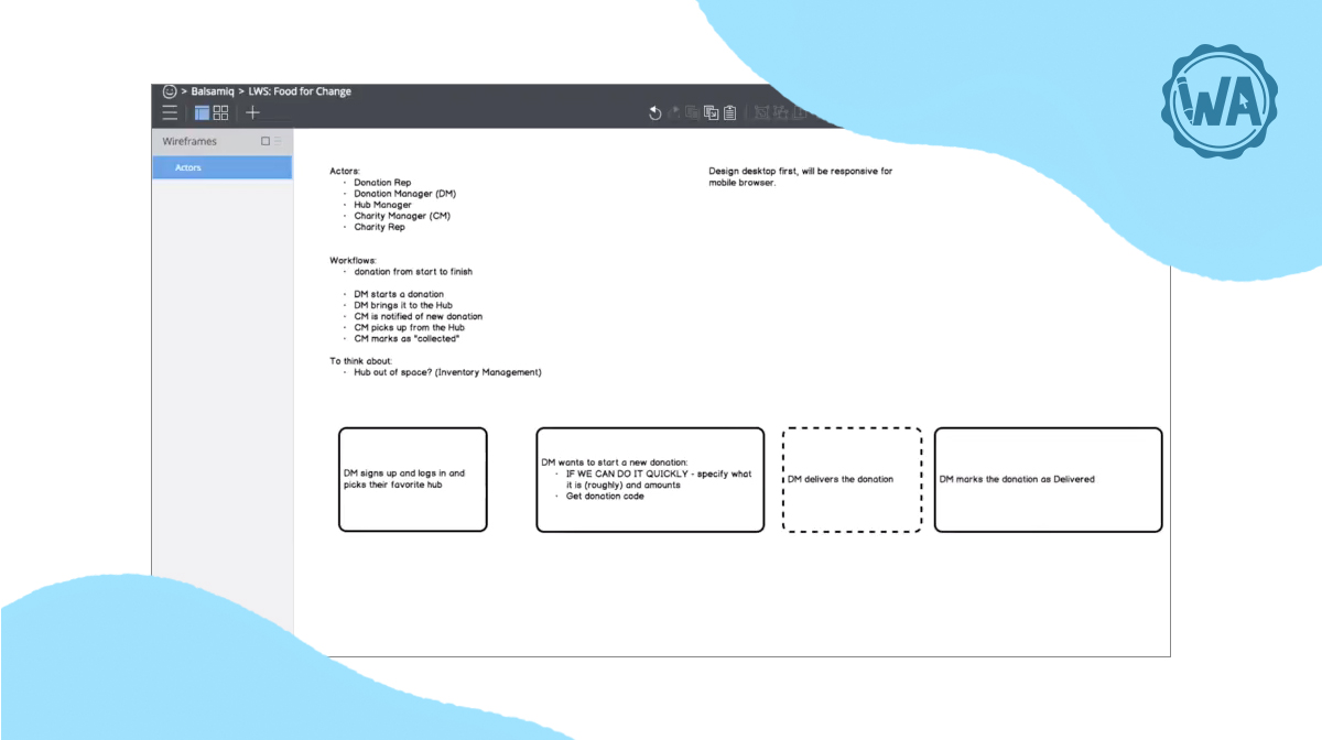
Like building a product or service, annotating your wireframes is an iterative process. Maybe you’re in a brainstorming session and sketching various ideas on your board.
You may have a few annotations to call out the functionality of what you’re thinking at a first pass. As you get your ideas onto your wireframe, remember to add comments for yourself. Treat these initial comments as helpful reminders of your thought process when building so that you can easily pick up from where you left off.
As you move into digital tools, your annotations will become more detailed and laid out cleanly with your designs. When you talk with developers, you'll learn a bit more about what's needed and technical feasibility. It helps to add these notes to your annotations as well.
Who are wireframe annotations for?
“There are typically five audiences for wireframes: clients (internal or external), developers, visual designers, copywriters, and, most importantly, your future self."
Annotation best practices help everyone involved in creating a digital project. They’re made for:
- Key stakeholders who want a clear understanding of design decisions without a deep knowledge of user experience (UX) or user interface (UI).
- Developers who want to see what they have to support, and how the site or application works (and doesn’t work).
- Visual designers who want to see what visual elements need to be on the page.
- Copywriters who want to see what they need to write.
- The future you who needs to remember why you made that form element a checkbox instead of a radio button.
- Clients who want to see that you’ve incorporated the business goals they provided.

In short, annotations act as the connective tissue between teams, keeping the discussions focused and moving forward so nothing gets lost in the translation.
Why use annotations in wireframes
Annotations aren’t just for decoration—they solve real problems in the design process. Here’s how:
- Add clarity without clutter – Instead of squeezing explanations into the wireframe itself, annotations keep things organized and readable.
- Improve cross-functional communication – Annotated wireframes make collaboration smoother by ensuring everyone understands design intent.
- Reduce back-and-forth – By adding notes upfront, you avoid endless rounds of clarification and corrections later.
- Document decisions easily – Annotations serve as a record of why certain choices were made, preventing confusion down the line.
When used strategically, annotations create less friction and more alignment in your design workflow.
When to use wireframe annotations
Wondering when annotations are most helpful? These are a few scenarios where they shine:
- Explaining complex interactions — Ideal for dashboards, apps, and multi-step user flows that need additional context on how elements interact with one another.
- Defining user flows — When mapping out user paths, annotations help describe transitions between screens.
- Handing off to developers — Annotations ensure developers don’t have to guess about behaviors and requirements.
- Presenting wireframes to stakeholders — A great way to clarify decisions for non-designers who might not intuitively grasp layout choices.
- Capturing accessibility considerations — Useful for documenting alt text, keyboard navigation, or other accessibility-focused elements.
- Documenting link and button behavior — Clarify what happens when users click a button or a link (e.g., redirects, popups, or sign-up flows).
- Indicating conditional items: Explain elements that appear only under certain conditions, like error messages or dynamic menus.
- Representing elements that can’t fit in the wireframe: Use annotations to describe hover effects, animations, or features that are too complex or time consuming to depict visually.
- Showing edge cases: Grace Noh’s annotation framework shares the importance of highlighting annotations for showing edge/error cases. Use these annotations to give developers direction as they build out your wireframe.
Annotations turn wireframes from static sketches into actionable roadmaps, making them even more effective tools.
Best practices for writing annotations
Adding annotations is simple, but doing it in a way that others can understand your thinking requires some work. Here’s a quick guide:
- Be clear and concise: Keep descriptions short, specific, and easy to skim.
- Use consistent formatting: Stick to a standard annotation style (e.g., color coding, numbered notes).
- Prioritize key information: Avoid overloading a wireframe with excessive details—focus on the essentials.
- Place annotations strategically: Make sure notes are positioned near relevant elements without blocking visibility.
- Review and refine: Before sharing, check annotations to ensure they provide meaningful insights.

A well-annotated wireframe balances information and usability without overwhelming the viewer.
5 Wireframe annotation examples
We can talk about design annotations until we’re blue in the face, but the best way to learn is by showing you the real deal. Here’s 5 examples:
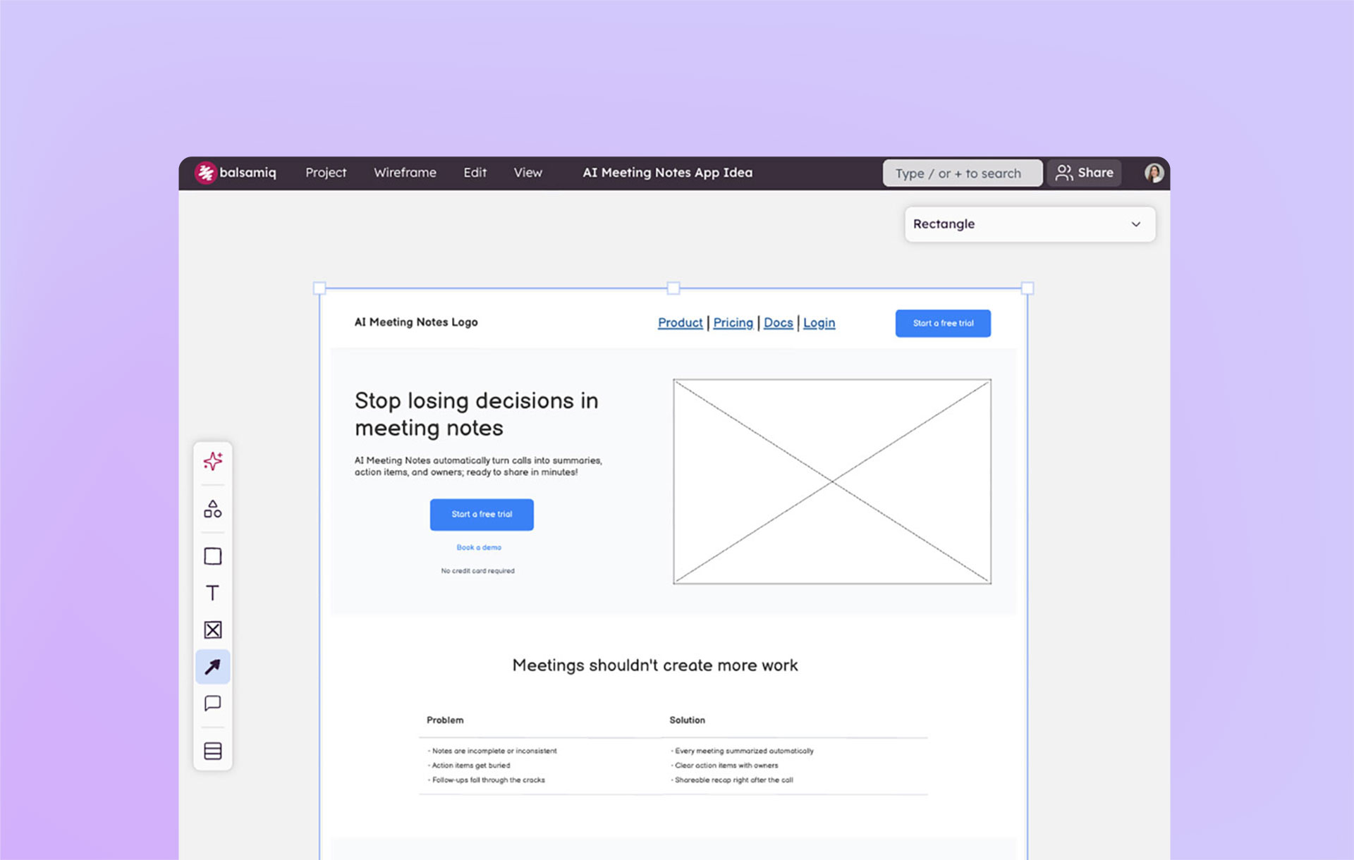
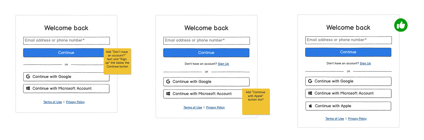
1. Design annotations
A design annotation provides context for a feature, interaction, or design choice. Think of it like writing helpful instructions in the margins of a sketch—it gives extra clarity so everyone understands what’s supposed to happen, even if the final visuals aren’t ready yet.
Example
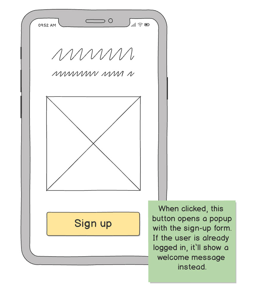
You’re wireframing a mobile app screen with a “Sign Up” button. Without an annotation, developers or stakeholders might just see a button and wonder: Does it take users to a new page? Should it trigger a popup? What happens if they’ve already signed up?
A design annotation would clarify that: “When clicked, this button opens a popup with the sign-up form. If the user is already logged in, it’ll show a welcome message instead.”
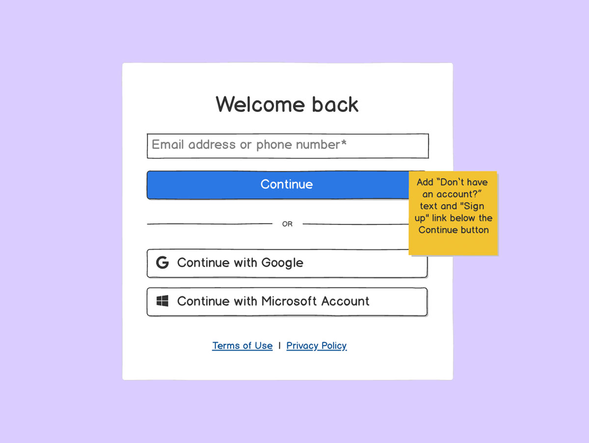
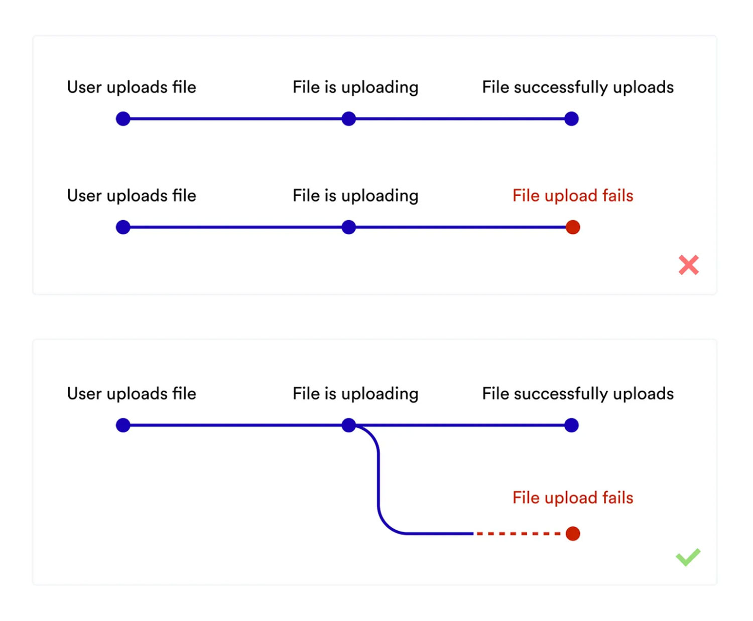
2. User flow annotations
A user flow annotation explains how users move through a digital product—where they go next after clicking a button, what happens after completing a form, or how different screens connect. It helps teams understand the intended navigation and interactions so there's no guesswork when the time comes to build the final product.
Example
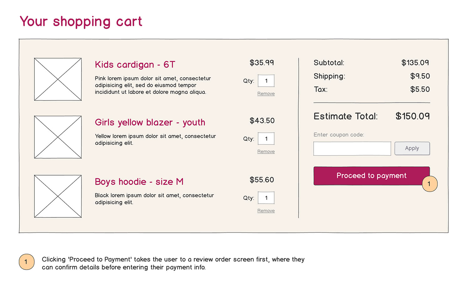
You're designing an e-commerce checkout flow. In your wireframe, there's a “Proceed to Payment” button. Without an annotation, developers might not know whether hitting that button sends you directly to a payment page or if there's another step.
A user flow annotation could explain: “Clicking 'Proceed to Payment' takes the user to a review order screen first, where they can confirm details before entering their payment info.”
By adding this note, you make sure everyone involved—designers, developers, and stakeholders—understands how users move through the experience. This saves time, prevents unnecessary revisions, and ensures a smoother user journey.
3. Accessibility annotations
An accessibility annotation explains how a design will support users with different needs—such as those who use screen readers, navigate with a keyboard, or rely on high-contrast visuals.
Example
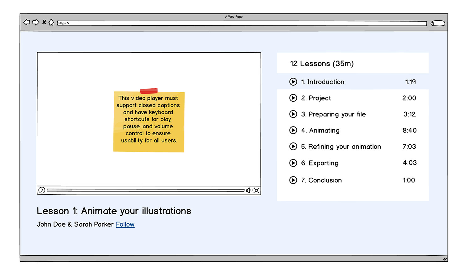
You're designing an e-learning platform, and your wireframe includes a video player. Without an accessibility annotation, developers might not even realize they need to include captions for those who are hard of hearing.
An accessibility annotation could clarify: “This video player must support closed captions and have keyboard shortcuts for play, pause, and volume control to ensure usability for all users.”
By adding this note, you make sure inclusivity is built into the design from the start, rather than needing costly fixes later. Accessibility annotations help teams create products that work for everyone, making digital experiences more equitable and user-friendly.
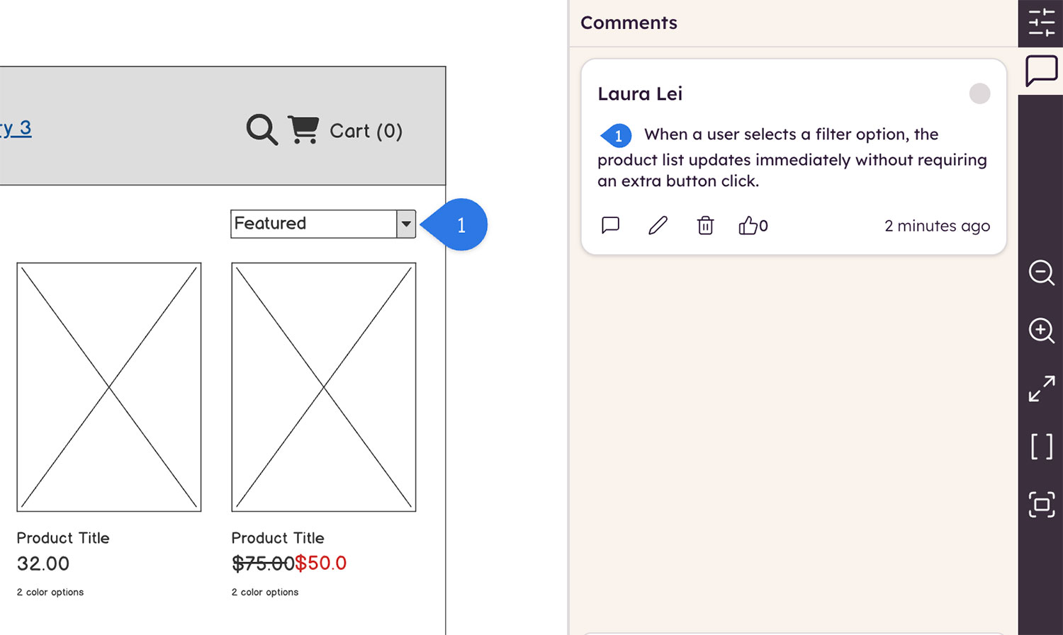
4. Functionality annotations
A functionality annotation explains how a feature is supposed to work. Instead of showing a button in the design, functionality annotations describe what happens when users interact with it—helping designers, developers, and stakeholders understand the intended behavior.
Example
You're designing an e-commerce site, and your wireframe includes a filter dropdown for sorting products by price, popularity, or category. Without a functionality annotation, developers might not know whether the filter should update the page in real-time or make users hit a separate “Apply” button.
A functionality annotation could clarify: “When a user selects a filter option, the product list updates immediately without requiring an extra button click.”
This type of annotation helps ensure the team builds features correctly the first time, avoiding unnecessary revisions. It also keeps the focus on how the product should function, ensuring a smoother UX from idea to launch.
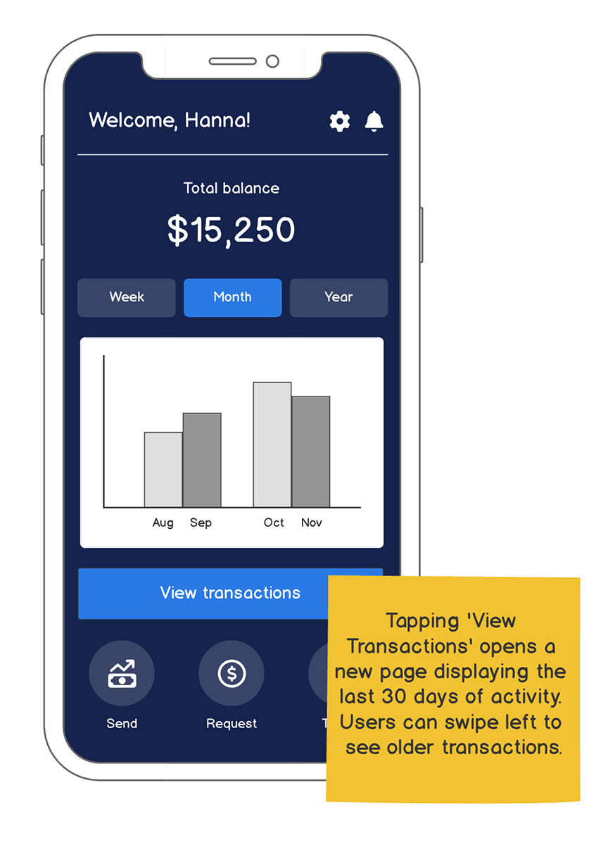
5. Navigation annotations
A navigation annotation explains how users move from one screen or section to another. Instead of leaving navigation up to interpretation, these annotations clarify things like how menus work, where links lead, and how back or forward buttons behave.
Example
You're designing a mobile banking app, and your wireframe includes a “View Transactions” button. Without an annotation, developers might not know if hitting the button should open a new screen or expand a section within the current view.
A navigation annotation could clarify: “Tapping 'View Transactions' opens a new page displaying the last 30 days of activity. Users can swipe left to see older transactions.”
This kind of note helps you tackle two things:
- Make sure that users can navigate the app easily and intuitively, reducing frustration and making interactions feel natural.
- Help dev teams understand technical needs and communicate if there are any issues with the ask before building.
Tips and tricks for annotating wireframes
You’ll get the hang of wireframe annotations pretty quickly when you keep these tips in mind:
- Avoid over-explaining: Stick to key points so annotations don’t overwhelm the design.
- Use visual cues: Color coding or numbered notes can help make annotations more scannable.
- Use non-UI visual elements: To avoid confusion, use non-UI visual elements like arrows, notes, and callouts when adding in your annotations.
- Make annotations actionable: Focus on what should happen rather than just stating features.
- Test before finalizing: Ask your teammates if the annotations make sense so they add value.
"I wireframe first and annotate after, otherwise I get pulled out of my flow. Once the layout’s in a good spot, I’ll go back and add notes for the team. Devs get stuff like ‘click to open modal’ designers get things like ‘replace with branded icon,’ and I flag what copy’s final vs. placeholder so nobody ships lorem ipsum. I try to use different colors/styles for different teams."
Annotations should feel helpful, not like extra clutter—so keeping them structured and meaningful is everything.
Adding annotations effectively
In our book, Wireframing for Everyone, User Interface and Interaction Designer Michael Angeles shared his advice on how to add annotations effectively. His advice includes:
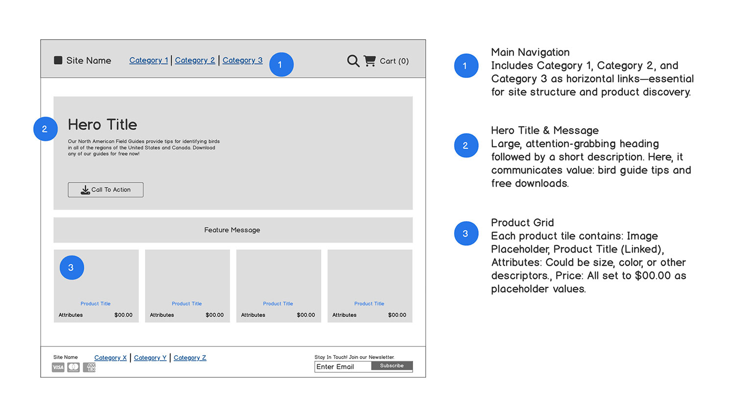
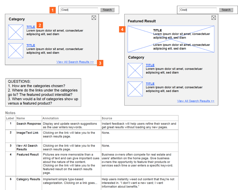
1. Non-invasive placement Place callouts or sticky notes around the wireframe, not inside core UI areas, to avoid visual confusion. Use arrows to point precisely.
2. Use numbering for clarity and to avoid clutter Use numbered callouts within your wireframe and add annotated notes in a separate area.
3. Group annotations by purpose When adding annotations to your wireframe, a great way to organize your thoughts is by creating consistent visual groupings. For example:
🟩 Green callouts for functional behavior
🟦 Blue stickies for design rationale
🟥 Red notes for errors/edge cases
This keeps things readable for multi-role teams.
Wireframe annotations made easy
Using the right tool makes adding wireframe annotations a breeze. We get that at Balsamiq.
In Balsamiq, adding notes is built-in, letting you label functionality, describe interactions, and communicate ideas clearly—all without needing advanced design skills.
Whether you're mapping out an app dashboard, defining user flows, or preparing a product handoff, Balsamiq helps make the annotation process smooth and intuitive.
Try us for yourself and see how much clearer your wireframes become!
FAQs
What are wireframe annotations, exactly?
Annotations are notes you add to your wireframes to explain what's happening on each screen. They can describe interactions, logic, content rules, or anything that's not visually obvious. Think of them as your behind-the-scenes commentary.
Why are annotations important in wireframes?
They help bridge the gap between design and development. A wireframe shows what something looks like, but annotations explain how it works. They're especially useful when handing off to devs or getting feedback from stakeholders.
Where should I place annotations in a wireframe?
Keep them close to the element they're describing, but make sure they don't clutter the layout. Use callouts, side notes, or numbered labels with a legend if things get busy. The goal is clarity, not chaos.
Do I need to annotate every part of the wireframe?
Nope, that would be overkill. Focus on areas that might raise questions. For example, things like conditional logic, dynamic content, or unusual interactions. If something's self-explanatory, you can skip it. Only annotate wherever it adds value.
Can non-designers add wireframe annotations?
Of course! Product managers, developers, and content folks often have key insights that make the wireframe stronger. Annotations are a team sport and everyone's input helps clarify intent.