It’s easy to let real product thinking fall by the wayside when anyone can generate a “fully-functioning” app or website with just a few prompts. But let’s be real, the ability to produce a polished UI doesn’t mean the underlying product logic is actually sound.
Today, the lines between design stages are blurring, and jumping straight to high-fidelity detail can be a trap. Polished screens look impressive to stakeholders, but they often create a false sense of security. If you haven’t validated the core usability first, you’re just adding to your future technical debt and risking expensive rework later.
To keep your project on track, you have to align on the structural essentials before worrying about the finer details. This starts with the most fundamental tool in your arsenal: the wireframe.
What is a wireframe? Do teams still need them today?
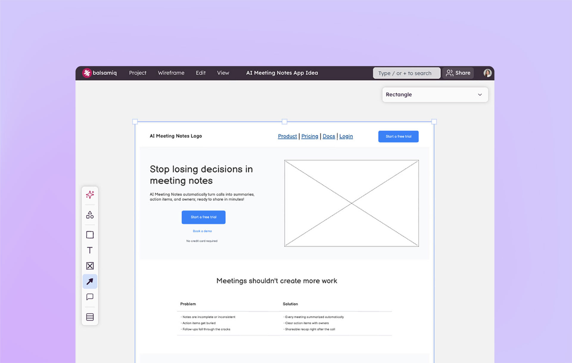
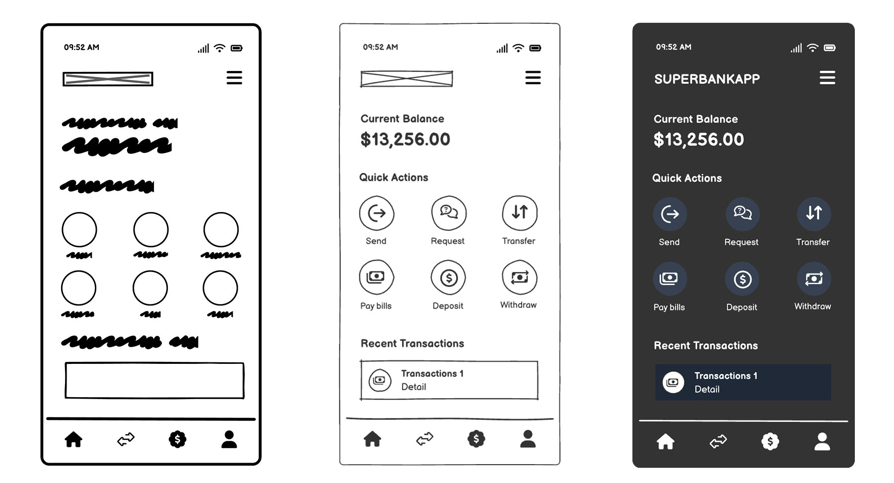
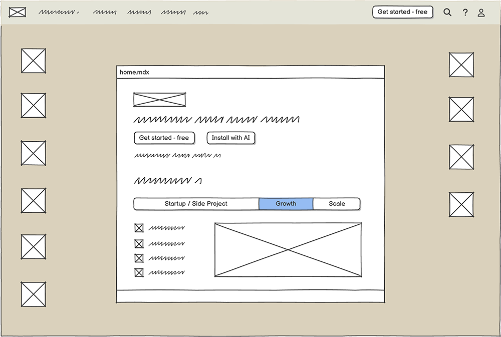
A wireframe is a low‑fidelity visual (not a final design) that outlines structure, layout, and intent. Think of it as the skeleton of your product idea. They’re intentionally rough, often black‑and‑white or grayscale, and stripped of branding details. That “unfinished” look is the point because they keep conversations focused on logic and hierarchy rather than fonts and colors.

What makes a good wireframe?
- They’re fast to make
- They look intentionally rough or unfinished
- Their structure is the main focus, not visual aesthetics
- They encourage healthy exploration and iteration
Wireframes are best for:
- Exploring multiple concepts quickly
- Structuring user flows
- Clarifying requirements
- Early team discussions
Wireframes are the fastest way to get ideas out of your head and into a format others can react to. They help teams sync up on what they’re building before debating how it should look. In early‑stage product work, wireframes are still essential (even with AI so prevalent today) because they strip away distractions and force clarity.
What is a mockup? How are they different from wireframes?
A mockup is a static, higher‑fidelity representation of what the final UI might look like. Unlike wireframes, a mockup uses real fonts, colors, and spacing. They’re closer to the finished product visually, but they don’t yet simulate user interaction.
What makes a good mockup?
- They’re higher fidelity than a wireframe
- They includes branding, typography, and spacing
- They’re better for visual decisions than structural ones
Mockups are best for:
- Brand and design reviews
- Marketing or stakeholder previews
- Polishing before development
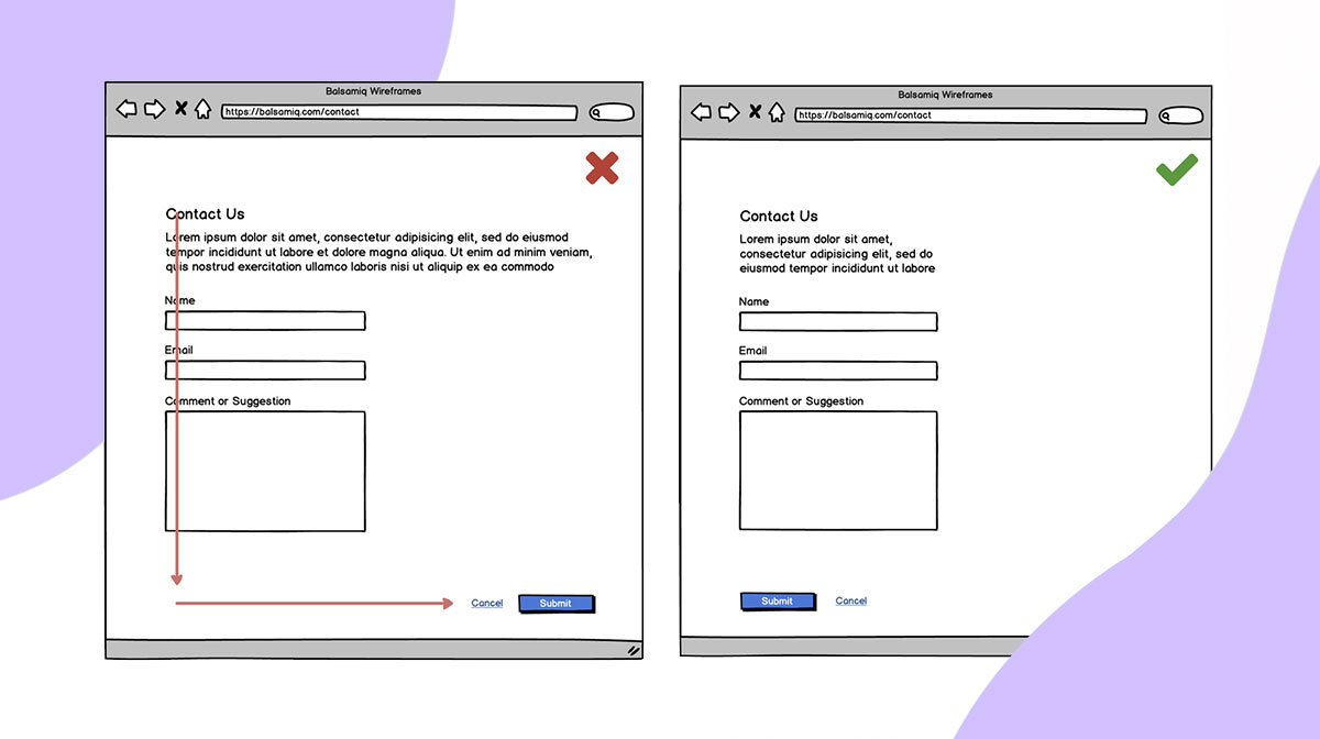
Keep in mind that jumping to mockups too early can mislead stakeholders. A polished screen often looks “done,” even when the underlying logic hasn’t been validated. Be mindful of this because a false sense of completion can derail conversations about structure and functionality, both of which are necessary to ensure you can walk before you run.
And finally, what is a prototype?
A prototype is an interactive model that simulates how the product behaves. It’s clickable (desktop) or tappable (mobile), so you can test flows, navigation, and interaction patterns. Prototypes bring ideas to life by showing not just what the product looks like, but how it works.
What makes a good prototype?
- They use clickable or tappable elements
- They test flow and interaction
- They help validate usability
Prototypes are best for:
- Usability testing
- Demonstrating behavior
- Gathering feedback on interaction patterns
Comparing wireframes, mockups, and prototypes
It’s easy to get the three mixed up when you’re in the middle of building. Wireframes, mockups, and prototypes often get tossed around like interchangeable terms, but they each play a different role. To make things clearer, here’s a side‑by‑side look at how they stack up:
| Wireframe | Mockup | Prototype | |
|---|---|---|---|
| Purpose | Structure & logic | Visual polish & branding | Interaction & usability |
| Key question answered | “What are we building?” | “How will it look?” | “Does this experience work?” |
| Fidelity level | Low | High | Middle to high |
| Ideal stage | Early ideation | Mid-stage alignment | Testing & validation |
| Strengths | Fast, clarifies flows, encourages debate | Shows design direction, engages stakeholders | Validates flow, reveals usability issues |
| Risks of using too early | Can feel too abstract if used alone | Creates a false sense of completion | Wastes effort if the logic isn’t clear |
Why teams struggle with fidelity today
Fidelity itself isn’t the problem. The problem is how teams approach fidelity. New tools and shifting expectations mean wireframes, mockups, and prototypes often overlap more than teams expect.
AI has made it easy to start at the wrong level (typically too early)
AI can make polished UIs really fast. But polished ≠ correct. Attractive ≠ aligned. Fast output ≠ shared understanding. Teams often skip essential early thinking because the visuals look finished, mistaking speed for clarity. Remember, AI can’t replace product thinking.
"If we design everything up-front, or without allowing others the opportunity to contribute, we lose those opportunities for serendipity and happy accidents, which is often where our best work comes from.
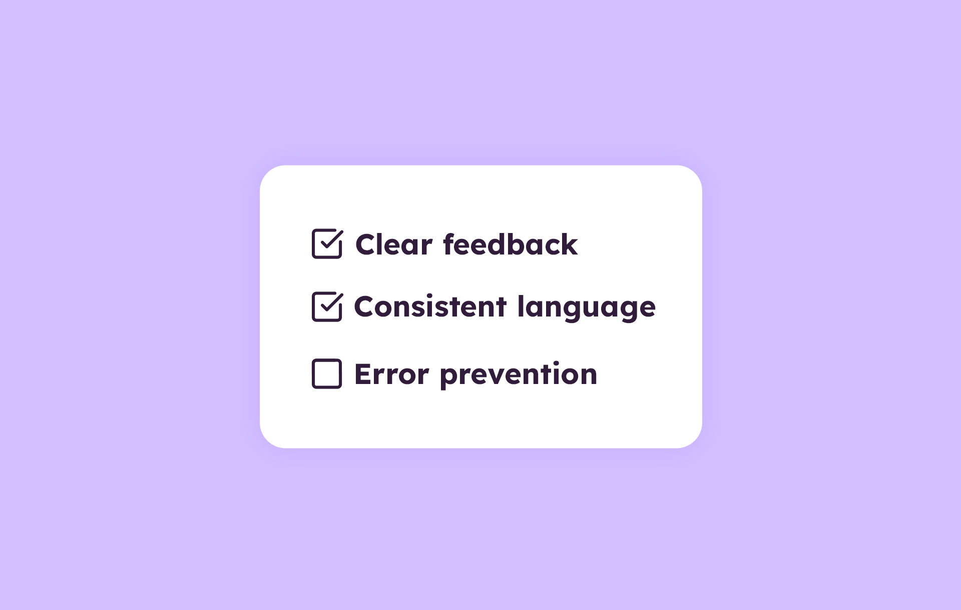
Fidelity often reflects confidence — the more precise something appears, the more time and effort it seems to have taken. Showing pixel perfection to decision-makers or end-users signals the work is nearly finished, which directly affects the feedback you get. Polished work looks “done", so people are less likely to criticise it.
I usually get the best feedback from scribbles on whiteboards or doodles on paper. When ideas feel disposable and cheap to change, people challenge them more, testing them and making them stronger." James Cook,Design Operations Consultant & Mentor

High fidelity too early can cause confusion
Stakeholders see a polished mockup and assume decisions are final. This shuts down debate and locks teams into flawed assumptions. Showing high fidelity components too early can create a false sense of confidence and lead to costly rework.
Wireframes keep everyone honest
Wireframes force teams to focus on structure, logic, and clarity. They don’t include any distractions and keep cross‑functional conversations grounded. In a world of instant polish, wireframes are the antidote to premature certainty.
How AI changes (and doesn’t change) fidelity
AI has reshaped how teams approach design. With a single prompt, you can generate near-finished screens, explore multiple directions, and move from idea to visual in minutes. That speed is powerful but it doesn’t replace the deeper work of product thinking. Fidelity is still about choosing the right level of detail to answer the right question, and AI doesn’t change that truth.
What AI does well
AI is great at accelerating your ideas and getting them out in the open to decide which ones are worth pursuing.
- Drafts starting points quickly: Instead of staring at a blank board, teams can jump into exploration with ready-made layouts.
- Suggests variations: Need three different takes on a landing page? AI can whip them up in seconds so you can compare options side by side.
- Helps teams explore ideas faster: By lowering the cost of iteration, AI makes it easier to test directions and spark new conversations.
When used correctly, AI can help you move faster through the “what if” stage of product design. Just remember to use it responsibly instead of being overly reliant on it.
What AI doesn’t solve
AI can generate polished outputs, yet it can’t decide whether those outputs are right for your product. This is a prime example of what it means when we say speed doesn’t replace clarity.
- Product logic: Only humans can define the underlying structure and flows that make sense for your users.
- Trade-offs: AI doesn’t weigh competing priorities or resource constraints.
- Human alignment: Teams still need to agree on goals and direction; no algorithm can replace that conversation.
- Contextual decision-making: Market signals, customer needs, and product vision all require judgment that AI can’t provide.
This is where wireframes are essential. They strip away polish and force you to focus on structure, intent, and alignment before diving into detail. At Balsamiq, we see AI as a complement to this process: a way to accelerate exploration, while wireframes keep the thinking honest.
Choosing the right fidelity for different moments
Different stages of product work call for different levels of fidelity. The detail you choose should match the question you’re trying to answer—whether it’s exploring a new feature, securing stakeholder buy‑in, testing usability, or using AI to spark your ideas.
Aligning the team on a new idea? Use wireframes.
Start with wireframes to explore ideas broadly and clarify requirements. Because they are intentionally rough, you can sketch bold ideas and discard weak ones without worrying about wasted effort. This low-stakes environment encourages your team to be creative while keeping the discussion grounded in logic.
Selling the vision to stakeholders? Use mockups.
Once your structural decisions are made, mockups help communicate the final direction. Visual polish (using real fonts, colors, and spacing) reassures stakeholders and connects the product to your brand. Use these when your audience needs to see exactly how the product will look in context to visualize the end result.
Testing if it’s easy to use? Build a prototype.
Prototypes let teams test flows, navigation, and expectations. They reveal usability issues that static screens can’t. Prototypes are especially valuable for usability testing. By simulating real interactions, teams can observe how people move through tasks, determine whether navigation feels intuitive, and raise concerns wherever friction points arise.
Using AI for ideas? Use wireframes first.
Even when AI generates screens, wireframes provide the “logic layer” needed to evaluate ideas effectively. Wireframes force you to ask hard questions like, “Does this flow make sense,” “Are we solving the right problem?” and “What’s missing from the customer journey?” Use AI for speed, but wireframes for clarity.
Wireframes anchor product work
Wireframes, mockups, and prototypes each answer different questions. Wireframes clarify what you’re building, mockups show how it will look, and prototypes validate how it works. Using the right fidelity at the right time prevents wasted effort, reduces confusion, and speeds up iteration.
AI accelerates creation, but it doesn’t replace human judgment. Teams still need shared understanding, and wireframes remain the foundation of good product thinking. With Balsamiq, you can marry low‑fidelity wireframing with mid‑fidelity vibe prototyping…balancing speed with clarity in modern product workflows.