Wireframing is all about structured thinking. It’s the best way to explore ideas without getting caught up in colors, fonts, or pixel-perfect designs too soon. Even better, it allows you to experiment on the cheap without having to make final decisions.
High-fidelity tools like Figma can make things feel “done” too early, sometimes trapping teams in the way designs look before the real functionality is worked out. Low-fidelity tools like Balsamiq keep the focus on usability, structure, and flow—where it matters most in the early stages.
So before you open any design software, here’s what you need to consider to start wireframing.
1. Write before you wireframe
It’s tempting to jump straight into a wireframing tool, but take a step back. Before you touch a tool, write out a simple brief answering these three questions:
- Who is this project for? (Define your user.)
- What problem does this solve? (Clarify the purpose.)
- What’s the user trying to do? (Map the journey.)
[Embed Note: If you have a hard time answering these questions, you're probably not ready to start wireframing. We suggest that you go back to the gathering requirements phase if that’s the case.]
If you can’t explain the user’s journey in words, don’t open your wireframing tool yet! Instead, try writing a simple prompt to guide your thinking:
"What’s the simplest way for a new user to complete X?"
By thinking through what needs to happen before worrying about how it looks, you'll avoid unnecessary complexity later.
2. Use low-fidelity tools early
When you're ready to get ideas on the screen, your choice of tools matters.
Sketching on paper feels quick and easy, but it’s hard to share, revise, or reuse. High-fidelity tools will come in handy later, like when you want to present something more polished, but stakeholders can get distracted by visuals instead of looking at the structure. Low-fidelity tools hit the perfect balance between speed, clarity, and flexibility, making them perfect for the early stages of the design process:
- Easy to iterate on – Make quick changes without overthinking visuals.
- Forces focus on structure – Keeps attention on layout and content hierarchy.
- Clear enough to discuss, rough enough to change – Stakeholders feel comfortable giving feedback without worrying that everything is "final."
- Feels like sketching, but works like a product tool – Let everyone contribute, not just designers.
Starting with a low-fidelity wireframe keeps the emphasis on function and usability, making discussions more productive.
3. Map the experience, not just the screens
It’s easy to treat wireframing as a collection of individual screens, but what really matters is how users move through an experience.
Use sitemaps or simple user flows to visualize how different screens connect. Sequence your screens—what happens before and after matters just as much as the current view.

Try breaking things down into scenarios rather than standalone screens. For example:
- What happens if a user clicks a button like “Next” too soon in a checkout flow?
- Where does a user land after submitting a form?
- How does a user recover if they make a mistake?
Thinking beyond single pages will help create a more intuitive experience for real users.
As another example, watch Mike as he creates a site map and a user flow diagram before starting UI design work.
4. Recreate the current reality (if it exists)
If you’re redesigning an existing product, resist the urge to jump straight into new ideas. Instead, start by wireframing the current version first. This step helps you fully understand what’s already working, what’s broken, and where you can improve.
For example, imagine you need to improve a customer support portal. Right now, users struggle to find answers, and the support team is overwhelmed with inquiries. Instead of designing an entirely new portal from scratch, you can:
Capture the existing state
- Take screenshots of the current support portal.
- Map out user flows—how users navigate through FAQs, ticket submissions, and live chat options.
Wireframe the current experience
- Recreate the portal using a low-fidelity wireframe, outlining its current navigation, search functions, and ticket submission steps.
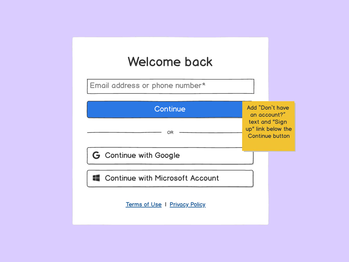
- Annotate problem areas: “Users often miss this search bar,” or “Ticket submission form has unclear instructions.”
Analyze and compare
- Identify where users get stuck or drop off—are FAQs too hidden? Is live chat prioritized over self-service?
- Note opportunities for improvement, like simpler navigation, better search functionality, or clearer CTAs.
Refine the wireframe for a better experience
- Create a new wireframe based on what you’ve learned—highlighting improved organization, clearer labels, and faster access to help.
- Share early versions with stakeholders and support agents to validate proposed improvements.
Instead of blindly redesigning, this approach helps teams justify changes with real insights rather than personal preferences. It also prevents accidental loss of existing functionality that users rely on.
Pro tip: If a product exists, don’t just look at its current layout—study user behavior, feedback, and pain points. A great wireframe isn’t just visually different; it solves real problems.
Pro tip: Copy-paste screenshots into your wireframing tool and sketch over them to compare old vs. new layouts easily!
5. Look sideways for inspiration
When tackling a wireframe, don’t limit your thinking to just your industry. Some of the best user experience (UX) ideas come from borrowing logic from different fields.
E-commerce checkout flows
You can appreciate a checkout experience that feels smooth, natural, and doesn’t distract you from making an online purchase. In a wireframe, modeling this kind of efficiency can lead to a better user journey. Here’s how:
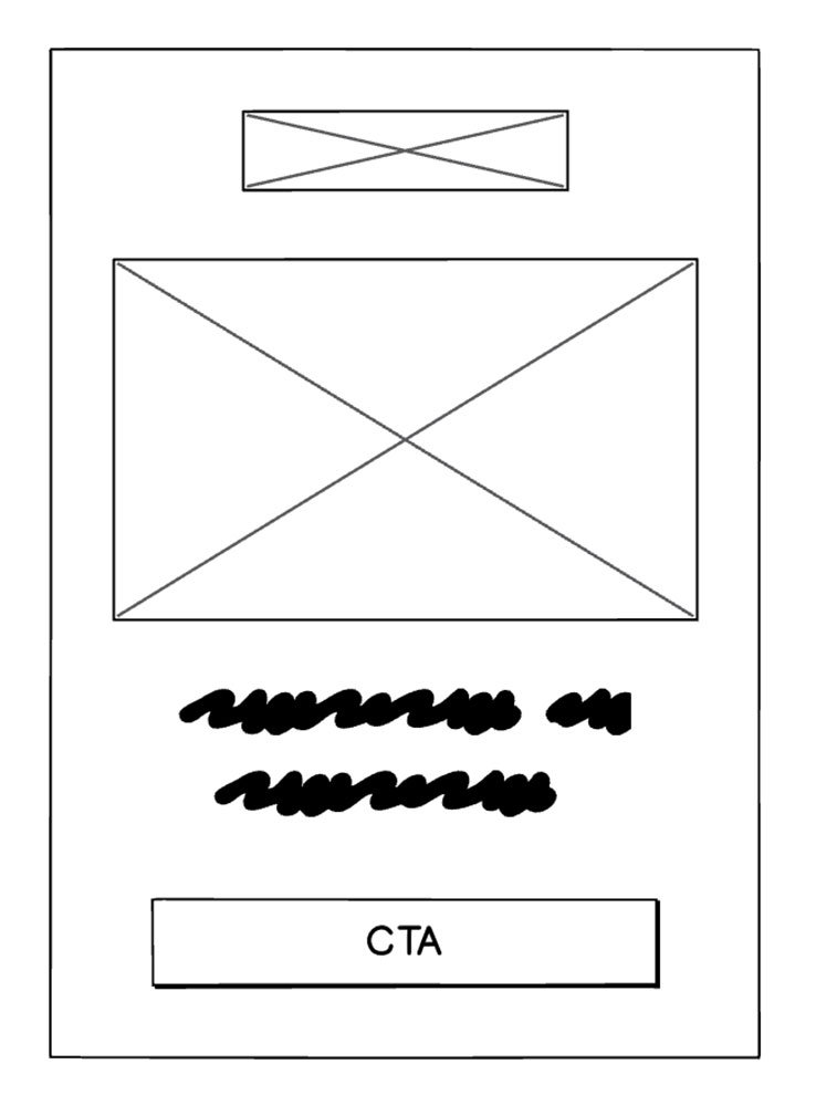
- Step-by-step progression – A good checkout process breaks tasks into manageable steps (cart > shipping > payment > confirmation). Applying this principle to wireframing can help structure onboarding flows, as an example.
- Minimal distractions – Checkout pages prioritize only the essential elements—removing unnecessary navigation options that might lead users away. This approach is valuable to keep people on track.
- Clear calls to action (CTAs) – E-commerce checkouts make sure users always know their next step, whether it’s “Proceed to Payment” or “Place Order.” Using similarly well-labeled buttons in wireframes ensures clarity in any flow-based experience.
Social media
Whether it’s Instagram or TikTok, social media platforms are built around effortless interaction. It’s easy to like a post or share a reel, so you do it almost subconsciously (scary!). When wireframing, you can borrow UX principles from socials like:
- Instant feedback – Users get immediate responses when they interact (e.g., tapping “Like” triggers a visible animation). Wireframes can include annotations for similar feedback, like showing how a button should indicate success when it’s tapped.
- Mobile-first thinking – Since social media is primarily used on phones, designing with thumb-friendly interactions, minimal text input, and clear action buttons improve usability.
- Clear navigation paths – Social platforms make sure their users always know where they are and how to return to previous pages. Borrowing this logic for dashboards or apps can help users avoid frustration.
Search filters
Whether it's a travel booking site, a retail store, or a content library, search filters simplify decision-making by removing distractions. Similarly, in a wireframe, search filters make datasets more accessible through:
- Progressive filtering – Many travel and retail sites use step-by-step filters, showing only relevant options as users narrow their search. Applying this approach to dashboards can make sure users don’t get overwhelmed.
- Clear category labels – Search filters should be intuitive—users should never have to guess what a filter means. Wireframes should clearly define categories, using real-world language instead of vague terms like “Advanced Options.”
- Saved searches – Ever noticed how some sites remember your last search? Wireframing search experiences should consider how users might want to revisit a previous session and refine it without starting over.
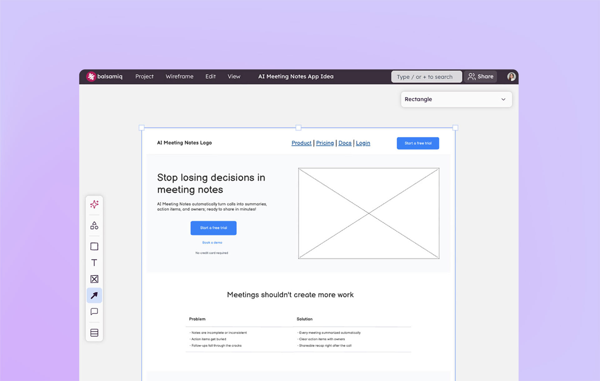
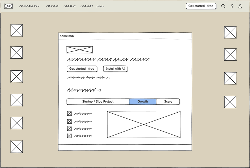
6. Graduate to a tool like Balsamiq
Once you’ve got your words, flow, and rough ideas mapped out… it’s time to wireframe digitally. But remember to keep it low-fidelity—you’re still in the early exploration phase.
Tools like Balsamiq help teams stay in idea-mode, not pixel-perfect mode. This is where your wireframes become team-aligned and testable, allowing you to iterate quickly without getting lost in unnecessary details.
By following these steps, your wireframes won’t just be drawings—they’ll be thoughtful, structured blueprints for better digital experiences.
Now, it’s your turn. What’s the simplest way for a new user to complete X? Start there, and let your wireframe guide the way.