A camera on a smartphone, laptop, or stand-alone webcam allows the user to take photos, videos, and live recordings of themselves and others.
Applies to:

Taking a photo
Users can take photos on their smartphones using a built-in camera.
While different smartphones may have slightly different camera software, most will have the following features:
- Camera live view: This shows the photographer what the camera is framed up to shoot.
- Shutter button: Clicking the shutter button will take a photograph.
- Switch camera: The “switch camera” button is found on phones with 2 cameras; one on the front and the other on the back. The “switch camera” button allows the photographer to switch between these 2 cameras.
- Settings: The settings button opens up camera settings, including flash, brightness, filters, and more.
- Camera type tabs: Most phone cameras will let you switch between different camera and video types.
- Gallery: The gallery button, also known as "photos," takes the user to their previously shot photos and videos.

Taking a video
Video cameras allow the user to take video footage and watch it later.
There are 2 modes when dealing with a video camera: the "pre-recording view" and the "recording view". Before filming, the user will have more settings and options. While filming, the user will usually not have any options.
The "pre-recording view" is very similar in appearance to the camera view. However, while recording, the user will see a readout of the recording time and a red indicator letting them know that it’s currently recording. The user should be able to click the square "stop recording" button when they are done.

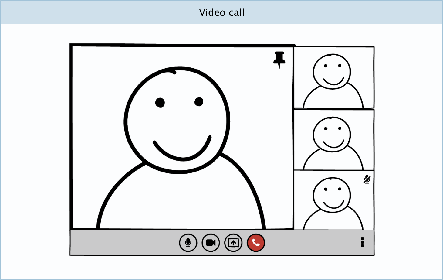
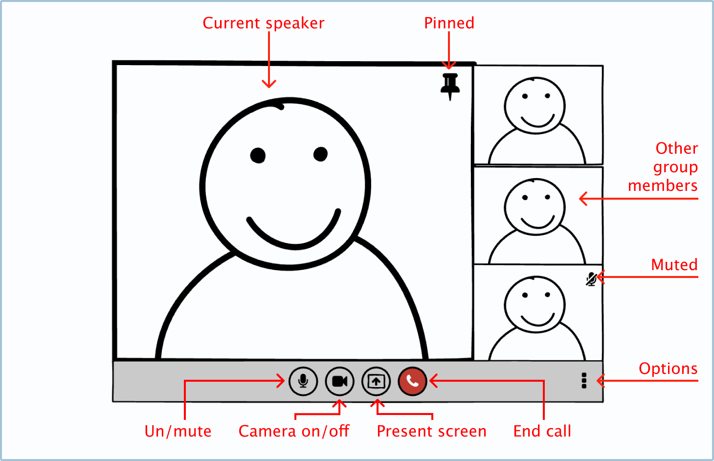
Video call
A video call application allows users to send video and audio to each other in real time, creating the appearance of an in-person meeting (provided the internet connection is good).
While video call apps may differ, a few of the most common features are as follows:
- Un/mute toggle button: The un/mute button allows the user to turn the sound that they are broadcasting on or off.
- Camera on/off toggle button: The camera on/off button allows users to show or hide their current video footage.
- Present screen button: This button allows the user to share their screen so that the other members of the call can see it.
- End call: The end call button allows the user to end or leave the video call.
- Pinned toggle button: The pinned toggle button allows the user to make one of the call member’s recordings bigger than others, even when the pinned call member isn’t talking.
- Muted icon: The muted icon means that one of the members on the call has turned off their microphone.
- Options menu: More options and permission settings will be contained in the options menu.
Variations
You can make your own camera variations.
UI elements included in Balsamiq
Balsamiq offers a range of pre-made UI elements. Use search to find the one you need, then drop it directly into your wireframe.
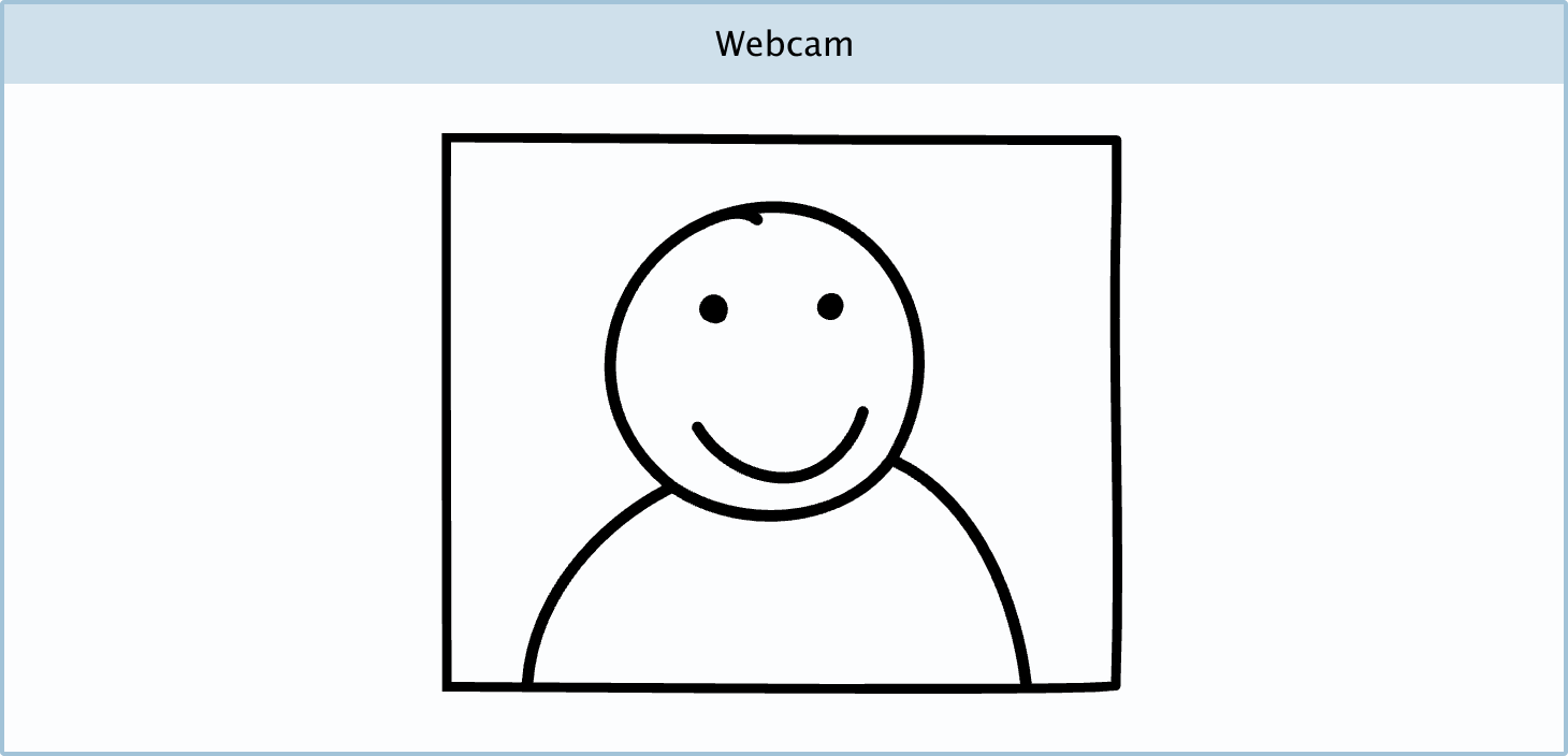
Webcam image: The webcam image is used to show the recording of a person. You can also use this UI element as a "selfie" view on a camera or as a profile picture.
DIY components
You can make your own custom camera Components in Balsamiq.
Camera and video camera mobile app: You can create your own camera apps in Balsamiq using a phone template, the webcam image, circle buttons, shapes, and labels.

Video call: You can create your own video call app by using the webcam image, rectangles, and icon elements in Balsamiq.