On this page
Design principles are foundational rules that work well for communicating information so that the user can do something with it, whether it's making a decision, taking action, or just making sense of what's being conveyed. Like patterns, they emerge because they have proven to be optimal attributes for the purpose they serve, in this case for communicating effectively.
The design principles we'll be covering are:
Until you familiarize yourself with them, these principles may seem new to you. By labeling and understanding what they are, they become under your element so you can use them. With practice using them will be second nature, and they'll be part of the language you use to communicate information in your interfaces. You won't be able to look around without thinking about them.
The Cooking Analogy:
Imagine that you ordered a dish of fish tacos. But when it arrives at your table, you get a tortilla soaked in oil, your fish is dry, overcooked and served on a separate plate, and spices come in a separate bowl. Sounds like something you'd send back.
Separate ingredients don't usually make an interesting dish by themselves. The selection, preparation and arrangement of parts is what gives those parts form as the dish. The techniques and style of presentation can also make the dish more appetizing — this part is what makes the dish really become an experience.
In design we have something like that too, and it's based on somewhat universal principles that make communication with design effective.1
We're going to consider some basic visual design principles that are helpful for designing interfaces.
We've selected 4 principles that you'll get the most benefit from as you begin your practice in interface design. There are many more beyond this list, but these will give you a good foundation for making your wireframes more effective.
Why use design principles?
The use of design principles may be unnoticeable at first, when we're looking at screens or pages in the world. You may, however, start to notice when some of these design principles have not been applied. The next time you find it hard to make it through a big form or can't find a button among a sea of elements in a cluttered application, think about how applying these design principles might have helped.
Well-considered design tends to disappear when it serves its purpose in optimizing communication or use. It gets out of the way and gets users to goals faster.
While you may not be doing the ultimate visual design for your product, some familiarity with design principles goes a long way toward communicating your ideas. We may deal less with the rendering of the final interface surface, but much of the understanding of what we want to communicate comes from what we explore in interaction and information in our wireframes.
Now let's look at each principle and learn when and how to use them to communicate in our interface wireframes.
Contrast
Contrast refers to the differences between things.
There are various ways to achieve contrast. A common way of adding contrast is to make things very different in size. Another way is to use contrasting colors.

When to use contrast
In interface design we use contrast to organize information and direct the eye.
A wall of text with no contrasting elements to break up the flow can be tiresome to read.
Contrasting font sizes and styles can indicate a heading that precedes a section of subordinate text. It breaks up the flow and gives the reader visual cues to pause and shift their focus and allows them to process the information in chunks.
The example below might be a layout for a website homepage. Notice how typography helps add contrast in the headings.

You'll find examples like this in many traditional Newspapers. This is also an example of visual hierarchy, which we'll talk more about below.
We also use contrast to indicate important information.
Using different typography or colors can alert users when a warning or crucial message demands attention.
A red text block, for example, might make a user pause before a destructive action. This red dialog contrasts highly against the pale gray background.

You'll find examples like this in application design, as with the warning that the Google Chrome browser shows if you are about to enter a site that contains malware.
Note how well the white text works against the red background. That's because the white also contrasts highly against the red background.
There are some caveats when using color. These are less of a concern when it comes to wireframes, but be aware of some of the issues below as you move on to visual design.
- Be careful not to use colors that don't contrast enough, because they may be difficult to read.
- Be sure to consider cultural norms when it comes to color.
- Colors have different meanings in different cultures.
- Also be aware that users who have experience color deficiency in their eyesight may also have difficulty recognizing certain colors.
How to use contrast
Contrast works best when things are very different from each other.
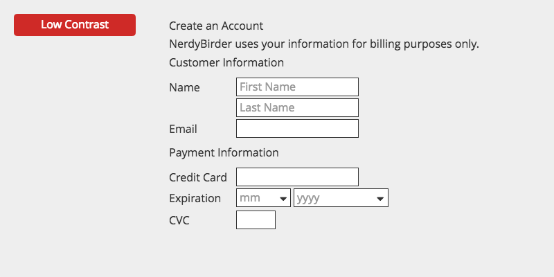
In the form below, all of the text is too similar. The headings and labels show little contrast and it's subsequently more work for the user to parse the text to determine where one piece of information ends and another begins.
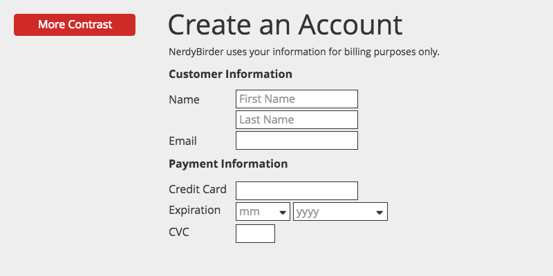
We can add more contrast so that the pieces of information contrasted with each other.
By making the title and headings stand out visually using scale and weight, they can be read at a glance, before continuing to the inputs below. This helps the user get through the information more easily.
Certain UI elements may help you to easily use contrasting text. In Balsamiq, a Title element is 40px by default and a text block, useful for body text, takes your default project setting (around 13 - 16px).
Remembering to use elements that are intentionally made for specific contexts like these will get you in the practice of using contrast effectively.
Hierarchy
Hierarchy refers to a group of things where items are rank ordered by importance.
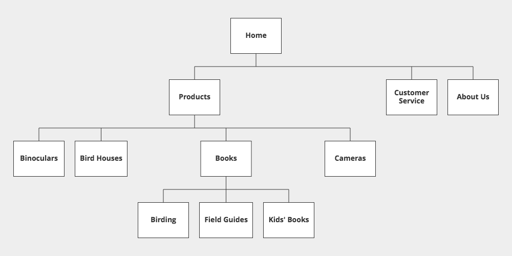
There are various ways to display hierarchy in a system. Typical examples may orient information from most important to least important visually, as in this top-down display of a hierarchical tree. You see this often in Organizational Charts or Site Maps.

When to use hierarchy
We use hierarchy to organize information in a system.
Site maps like the tree representation below are typical of how we use hierarchy when organizing screens in website or application design.
There can also be a hierarchy within individual screens.
One relevant use of hierarchy is also shown above in our contrasting text examples. We used size and scale to draw attention to the most important information on the screen, and then used smaller scale typography for body text.
We also use hierarchy to help users understand the relationship of content in a system.
There are various ways of indicating hierarchy.
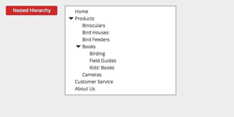
When we create menus with nested flyout sub-menus as in the example below, we're showing a hierarchical listing of functions in an application.

We're also using hierarchy when we're showing expanded lists of categories and their children as in the next example. This might be the type of interface you would show in a shopping site, for instance and there are various ways of showing hierarchy in menus.

You'll find examples of hierarchy in software elements like the flyout Menus in your Windows or Mac operating system, in the collapsible lists in Windows Explorer or the Mac Finder that look like stairs when expanded and in Breadcrumb menus where parent-child relationships are indicated. Hierarchy is everywhere!
How to use hierarchy
The common way to achieve hierarchy is by visually containing or nesting groups of child information within a parent container.
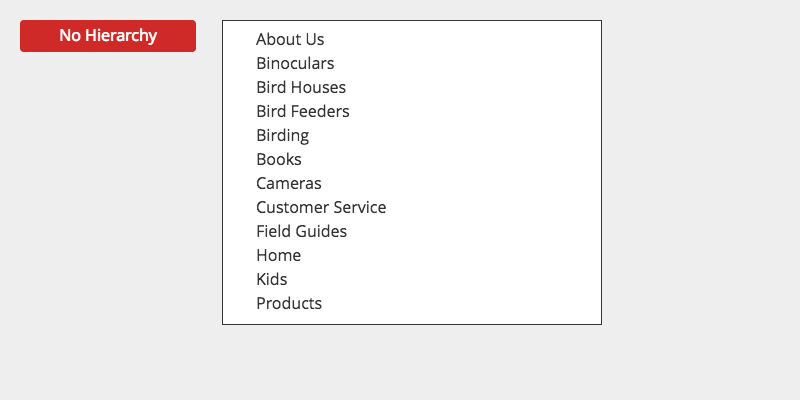
Here's an example of a set of pages in a website, arranged alphabetically. There's no sense of relationship between the pages. They all appear to be equal in this flat hierarchy.
By grouping the information into parent-child relationships, we can create the menu for the web site below.
This is the kind of navigator you'll find in applications for nesting child branches in a program like PowerPoint, Keynote or even Balsamiq.
Hierarchy helps users make sense of complex systems. There are great examples where hierarchy helps in extensive information systems. On large online stores like Amazon, for instance, hierarchy is used in navigation to help users drill down to content from broad to smaller categories.
And as we also saw in our contrast examples above, smaller interfaces such as forms can also benefit from visually displaying hierarchy within the screen.
By establishing a highly contrasting text style for the headings, we indicate the most important parts of the screen content. This is also an example of how to use hierarchy in the screen.
Proximity
The Proximity principle is about creating relationship between items by putting them near each other.
The reverse is also true. Objects that are seen as distant from each other are understood to be unrelated.
We know how we perceive relatedness from human psychology. This is called the Gestalt principle of grouping. We can use this to our advantage in interface design.

When to use proximity
When you want to use similarity to help the user, proximity can be helpful. Grouping items that are similar in function, for instance can help them find related actions.
This example from an application creates groups of buttons in a toolbar. This is a wireframe of the Keynote toolbar. The first grouping is for document-level actions like view, zoom, and adding new slides, the second grouping is for presentation functions, the third is for inserting content, etc. Grouping them this way helps the user to recall buttons that are similar in function with repeated use.

When we want sections of content to be clear we can move them apart to show that they're unrelated.
In the website wireframe below, notice how there is some important information at the top, including some buttons for important actions this site wants users to take. Then there is some more important, but denser information at the bottom of the screen. But then notice the smaller text in the middle separated using border lines. This is clearly serving a less crucial function, so the site decided to separate it from the other bits.

Proximity is useful in this case because it gives the user some help. In some cases, as in the testimonial block of the wireframe above, it might help to make something visible at a glance, but then guide them towards the more substantial chunks of info.
How to use proximity
We've seen in the examples above how the use of proximity can help organize the information in your interface.
To use proximity effectively, make sure you're using enough white space between groups. Let's bring back a more fleshed out version of our Customer Information form.
With the Opt-in checkbox, the submit button and the help tip, the form is more densely loaded with information.
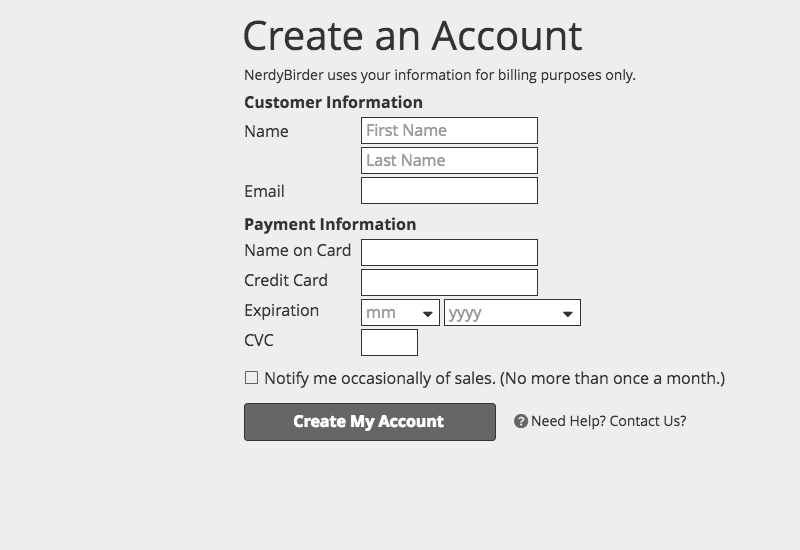
The contrast we added to headings by making them larger or bold worked to help separate the parts of the form. But it's still a lot to get through.
Forms can be pretty tedious to fill out, so we can do a lot better to make it easier on our users.
Here's where proximity can really help. We can move the groups of related form fields close together and add white space to separate the unrelated groups.

This is much easier to take in, visually and the user has a clear indication of when they're done filling out a group of fields, so they can pause and work on the next.
With time you'll be seeing how the proximity principle is used everywhere.
When you're wondering when the proximity of objects is enough or too little, try the squint test. Move back from the screen and blur your vision by squinting.
If you can detect that the clusters of information are separate while doing this, you'll know that proximity is working. If the space between seems too little to make the groups recognizable, try adding more space between groups.
Alignment
The alignment principle is about making it easier for users to process information by guiding their eyes through aligned objects.
When users can scan through information that has a clear line or path for their eyes to travel, they intuitively know where to look to take the next action. Think of how hard it would be to read a book where all of the text is centered. Blocks of texts in books are left aligned so that your eyes automatically return to the beginning of the next line effortlessly. We can use alignment this way with more than just text in our interfaces.

When to use alignment
Alignment can and should be used whenever you lay out a screen with information to process. Using alignment, you can ensure that nothing is placed arbitrarily on the screen.
Seemingly arbitrary placement and lack of alignment can lead to unintended consequences. In the United States Presidential Election of 2000, a voting ballot in the state of Florida featured a poorly aligned interface that led to many voters voting for the wrong candidate.
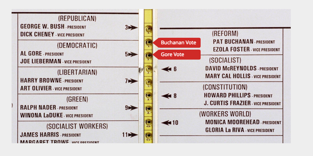
This ballot confused a lot of voters. Note how the Democratic candidate, Al Gore, is the second on the left side. It became apparent that the Reform candidate Pat Buchanan on the right side had gotten many more votes than expected, and it is believed that the Democratic voters punched the second hole, registering a vote for Buchanan.
There are quite a few elements that lead to this confusion. The lack of alignment and the multiple border lines and arrows are hard to make sense of.
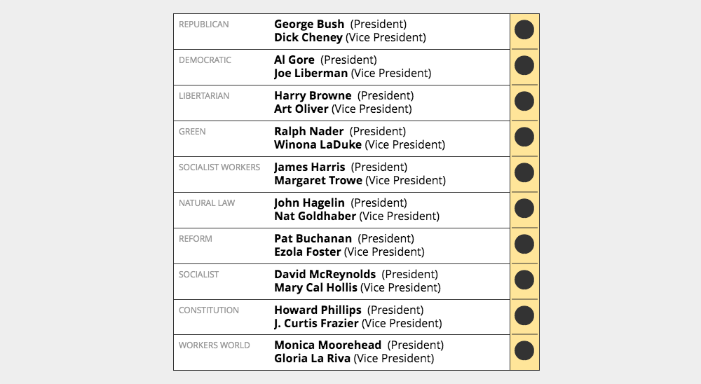
When you need to make the path clear to information, you can use alignment. This redesigned ballot might have made it more obvious to voters which hole to punch for their candidate.
When you start to think that everything should be aligned to something on your screen, information becomes more clear and easier to use and your interfaces will begin to feel more cohesive.
How to use alignment
To use alignment, we look at everything on our interface and think about how each item relates to the related items around it. One exercise you can do is to try to see if each object can align with something else.
Let's take one last look at our Customer Information Screen. We did a good job at adding contrast and using white space to put related items next to each other. But take a look at the screen overlaid with blue and red lines below.

The blue lines show objects that have a strong left alignment to other objects. But the Red lines show how some of the objects don't align to other objects, particularly on the right of the form. The form inputs are sized so that they create a ragged right edge that makes the eye jump around on the right, compared to the strong left alignment.
We can create a more solid feeling layout that directs the eye down through the form by resizing and laying out objects so that each one aligns with something else.

Notice the blue lines now. All of the objects have a strong left alignment, and most of the objects also have an object they align with on the right side. Adding a light hairline in our white space between chunks of the form also helps to create this sense of solid alignment.
We even reinforced the sense of movement by using the natural direction our eyes take when reading (down and to the right with Left To Right languages) by moving the submit button to the bottom right of the layout.
Here's what our form looks like without the alignment lines.

There are a lot of different ways you could have aligned objects out on this form that would work just as well. The goal here is to just think about how to help users move forward through the interface to completing whatever the intended task or goal is.
In this example, we showed how to use all of our base principles to improve one interface. When you're working on your own products or websites, use this step-by-step approach to see if you can apply the principles to each of your screens. You might find it useful to take a screenshot of your work before to compare how much easier it is to use your interface after you've applied the principles.
Further reading
- Robin Williams' "Non-Designer's Design Book," written for those new to graphic design, describes how to use a set of 4 core principles when communicating with design. The idea of beginning to internalize principles in the beginning of this section comes from her.
- "Universal Principles of Design" by William Lidwell
1: Note that this differs from individual and organizational design principles. Dieter Rams' 10 Principles for Good Design is one example. You can find more about those at the principles.design website.
