On this page
User Interface Design is the craft and process of designing what a user interacts with when communicating with software. We’ll look at common aspects of this process, including how to apply design principles and interface conventions.
User interface design is surprisingly hard to define. The crowdsourced (i.e., Wikipedia) definition seems to essentially say "user interface design is the design of software user interfaces," which isn't very enlightening.
A better way to define it is through the process of deconstructing a user interface into the areas that a UI designer is concerned with. As we'll see, good UI design doesn't happen by accident. There are actually multiple layers of UI design and multiple lenses that a UI designer looks through when creating a user interface.
Here is a typical user interface on a web site. There are slightly different UI considerations for web, mobile, desktop and other types of software, but, generally speaking, they are all software, and the following concepts apply to all of them.
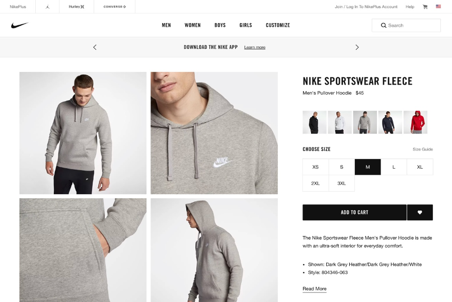
So, let's begin by stepping into the shoes of a UI designer to see how they might approach this website UI.
UI design layer 1: UI elements
Before diving into the UI elements layer, let's simplify the page above by viewing it as a wireframe.

Now let's look at some of the UI Elements that were used to build this page:
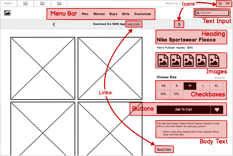
User interface elements (also known as elements, components, and "widgets") are individual pieces of a user interface that perform a single function. Some examples are links, buttons, and icons. Even plain text can be considered a UI element, since its function is to describe or label something within the user interface.
Each one of these UI elements was selected for a specific reason. UI design is concerned with the process and rationale of choosing UI elements.
Read more about UI elements in Intro to UI Elements.
UI design layer 2: Patterns
We can further simplify this page by decreasing the fidelity of our wireframe to abstract away the individual UI elements, like this:
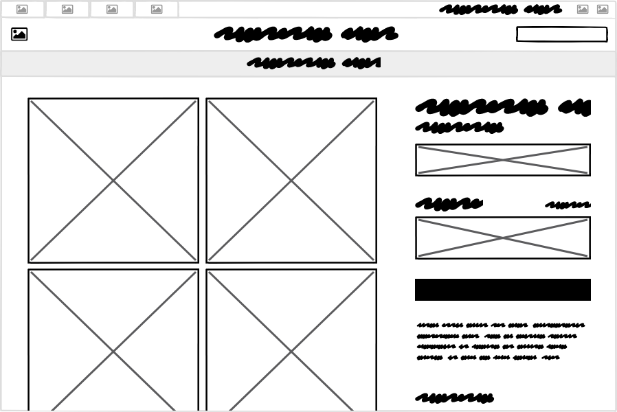
Now let's think about the groups of UI elements and what purpose they serve as units within the page. A UI Pattern is a group of UI elements that function to solve a particular problem. Let's look at some of the patterns on this page:

It can be useful to consider this layer of UI design even before moving on to the level of UI elements, as each pattern can meet its goals in different ways and using different UI elements.
Read more about patterns in Intro to UI Design Patterns.
UI design layer 3: Design principles
The most commonly understood definition of UI design is the visual design layer. But even this is more purposeful than most people understand. Visual design isn't merely "making it look pretty." A better way to think of it is as the application of established visual design principles, many of which are rooted in scientific psychological, neurological, or physiological understanding.
The specific principles we'll cover in this course are Contrast, Hierarchy, Proximity, and Alignment.
One way that UI designers evaluate design principles is using the "squint test", which helps to further abstract the design into its visual principles. An alternative is to blur the screen.

Either way, the goal is to take your attention away from the content in order to focus on the visual effects and techniques.
Read more about design principles in Visual Design Principles.
UI design layer 4: Templates
Finally, looking at this site as a whole, we can view this page as an instance of a template that can be reused across the site, rather than a single page that was designed for this particular article of clothing. For a site or product that can have dozens, or even thousands, of screens, it is useful both from the designer/developer and the end-user perspectives to have screens that behave predictably and look similar across the entire application.
The example we've been looking at so far could be described as a "product detail view" template that would look very similar when any other product is viewed.
Another UI template is the category template, shown here:
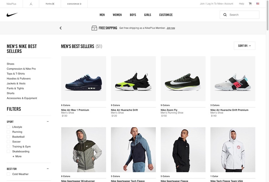
Other templates for this site might include one for checking out and purchasing, and another for search results. While every product may use different types of templates, all software types can benefit from a template-based approach to design.
Read more about templates in UI Design Templates.
The cooking analogy
In cooking there's a term called mise en place, which refers to the practice of putting "everything in its place" so that when the time comes to cook, you can automatically find what you need in the place you expect it to be.
The same will be true of the UI elements and patterns you use once you've familiarized yourself with them. In Balsamiq, you'll find the ingredients (the UI elements) in your UI elements panel. You may find the recipes (design patterns) in Balsamiq's Template Library, or you'll build your own patterns for your ecosystem.
Once we've learned how to put together the pieces, we can create more complete solutions (using design principles and templates). We have some good awareness of ingredients, we have an understanding of our recipes. These fast become a toolset for our culinary work.

Finally, for a restaurant to be successful, it must figure out how to prepare food that comes out on time, in the right order, at the right temperature, and that is consistent across visits (the process).
Learn about the UI design process in our Opinionated Guide to Creating Software.
There's a lot to learn, but we're not going to go too deep in this course. If successful, it will give you just enough to feel comfortable designing or reviewing user interfaces in your own work. And hopefully have a little fun along the way!
Ready? Let's start with the ingredients (the UI elements)!
