Splitters are used to divide or shorten screens and spaces.
Applies to:


Uses
Splitters are a practical solution for screens without enough space. They allow users to arrange and alter their workspace (browser or app) so that they can focus on their current task. When they change tasks, they can alter and arrange their screen again with splitters.
A few common uses are:
- Expanding panes in a coding platform so you can see the code, then shifting it so you can see the design
- Expanding layer panes in design software so you can see what layers you’re working with in more detail
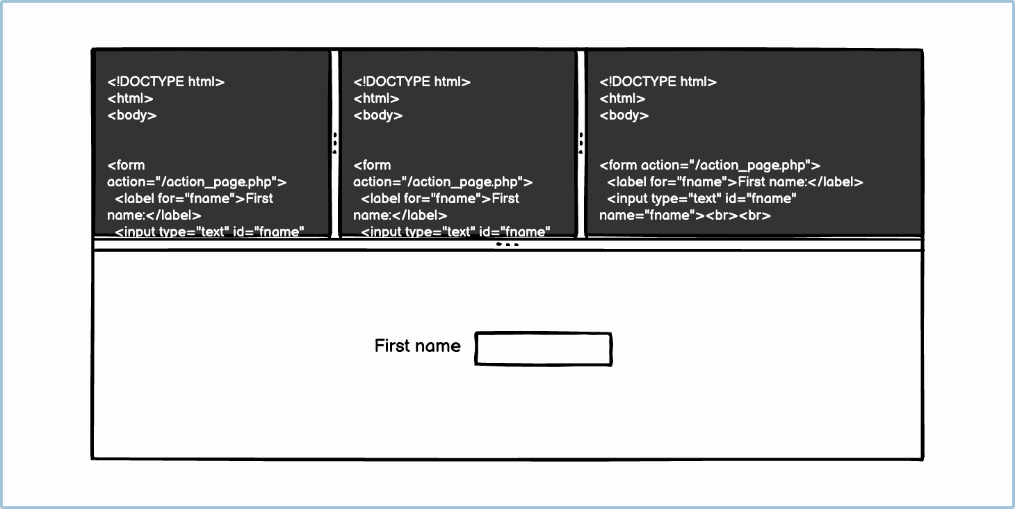
- Using the “inspect code” tool in your browser to see how the webpage was built and to test the responsiveness

Best practices using splitters
Here are a few best practices for using splitters in your design.
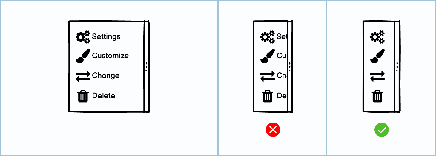
Splitters can be used to shorten, not just divide
For little windows or control panels, splitters can be used to shorten the pane. This is especially useful in design programs when the user may have multiple windows open.

Be mindful when having multiple splitters in different directions
While it’s possible to have splitters in different directions, it can get confusing for the user. Make sure that all the dividers are needed before you add them. Also, ensure that there’s a hierarchy among your primary splitter and sub-splitters.
Design for responsiveness when using splitters
When shortening areas and narrowing panes, make sure that those areas are designed to be responsive.
Allow users to change docking
Depending on the interface structure, you may want to change the alignment of the splitters from vertical to horizontal. The standard practice is to have an options or “kebab” menu icon that allows you to change the orientation.

Both screens sections should be relevant to each other
This goes without saying, but the 2 areas in a split-screen should be relevant to each other. For example, showing the code for a design and the design itself makes sense on the same screen; showing the code for a different design than the one currently being displayed does not.
Variations
There are a few different kinds of splitters.
UI elements included in Balsamiq
Balsamiq offers a wide range of pre-made UI elements. Use search to find the one you need, then drop it directly into your wireframe.
V. splitter or vertical splitter: This is the vertical version of a splitter. It can be used along the x-axis (left and right).
H. splitter or horizontal splitter: This is the horizontal version of a splitter. It can be used along the y-axis (up and down).