Text editors allow users to style their text to best convey their message.
Applies to:

Types of text editors
Plain text editor
A plain text editor allows the users to input just standard text without any formatting. This means that they can’t bold, italicize, add links, etc. It is often used in forms and input fields, as well as in basic messaging apps.

Rich text editor
A rich text editor allows users to add text, format it, and add rich media. Rich text editors may be divided into levels based on their features.
Basic: These editors allow users a few basic features such as bold, italics, and underline.
Mid: These editors may include the basic features as well as heading styles and text alignment (including bullet points and numbering).
Extensive: These text editors will include everything that the mid and basic editors do, plus giving users the ability to add things such as images, tables, HTML snippets, embed code, and more.
(Note: these levels are a guideline and not a rule.)
There are many different text styling features you can have in a rich text editor, but some of the most popular ones are as follows:
- Bold: The bold icon is a toggle button that allows you to un/bold selected text, like this.
- Italics: The italics icon is a toggle button that allows you to un/italicize selected text, like this.
- Underline: The underline icon is a toggle button that allows you to add or remove underline on selected text, like this.
- Strikethrough: The strikethrough icon is a toggle button that allows you to add or remove strikethrough on selected text, like
this. - Highlight: The highlight icon button, when clicked, opens a color selector that allows you to highlight text, like this.
- Text color: The text color icon button, when clicked, opens a color selector that allows you to change the text color, like this.
- Heading/paragraph style: A dropdown that allows you to select a pre-made style, including heading styles 1–6 and a “paragraph" style.
- Text alignment: Usually 3 or more buttons allowing the user to align their text left, right, center, or (sometimes) justified.
- Bullets: The bullets toggle button turns selected paragraphs into bullet points.
- Numbering: The numbering toggle button turns selected paragraphs into numbered points.
- Insert image: When clicked, the “insert image” icon will usually bring up a dialog asking the user to upload or select an image, which will be inserted into the text.

Inline text editor
Inline text editors mean that users can format their text without having to scroll to the top of the page to view all their options. One of the limitations of inline text editors is that, due to size constraints, there will often be fewer formatting options available to the user.
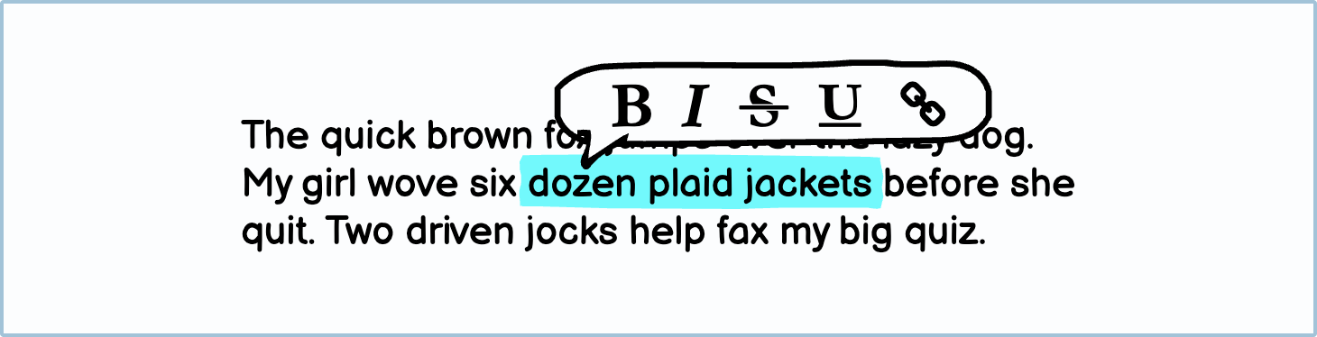
The inline text editor will appear when the user highlights some text. The options available in the text editor will usually be fairly basic, such as bold and italics.
Variations
There are several variations of text editors.
UI elements included in Balsamiq
Balsamiq offers a range of pre-made UI elements. Use search to find the one you need, then drop it directly into your wireframe.
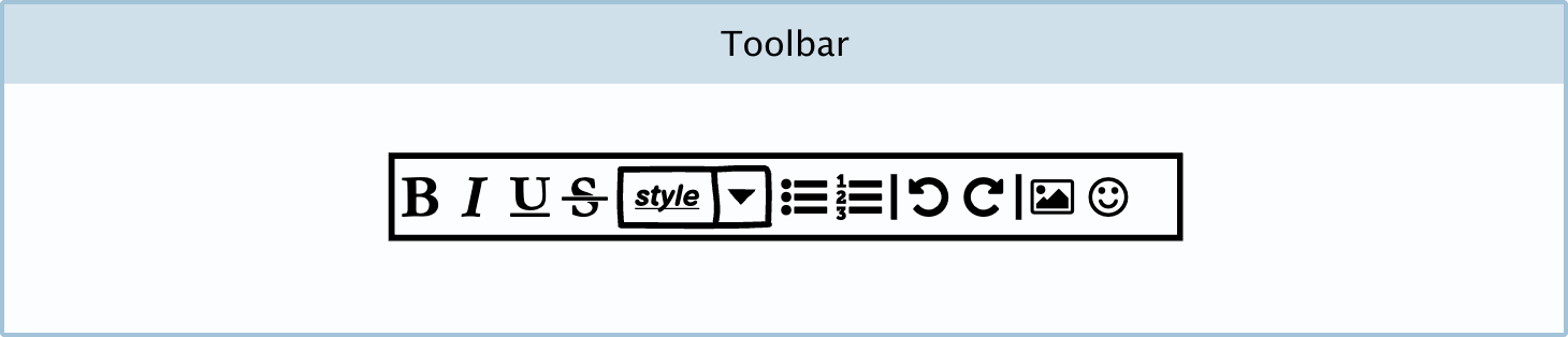
Toolbar: Balsamiq has a pre-made text formatting bar, called a ‘toolbar’.
DIY components
You can make your own custom text editor Components in Balsamiq.
Text editor toolbar: You may want to create your own text editor to show your wireframe reviewers how basic or extensive your text editor is. You can do this by using rectangles and icons.
Inline text editor: An inline text editor allows the user to edit the selected text in situ without a fixed toolbar. You can create one using icons and a tooltip in Balsamiq.