Annotations are a separate layer on top of a wireframe, used to clarify concepts and explain ideas when the designer isn’t in the same room as the stakeholders. They should detail how things work, component ideas, user journeys, edge cases, and much more.
Applies to:


Annotations in wireframes
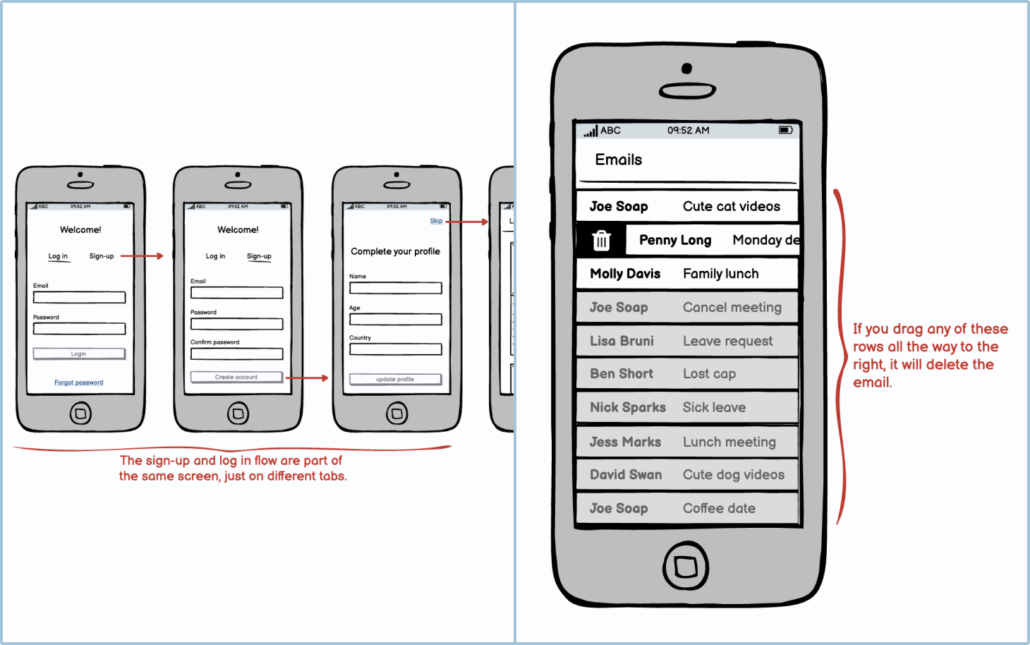
There are 2 ways to show wireframe screens connected together: wireflows and click-through wireframes. Click-through wireframes allow the reviewer to interact with a wireframe as if it were the actual product. Wireflows show all the steps of a user journey on one page.
Because wireflows show the big picture of the product, annotations become quite important as they allow reviewers and other stakeholders to understand how all the screens fit together. It is also beneficial to have an overview of all the possible journeys the user could take.

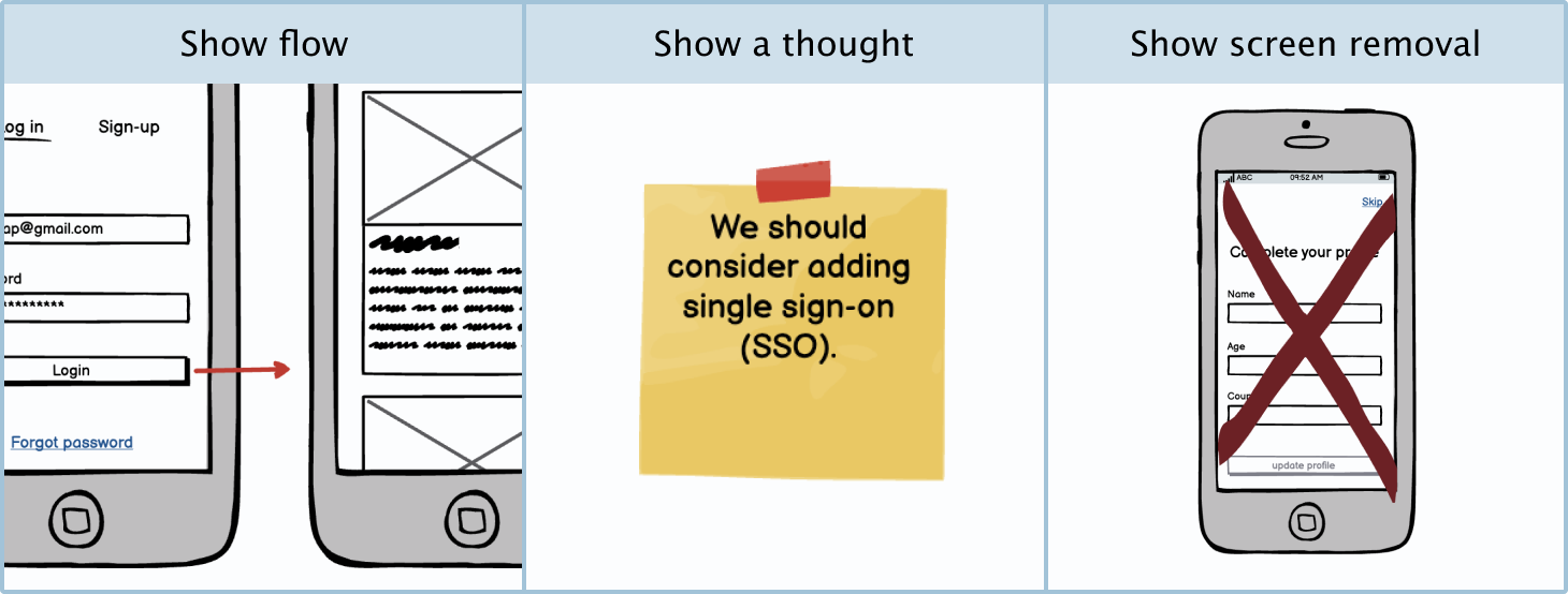
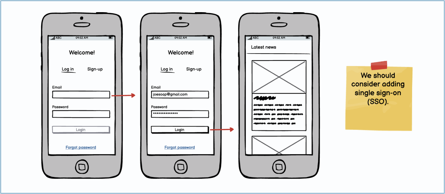
Annotations in wireflows are used to explain to the reviewer what is happening in the screens. This is especially useful for distributed or asynchronous teams who aren’t able to present their ideas in person. Annotations should do one of 3 things: show a flow, show a thought, or show a removal.
Annotations in wireframes and wireflows also allow developers and business analysts to see what is happening on the backend with the different system calls the application is making.
Tip Always make sure your annotations are in a different color to your wireframe screens. Some designers like to use red as it is very striking and is the industry standard. Other designers like to use blue as red can sometimes get confused with error feedback.
Arrows
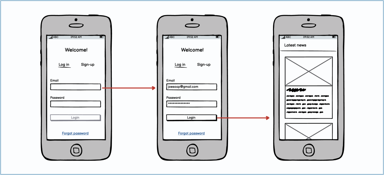
Arrows are a fundamental component of wireflows. Arrows show the reviewer and other stakeholders where the different links take the user and the direction of the flow.
Arrows showing a direct flow
The majority of the time, arrows will be used to show a user journey. It’s best practice to show exactly what the users have clicked or tapped to go to the next step in the user journey. You can do this by making the arrow’s starting point the aforementioned user input.
Arrows showing an alternative user journey
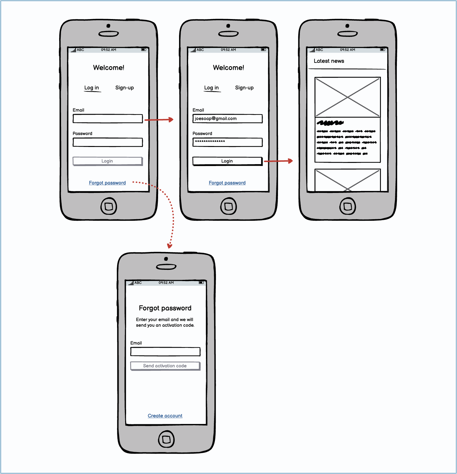
When designing a specific journey, you may want to indicate an alternative user journey without distracting from the main one. To show the primary flow, use arrows with solid lines. To show non-primary or alternative journeys, use dotted or dashed arrows.
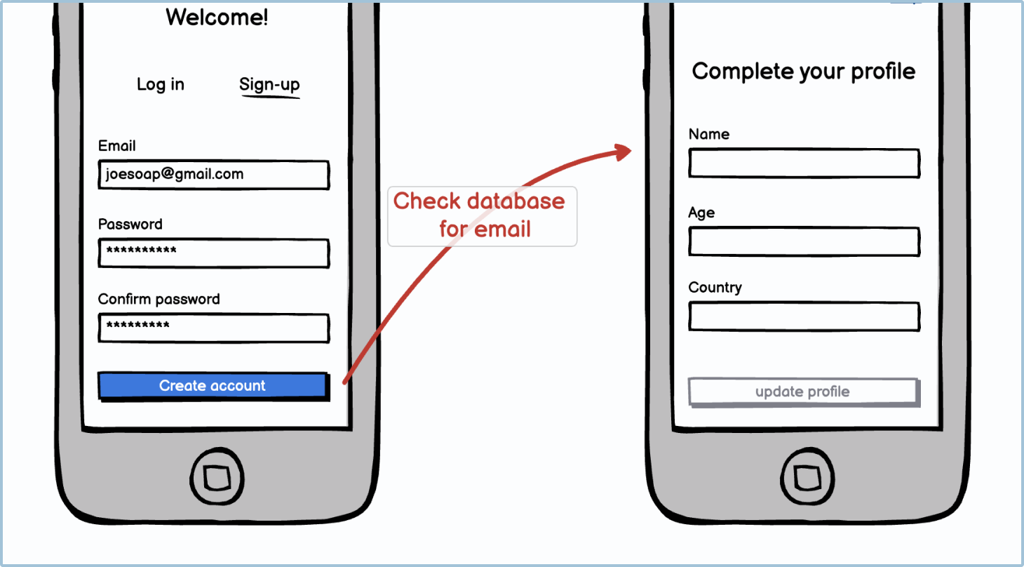
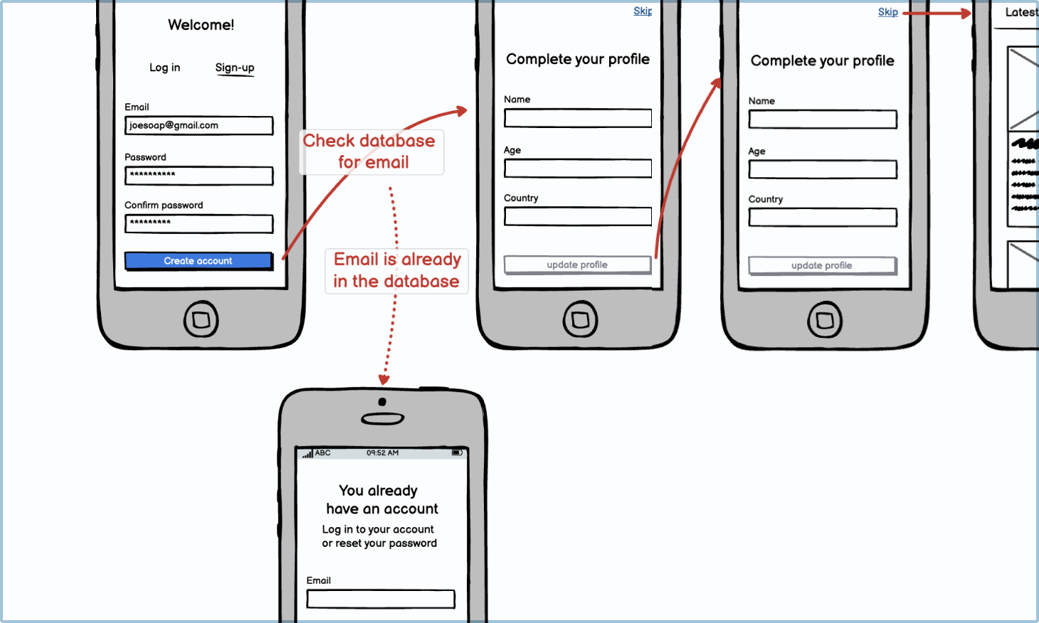
Arrow showing system calls
Arrows with labels can also be used to show what is happening in the background that the user may not be aware of. This can include system checks, SND checks, database calls, and more.It’s important to show these messages so that when developers and business analysts are reviewing the wireframes, they know that all the requirements are being met.
Arrows showing an edge case
You may need to design user journeys for edge case scenarios. For example, when creating a registration flow, part of the process involves the system checking the database to make sure that an account with that email address hasn’t already been registered. If the user’s email address has already been registered, they will be taken on a different user journey. To show an edge case, use a dotted or dashed arrow.
Arrows showing a flow based on a different user input type
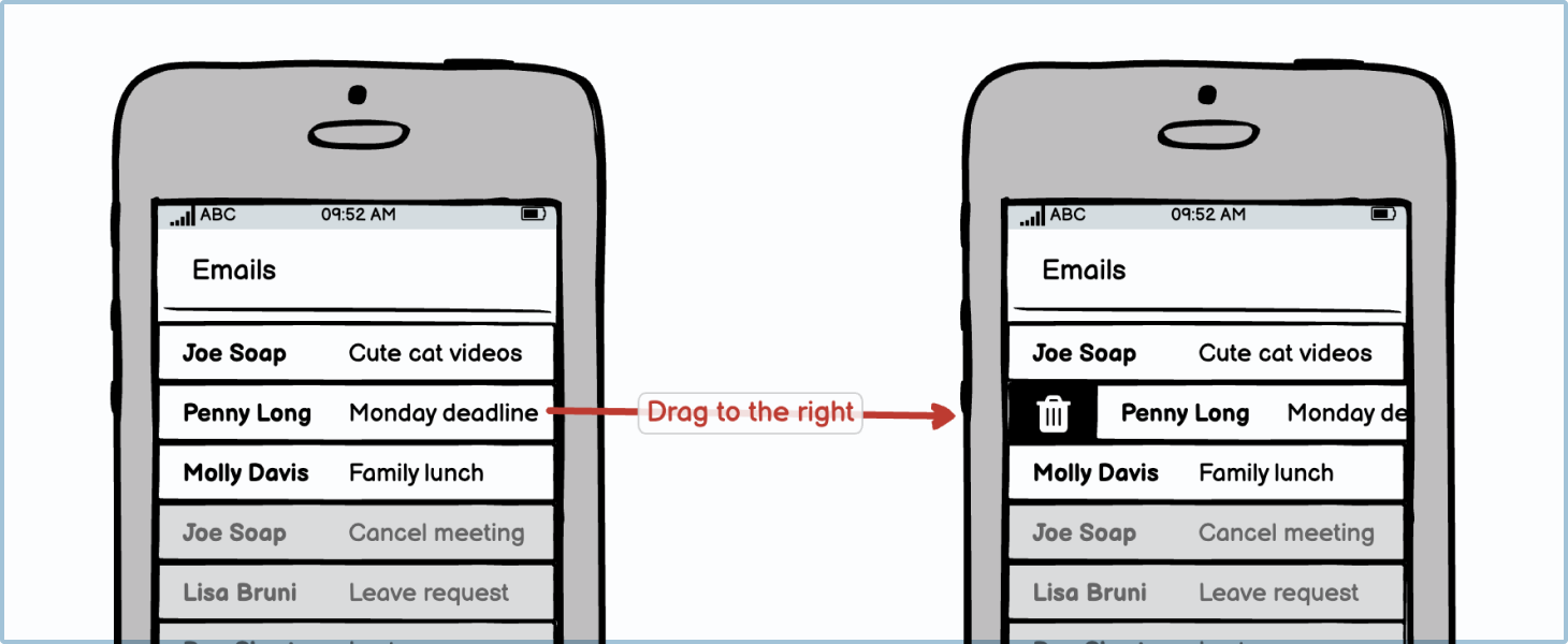
As you will know, user interfaces on touch devices aren’t made up only of links and buttons that need to be tapped. They also contain drags, pinches, pans, double taps, triple taps, zooms, and more.
Desktop applications also have more interactions than just clicking and scrolling. The keyboard allows for more user inputs, such as hitting the “Esc” key to close a window, and a computer mouse does different things if you use the right or left button. And most touch screens and desktops devices also allow for voice commands.
For these richer interactions, it’s always good practice to make it clear in your wireframe what interaction the user would have done to get to the next step in the user flow.
Curly brackets
Curly brackets are used to explain a concept about a component or a design to the reviewer. Usually, it’s used when the idea or component is new or an unusual design pattern.
Sticky notes
Sticky notes are used by team members to communicate new ideas or other information that's not apparent in the UI design. These could be suggestions, justifications, or ideas.
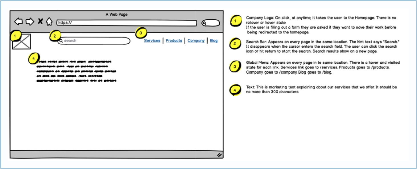
Callouts
Callouts are highlighted boxes that indicate important steps or features to the wireframe reviewer.
Annotation with legend
In some wireframes, stakeholders and reviewers may need more information about what’s happening in the design. Callouts can be used to indicate the section on the screen that needs more of a description, and the description itself can be put in a legend or key on the side.
Page numbering and names
Adding page numbers and names allows reviewers and other stakeholders to quickly navigate a user flow map. It also allows them to be able to easily count the number of screens in the flow.

Highlighting
Callouts can be used to highlight certain features or interactions.

Step counting and indicating
User flow maps can sometimes be misleading as they don’t clearly indicate the number of steps the user needs to take. A registration form, for example, has a lot more steps than a single sign-on. You can use a callout or highlight to count how many steps the user takes.

Red X and Scratch-Out
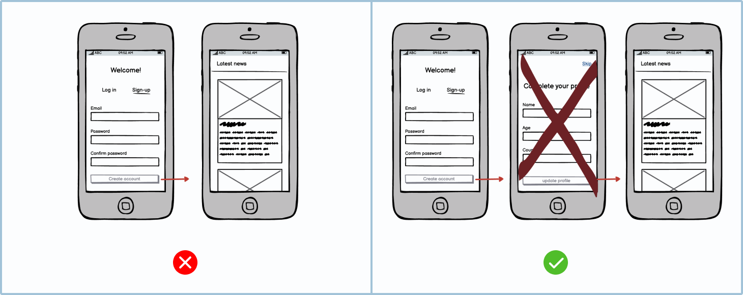
Wireframes are usually used for creating screens, but you may want to delete or remove a component when refining a user journey.
Before refining a user journey, it’s best practice to document what is currently in place by mapping it out. When doing this, you may notice pages or components that are redundant and that slow the user’s progress. Instead of redesigning the whole journey, it may be easier to delete those pages or elements.
To clarify to the reviewers that you’re removing a screen from the current user journey, you should cross it out rather than remove it. In the example below, the designer wants to remove the “Complete your profile” step. If they just remove it, it isn’t clear what the change is. Whereas crossing it out clearly communicates the desired update.
When to use a red X or a scratch-out
Both the red X and scratch-out can be used interchangeably. However, the red X is better for instances where you want the reviewer and other stakeholders to see what the screen was. The scratch-out, on the other hand, is better at obscuring what is beneath it.
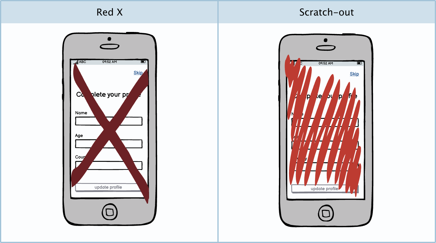
Sometimes when designers are creating a new flow and aren't sure about a particular screen, they may scratch it out and leave it off to the side rather than deleting it outright.