A radio button is a UI element that allows users to select a single option from a list.
Applies to:

Styles
There are 2 common visual styles for radio buttons that you can bring to your wireframes: simple and simple with an icon. There are also 2 different structural styles of radio buttons that you can consider as well: simple or hierarchical.
Simple
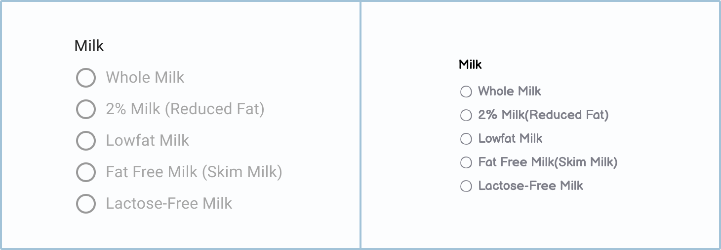
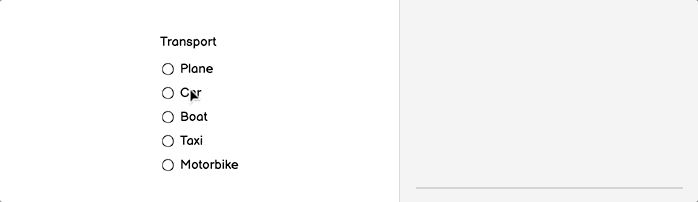
The simple radio button style is the most common type. This basic pattern is what you will probably use most of the time due to its ease of use.

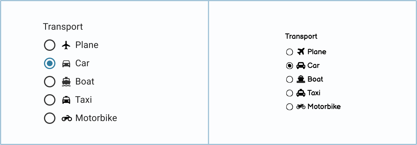
Simple with an icon
The addition of an icon can make a radio button list appear more attractive and inviting. However, this style is not always practical: the icons necessary for your options may not be readily available.
How to in Balsamiq To add an icon to your radio button, simply search for it in the Icon field.
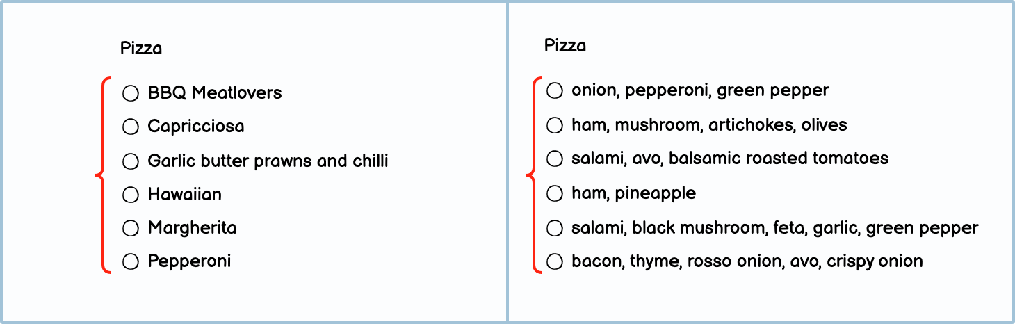
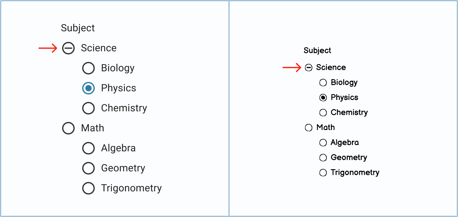
Hierarchy
In a standard radio button list, you would usually have less than 6 options. However, in instances where you need to show a much longer list, it's helpful to establish hierarchies or groupings. Breaking up options into groups makes it easier for the user to find what they're looking for.

Tip Usually, you would avoid having long lists of radio buttons. (If long lists are unavoidable, you would use a dropdown/combo box instead.) However, if you want your users to select both a "parent" category and a "child" option, you can use hierarchically organized radio buttons to do that.
Labels
The labels in a radio button component let the user know what they are supposed to do and what option best suits them.
Question label
The top label, or question label, should be short and to the point. Like most other input fields, the more direct it is, the easier it is for the user to fill out the form.
Option labels
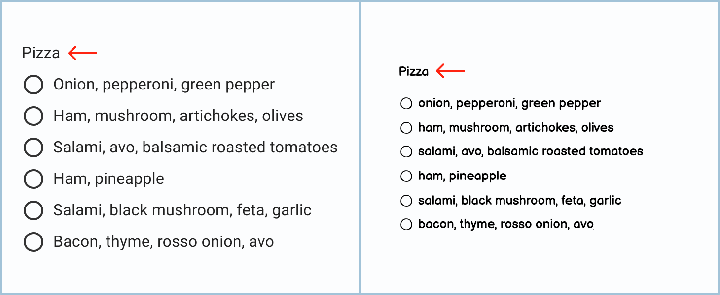
When it comes to making labels for your options, the main thing to keep in mind is consistency. If you do something one way for one, you have to do it that way for all. Here are a few rules you can set up to keep consistency:
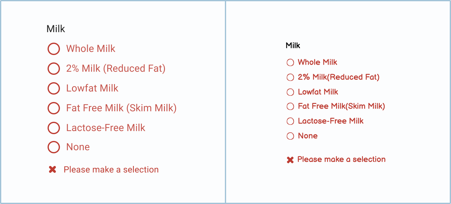
- Length. Decide whether you want to use single words, phrases, or sentences.
- Period. If you’re using sentences and phrases, decide whether or not you’re going to end with a period.
- Capitalization. Decide what case your label will be in. Your options are Title Case, Sentence case, lower case, and (the less advisable) ALL CAPS.
Tip When the question label is a word or a phrase, use sentence case. If the question label asks you to complete a sentence, then use lower case with a period.
Option label order
When deciding on what order to have your radio buttons in, you can consider some of the following options:
- Alphabetically or numerically. E.g., Apples, Bananas, Kiwis, Pears.
- Price. For items with a price attached to them, you may want to order them from the most to least expensive or vice versa. E.g., Bacon – $2, Avo – $1, Chili – $0.5.
- Scale. When selecting from a list of items that deal with size or magnitude, you can scale from biggest to smallest or vice versa. E.g., yearly, quarterly, monthly, weekly.
- Popularity. You may want to put your best sellers or most common choices at the top of the list.
- Profitability. You may want to arrange options in order from the most to the least profitable for the product or company.
- Shuffle. This method, often used in quizzes, will randomly shuffle the options each time to ensure that learners don’t cheat.
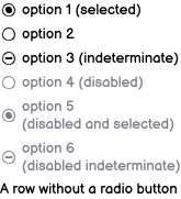
States
Radio buttons change their state or appearance so that users know what to do or what the system is doing.
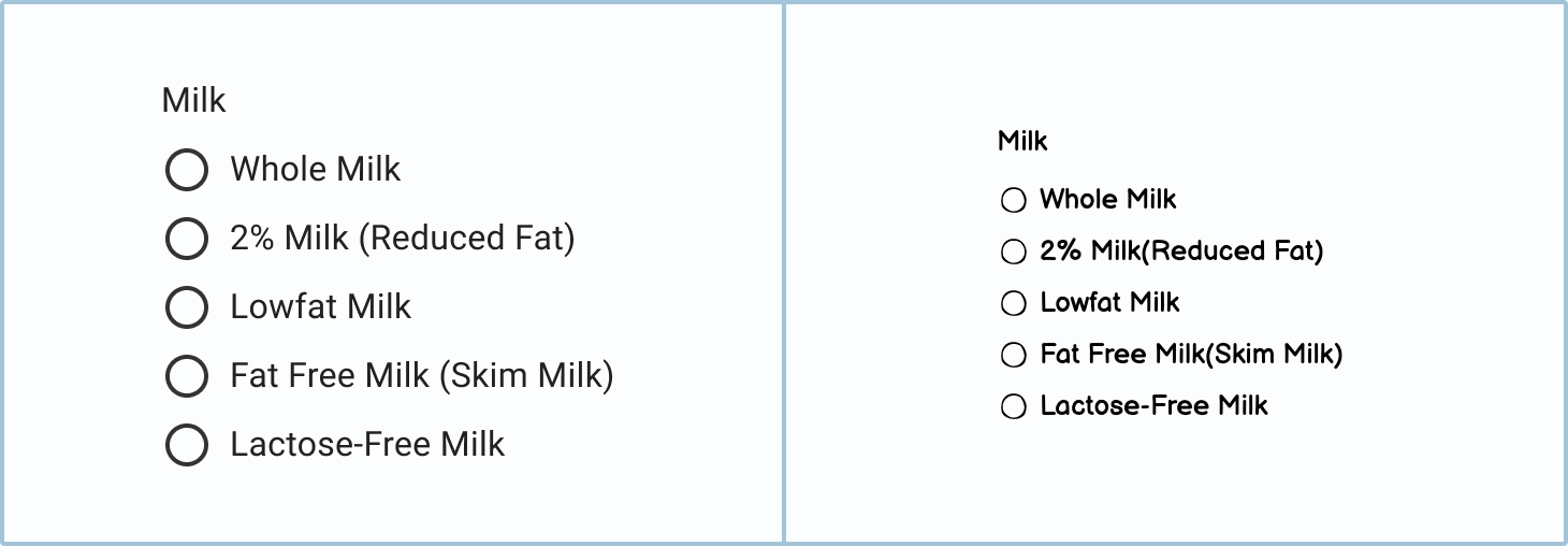
Normal
This is the starting state of most radio buttons. As you can see in the example below, no options are selected.
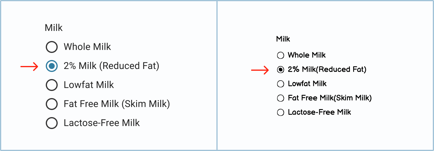
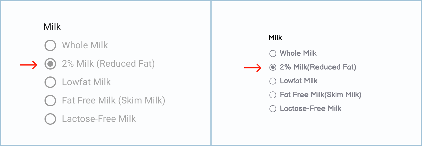
Selected
Once the user has clicked on an option, the radio button’s circle will change its appearance to indicate that it is selected.
Disabled
When the disabled state is set, the user won’t be able to interact with the options. This will usually be because they have to select something else first.
Disabled and selected
An option can be disabled and selected if it was preselected for the user and they aren’t able to change their selection without altering another UI element.
Indeterminate
The indeterminate state is when a “parent” radio button is neither on nor off. It can be used to indicate that one of its children is selected.
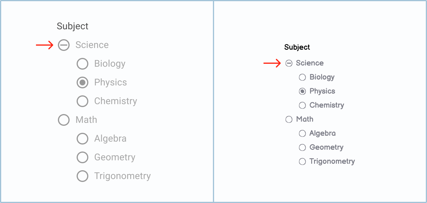
Disabled and indeterminate
The disabled and indeterminate state is when an option is disabled and it has a selected child.
How to in Balsamiq In Balsamiq, you can switch your radio button’s state by using the State dropdown in the UI element panel.
Feedback
Feedback lets the user know that they haven’t filled out the form correctly or that their answer is wrong.
Incomplete
Since a selector’s options are predetermined, there will usually only be one type of error feedback: the “incomplete” type. The user will only receive it if they click the 'submit' button before filling out the form.
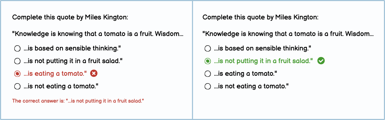
Feedback in a quiz
There is another type of error feedback associated with radio buttons in the context of online learning or quizzes. This type of feedback lets the user or learner know if they got the question right or wrong after they have submitted their answer.
Best practices
There are a few best practices when it comes to radio buttons. Overall, you want to make sure that the already laborious task of filling out forms is as easy and intuitive as possible.
When to use radio buttons
Radio buttons are very similar to on/off switches, dropdowns, and checkboxes. However, in some circumstances, they are a better choice than these alternative formats.
When you should use radio buttons:
- If there are roughly less than 6 options.
- If the options are longer than a few words, and especially if they are sentences.
- If the user needs to be able to see all options at the same time.
- If you want to force the user to click 'save' or 'submit' to confirm their selection.

Radio buttons vs. checkboxes
Checkboxes, like radio buttons, present multiple options in a list. Unlike radio buttons, however, they allow you to choose more than one option.
When you should use checkboxes:
- If you want users to select multiple options. This is especially true if they get charged per extra option (pizza toppings, for example).
- If you want to give your user the choice of selecting none of the options.

Radio buttons vs. dropdowns
Like radio buttons, dropdowns are single selectors, meaning that you can only select one option from the list at a time. While there are no hard and fast rules, there are some guidelines you can follow.
When you should use dropdowns:
- If you have more than 6 options.
- If you need to save space in your interface.

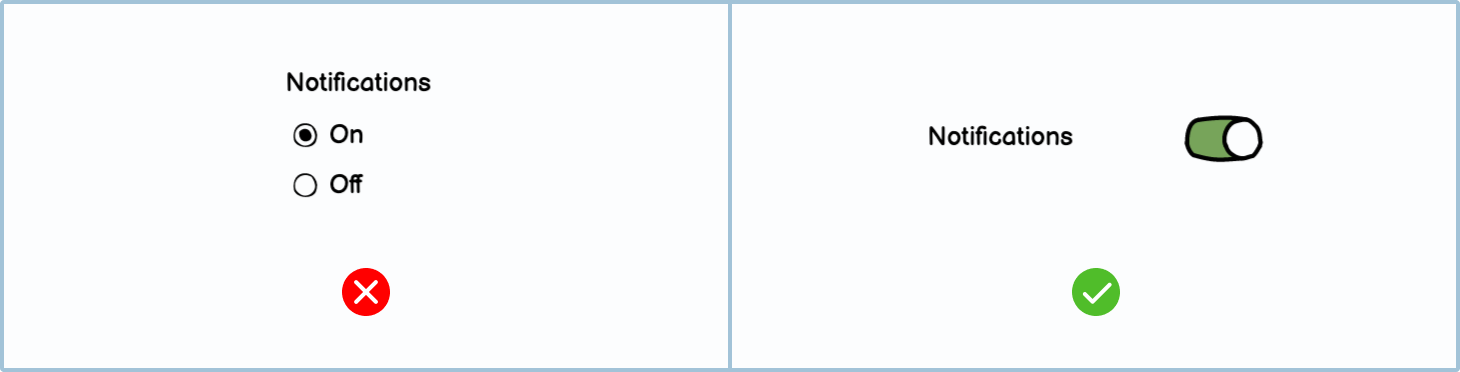
Radio buttons vs. on/off switches
An on/off switch, like a radio button, can only ever have one option selected. However, unlike a radio button, a switch can have only 2 options, which usually relate to something being active or inactive.
When you should use on/off switches:
- If there are only 2 options.
- If the 2 options are paired alternatives, such as “on”/“off,” “yes”/“no,” or “active”/“disabled.”
- If you want the action to be instant. When you toggle an on/off switch, it should instantly make the change. Whereas with a radio button you usually have to select 'save' or 'submit' to confirm the action.
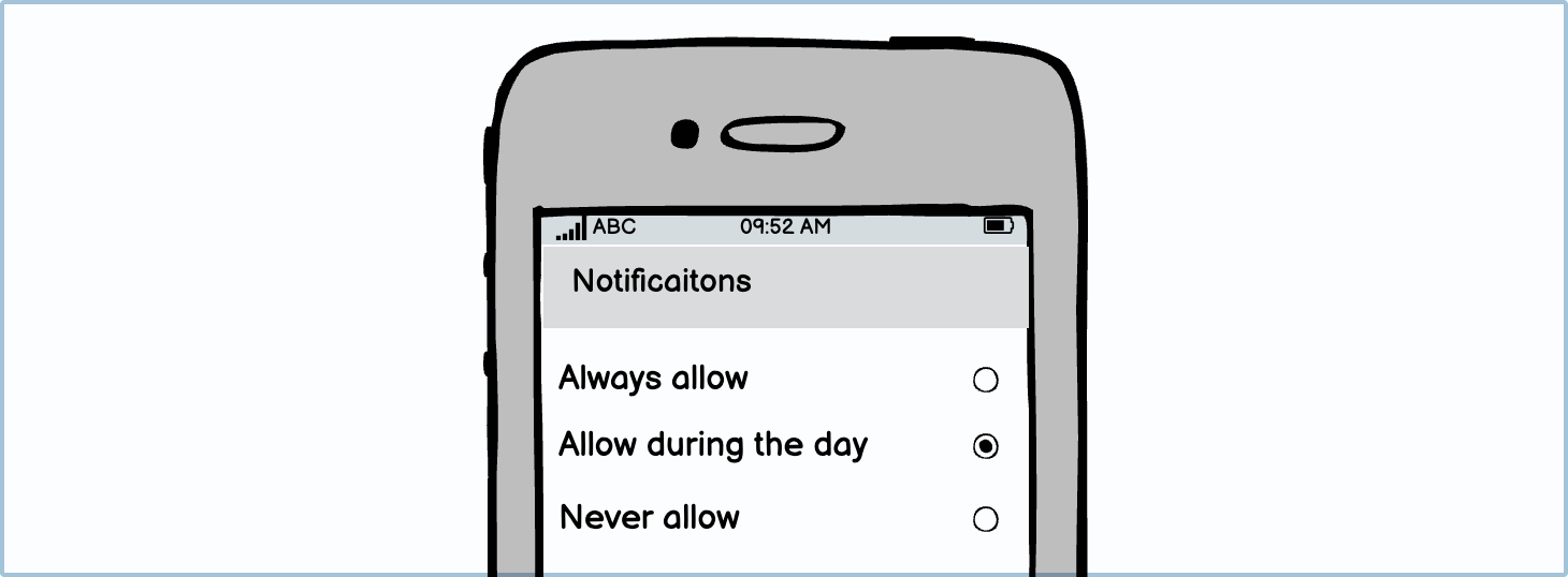
Radio buttons on mobile
Radio buttons on websites are usually treated like bullet points. However, on mobile, we have to think about how users interact with their phones and how we can make using these UI elements easier for them. When a right-handed person (approximately 90% of the population) uses a phone, it is easier for their thumb to reach the UI elements on the screen’s right-hand side. Knowing this, consider putting the radio buttons’ “circles” in reach of their thumb on the right side.
Preselect the most popular option
One of the flaws with having nothing preselected is that once the user has selected an option, they can’t go back to having nothing set. Thus, many interfaces opt to have the most popular option preselected. (Except, of course, in quizzes and online learning tests.)

UX dark pattern Some interfaces preselect radio buttons that are the more expensive option to try and trick their users into spending more money than intended. While it may be more profitable in the short run, it’s likely to create much frustration and damage your company’s reputation going forward. Rather preselect the most popular or cheapest option.
Variations
You can choose to use other variations of radio buttons to make your designs easier to create.
UI elements included in Balsamiq
Balsamiq offers a wide range of pre-made UI elements. Use search to find the one you need, then drop it directly into your wireframe.
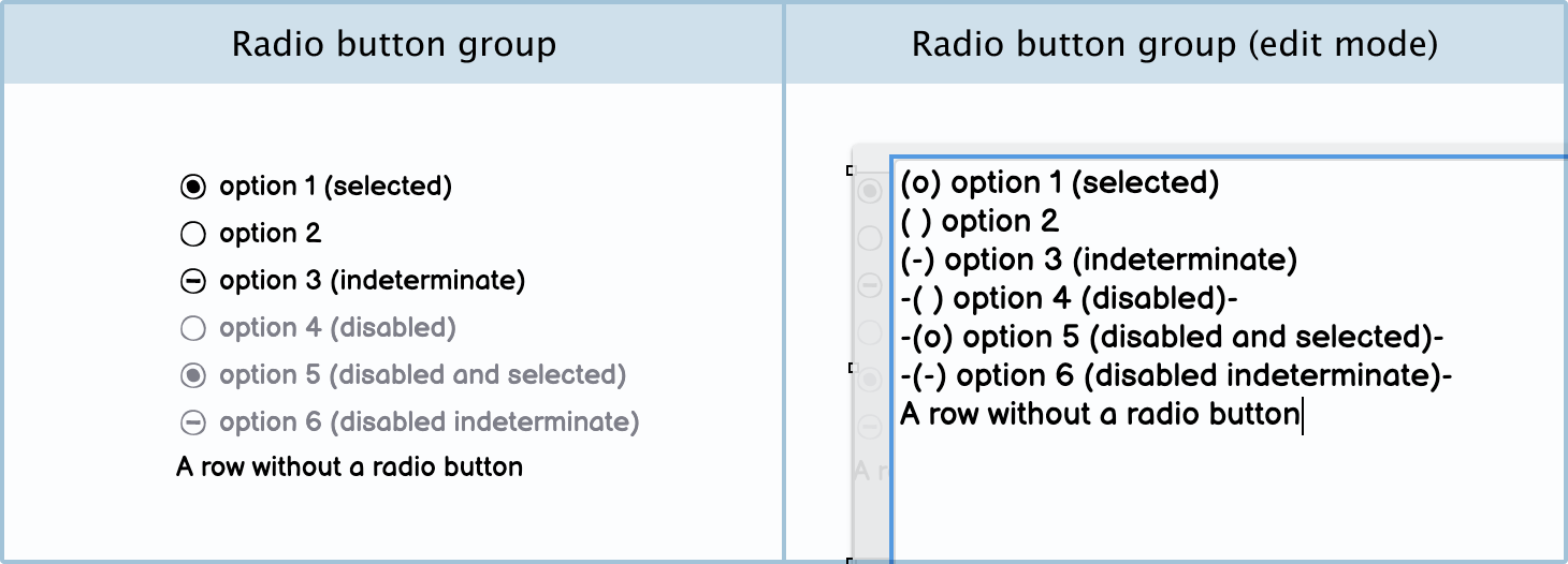
Radio button group: Using a radio button group will save you time when creating your options. Instead of using individual UI elements, you can just use a radio button group and update them all from the same list. You will need to keep note of the formatting syntax used to create these options.