Text in an interface guides users along their desired journey through input labels, page titles, body copy, links, feedback messages, and more.
Applies to:


Common text types
Text types are usually derived from the size of their font, as well as their purpose and position.
Titles
Titles help orientate the user and tell them what the rest of the page or page section is about.
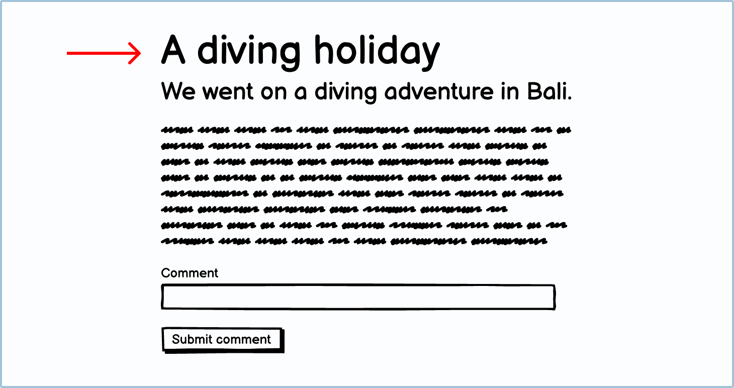
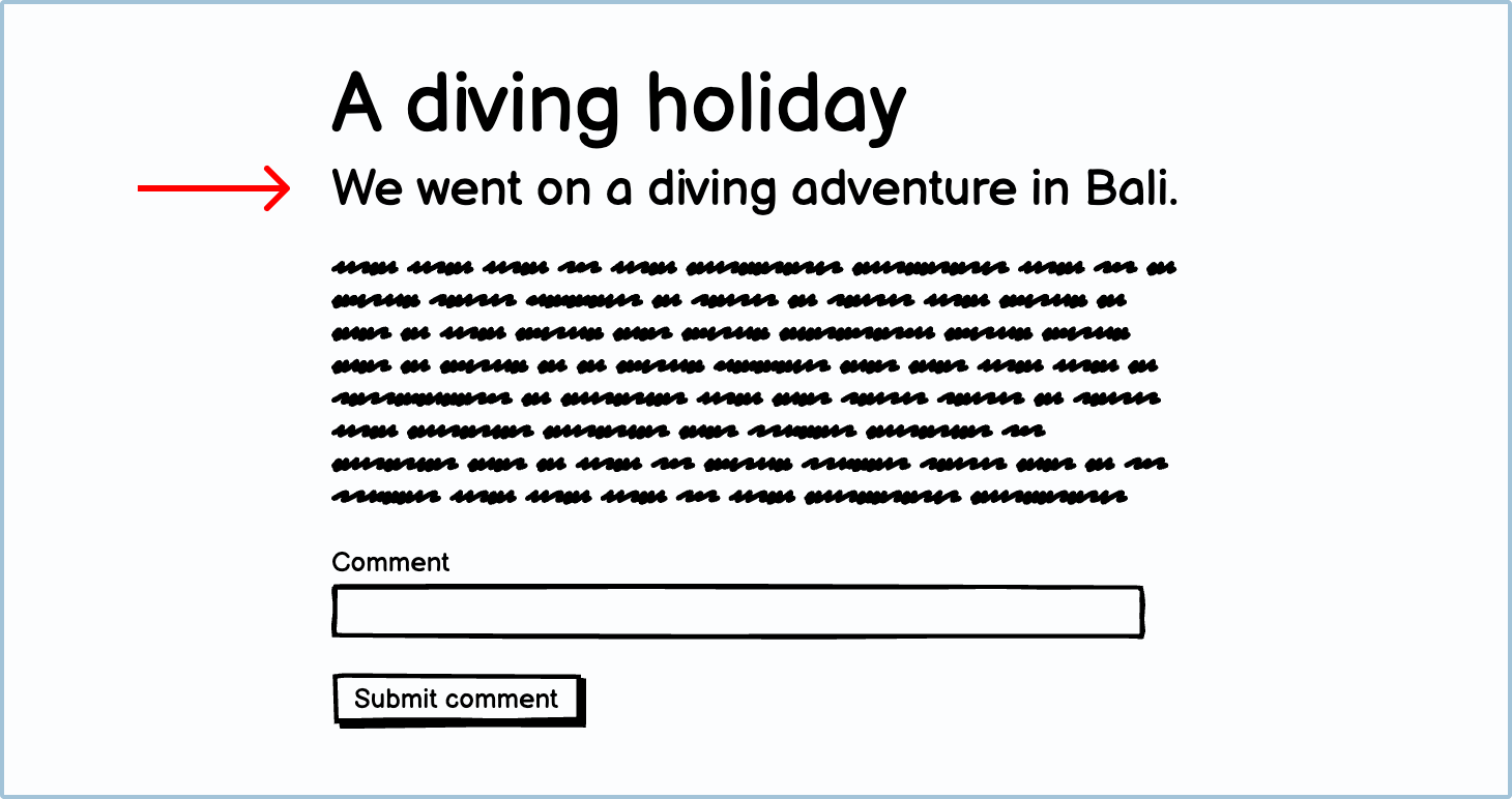
Subtitles
Subtitles give the user more context as to what the page or section is about. They are usually bigger than body copy but smaller than the title.
Body copy
Body copy is used to describe and flesh out a topic. It is often used in blog posts, articles, and legal text.
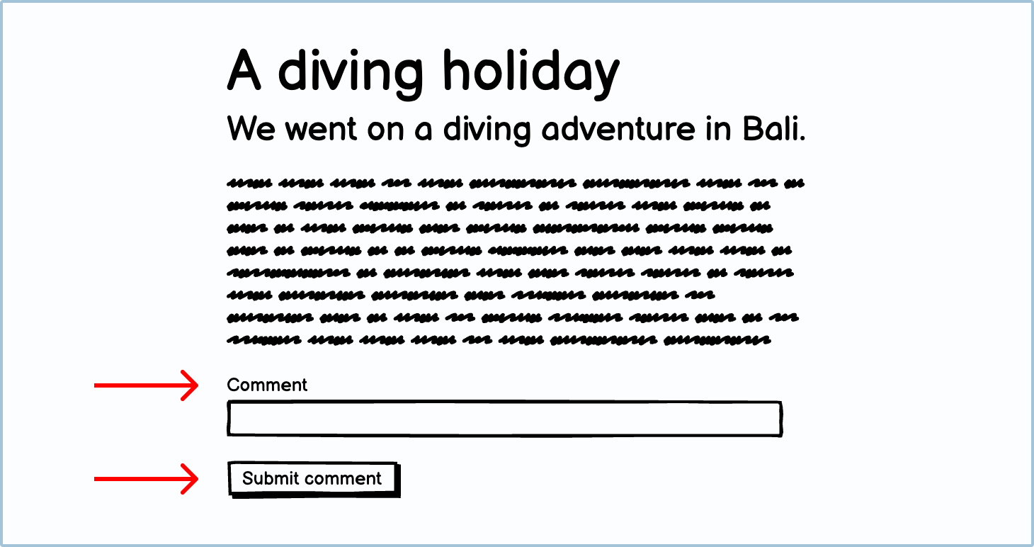
Labels
Labels are usually 1–2 words that are typically associated with user input like text fields, buttons, checkboxes, etc.
Text uses in wireframes
There are many different uses for text in wireframes.
Orientational
Navigational text can introduce users to a page and help orientate them. This will usually be done by the page’s main heading.
Good orientational text checklist:
- The user should be able to tell what page they’re on right away.
- Usually title text.

Explanatory
Some user journeys are more challenging than others and may require an explanation of the outcome of the choice users are about to make.
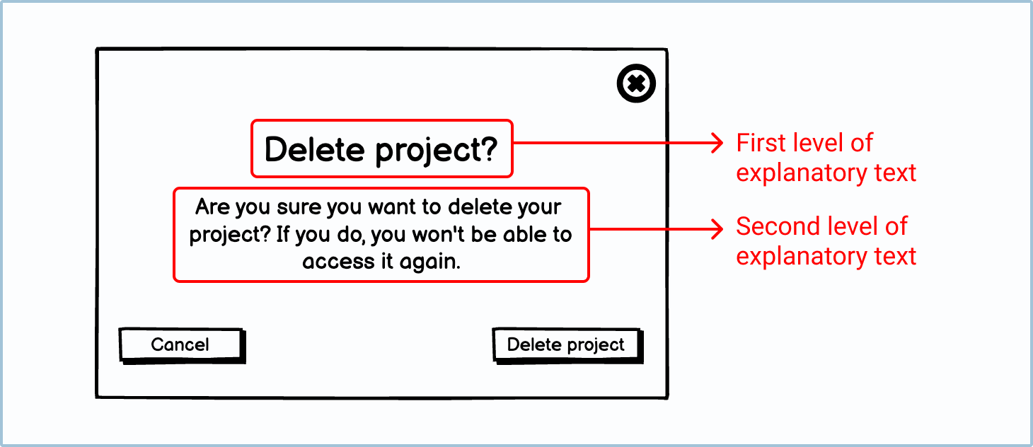
Ideally, there should be 2 layers of explanatory text: a bold title and a clarifying description. The first level of explanatory text allows more confident or experienced users to understand the explanatory text at a glance. This lets them move through their journey without getting bogged down with too much reading. The second level allows newer or less confident users to check that they have properly understood the first level.
Good explanatory text checklist:
- Users should know what the outcome of their decisions will be.
- The user should know how to complete a task.
- Ideally, there should be a short title and a longer description.
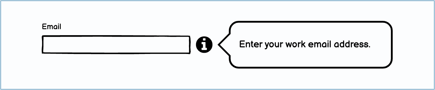
Instructive
Some text is used to tell the user what to do. Sometimes this can be as simple as the label above a text input. Other times, it has to be more descriptive to help the user make the right decision.
Good instructive text checklist:
- Instructive text should make sense within its context.
- The instructions should be as short as possible but should also allow for longer explanations if needed.
Navigational
Links and button text (and occasionally icons) let the user know where they will be taken to if they click the link or button.
Good navigational text checklist:
- Navigational text should be short and to the point.

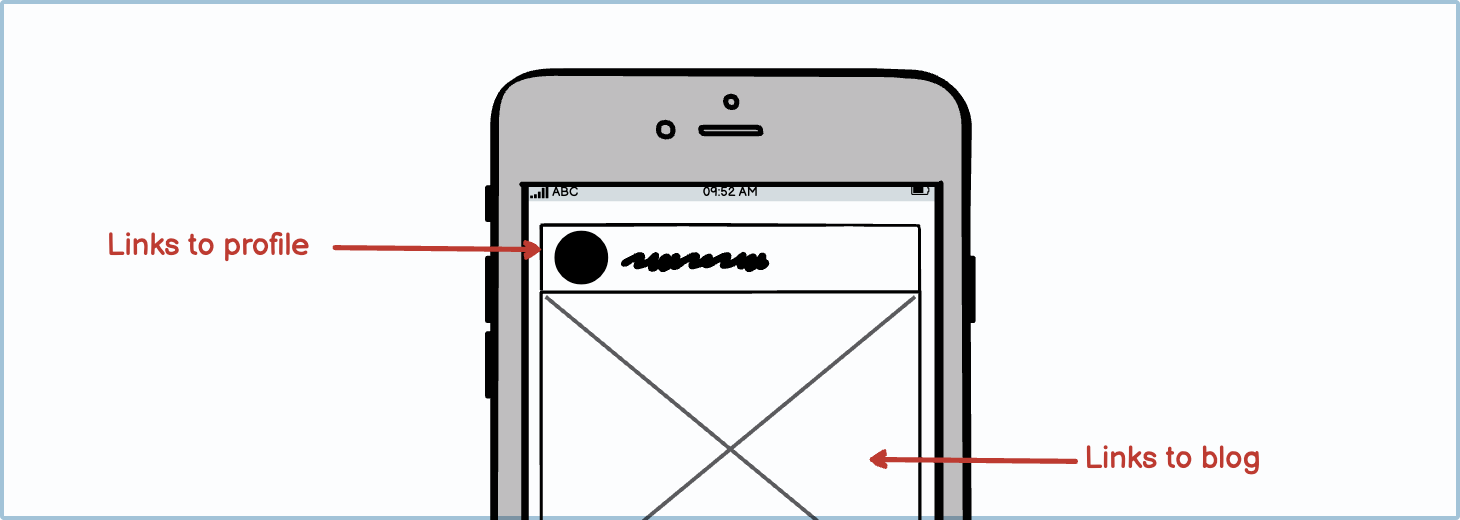
Annotative
Annotations are not part of the final product; they are used to help other people looking at your wireframes to understand the different functions and features you envision.
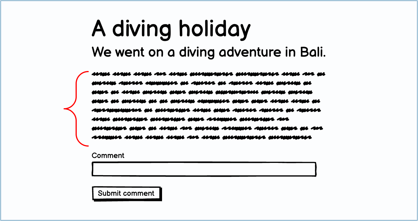
Descriptive
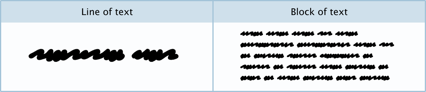
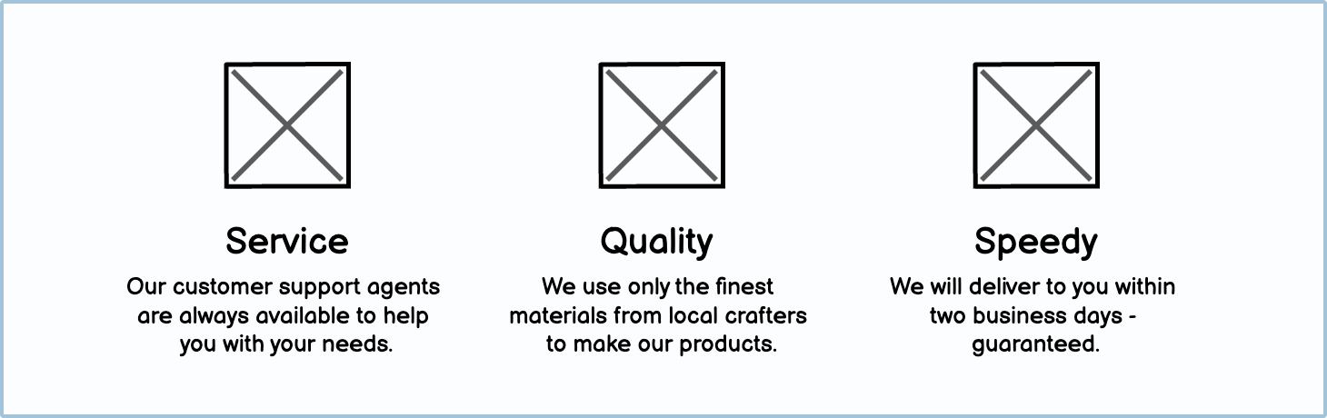
Descriptive copy, or body copy, usually elaborates on an idea or concept. It can be found beneath headings in blog posts, legal messages, welcome messages, and more. You can often substitute this type of copy with scribble text in wireframes.
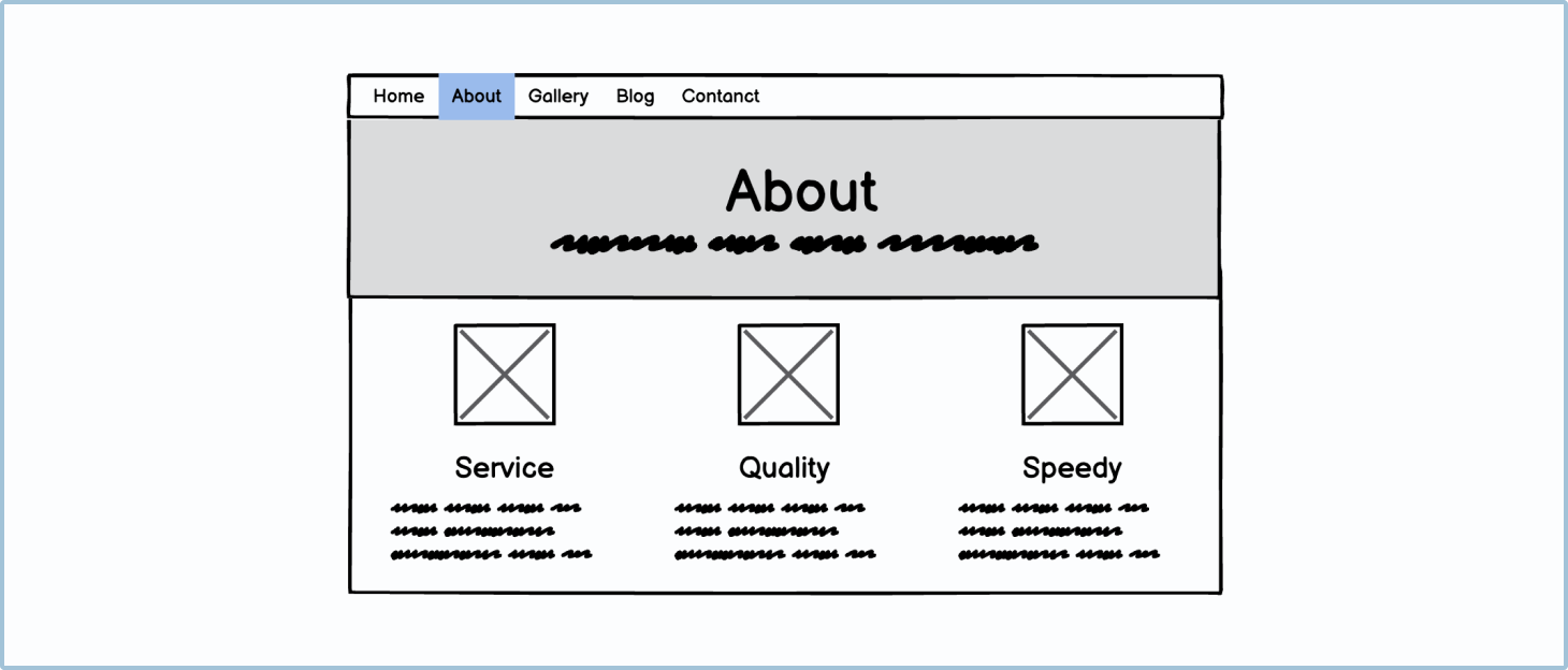
Scribble copy vs. actual text
Deciding on whether to use scribble copy (an abstract representation of text), or actual text for body text should be determined by how deep into the design process your project is.
At the beginning of the design process
At the beginning of the wireframing process, you are researching and exploring your options. At this stage, rapid wireframing is essential. You don’t want to waste this precious time writing out all the little bits and pieces of information; you just need to get the big idea across.
As a general rule, you should only ever use scribble copy for body copy or descriptive text.
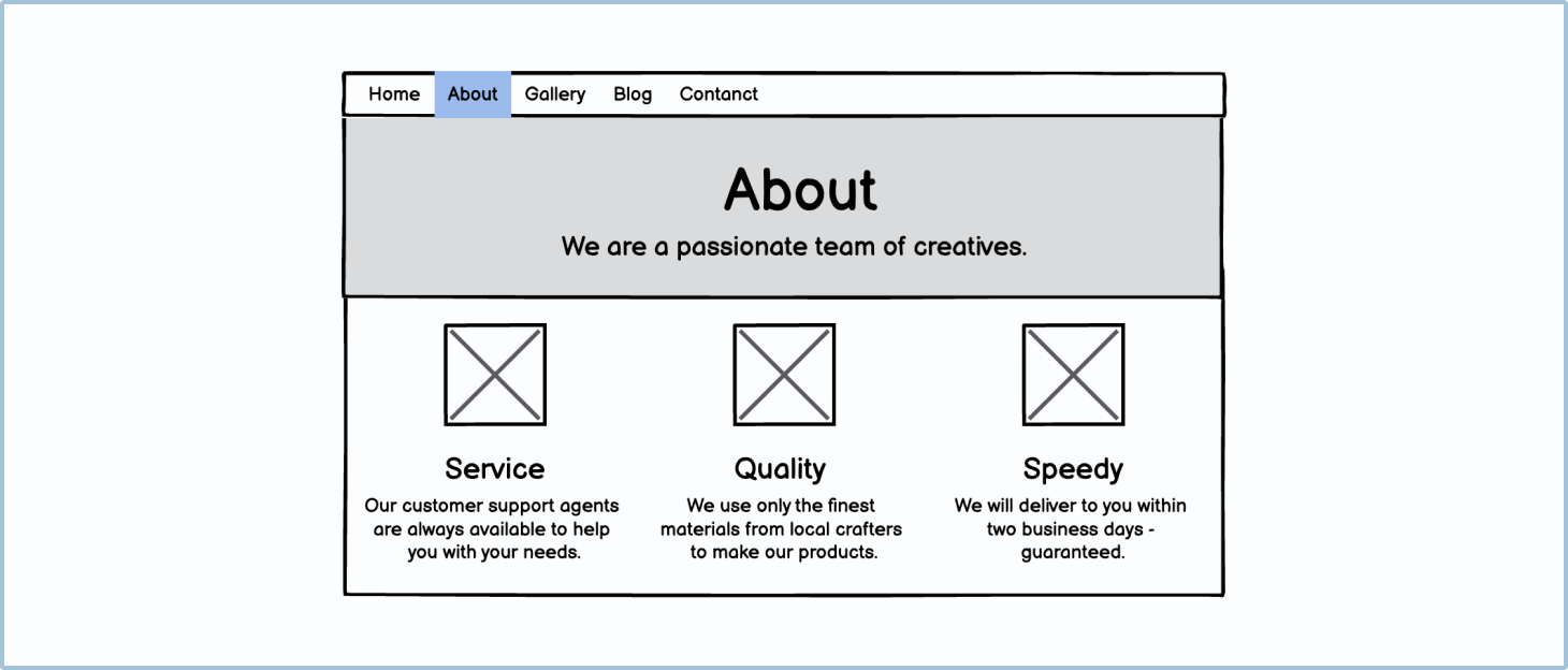
Toward the end of the design process
Toward the end of your design process, you should have no scribble copy in your designs. The general rule is that if you don’t know what to write in a designated body copy area, the area is unnecessary and you should cut it from your design.
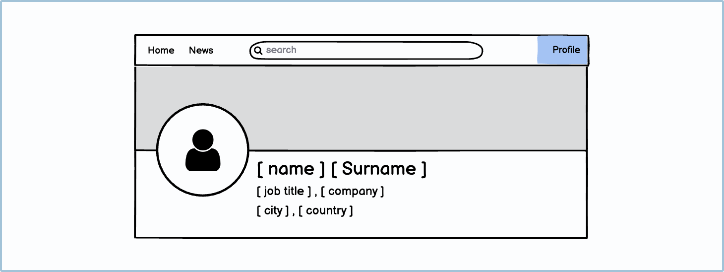
Showing data variables vs. dummy content
Data variables usually refer to what you would reference from a database. For example, “[surname]” would refer to the database of user surnames. Dummy or placeholder content is fake text and images, used to make an interface look more realistic. Whether it’s better to show real data variables or dummy content depends on the audience you’re designing for.
Designing for non-technical audiences
As a software creator, it’s very easy to forget that not everyone thinks about technology the way you do. When talking to colleagues or users who don’t have the same background as you, use dummy content. This will make the wireframes look more realistic and easier to understand.

Designing for a technical audience
When getting closer to your final designs, it’s sometimes good to convert all relevant text to data variables. This helps ensure that your logic is sound and that you haven’t forgotten to include anything. This also allows the development team to understand where the information should be coming from.
Best practices
There are a few best practices when it comes to working with text in wireframes.
The title should always be at the top of the page
The title should always be at the top of the page and clearly visible to the user. This will help to orientate them and to introduce them to the page.
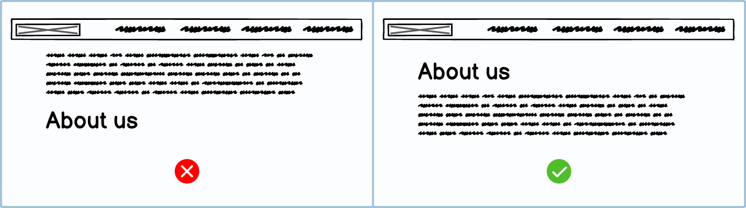
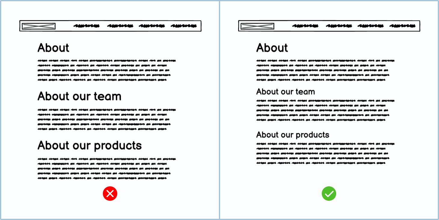
Only have one title per page
There should only be one title per page. Having multiple titles is confusing for the user and bad for search engine optimization.
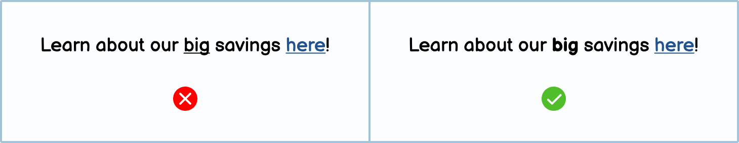
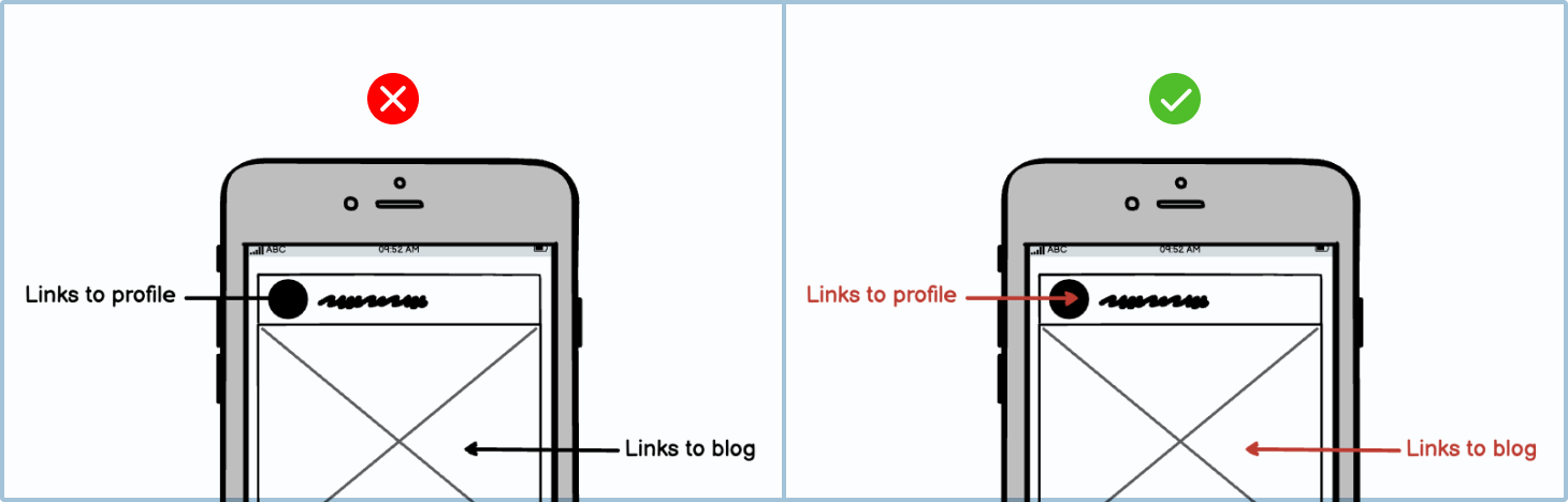
Don’t make text look like a link unless it is one
It might be tempting to underline text or use colors to make text seem more important, but this can confuse your users. It’s preferable to use bold text for emphasis.
Annotated text should always be clearly indicated
Annotated text should always be in a different color to clearly indicate that it’s not part of the interface design.
A shared wireframe should never just be scribble text
Your first wireframes should be made quickly but with thought. When your wireframe is just scribble text, it isn’t clear to users or colleagues what it’s supposed to do. So even when you’re designing rapidly, you should make sure all your headings are actual text and not scribble text before you share your design.
Use text sparingly
As a general rule of thumb, the more text there is, the less chance someone will read it. You should remove or hide any information that isn’t important, and shorten instructions where possible.
Variations
You can use different types and styles of text in your wireframes.
UI elements included in Balsamiq
Balsamiq offers a wide range of pre-made button UI elements. Use search to find the one you need, then drop it directly into your wireframe.
Text
Text: Used for titles, subtitles, labels and body copy.
Scribble text
Line of text: Used to indicate small headings or labels.
Block of text: Used for bodies of text.