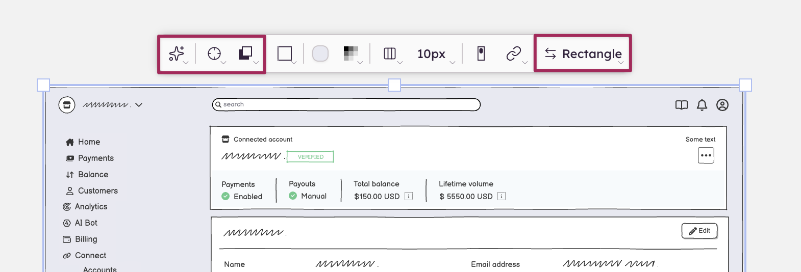
The selection toolbar
On this page
The selection toolbar is a floating toolbar that appears directly above a selected element. It allows you to set properties for the selected UI element, such as alignment, position and size, text properties, color, etc.
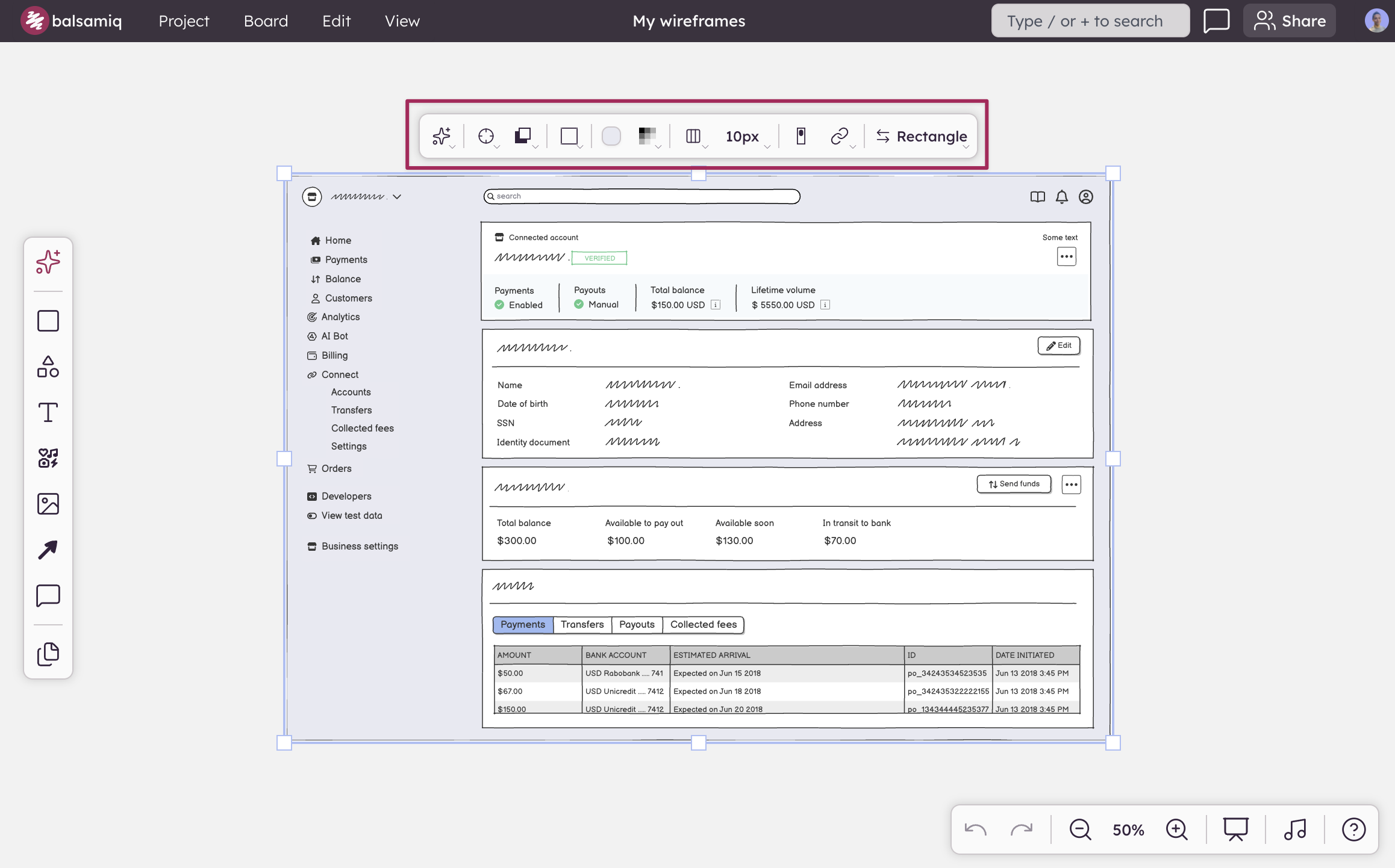
If you have multiple UI elements selected, it will display properties that are common to all the selected UI elements, as well as options for aligning and distributing the selection.
Common selection toolbar controls
These controls appear for any selected element:
- AI: Edit the selected UI element with AI.
- Position & size: X, Y, width, and height fields. Arrow keys nudge values while a field is focused.
- Layering: Bring forward, send backward, bring to front, send to back.
- Element name + Transform: Shows the element type (e.g., "Button", "Rectangle"). Click to convert the element to a different one.
Specific selection toolbar controls
These appear only when relevant to the selected UI element.
Text & typography
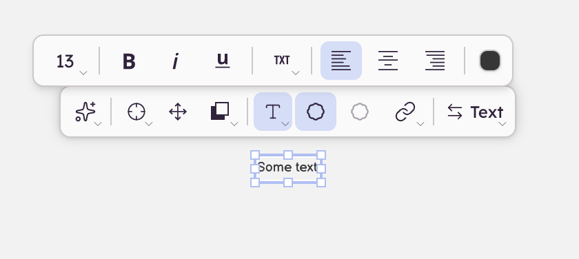
- Font size, bold, italic, underline
- Text color
- Text alignment (left, center, right)
- Text orientation (horizontal, vertical, slanted)
Note: Text controls in the toolbar apply to the entire element and override any per-character formatting applied during inline text editing. Inline formatting (such as making a single word bold) will be lost if you change a text property from the toolbar.
Color & style
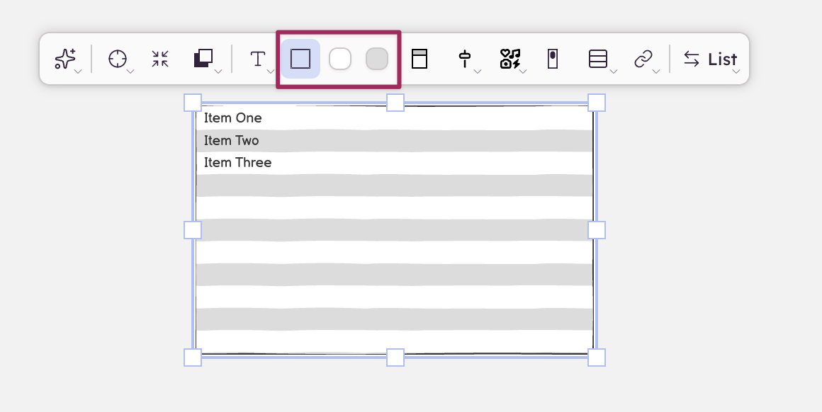
- Fill color (shown as a preview swatch in the toolbar)
- Border style and color
- Stroke style (line elements)
- Background color / row color (lists)
Linking
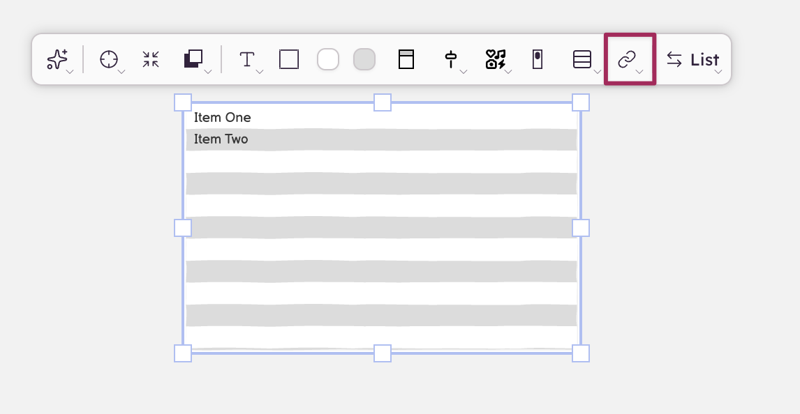
A chain-link icon appears in the toolbar for any element that supports linking.
- Single link: clicking the icon opens a dropdown where you can choose a destination board, enter a web address, or remove the link.
- UI elements with multiple sub-items (Link bar, AppBar): clicking the icon opens a popover with one row per sub-item. Each row has its own destination dropdown.
Multi-select behavior
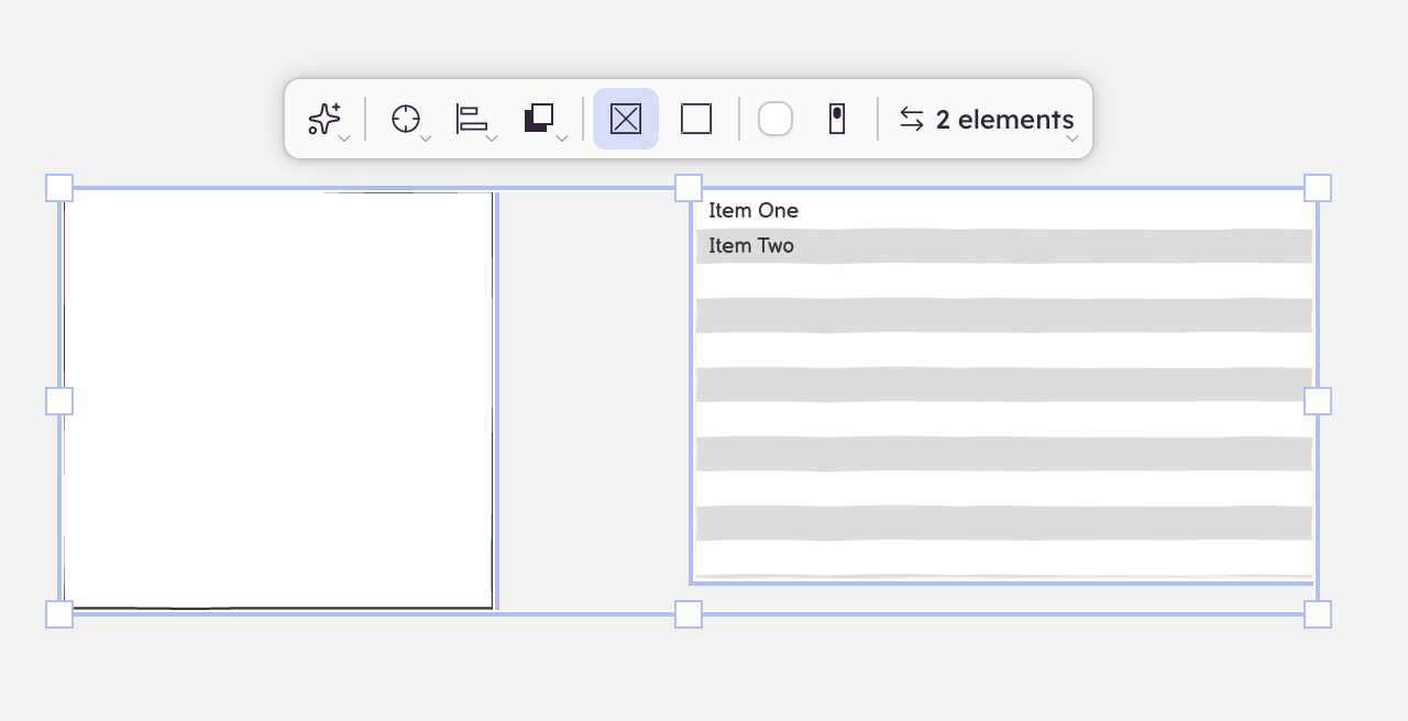
When two or more elements are selected:
- The toolbar shows only properties that exist on all selected elements
- Alignment controls appear (align left, center, right, and other axes) — these only show up for multi-select
- Changes apply to all selected elements at once
Components
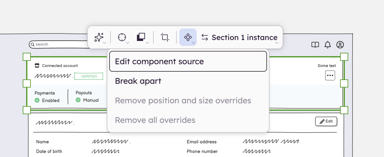
When a component instance is selected, the Transform area in the toolbar shows:
- The component's name
- Edit component: opens the component source for editing
- Break apart: detaches the instance from the component
When you override a property on a component instance (such as changing the text or color), the component button turns green to indicate overrides are active. You can remove individual overrides from the component menu ("Remove [property] override").