The toolbar
On this page
The outer edge of the Balsamiq editor has a series of buttons and fields that allow you to wireframe with just the board.
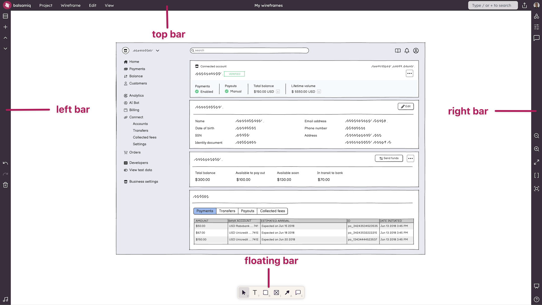
We've split the toolbar into three main sections.
The top bar
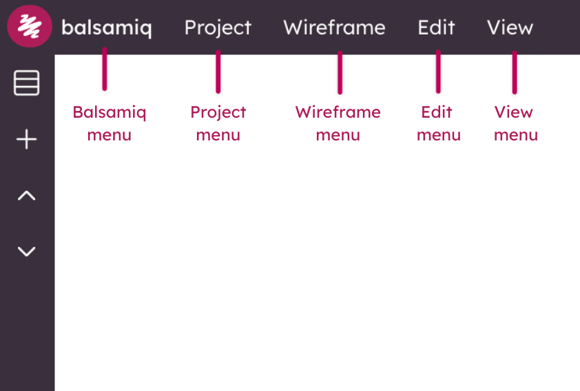
The upper-left holds most of the editor menus.
- Project Menu - This menu has all of the options for the project.
- Board Menu - This menu has all of the options for the currently selected board.
- Edit Menu - This menu has all of the editing options for the currently selected board.
- View Menu - This menu has all of the viewing options for the project.
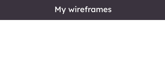
The middle part of the Top Bar holds your project name. Double-click it to rename your project.
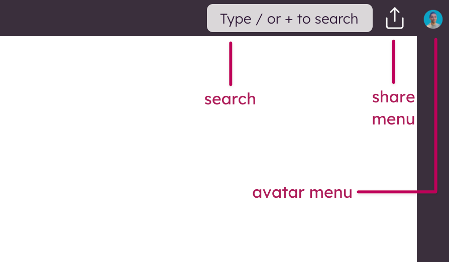
Finally, the upper-right portion of the Top Bar has a couple more useful tools.
- Search - Use search to find UI elements, icons and templates.
- Share - This opens the sharing settings for this project.
- Avatar Menu - This is where you can open your User Settings, manage your subscription (only in Balsamiq Cloud), change Spaces (if you have more than one), create a new Space.
Note: The Share and Avatar Menu options listed above are specific to Balsamiq Cloud.
The left bar
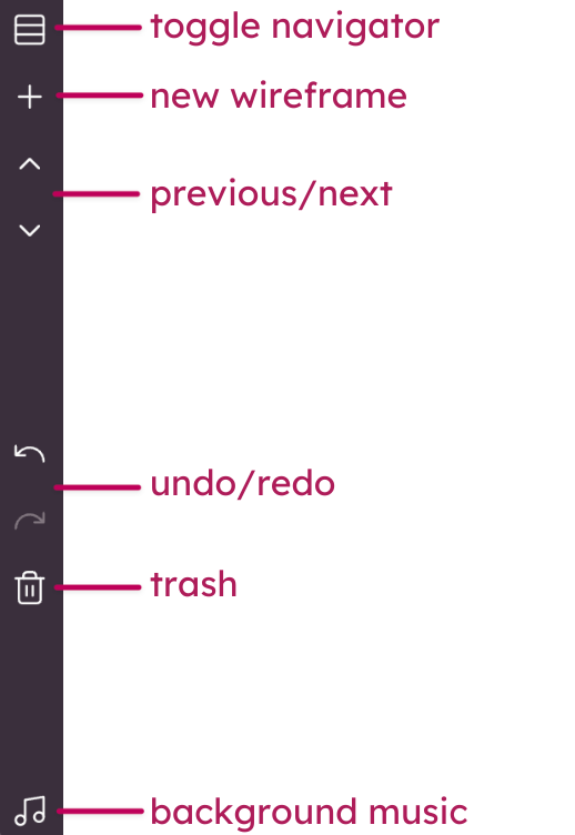
The left bar help you to navigate and add UI elements to your project:
- Balsamiq AI (Beta) - This button will toggle the Balsamiq AI assistant.
- Toggle UI Library - This button will toggle the UI Library.
- Rectangle (R) - Add a Rectangle element to the board. The default is a Rectangle but you can change the shape in the property inspector.
- Text (T) - Add a Text Paragraph element to the board.
- Image (I) - Add an Image element to the board. The default is a placeholder but you can add your own images in the property inspector.
- Arrow (A) - Add an Arrow element to the board. Remove the arrow heads in the property inspector to get a simple line.
- Comment (C) - Quickly add a comment with callout to the board at the cursor position.
- Toggle boards panel - This allows you to display and hide the boards panel. Great for clearing up screen real estate.
Note: The indicated shortcut keys allow you to quickly switch between the options.
The bottom-right bar
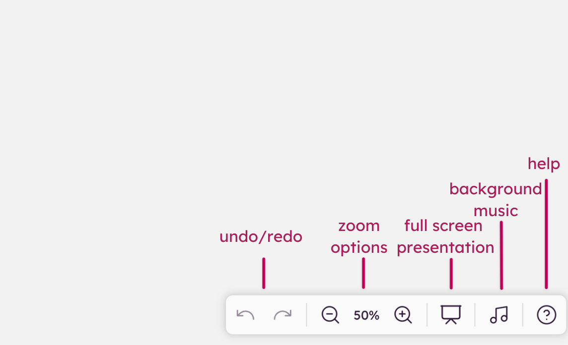
The bottom-right bar allows you to control your view of the board:
- Undo/redo - Allows you to undo/redo the last change.
- Zoom options - Zoom in/out, Zoom to Actual Size, Zoom to Width and Zoom to Fit.
- Full Screen Presentation Mode - Pressing this button will open Full Screen Presentation Mode.
- Toggle Background Music - This allows you to play and stop the built-in background music.
- Help - Lets you search the Balsamiq documentation or reach out to our Support team.