Contact pages are easy to overlook. They're not glamorous, and they don't drive conversions the way a landing page does. But a poorly designed contact page creates friction at exactly the wrong moment: when someone has already decided they want to reach you.
The structure matters more than you think. A clear form, the right fields, and a reassuring message can mean the difference between a sale and someone ghosting you forever. That’s exactly why you should wireframe your contact page first. It helps you lock in the structure and avoid getting lost in design decisions or redoing work later.
Let's walk through how to do this with Balsamiq.
How to create a contact us page wireframe with Balsamiq in 6 steps
Wireframing a contact page is simpler than it sounds, especially when you let Balsamiq AI do the heavy lifting on the first draft. Here's how to go from blank canvas to a complete, thoughtful user flow.
For this walkthrough, we’re building a hypothetical contact us page for an auto repair shop. It’s a great example because we’re designing for two types of users with completely different needs—one who’s broken down and needs immediate assistance, and another who’s planning a service appointment.
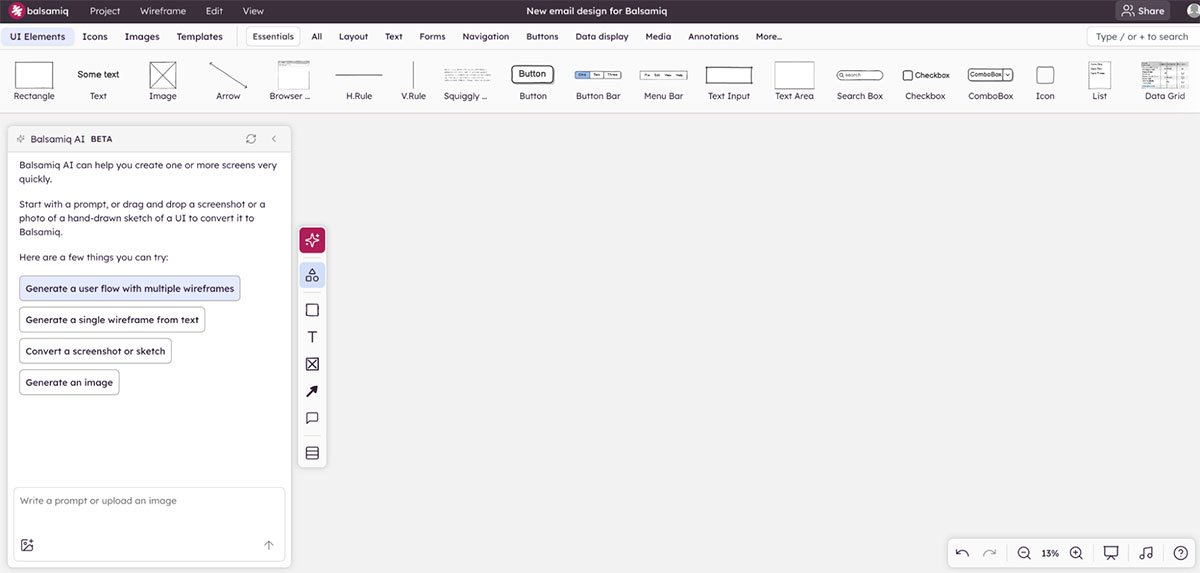
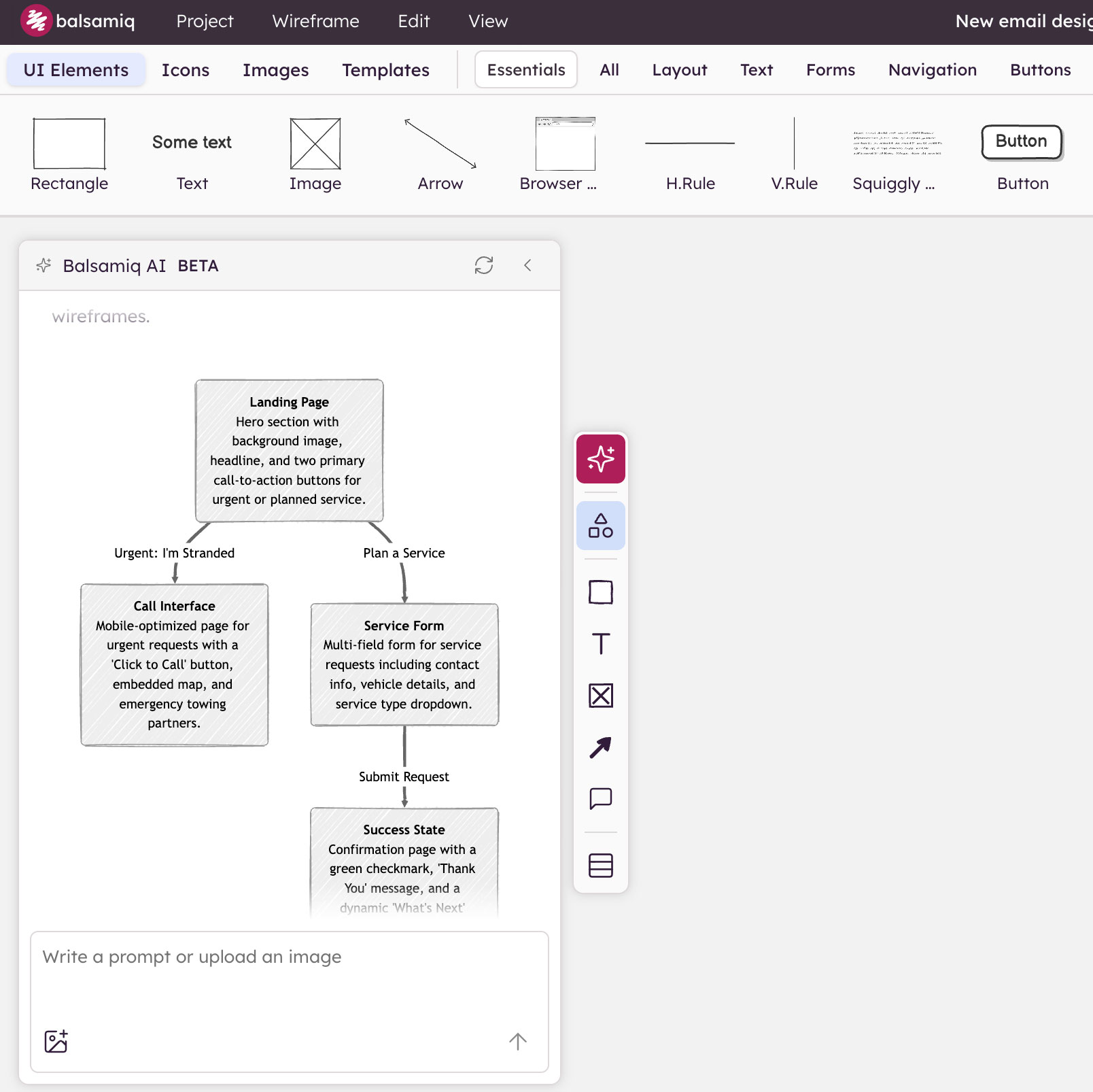
Step 1: Use Balsamiq AI to generate a user flow
This is where things get interesting. Instead of starting with a single screen, use Balsamiq AI to generate a multi-screen user flow in one prompt. Simply select “Generate a user flow with multiple wireframes,” and let Balsamiq map out how every element connects before generating anything.
It’s important to be as descriptive as possible in your prompt to get richer results. For our auto repair example, the prompt outlines five screens:
- A landing page with triage buttons ("Urgent: I'm Stranded" and "Plan a Service")
- A mobile-optimized urgent request screen
- A service request form
- A success state, and
- A final appointment confirmation
You can be even more specific by instructing Balsamiq to use a specific color palette, clearly defined headers and footers, and legible UI elements. You want to create something that actually looks like a real web page rather than an abstract diagram.
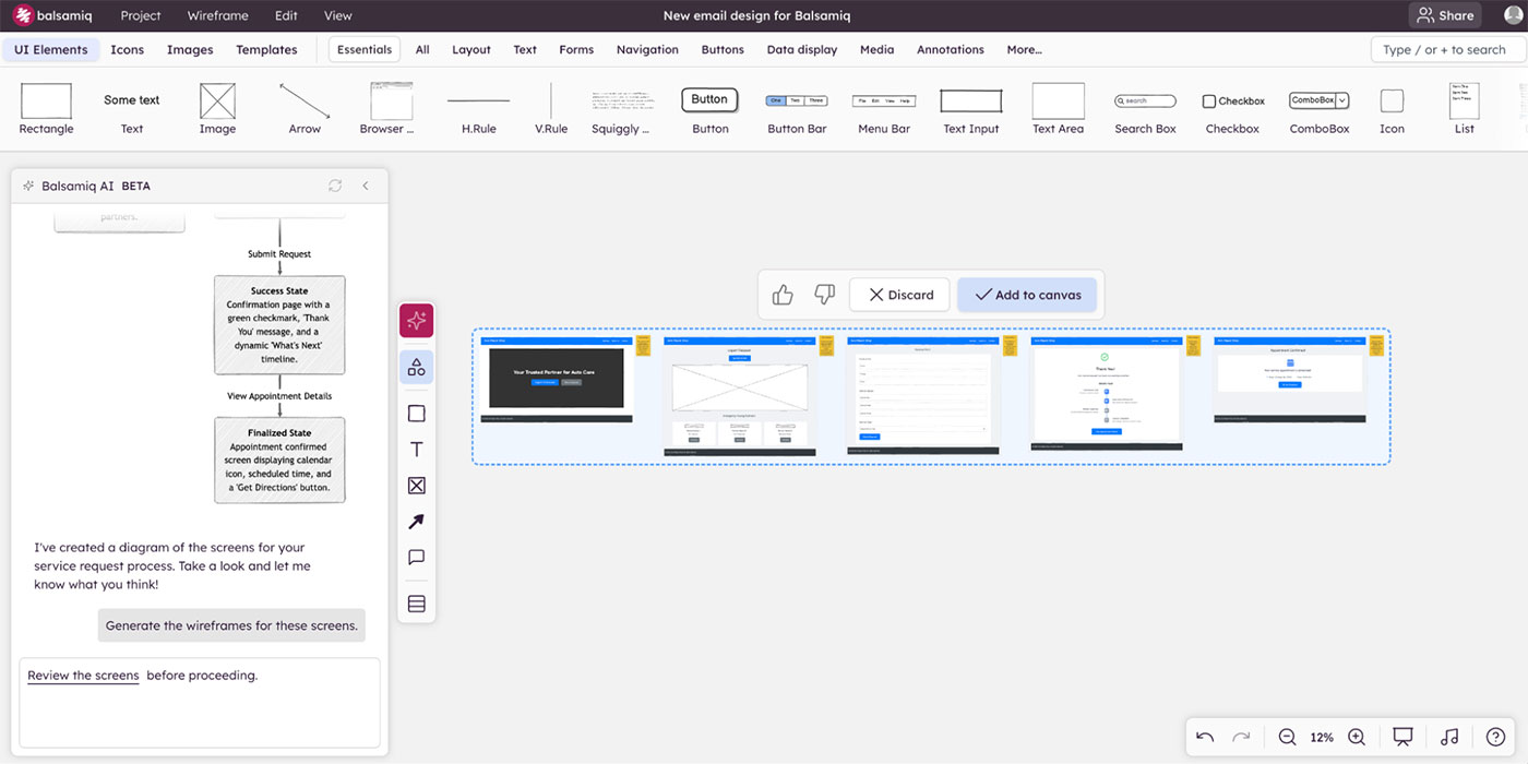
Step 2: Review and add the screens to the canvas
Once Balsamiq AI generates the wireframes, take a moment to review what it’s produced.
- Does the flow make sense?
- Are the right screens there?
- Is the order logical?
This is your first gut check—and it's much easier to course-correct here than after you've started refining. If you're unsure whether you've covered all possible paths, it's worth thinking through potential edge cases early (like incomplete submissions, errors, or unexpected user behavior).
When you're happy with the direction, add the screens to the canvas and arrange them into a proper user flow:
Landing page → urgent path or service form → thank you → appointment confirmation.
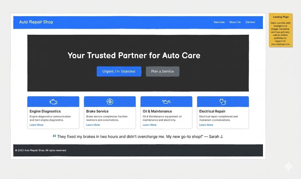
Step 3: Refine screen 1 (your landing page)
The AI draft gives you a solid foundation. Now it’s time to put your product hat on. Look at the landing page and ask: Does this immediately tell someone what to do and why to trust us?
In our case, we have two very different customers. Someone who's stranded and panicking, and someone who wants to schedule a routine service. The layout should make it immediately obvious which path to take.
A few things worth adding to the landing page:
- A trust bar below the hero. Certification badges and a star rating establish instant credibility.
- A click-to-call number in the header. Anyone in crisis mode shouldn't have to hunt for a way to reach you.
- An operating status indicator. “Open Now” signals a higher likelihood of getting a response or callback the same day, while “Closes at 6:00 PM” sets the expectation that anything after hours will be handled the next day.
- A row of service cards. Engine diagnostics, brake service, oil and maintenance—this helps "Plan a Service" users self-identify quickly.
- Social proof (a short testimonial). A single, impactful quote from a customer.
Step 4: Refine screen 2 (the urgent request screen)
Users who land here are stressed. Their car just broke down on the side of the highway. Cars are whizzing by at 130 KM per hour, and they're feeling every nerve in their body telling them to get off this road now. The copy and layout should reflect that urgency.
Lead with a reassuring sub-header below the main title. Something like "Stay safe. We're here to help get you and your vehicle off the road quickly" sets the right tone immediately.
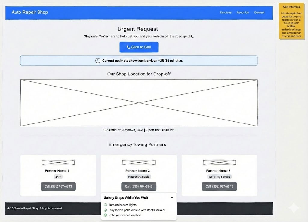
Then, consider adding:
- A dynamic “Wait time” indicator. This is a huge value-add for someone stranded—it tells them help is on the way.
- The “Shop location” with physical address and opening hours to confirm where their car is being towed to.
- Emergency towing partners with their contact details.
- "What to do while you wait" checklist. A small, collapsible accordion section at the bottom provides immense value by helping distract from anxiety, with checklist items like “turn on hazard lights” and “stay inside your vehicle with doors locked.”
Step 5: Refine screen 3 (the service form)
The service form is the most field-heavy screen in the flow. The focus here should be on making it feel shorter and less intimidating than it actually is.
Here’s what we included in our example wireframe:
- Contact information
- Vehicle details on one horizontal line
- A preferred appointment date and time picker
- A free-text field for describing the issue
- A "Privacy Guaranteed" badge near the submit button
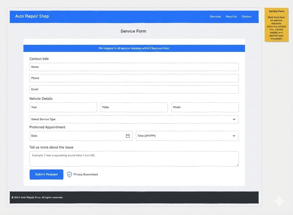
The goal of every element here should be to move the user one step closer to a confirmed appointment.
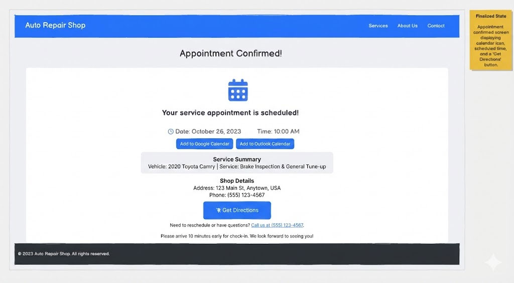
Step 6: Refine screen 5 (appointment confirmation)
The confirmation page is the last thing a user sees. Make it count by including:
- A "Service Summary" section to confirm the vehicle details and service booked
- The shop’s address and phone number
- "Add to Calendar" button
- A reschedule link
- A brief final note with instructions, such as: "Please arrive 10 minutes early for check-in. We look forward to seeing you!"
📌 A quick note: Screen 4 (the success state) came out of the AI draft in good shape. You don't always need to heavily refine every screen, and recognizing that is part of good product thinking.
What makes a great contact us page?
Before you start building your contact page, it helps to know what you're aiming for. While it isn’t rocket science, it still requires a bit of thought.
Here are the key boxes you’ll want to tick to get it just right:
- A clear headline and short intro. Tell people they're in the right place and set expectations. ("We'd love to hear from you" is fine; "Get in touch" is even cleaner.)
- The right form fields—nothing more. Name, email, message. Maybe the subject or topic, if it helps with routing. Don’t overload it with unnecessary fields, though, as that reduces completion rates.
- Clear labels and placeholder text. Don't make people guess what goes where. "Your email" beats "Email" and "Enter your email address" in the placeholder.
- A strong submit button. "Send message" is clearer than "Submit." The button should describe the action.
- Confirmation message. After the user clicks submit, clearly show that their message has been received. Use a short, friendly confirmation like “Thanks—we’ve got your message.” Set expectations by letting them know what happens next and when they’ll hear back (e.g., “We’ll reply within 24 hours”).
- Alternative contact options. Not everyone wants to fill out a form. Consider including an email address, a phone number, or links to support docs.
- Context awareness. Is this a support request, a sales inquiry, or a general question? The page structure should match what people are actually trying to do. Good UX heuristics can help you make those calls.
Why wireframing a contact page is worth it
It's tempting to just build it. A contact page is simple enough, right? Not quite. It’s always smarter to wireframe it first, as that means you can:
- Get the form right before you build it. Moving a field or rewording a label in a wireframe takes seconds. In a coded form, it's a whole thing.
- Avoid the "while you're at it" trap. Contact pages have a way of accumulating—a chatbot here, a map embed there, a social feed nobody asked for. A wireframe is what keeps you honest about what actually helps the person trying to reach you.
- Align the team on the details before they become debates. The confirmation message, the button label, and the supporting copy are the content decisions that tend to surface at the worst time. Getting them on canvas early helps you avoid last-minute scrambles.
- Catch mobile issues early: Contact forms are notoriously awkward on small screens. A wireframe makes it easy to pressure-test the layout before you develop it.
Ready to wireframe your contact page?
Contact pages don't need to be complicated, but do build them with intention. Wireframing yours first means you're making decisions about fields, flow, and confirmation copy before your developers write a line of code.
Balsamiq AI gets you a working multi-screen flow from a single prompt, and the rest is refinement to make it perfect.
Try Balsamiq free for 14 days and wireframe your contact page before you build it.