Accordions are used to show and hide information.
Applies to:
States
Accordion sections can change their state or appearance so that users know what to do. These little visual cues nudge the user in the right direction.
Unselected
When an accordion row is unselected, it means that it isn’t currently open or expanded.

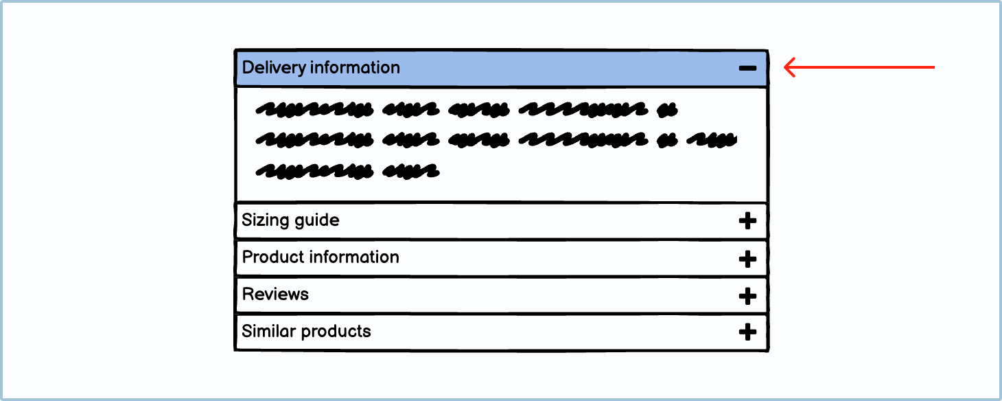
Selected
When an accordion row is selected, it means that it is currently open. When it is in this state, the user should see more information in the now expanded area. This expanded area is sometimes called a pane.
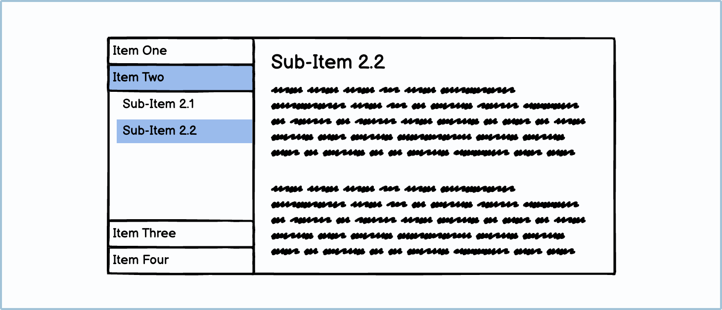
You can also select a sub-option; this is usually used for navigation purposes.

How to in Balsamiq You can change the selection of an accordion using the Selection dropdown in the Property Inspector.
Accordion uses
Accordions have 2 primary uses, namely to chunk information and to navigate.
Chunking information
When you are faced with long sections of text, you may want to chunk and hide the non-essential information to make it less overwhelming for the user. One of the ways you can do this is by using an accordion.
You will often find these types of accordions on product pages on online stores or in FAQ sections on websites.
Jargon: Progressive Disclosure According to the Interaction Design Foundation, “Progressive disclosure is an interaction design pattern that sequences information and actions across several screens (e.g., a step-by-step signup flow). The purpose is to lower the chances that users will feel overwhelmed by what they encounter.”
Navigation
When there are a lot of links that you need to house on a single webpage, a common suggestion is to group all these links into a side navigation accordion. That way, the user can simply find what they’re looking for without searching through a long list.
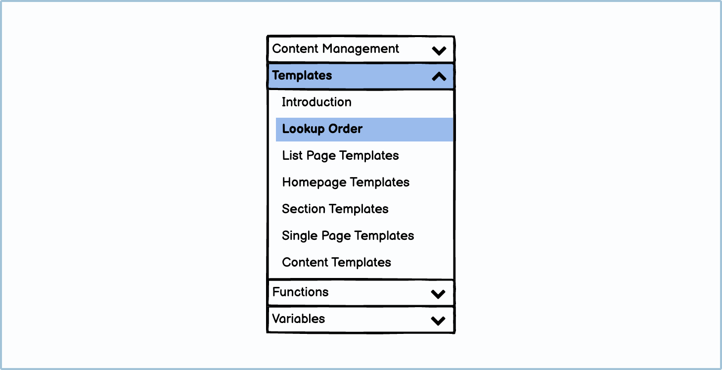
You can also use accordions to navigate through a single component.
Best practices
There are a few best practices when it comes to accordions. Overall, you want to make the task of seeking perfunctory information as easy as possible for the user.
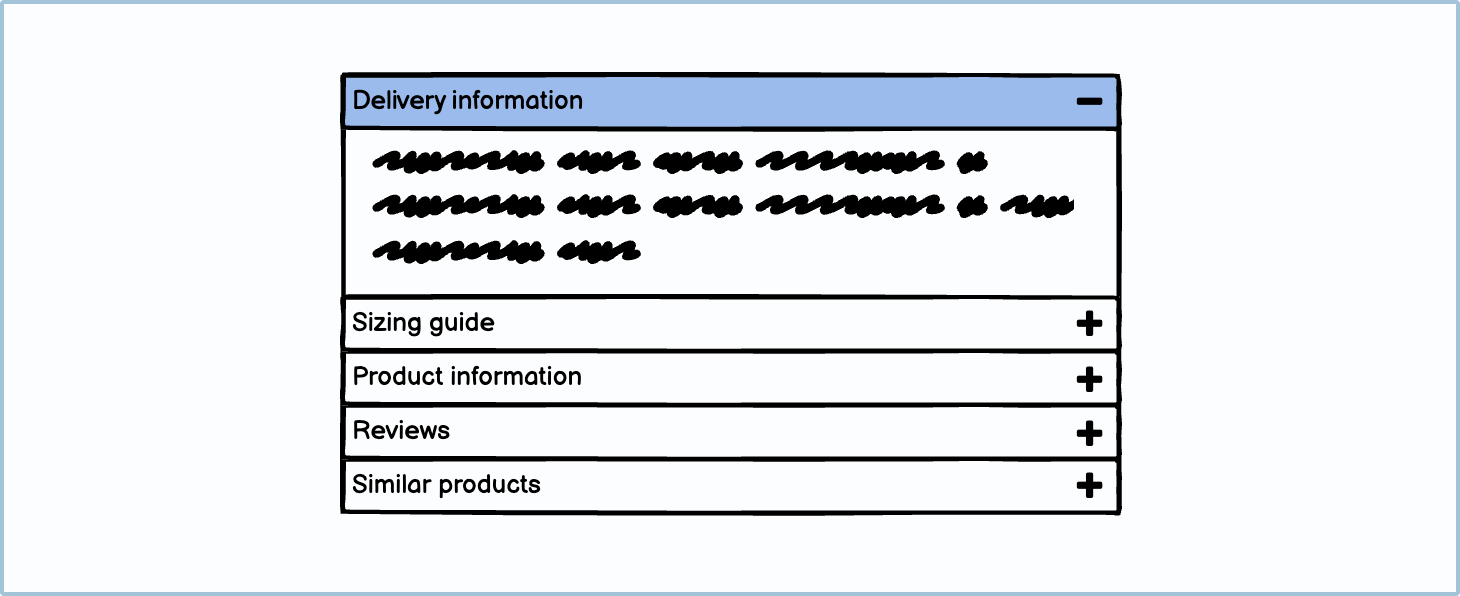
Only put non-critical information inside an accordion
If you are using an accordion to chunk information, only put non-essential information inside. For example, on a product page, you wouldn’t put the price or brand name inside an accordion. You would, however, put the sizing guide, delivery questions, and product materials inside one. If you are using an accordion to chunk information, only put non-essential information inside. For example, on a product page, you wouldn’t put the price or brand name inside an accordion. You would, however, put the sizing guide, delivery questions, and product materials inside one.
Default to closed
Depending on your business requirements, it’s probably better to default the accordion to closed. The first reason for this is that non-critical content is put into an accordion anyway, so it makes sense to hide it rather than clutter the screen. The next reason is that on small devices, users may not realize that there are more options at the bottom of the accordion.

Choosing an icon
It is advisable that an accordion should always have an icon to indicate to users that it’s interactive. The 2 most common sets of indicators are arrows and plus and minus symbols.
Variations
There are many different variations of accordions. Using more specific input styles makes it more apparent to the user what they are expected to do. Some examples can be found in the Tree Pane guidelines.