With more and more products being powered by piles of data, how do you present it in an easy-to-understand format? Start by following the same approach as for any other design project: Understand how the user needs to interact with or use the content. Then make smart design choices to organize the data logically and prevent it from being overwhelming.
Good data design lets you scan, decide and act efficiently. When you're tasked with designing an interface with lots of data, it must not overload the user's senses so much that it slows them down or increases the chance of mistakes.
Start by doing your research
If you’re creating an internal product for your company or a new consumer product, you’ll need to answer questions like: What will they do with it once they have it? Do they want to find the status of something? Generate a report? Enter new data?
User setups and workflows also affect your design. Do you know how big their monitor is? Do they use dual monitors? If so, how many windows do they have open while working with your product? Do they have them open at the same time or one at a time?
Knowing what space they have available and what other content will be around your product will help guide your design choices, too. Make sure you plan for screen space.
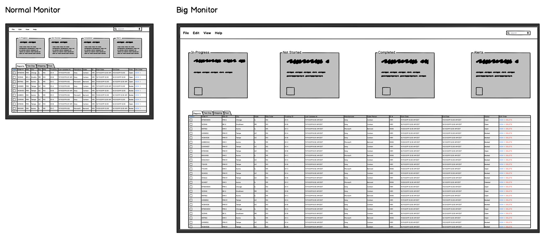
Too much white space can cause users to strain to follow the data from one point to the next. Their eyes aren’t being guided through the interface in the way it is with the smaller screen.


You might assume your user only uses your application, but it may be a part of a larger workflow.
Creating the initial layout
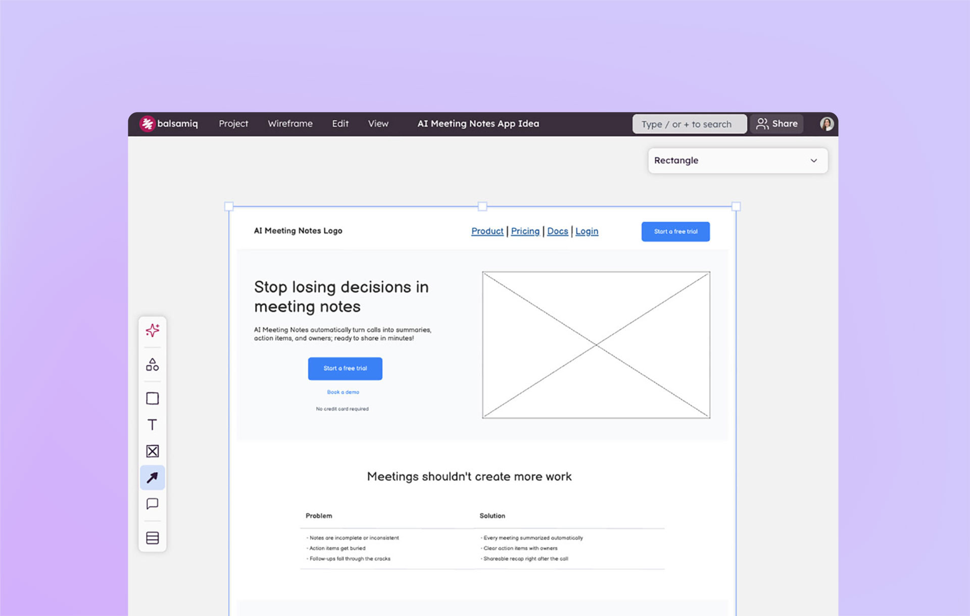
Now that you have the necessary background needed to start, let’s dive into the design of it. When starting from scratch there is a temptation to start by creating visual designs and writing code, but take a step back. The best approach is to start with a high-level layout.
For data-based design projects, start by reviewing the raw data that will populate this new product. How much is there? What are the pieces of information that will be used most to do the job?
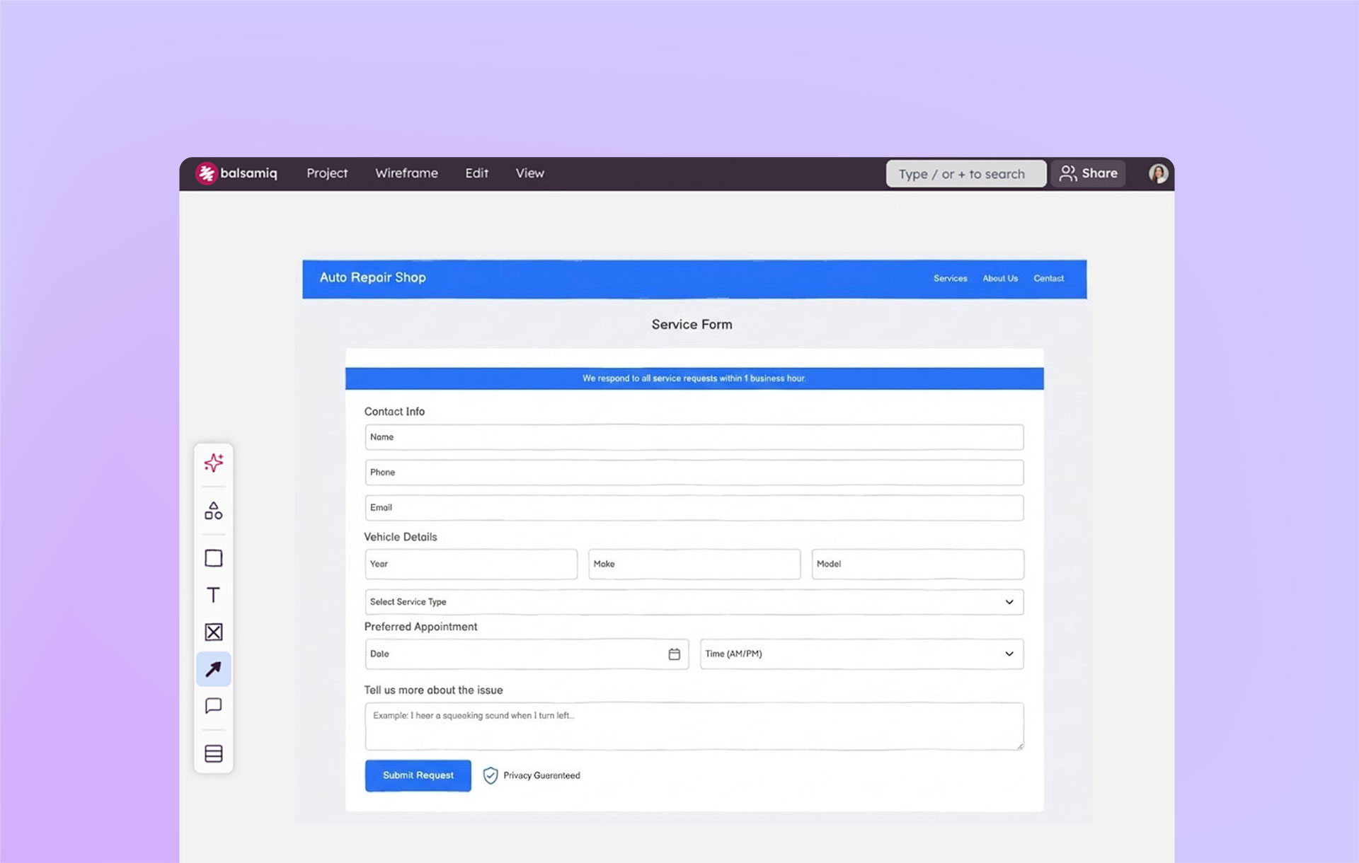
Step 1: Create a layout of the screen(s) by sketching blocks or assembling sticky notes

Step 2: Begin to add rough placeholder content
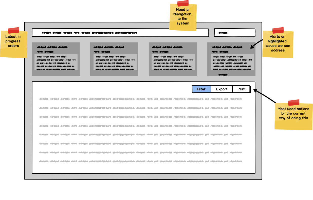
Use rectangles and Line of Text elements. Try to approximate the size and space it may need.
Step 3: Add the raw content into the layout
Note that you can paste data into the table control straight from Excel or other spreadsheet tools.
Step 4: Apply basic UI principles to the layout and begin to iterate on your design
Don’t forget to ask for feedback. No matter how much work you put into your design, you likely aren't the one using it. Good designs get buy-in and feedback from your team, users, and stakeholders throughout the design’s evolution. This means getting feedback early with your concepts, then later on the execution of that idea, and then finally on the nitty-gritty details before handoff.
Organizing and optimizing data-based layouts
Many data-based designs stop at the previous step. There have been many times I’ve inherited a design that looks like it was copied straight from Excel. I am hoping that the next time you encounter this, you can use these tips to push your product past the obvious and into a great experience for your users.
Remember to keep in mind how people are actually using the data, or want to be using it, not how you wish for them to use it.
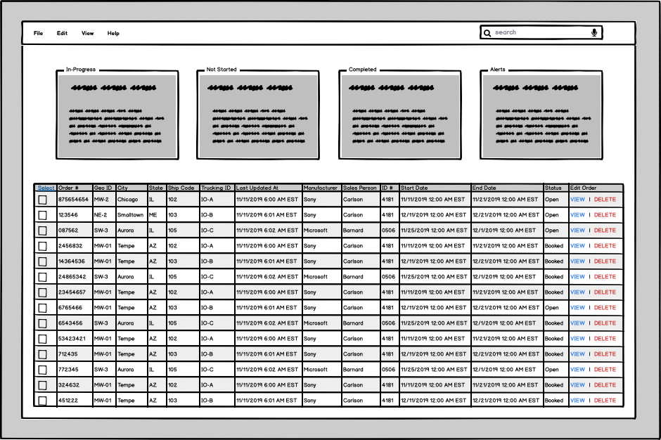
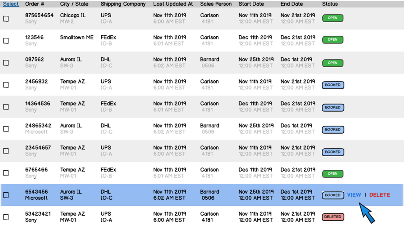
Here is a data table I've created for a hypothetical shipping / logistics tracking app that I'll use as an example in this section.

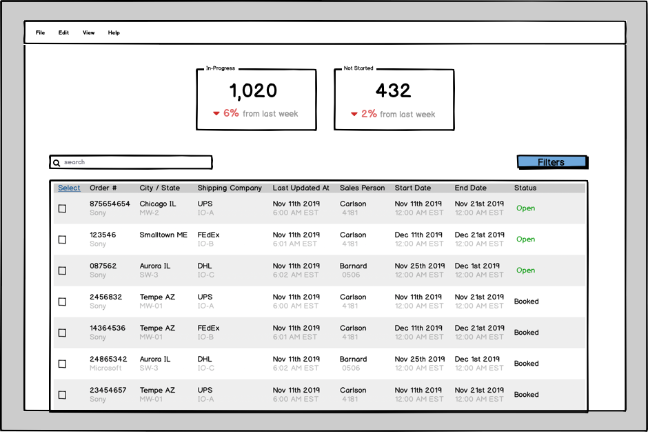
Tip 1: Group or hide as much information as you possibly can
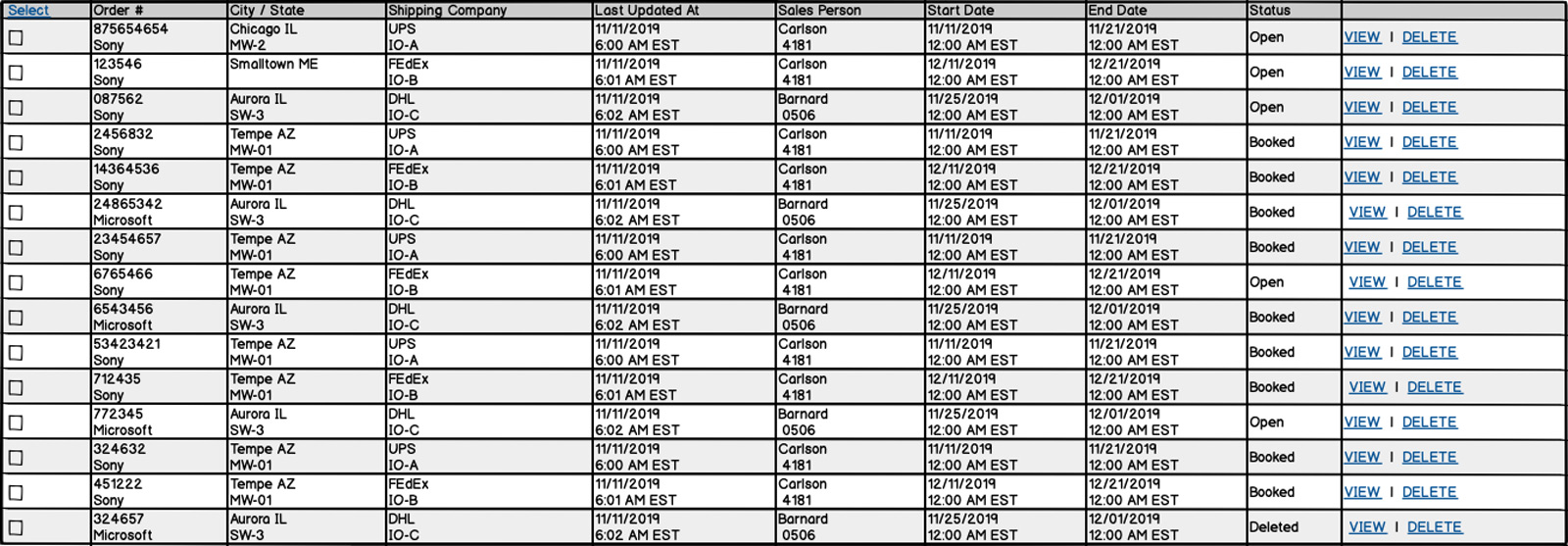
Reducing the number of rows in a table will improve its scan-ability, and thus the ability for the user to act upon it. Don’t feel beholden to how the data is currently displayed right out of the database. If certain data points pair together, such as a City and State, combine them.

If you have lots of data and you cannot simply get rid of it, hide it! Using dropdowns within a table to display more info is a great way to keep the focus on the core content without losing other data points that may be needed, but used less frequently.
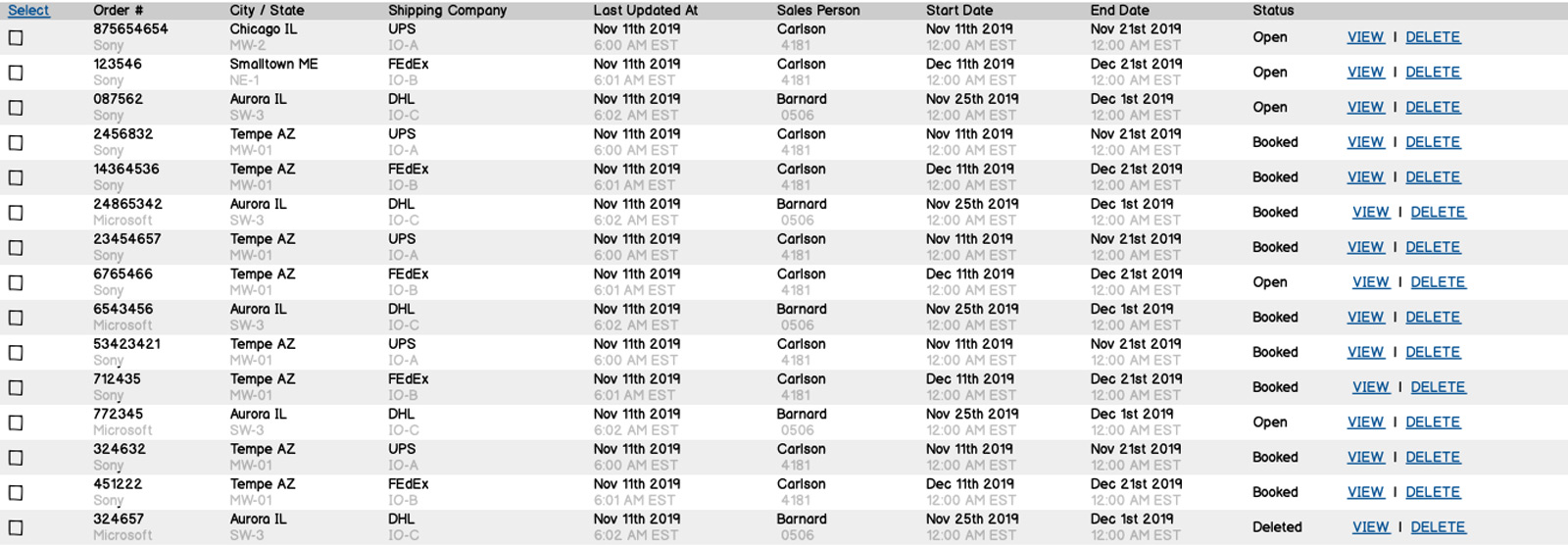
Tip 2: Use human language

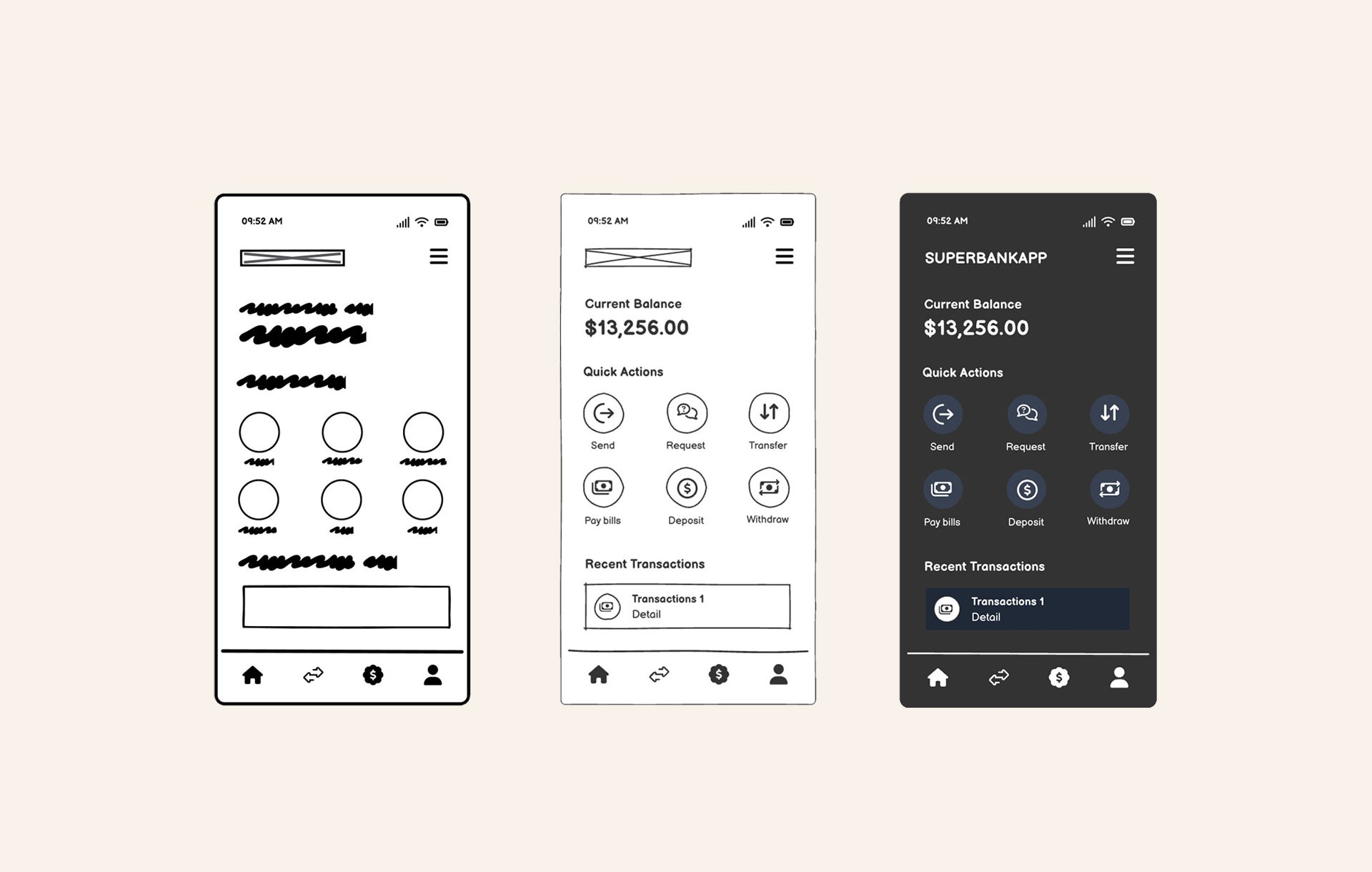
Databases are designed to speak to a computer, but they can also be designed to output natural, more human, language. Changing dates from numerical to alpha format greatly increases its scan-ability. Finding ways to make your data more readable will increase usability.
Tip 3: Use opacity to minimize the visual impact of secondary information
Reducing the opacity of lesser important information reduces the visual noise and allows users to more easily track the content in each column.

Here is an example of Spotify’s UI and how they use opacity to help us focus our attention on the important info. Playlist Name is of more importance than its description or the number of followers it has. Once you lessen the opacity of secondary information, your eye is no longer drawn to it. This is a common UI design practice. Start paying closer attention to the UI of products you use daily and you’ll start to see it everywhere.
Tip 4: Add room both vertically and horizontally to allow the user ability to easily scan
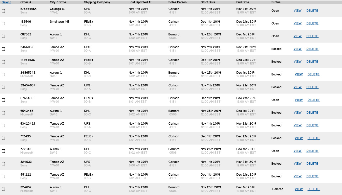
Offering adequate space between each table cell affords the user a stronger ability to focus on the content. Increasing scan-ability increases usability.
Tip 5: Repeating the available actions in a UI increases unnecessary noise to the user
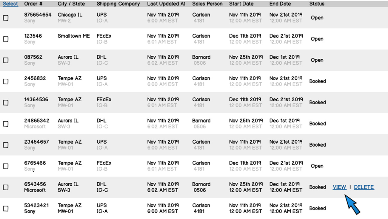
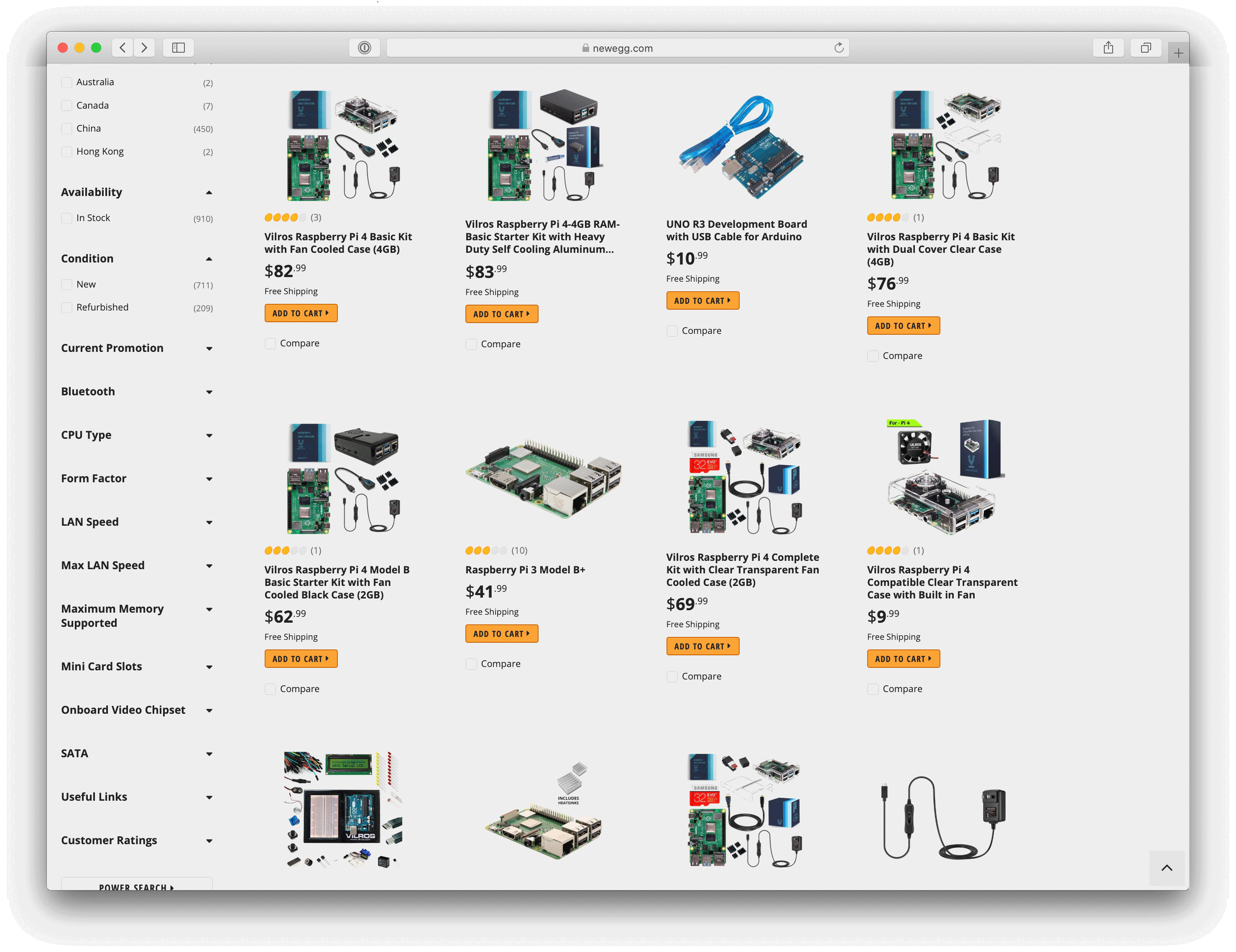
This is frequently seen in e-commerce, too. Here is an example from newegg.com. I’ve removed the repeating elements and will show them only on hover. Removing repeating elements lessens the visual noise and lets you act on the content better.
Tip 6: Use color in rows, cells or text to elevate its prominence on the screen.
Highlight single rows to help the user focus. Elevate data points like status by adding a background color to the text. You must use it sparingly for it to be effective
Bonus tip: Think outside the table
Excel was born out of databases, and data tables followed their example. However, there are lots of ways we can interact with data without needing to see it in a tabular form. Here are some examples of novel approaches to data presentation.
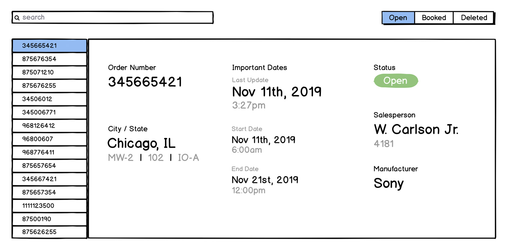
Instead of showing all the data in one long row, the example below uses order numbers as vertical navigation and puts the details to the right.
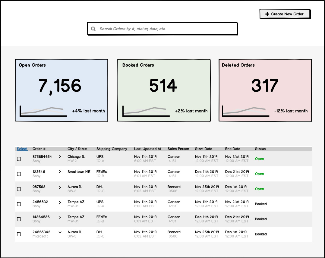
If the status of items in your data table is a key piece of information, consider using a dashboard to give an easy-to-digest overview of the current state. Pairing this with a data table can allow for a more user-friendly experience.
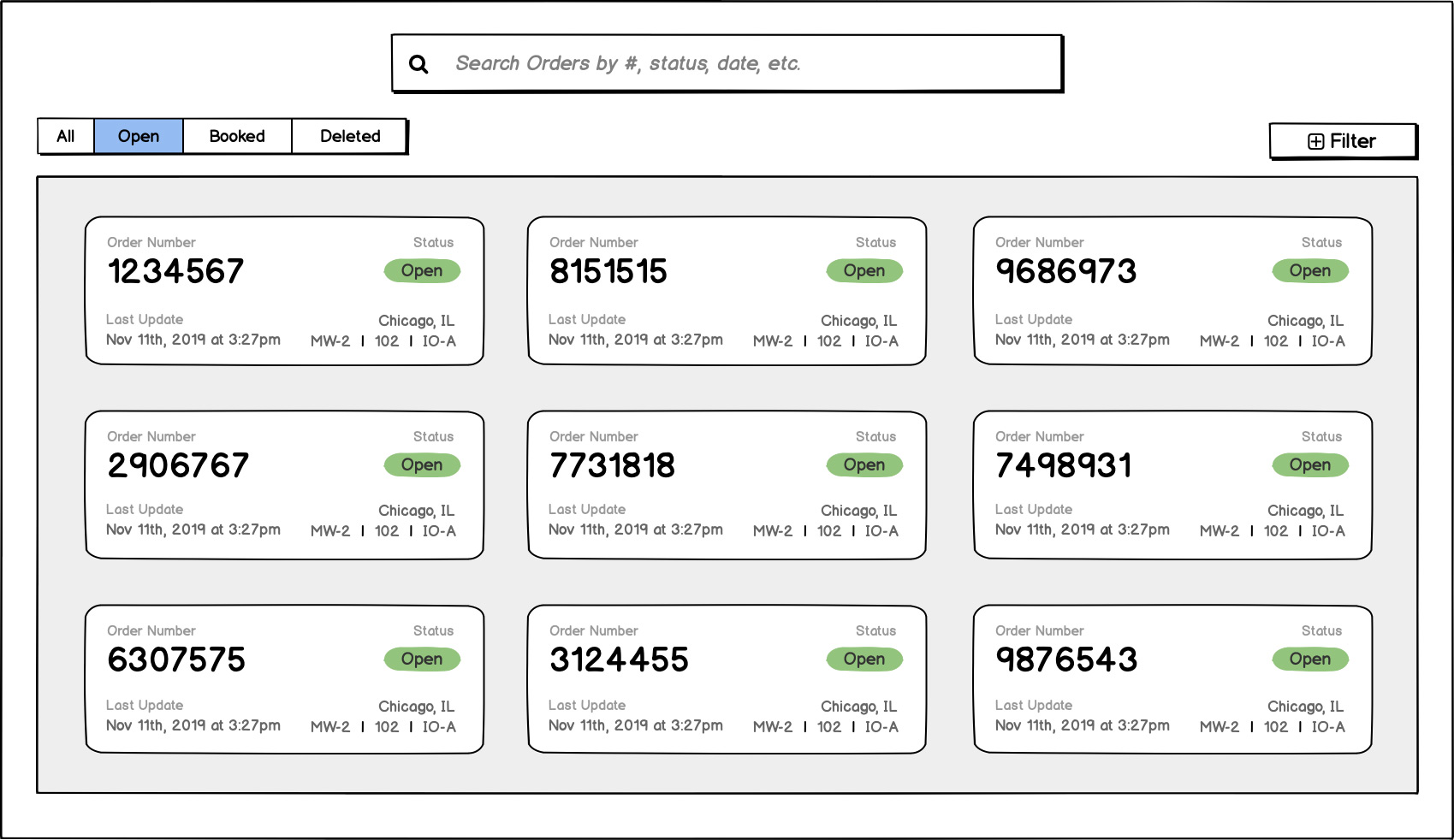
Use a card-based UI to improve the scan-ability of sets of information, as shown below.
Conclusion
Balancing complex data needs with a simple user interface is a challenge for any designer today. But the process of designing data-heavy interfaces is not much different than that of a marketing site. The principles of good design are universal.
Understanding the need, not overloading the user’s senses, and remembering to seek feedback will help ensure whatever you're designing will be a good experience for users. The tips we’ve laid out can be applied to all types of projects.
We hope you use them on your next project. If you do, tell us! We’d love to hear from you. Good luck and happy designing.
Webinar: How to design effective data tables with Wireframes
Watch the recording of our webinar about data table design.