A landing page is any type of web page that a visitor lands on, typically from a link on another page, an email, or an ad. In marketing, landing pages are thought of as single pages that may be able to stand alone to describe a product or service and provide a call to action for the visitor, usually to sign up for or buy it.
In this article we'll go through the landing page for Balsamiq Cloud, covering the process for a typical website project from start to finish.
How we design
The steps I take in the design process vary only slightly from project to project. One thing that I consistently do is work in the lowest fidelity possible at first. I then work towards higher fidelity as we explore, test and validate ideas.
Here’s how it usually shakes out.
- Words - Gather information and summarize the project in text.
- Sketches - Start out the design with thumbnail sketches — abstracted mini sketches of pages that look like blocks and squiggles. This can be traditionally done with pen and paper, but I use the Quick Draw feature in Balsamiq.
- Wireframes - Flesh out the ideas from our sketches using zone diagrams to identify elements. Start to wireframe by adding more detail and explore the hierarchy of elements on the screen and describe function and behavior.
- Visual Design - Begin the design comp by blocking out layout in grayscale elements. Add detailed information, specify position, weight and size of elements. Begin to add color and refine the elements on the screen iteratively. I leave plenty of time for frequent review and iteration in wireframe and visual design stages.
Let’s take a closer look.
Words first
Start with a textual description
The lowest fidelity and least expensive tools are the ones that let you dispose of ideas easily so you can throw out the ideas that aren't working, explore new ones, narrow them down and choose a direction to pursue. Words are perfect for this stage.
Clarify your user stories
I usually begin by gathering descriptions of what we're designing. The user story is clarified by meeting with team members to discuss what we're designing. I'll then start a description of the project on a wiki page. (See our article on Using Wireframes with Agile User Stories.)
Think of this as "project brief light." It's a words-only description of the project used to facilitate discussion, organization and planning before sketching. I can't emphasize enough how important it is to get on the same page at this point. Iterations on the foundational ideas for the project now will save you a lot of time and money later.
Take inventory
The next steps might be to take inventory of the elements that need to go onto the page.
This is the work of figuring out the Information Architecture of the screen. It might take the form of a user flow diagram with boxes and arrows to illustrate what leads where. It might take the form of an outline. Some people write up Page Description Diagrams.
For our landing page I created an outline, based on a walk-through of the features of the product and we reviewed and refined this outline. From this baseline of understanding I start working visually.
Review and validate
The main takeaway is that text is the cheapest deliverable to iterate, so have plenty of discussion and review at this stage.
Thumbnail sketches
Now I begin exploring some visual representations of the elements. Before Balsamiq, I did thumbnail sketches. You can think of this as pre-wireframe idea generation.
Think of this as sitting around a coffee table with your team sketching ideas on the back of a napkin. It's rougher and more abstract, with far less detail than a wireframe.
Identify elements
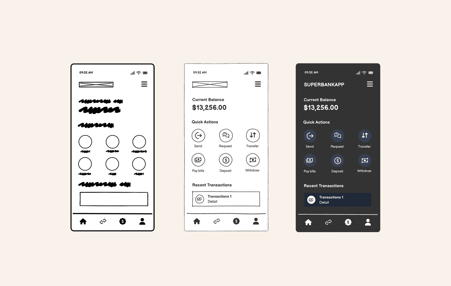
These are quickly sketched boxes to identify elements of the screen and begin to explore how to arrange them hierarchically.
Balsamiq's Quick Draw feature allows me to use that same type of pen/paper thumbnail sketching technique. I draw Rectangles and might label the elements of the screen.

This gives me a bird's eye view of the page. Seeing the entire page as little blocks helps me figure out the hierarchy of elements from the outline. It'll also turn out to be helpful as I'm figuring out how elements re-flow for responsive breakpoints.
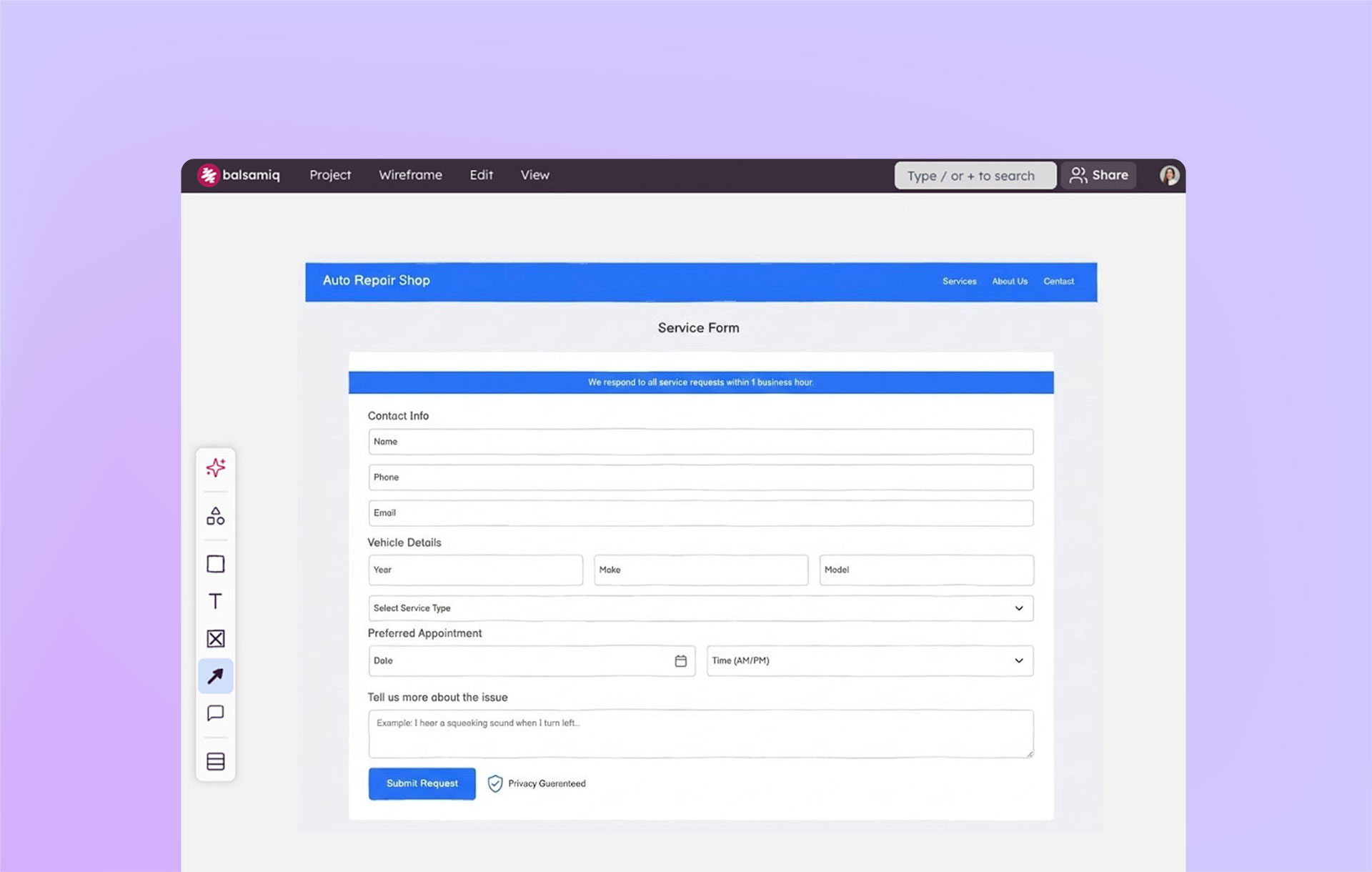
Wireframes
Once I have the high-level organization of the screen in the thumbnail sketches, I can start wireframing to flesh out more of the page elements. I start working from the outside in to organize zones of content or features and then switch gears to working from the inside out on adding details to each zone.
Work outside-in: Organize zones
I start by turning those sloppy blocks into a zone diagram based on the ideas we sketched. Zone diagrams let you figure out the blocks or modules of content that go into the screen further adding hierarchy to the elements, based on the priorities of the story the page should be telling.
After zone diagrams, I can continue to create smaller blocks within the zones for the content elements. I continue to use Quick Draw Boxes and Text to visualize the content abstractly. It's a bit like a technique I used when painting — get your basic shapes down, step back and blur the eyes to look at the composition.

To take the painting analogy further, once the broad, sketchy strokes start to define the architecture of the screen, I then keep working inward to find the inner structure. I'll flesh out the details, by putting in copy. I may use placeholder copy at first, but prefer to use something closer to the actual copy to get a sense of where text will break.
Work inside-out: Add detail
This is where the sketch evolves into a wireframe as more information is added and flow is demonstrated.

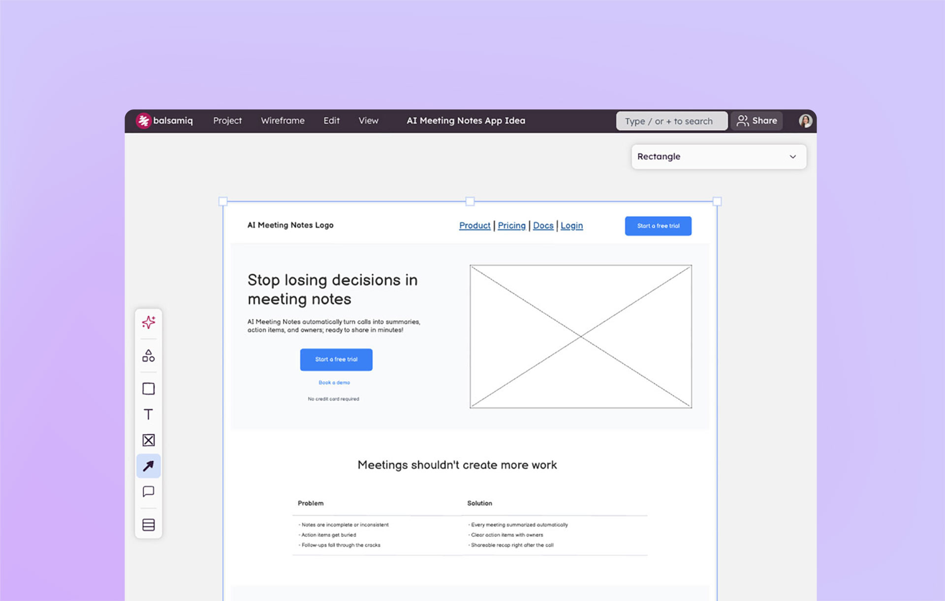
The illustration below shows how that bird's eye view gets more focused as we zoom in to show actual content. What I did in this case was use the Transform Control (CTRL+T or CMD+T) function to transform those Rectangles into components from the library and make the scribbly Line of Text objects into real text.

When we're ready to review at this level of fidelity, we'll do a walkthrough with the team.
We like to do a lot of review and iteration at this stage before moving on to visual design.
Visual design
If your team is satisfied with the direction the product design is headed, you may start thinking about visual design.
Iterate copy
In our project, Peldi had some great ideas to simplify the login flow as we were wireframing and we had a direction for the visual design. We did some initial copywriting and I set out to turn the wireframed elements into a visual design.
Start exploring visual concepts
Sketch, the excellent illustration application for the Mac, is my tool of choice for visual design. With Sketch I began some grayscale exploration of the screen, creating and moving boxes around and adding the headings.
I defined the zones of the screen and annotated some initial ideas, like having a simple hero with full viewport video, where to place the calls to action, what features to describe and how to message the value proposition. I started designing the typographic elements, adding all of the inner content inside the boxes, explored a few concepts for the layout and noted interactive behaviors.
Design review
I put the first comp into a Balsamiq Cloud project so we can review the early stage concepts. We do a walkthrough and begin to review as a team.
Here's a screenshot of the comp in Balsamiq Cloud. We used the Comment features in Cloud to ask questions and point out issues, and I iterated from that discussion.

Iterations
From the design review I get clarification on things we want to improve and we do a bit more copywriting.
At some point we have enough agreement on the concept and agree that we're ready to start building it in code. We know that some iterations will also continue in development, so we expect to evolve the real thing as we build.
This illustration showed the stopping point where we had enough validation of the visual design to start to develop.

As you can see from the actual Cloud landing page, we continued to iterate on the real thing. You can even watch a Live Wireframing video showing how we worked on adding our pricing information to the page.
Optimize around low fidelity and find the right design
I hope this gives you an idea of how we work iteratively using wireframes behind the scenes.
Don't move too fast past the lowest fidelity and least expensive tools. Because we're a small, distributed team, we're always thinking about optimizing our time on solving the right problems. Using low fidelity is a great way to avoid losing time in more expensive decision making by the time we're working on code.
We hope this might inspire you to think about how you use Balsamiq for even lower fidelity wireframing and see how it provides the glue between initial idea exploration and the more complete concept imagined in visual design.
For more guidance on designing landing pages, read our article on Perfect Landing Page Wireframes.