I recently bought sunglasses online, without being sure they’d fit or if I'd even like the style in person, but I didn’t hesitate. While attempting to purchase them, I had to fill out and re-fill out a series of forms and work through confusing interactions to make the purchase. But I didn’t quit. I wanted those glasses!

If you think about it, it’s pretty crazy. We go through so many steps and jump through many hoops just to give companies our money. Obviously it doesn't always stop us from doing it, but as aspiring designers, let’s review some best practices for designing UI for online shopping.
Product listing page design
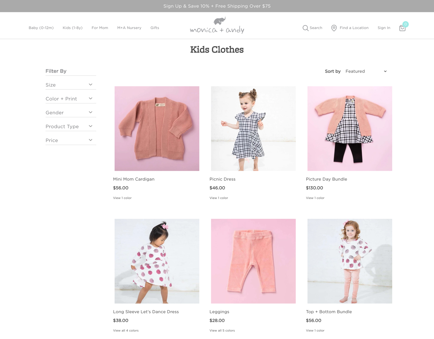
In most e-commerce experiences you’ll start on a page called the Product Listing Page. The design of a good product listing page is all about its scannability.
There are 3 primary UI elements users will need to interact with: Product Cards, Filters, and Search. A lot of thought should be put into the design of each of these elements. How they work together can make or break the shopping experience for your users.
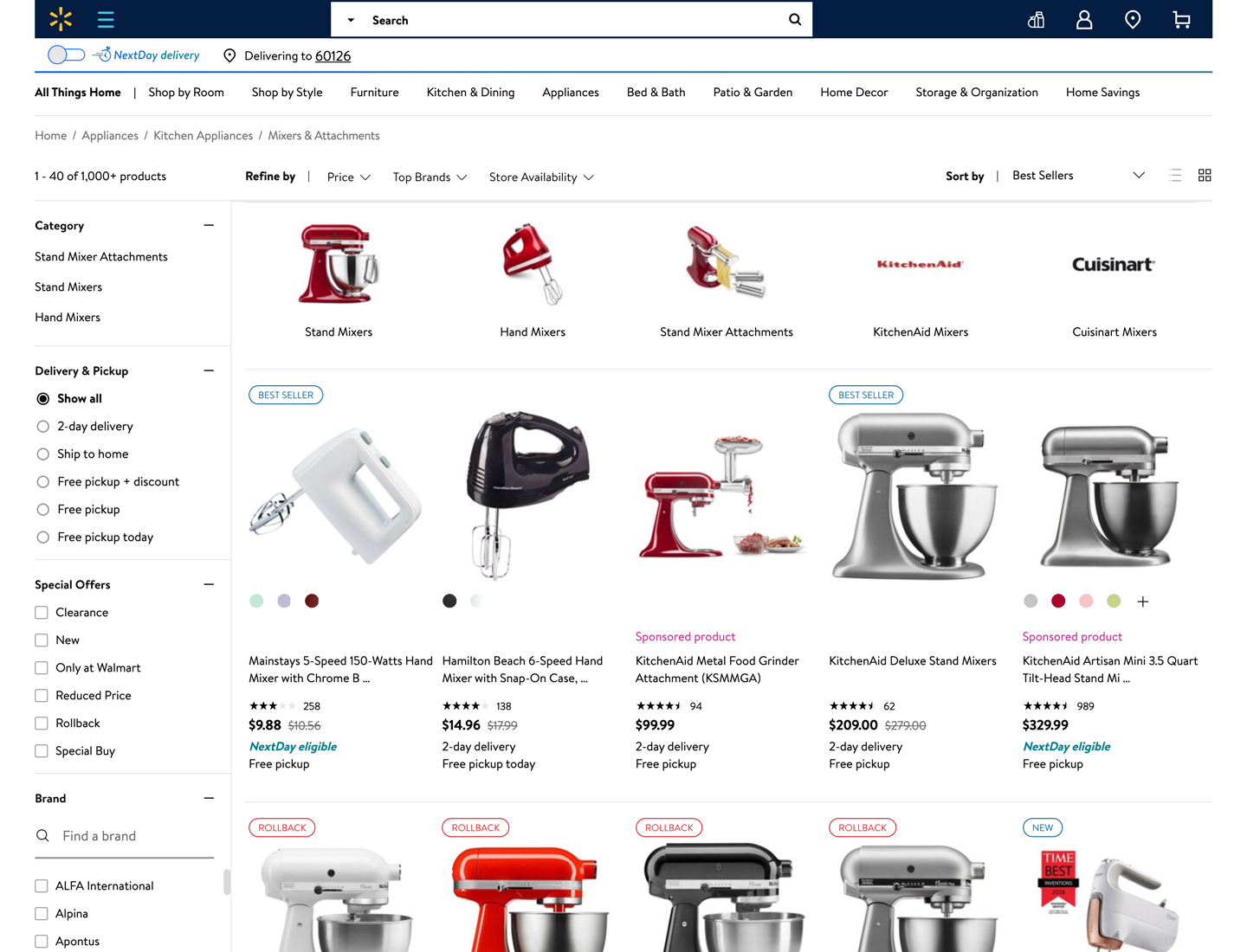
Product cards
To be successful, product cards need to highlight a few things: a thumbnail image of the product, the name/title, and the price.
Important secondary information, such as color options should be present, but not overshadow the others. Users will focus on the main imagery and want to glance at name and price. If they like it, they will focus in to pay attention to the less prominent (less scannable) details.

Filters
Filters in an e-commerce interface are vital to a pleasant experience. When done well they allow the user to browse your catalog to find what they want, just like a real store. Tips for designing a good filtering process include the same principles we talked about in this article about visual hierarchy and alignment.
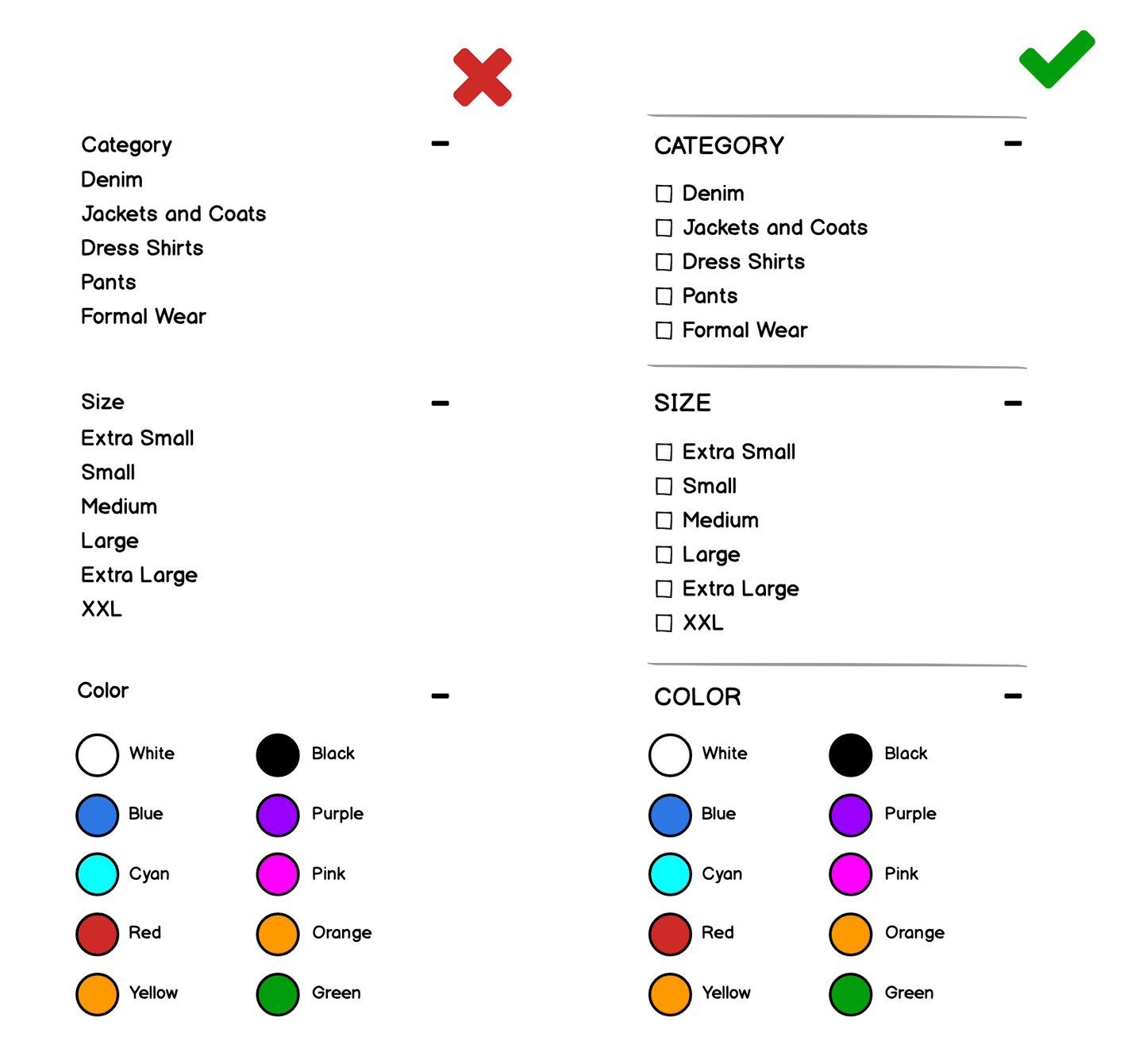
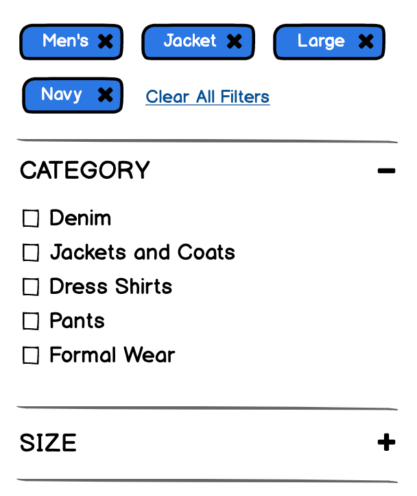
The biggest design mistake is allowing users to filter, but not letting them know they have done so. Also be sure to use the correct UI elements.
If the user can select more than one option, use checkboxes. If they can only select one option, use radio buttons. Be sure to follow these conventions for consistency. Finally make sure users can easily remove the filters at any time in the experience.
The search box
Designing for search is easy, but often done poorly.
Make sure that the search box is prominent and that it provides relevant search results. In terms of the UI, again, simple is key. Use an input field with a proper Search icon and use the label “Search”.
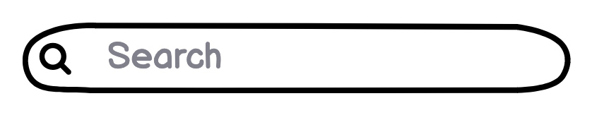
It can also be helpful to include search examples. Lots of large retailers do this due to the vast number of items that can be searched. Something like: Try searching for ‘Golf Clubs’ or ‘Wheaties’.
Heavy content vs minimal content
The amount of content on a product listing page can differ drastically between large retailers and small ones. A company that sells thousands of products online will need a far more expansive set of categories and filters to organize, as well as show more products on the page.
Small retailers don’t have the problem of an expansive catalog. Their filtering and product listings are much cleaner because they have less to sell.
It may seem easy to say, well why doesn’t a large retailer design their sites in a similar way? The answer is, they simply can’t. But if they do design their product cards, filtering and search area properly, the user experience will be equally as good.
Product detail page design
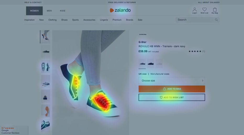
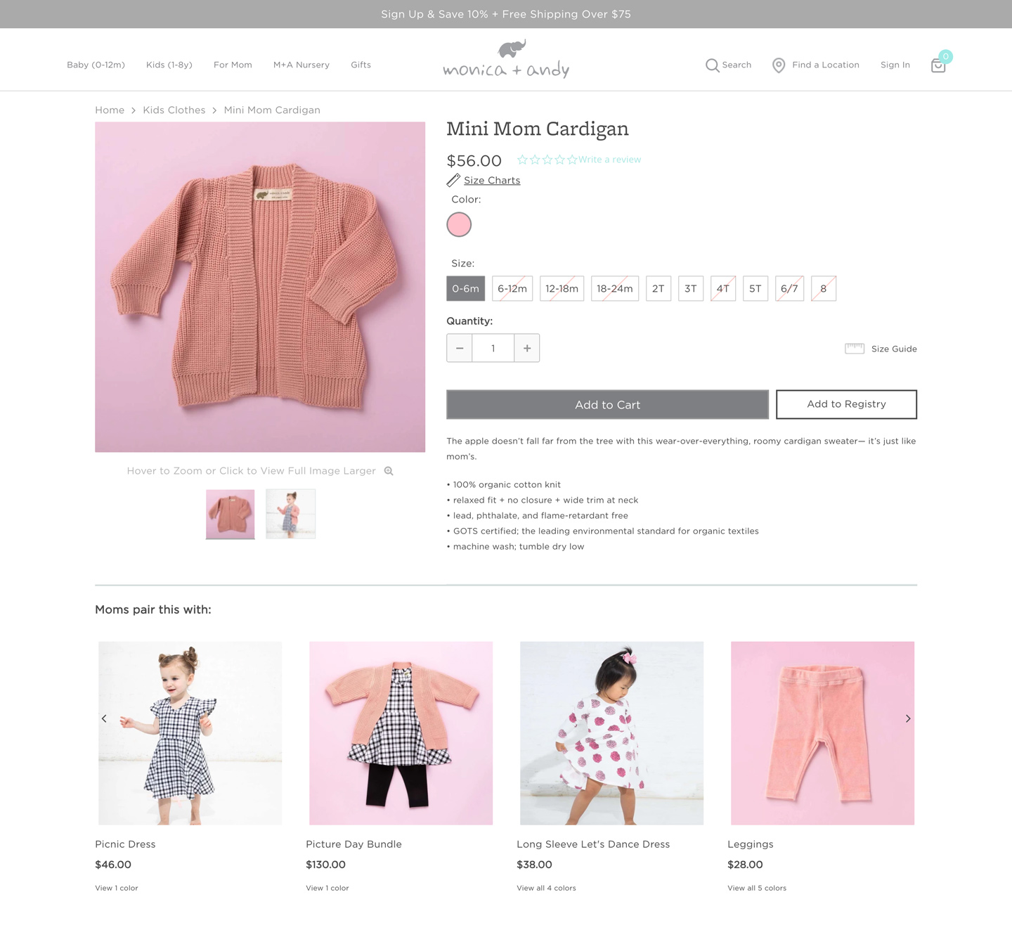
The design of a good product detail page is quite simple. Make sure to have high-quality images of the product prominently displayed on the page, along with a clear price and a primary Add to Cart button.
Layout
The layout of most product detail pages is identical. The image area takes up about half the width of the page, with the product details and the Add to Cart button, sometimes referred to as the “buy area,” taking up the rest.
Interestingly, this particular layout is rarely found outside of e-commerce. But it does make sense in its context. We scan content from left to right, then down, then back to left to right. It's called z-pattern scanning, and when shopping it seems to make sense to follow this progression. We first look at the images, which are the most dominant element on the page, then we progress to the right and see the product title and price (among other details), and as we move down, we see a primary action button.

Product description details
Using tabs or dropdowns to organize the details of the product will likely mean the user won’t see it and cannot search the page for it. This is frustrating and can lead the user to abandon the site. They hide content that doesn’t need to be hidden, just designed better. Organized content is far more usable than trying to play hide-and-go-seek with it!
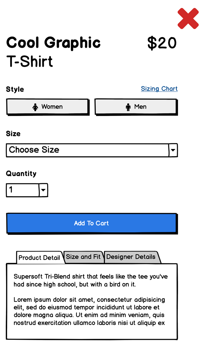
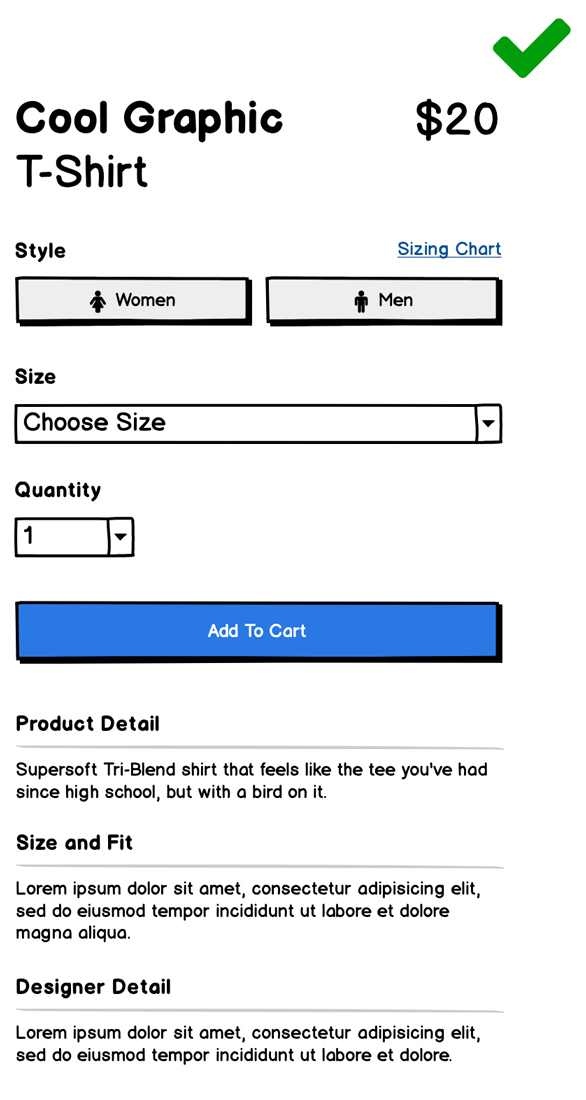
Longer pages are totally acceptable to users. They really don’t notice page length unless the design is cluttered and unruly. Having to scroll down to find the details of a product is expected.
Think of the vast variety of products sold online. Pretty much anything you can think of is sold online, right? Now try to design a page that will fit all of the possibilities. You can’t! But what you can do is make sure that your design organizes all of the content in easy-to-read sections. It can go on forever as long as it's organized and essential.
Cart design
Effective cart design relies on a combination of scannability and proper use of inputs and buttons. What would you say are the most important pieces of a properly designed cart? I’m sure you’d want to review the contents and prices of each product. Also, you’re going to want to know the total cost and the payment options.
Make sure to prominently display the product title and price of each item, as well as quantity. Then separate out the total costs with the Checkout button(s).

Checkout buttons
When displaying your checkout buttons, remember that you’ll already have an established pattern for primary buttons, use it! The other payment options may compete with it visually; make sure they have their brands associated with them to avoid confusion. Your button is associated with your brand. The user will be able to understand this and choose whichever option suits them best.

Coupon codes
The design of your coupon code input field will affect user behavior.
If your site has promotions running daily, then having a prominent coupon code input field is just fine, but if you only have them every so often, you may be causing your users to leave your site to start googling “<your company name> + coupon code.”
They will try relentlessly to find some kind of deal they now know they are missing out on! There must be one to be had! They just need to find it.
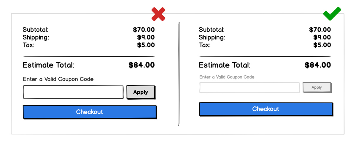
Coupons are an important element for the cart, but it does not need to have hierarchical dominance. It can be downplayed with a text link, or a subtle input field with a secondary action button, for its Apply state. Use placement, color and text to make it visible, but not prominent.
Conclusion
If you’re designing an online shopping experience, these tips will certainly improve the UX and allow visitors to shop with ease.
Proper hierarchy and alignment will create easy-to-scan pages of products and information throughout the experience. Following established patterns in your product pages and not hiding product information will allow users to find any details they may need to make the decision to purchase.
Always remember to put yourself in the users' shoes and think of the key pieces of information they’d want to know before buying something, then be sure to design your site to highlight those. Good luck and happy designing.