If your site needs to collect information from visitors you’ll likely need to use a form. Because of this, we think forms are one of the most important parts of your site or app's experience. And, sadly, they are almost always designed for you, the site owner, rather than for your users.
I’ve read somewhere that forms are the start of a conversation with your audience. Do you want to start off that conversation as an interrogation or a friendly chat? Do you want to confuse them with a mess of input fields, or a clear list of items you need from them to achieve their goal? Here are some basic principles of form design to help you have better conversations with your users.
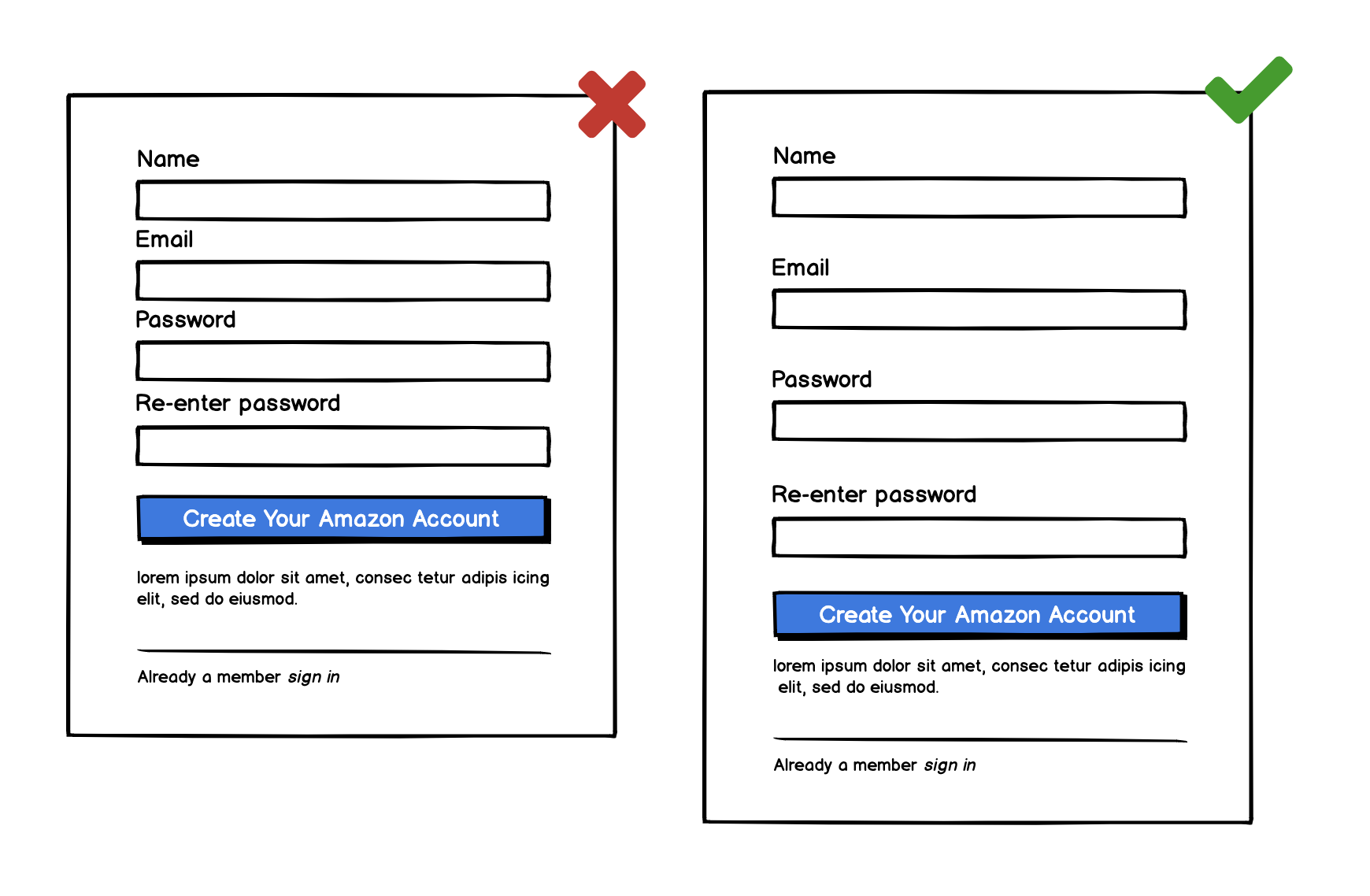
1. Only ask for information you absolutely need
Think, what is the bare minimum I need to ask in order to allow the user to continue? What information can I gather from them later? The more information you ask on a form, the less likely they are to be completed. Also the more time it takes to fill out a form, the more people will question the need for answering them. It will start to feel like an interrogation.

While I was working at my previous job, our signup form didn’t look too dissimilar... 10 years ago. We thought it was great to know your birthday so we could send you an email to say Happy Birthday; or your gender, to serve you better marketing / promotional items. But we heard from folks saying I don’t like giving out that information, for any number of reasons. They were all valid, so we changed it, streamlined it, and lo and behold, sign-ups went up.
We only asked for the absolute bare minimum we’d need to create an account. If the user wanted to give us more information, they could, in their account area, after they signed up.
Asking for unnecessary information is the most broken rule of form design. If all you get out of this article is that, we will have been successful.
But let’s not stop there. The visual design of your form is also very important. A lot of these topics have been covered in this article on hierarchy and alignment, but let’s review them in the context of forms.
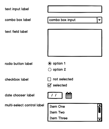
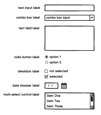
2. Proper spacing of input fields will greatly increase the readability of your form
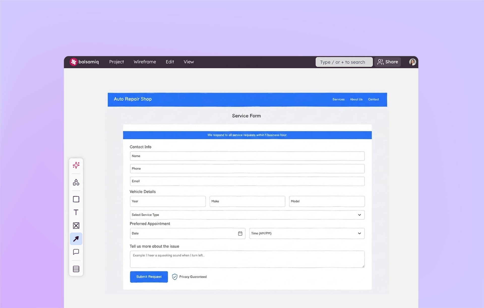
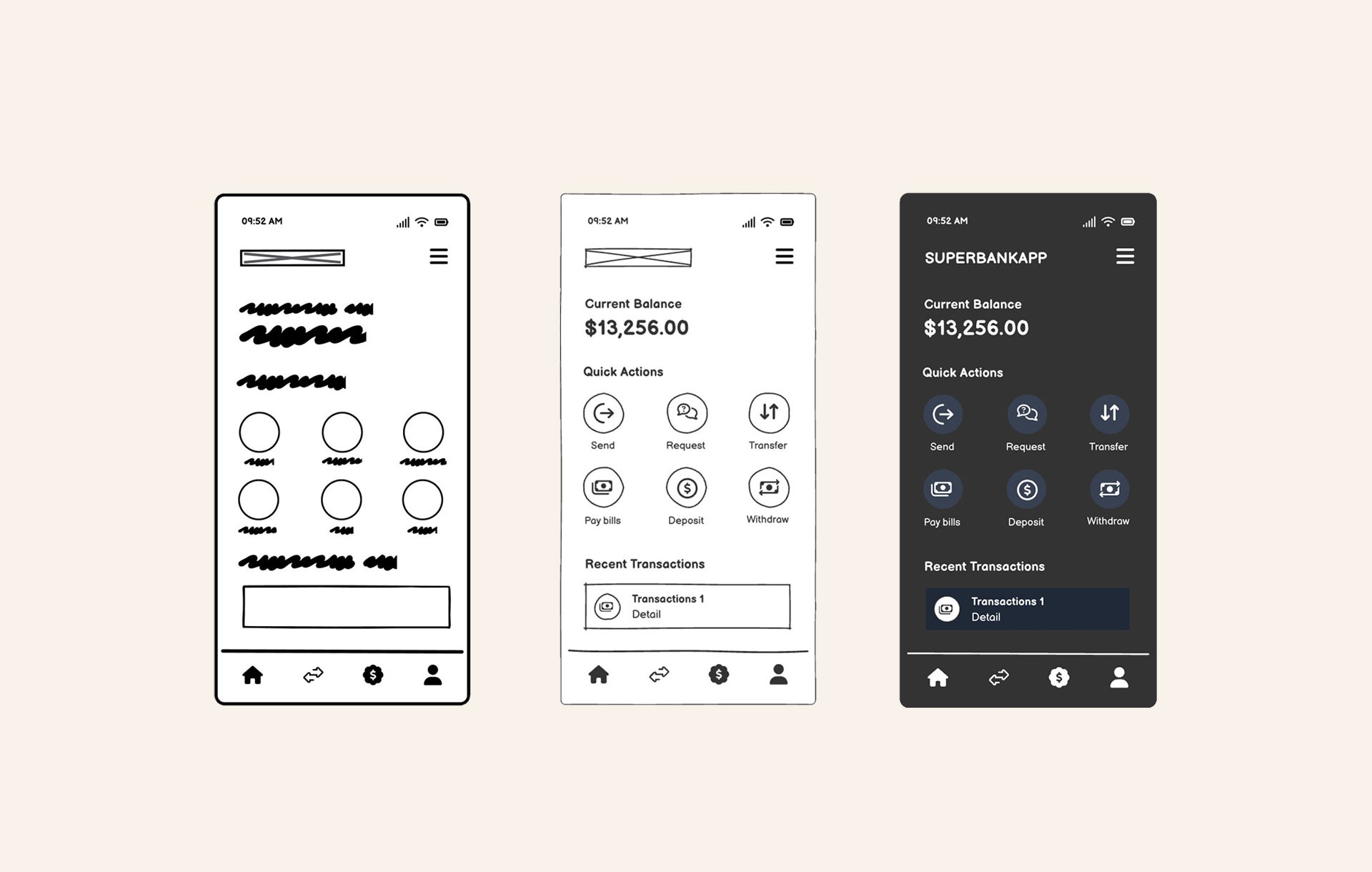
Look at these 2 forms side-by-side. The only difference is that there is more space between the fields in the second. Looking at the one on the left, you're not sure if the label is meant for the one above it or below it, and your eyes get lost. You can’t easily scan it. Adding a little space will make sure there is no doubt which label goes to which input field.
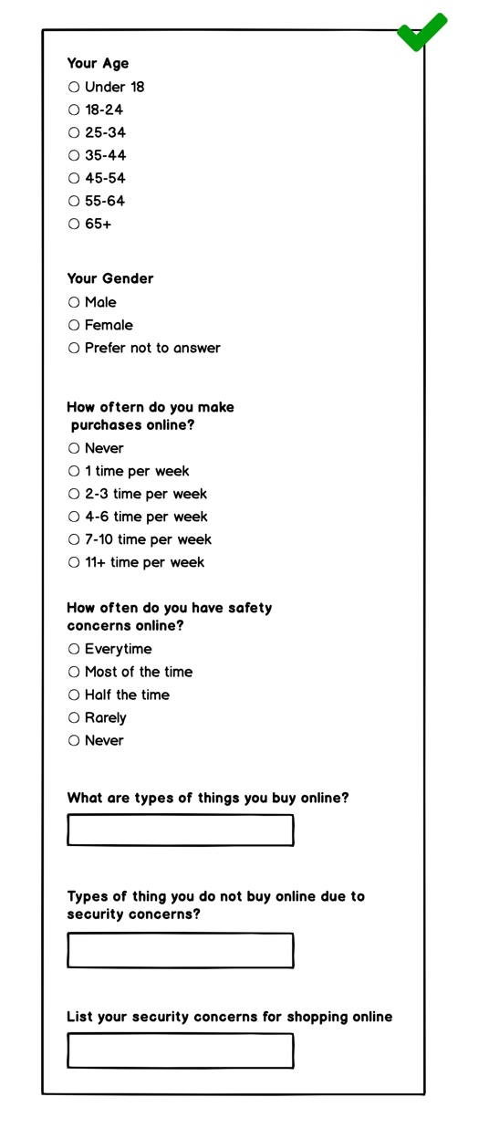
3. One-column forms are much easier to fill out and have a higher completion rate
Two-column forms are more difficult to scan and track as you fill them out. They often take longer to complete and induce more user errors. Why? Because your eye doesn't know where to go next. You get lost in all of the data presented across the screen.
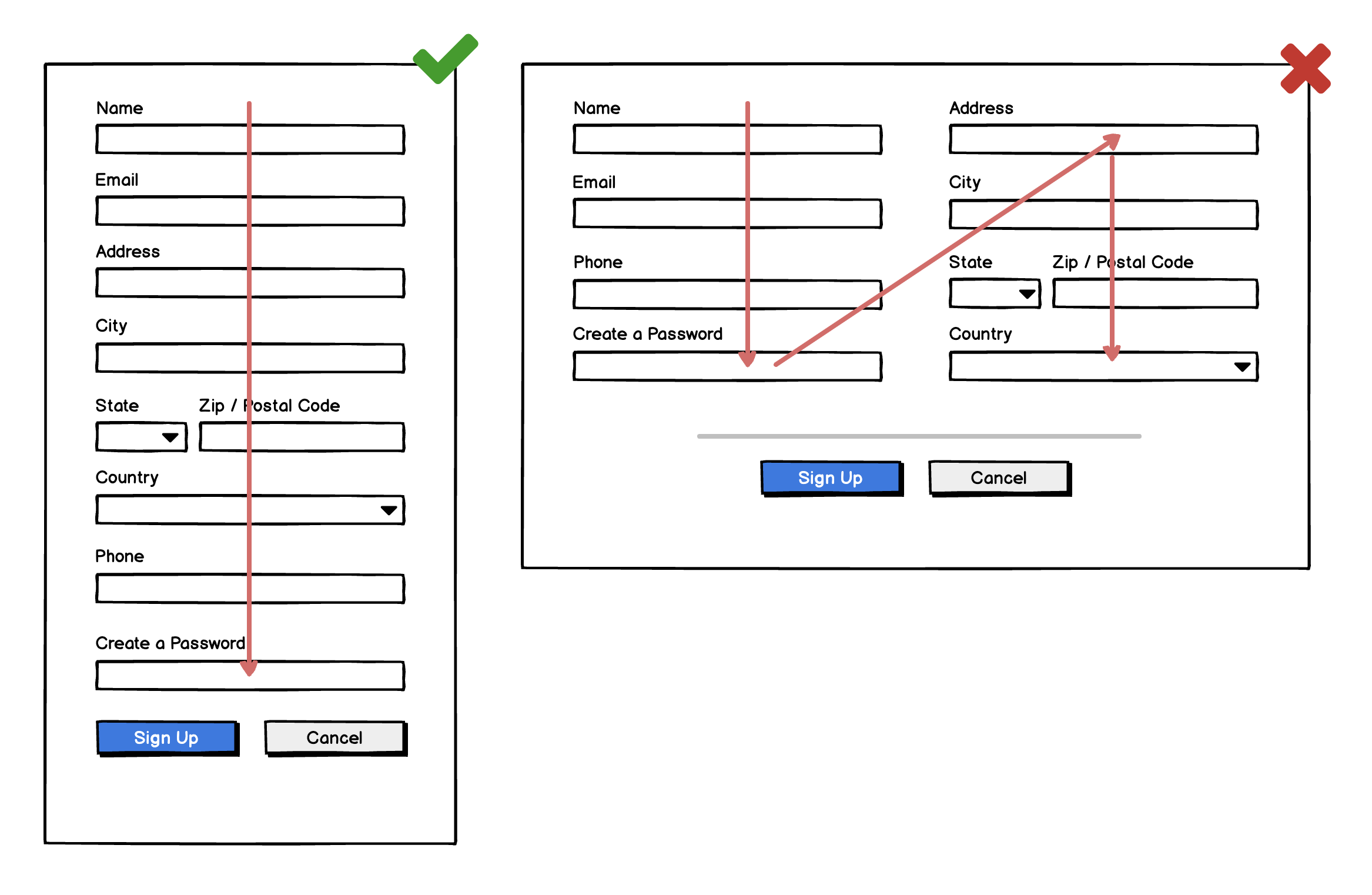
Even if the page is longer, it’s easier for the user to fill out sequentially. Putting all of your fields in one column will increase your completion.
The same goes for longer content, such as surveys.
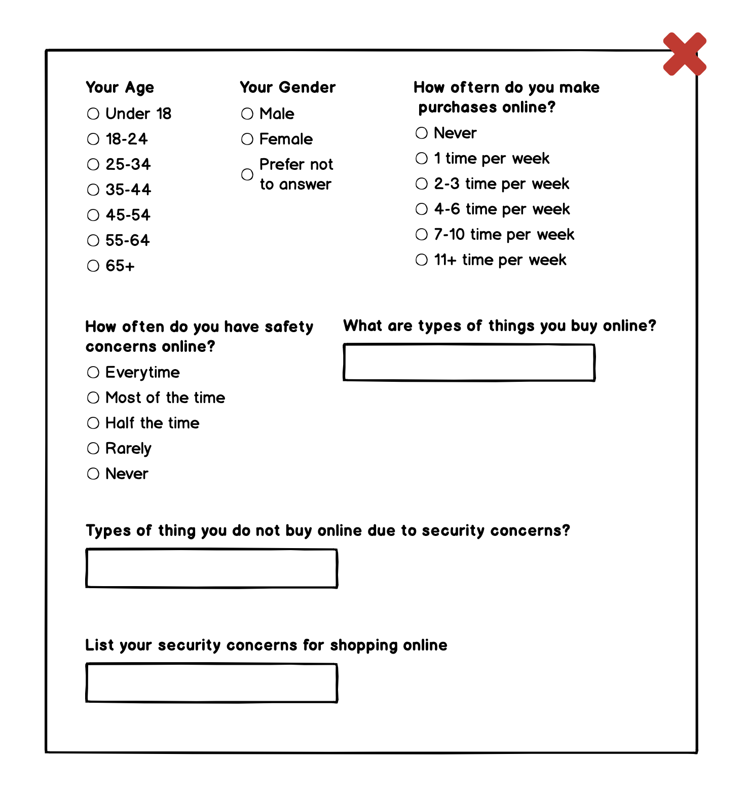
There is a tendency for new designers to want to maximize the space on the screen, so they cram all of the info into less vertical space. This layout makes it hard to keep track of which labels go with which fields.
Always give your users the ability to focus on one item at a time.
4. Use label placement intentionally
It's common to see labels placed in different locations relative to input fields, so it's understandable that you might not know where to place them in your forms.
Let’s look at the 3 best label positions and discuss advantages and disadvantages of each.
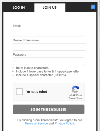
Note: Placing labels inside form elements is not recommended. Once a user clicks in and adds text, that label is gone and can only be recovered by clearing the field.
Left aligned labels
All labels being aligned to the left makes it easy to scan all of the information being asked for, and it saves a lot of vertical space on your page.
However, it takes much more focus to finish the form and could lead to lower completion rates. This solution is acceptable for short forms of 3-5 input fields.
Right aligned labels
Aligning labels to the right of their input field seems to be the most logical placement because they are the closest to the field when scanning left to right.
However, if the form is more than just a few fields it becomes difficult to scan and keep track of your place in the form.
Top aligned labels

Aligning labels at the top of your input fields is the best way to ensure users will complete your form and will result in fewer errors. It's easy to scan and is the easiest format for people to process.
Conclusion
Forms are a very important part of digital product design. Pay attention to the design decisions you are making when creating one. Fortunately, many of the rules are very straightforward. Following these 4 basic principles in form design will lead to higher completion rates, fewer errors, and a better experience.