If you own or work at a software company you might have all the numbers and data you need to improve your site, but there's one, messy detail you might be overlooking: human behavior.
Numbers tell you what doesn’t work, but until you actually see how people use your site, you won’t know why and what to change.
So let’s ask them!
Over at Conversion Crimes, we decided to run usability testing on 10 medium-big software companies’ websites. Real users went through some tasks while talking through their thoughts out loud, so we could understand which design and UX strategies work and which don’t.
These are the websites we tested:
- freshbooks.com
- youneedabudget.com
- sugarsync.com
- prestashop.com
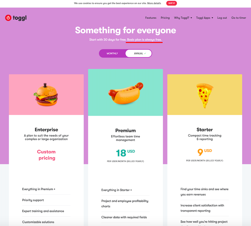
- toggl.com
- copper.com
- sendx.io
- hive.com
- gumroad.com
- zapier.com
Let’s see what we’ve learned.
What is the site about? Is it for me?
Users are getting better at extracting more information more quickly.
This means they are forming first impressions faster and more accurately than ever before. How can you make a great one?
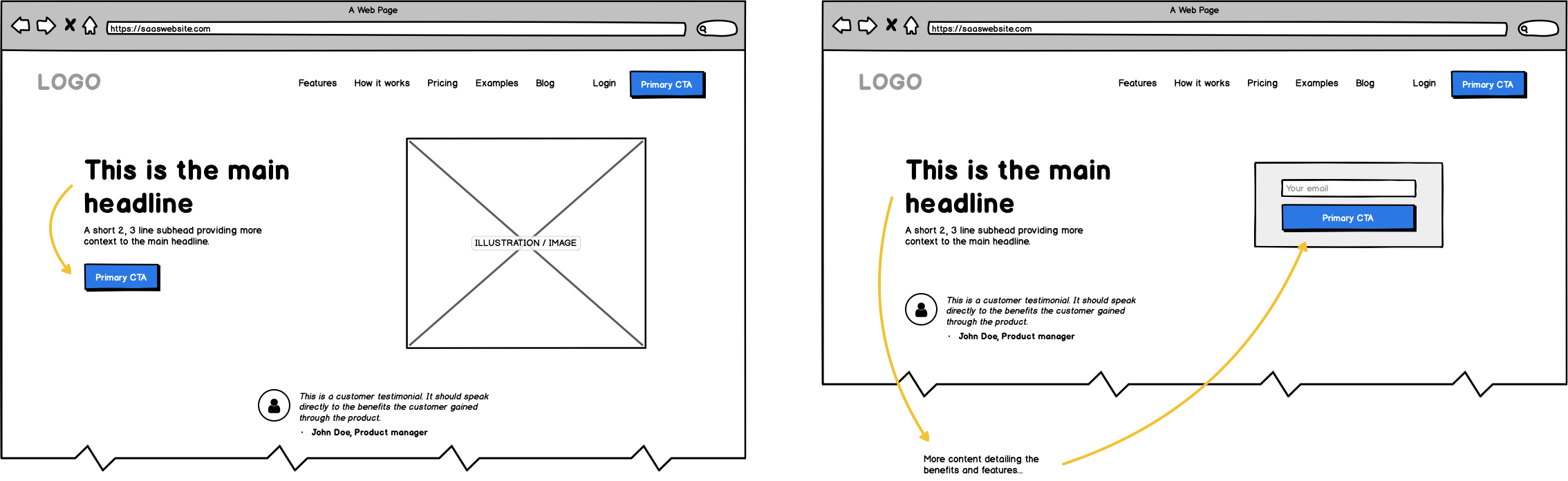
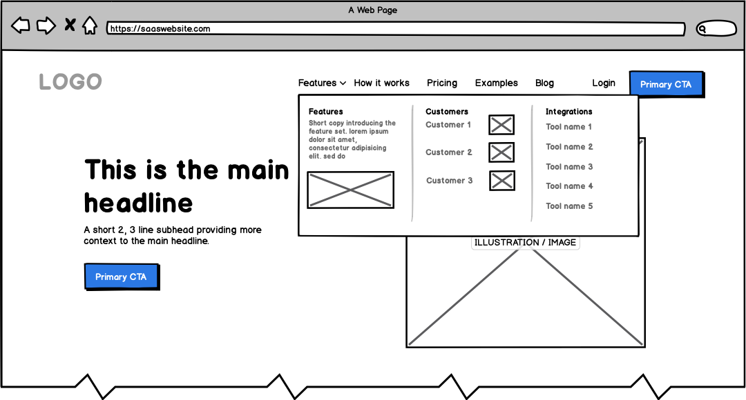
First impressions
Without telling them anything about it, we asked testers to provide their first impression of the site.
In the first 30 seconds they formed their opinion by looking in sequence at these elements:
- Logo: it should look professional and in tune with your brand’s message and colors.
- Headline: it should tell them exactly what your platform does (can be direct and to the point). Usually left aligned.
- Illustration or image: it should be placed on the right-hand side and be as descriptive as possible (forget stock images).
- Subhead: it should follow the headline and provide more benefit-oriented context (the shorter the better).
- Primary button: it should clearly tell them what the next step is and if they can start for free, it should say it.
- Navigation: it should not only be easy to use, but also use descriptive labels and clearly defined categories. Visitors often use it to understand what the site is about.
- Testimonials: they help visitors quickly figure out if they are the right type of customer (especially in B2B).

In general, make sure that your above-the-fold section is not crowded with text, that it suggests to readers what to read first, second, third etc. and that it helps them get a basic understanding of your product.
Bonus: Placing your button to the right of the headline helps visitors follow the information and understand the product more linearly. Great if your app is complex. (If it’s a simpler product, the standard placement of information is usually more intuitive.)
Navigation
Your navigation menu gives users a quick hint — at a glance — about the product and its audience. Labels should be descriptive, categories should follow their way of thinking about your product (how do they define categories?) and menu bars should take advantage of visuals to separate information. Avoid using multi-level navigation, it can be confusing.
A typical and effective navigation menu usually includes:
- Features (show them what the product does)
- How it works (show them the process, step by step)
- Pricing (present the different plans and price/terms)
- Examples (if you can showcase them, of different use cases)
- Blog (educate them)
- Primary CTA button (guide them towards the next step)
For enterprise products, we’ve noticed it can be effective to split the Features link into multiple areas (using a "mega menu", for example).
This is because usually enterprise SaaS products offer solutions to more than one or 2 audiences. Showing which types of customers you serve and how your product fits in with their other tools can be very helpful for busy decision-makers.
Is this the best solution for me? Can I afford it? Do I trust it?
Evaluating competitors
We asked our testers to compare the site they were on to a popular competitor. Users, especially in B2B, will often get to your site with an alternative in mind, whether it’s a direct competitor or a different way of doing the same thing your product does.
What stood out the most was that the winner in the comparison wasn't really the one with the most features or the cheaper one. Users, especially in the first few seconds of comparing websites, put a lot of weight on mainly a few factors: clarity, trustworthiness and transparency. It’s the Halo effect.
What can you do about it?
- White space, an effective color palette, good typography and visual hierarchy are hugely important in order to let the information on the page breathe.
- To convey trust, customer logos and testimonials are still very effective.
- And to be transparent you should opt for concise information and visual examples (dashboard mockups) over explainer videos, animations and content hidden in tabs.
- If you want to convey your authority, make sure you provide educational content (such as a blog, but also guides and case studies).
Obviously price is an important element, but it’s not the first thing users consider in their comparison. Rather, they look for the easiest “entry point.” Free trials were deciding factors in their preference.

Bonus: If you know exactly who your competitors are, show some confidence and spare them a trip to Google. Include a “Compare” navigation link leading to dedicated comparison landing pages (like Hive does).
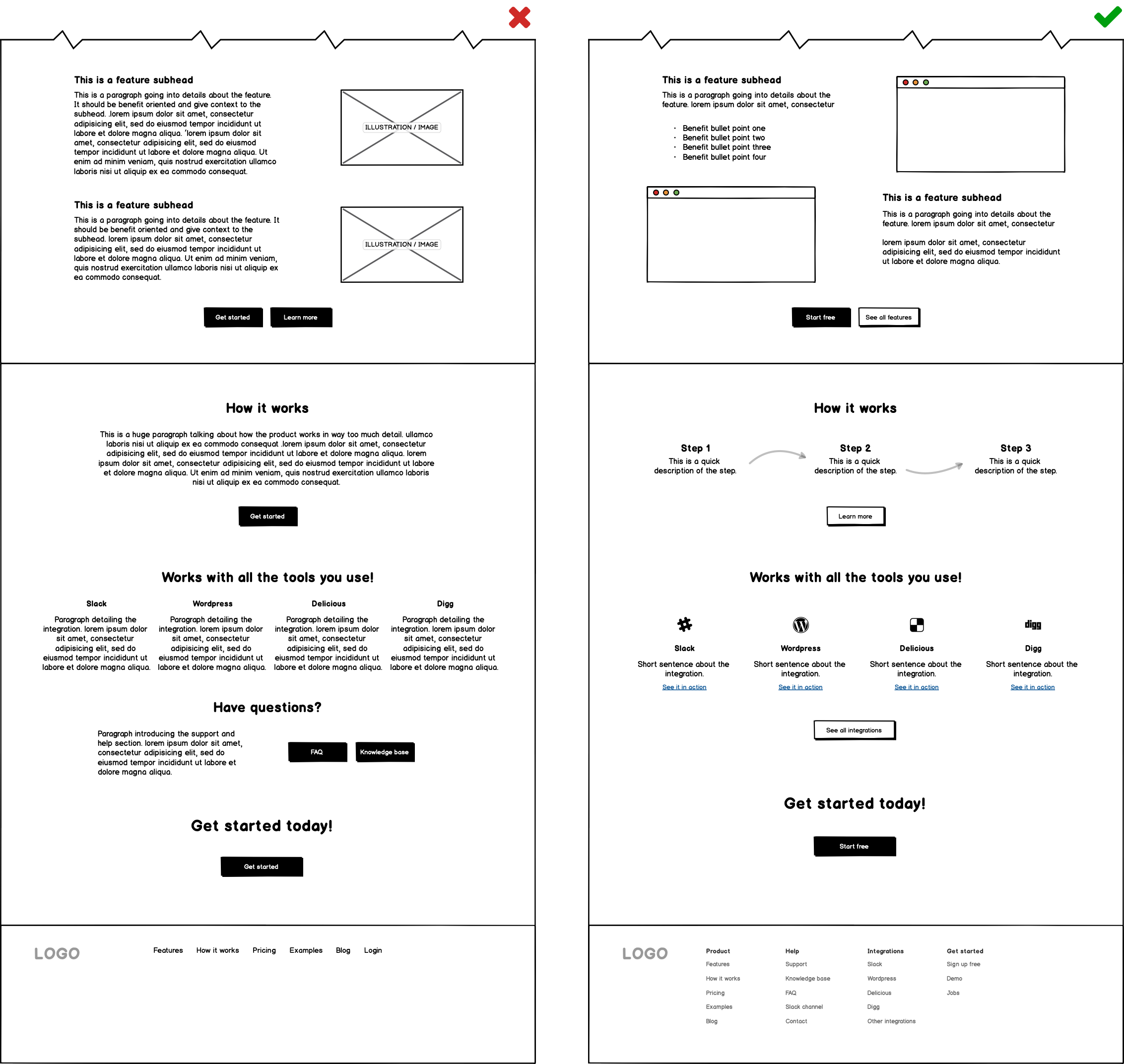
Searching for specific information
Users nowadays want to know how your product will fit with their current workflow or day-to-day.
An effective SaaS website should detail the main features that make the product unique and valuable in a way that’s easy to quickly skim, using compelling subheadings, short paragraphs and bullet points wherever possible. After learning about the functionalities of a product we saw that users wanted to get an idea of how the entire process worked. Adding a step-by-step “How it works” section on your homepage and to the navigation menu can be very powerful, especially if your product is new to the market.
You can think of these 2 sections this way:
- Features — Is this right for me?
- How it works — Can I be confident that it will be easy?
Make sure you link to an “Integrations” section (if needed) directly in your navigation menu and showcase the 3 or 4 most frequently used integrations — with recognizable logos — on your homepage.
Having an FAQ and a knowledge base on your site is also important but these should be your users’ last resort for finding information. Your footer is excellent for these.
Finally make sure the path to signing up is clear by differentiating your CTA buttons into primary and secondary. Primary buttons should reflect the goal of the page (usually to sign up or get in touch), while secondary should give users a way to learn more about what they’re reading.
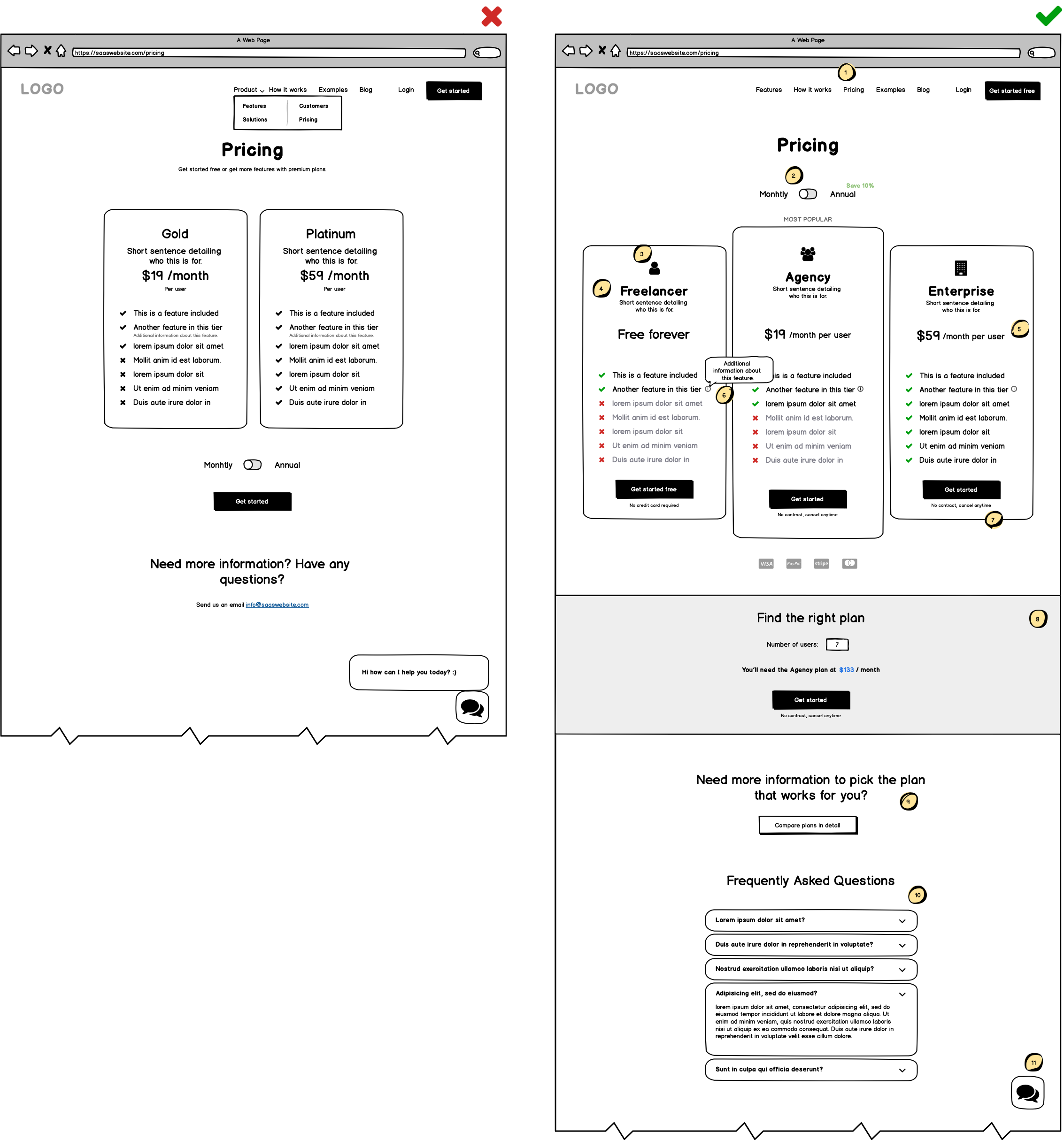
Pricing
Our tests pointed out some common issues that you should watch out for when it comes to pricing.
First and most important, if you offer a free trial, or a freemium plan, say it right away. Too many websites use confusing CTAs or hide the word FREE in paragraphs when they could just be transparent and open about it.
This is true for your pricing tables as well. If you offer a free plan, show it alongside your paid plans. If the value is there and they need premium features they will upgrade.
Other dos and don’ts to keep in mind are:
- Don’t hide the Pricing navigation link under a dropdown.
- Place controls where they affect change (above if change is global).
- Use descriptive names for your tiers/plans.
- Consider using visuals (illustrations or icons) to help describe your plans/tiers.
- Use visual hierarchy to clarify payment terms (per user, monthly or annual etc.).
- Use tooltips to add context and provide more information without crowding the page.
- If there’s “No commitment” state it clearly next to your CTAs.
- Don’t force users to mentally calculate the total price, do it for them.
- If you offer a lot of features, make it easy to compare them between all plans.
- Have a dedicated FAQ section at the bottom of your pricing page, users will thank you.
- Don’t interrupt users with your chatbot on the pricing page (if they need it, it’s there).
Is it safe? Did I make the right choice?
When it’s time to take out their wallets, users want to know it’s going to be safe. Often SaaS websites inadvertently introduce tiny friction points in the user experience that could quickly confuse and scare their user away.
Expectations vs. reality
The moment a user lands on your site is the moment they start creating expectations about your brand and your product. Don’t make your users guess!
Some very simple but often overlooked strategies work really well here. Like including a “How it works” section on your homepage (and a dedicated page to dig deeper). Define the top 3 or 4 actions that will help users accomplish their goal, and visually show them in a step-by-step fashion.
This includes the signup and whether or not they will need a credit card for it. Not mentioning these details and then asking for them later is like shooting yourself (and your user) in the foot.
Here are a few more things to consider:
- Do users require to download software or is it web-based? Make it clear.
- Give users a guided tour of your platform, but allow them to skip it.
- Offer a free trial? What will happen once it’s over? Outline the process for them.
- If your product is complex, a good interactive or live demo can go a long way.
- Show what your product looks like with mockups so users know what they’ll get.
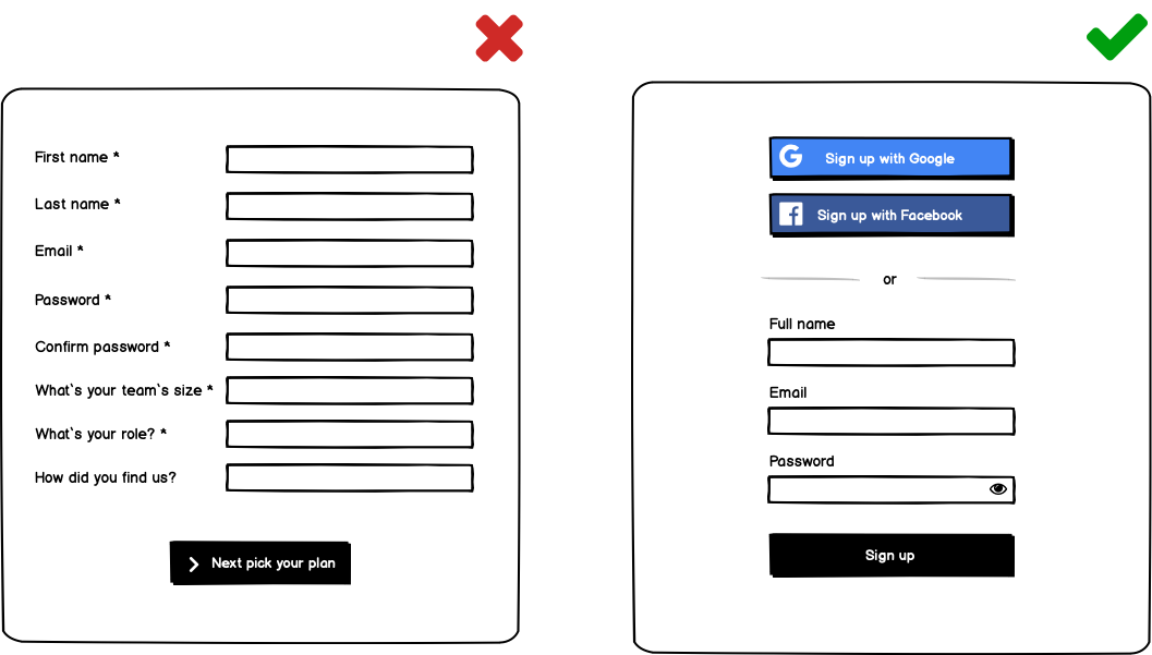
Sign up
When it comes to a software product, users are likely to be excited and want to jump into it right away, especially if you offer a free trial (or if they are already familiar with similar tools).
How do you make it easy for them to start?
- If you can, let users sign up with Google or social media.
- Only ask for what’s necessary at this point. Keep the marketing questions for later.
- No more messy captchas. If needed, use reCaptcha v3 to protect you from spam.
- When a user clicks a pricing table button, lead them straight to sign up for that plan, don’t add redundant steps in the middle.
- Show password requirements before entry and allow to view the password to avoid using 2 fields. Also validate the password before submission.
- Optimize loading time after submission or risk frustrating users.
- Walk users through their first experience and let them know when they’re all set and ready to start. This confirmation is what they’re looking for.
Conclusion
Always keep in mind that your users are busy and that you have the power to make their life and work easier. Your website is a natural extension of your product and what they’ll see first.
First impressions matter, as well as the expectations users have about your brand. Start thinking about their entire journey and anticipate their questions with clear copy and mindful design. Take them by the hand, step by step and show them they’re making the right choice with confidence.
And remember, when in doubt, always ask your users!
To learn more about how first-time users perceive and navigate your site, see our video series Website UX reviews with usability expert Paul Boag.