Just like the Terminator, your brain is always scanning what it sees, looking for cues on where to focus your attention. Understanding how and where your users will focus their attention will allow you to design more effective and easy-to-use products. When proper hierarchy and alignment are implemented your site or app will be easy to scan and better for comprehension.

Master visual hierarchy to make your UI more effective and easy to read
In the broad sense, understanding visual hierarchy means understanding how our brains help us see and comprehend the world around us, by scanning, and how that affects our behavior when interacting with digital interfaces. If you understand the levels of attention each item on your page will get, it will help you design better pages / apps / software. People will understand whatever it is that you’re wanting them to do more quickly, with less effort.
Lack of visual hierarchy and poorly aligned content interrupts your brain's ability to scan and zone in on areas of interest. If we cannot quickly understand what we see, we become frustrated and will likely leave the experience.
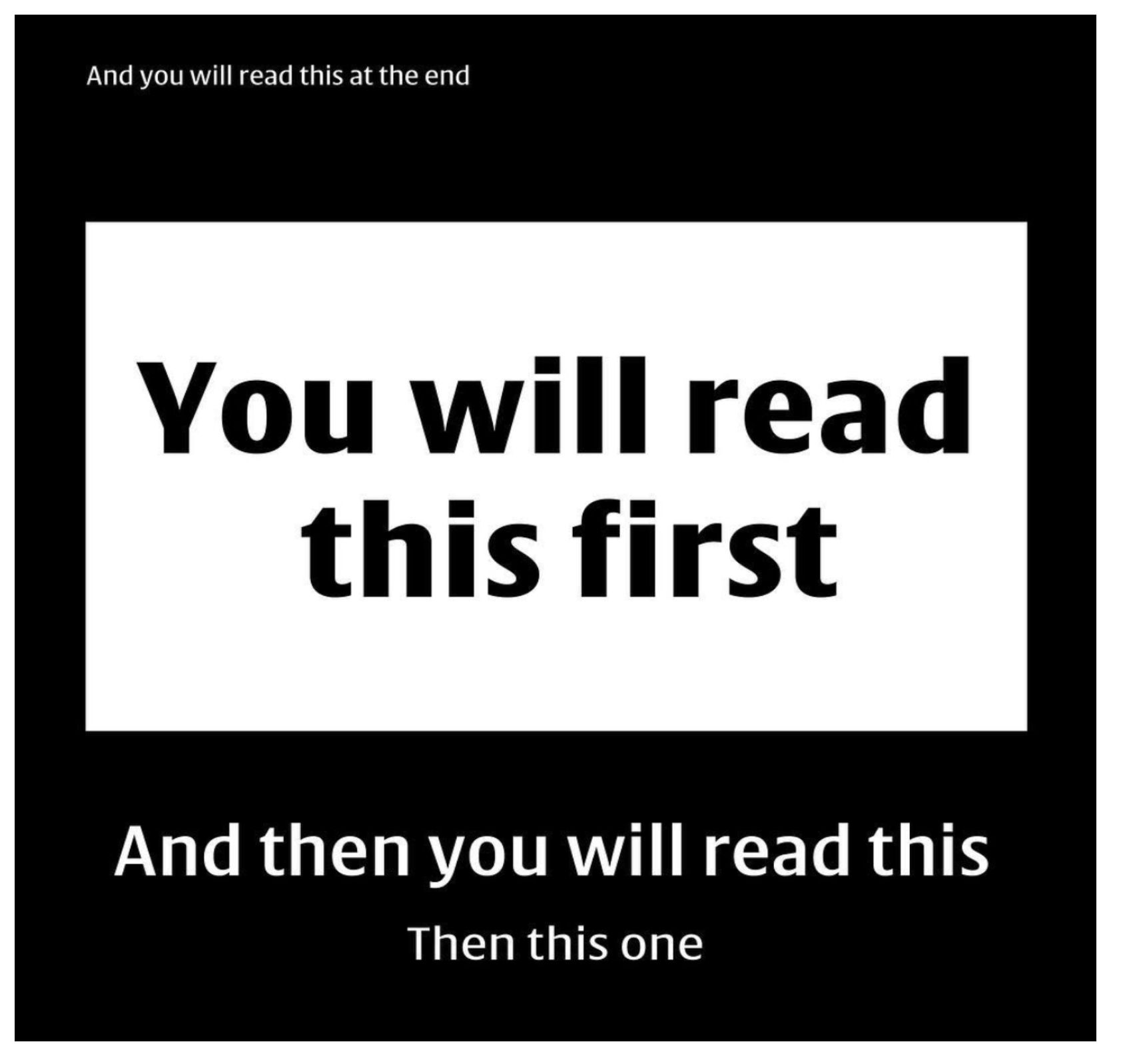
I’ve seen lots of these posted online and it's true. If you read in the order in which it said you would, you’re not alone.
It’s how our brain takes in information. Visual hierarchy is something that permeates all types of communication. Advertising, art, and journalism all use it. Designers use it intentionally to guide people to the areas they want the most attention on.
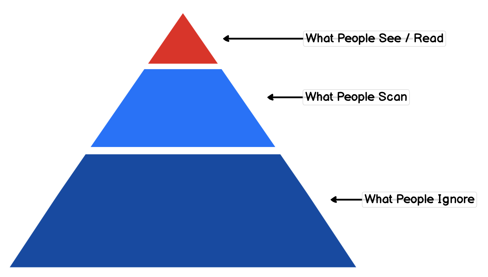
That is why our brains scan content. There is no way we can read every word that we see, just like we cannot focus on every image we see or sound we hear. We must design experiences that give users clues as to what each area is about, and let them decide if that is what they want to dig into more.
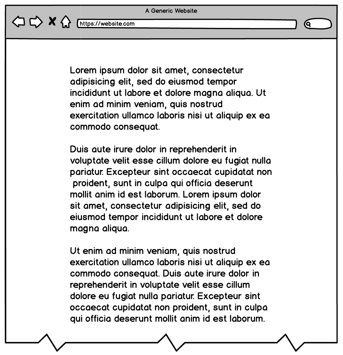
Look at this example of a web page with no hierarchy. There is nowhere for your eye to focus. You are looking or scanning for places to anchor onto and glance at. When there is no place like that, you simply ignore it.
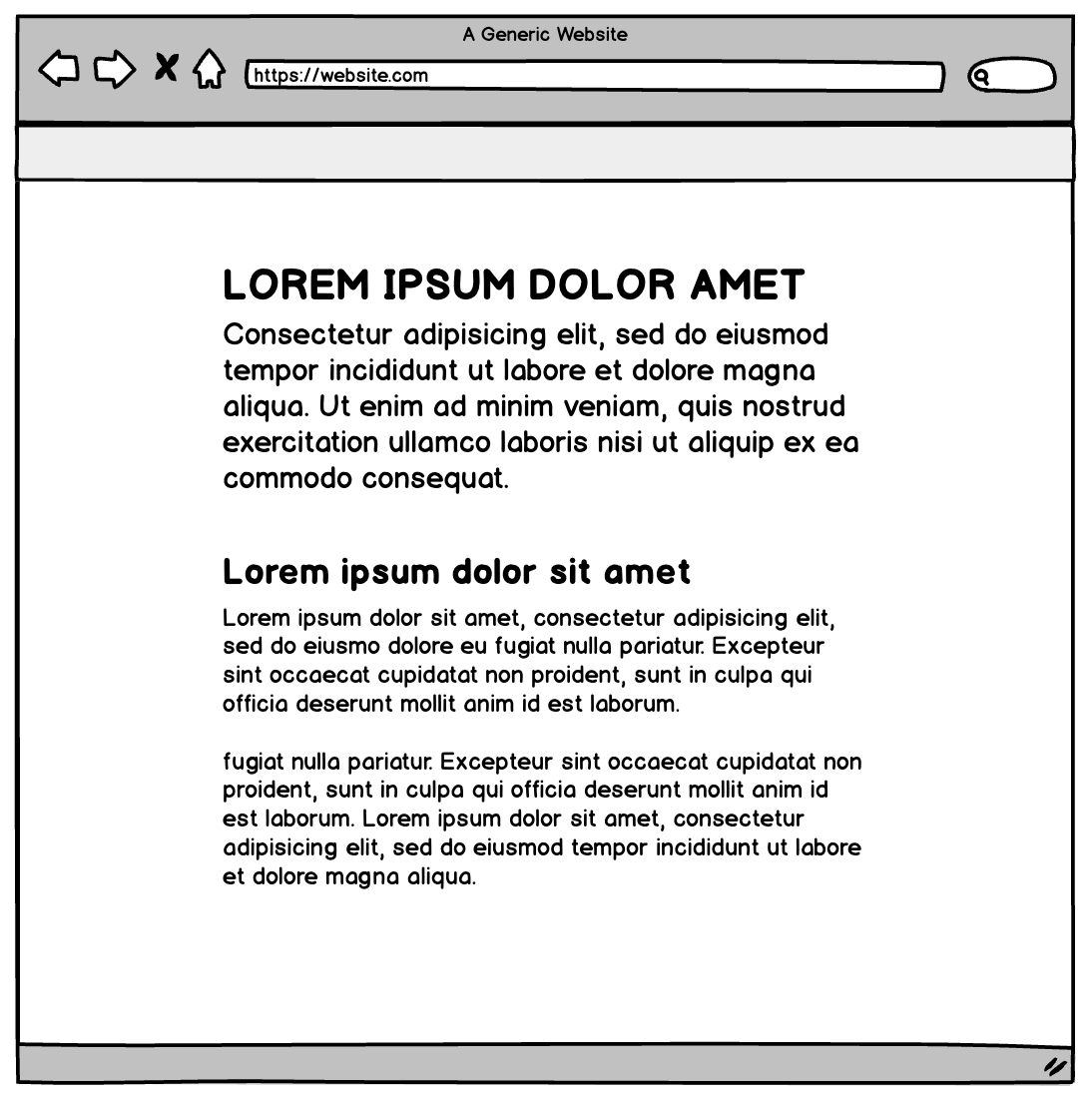
When you add a bit of hierarchy to a page, now attention is drawn to the top of the page and people will read the headline at the very least.
When there is no hierarchy or places for our eyes to go, we cannot focus, and must use more of our attention to discern where we need to go next.
Sometimes this is used intentionally. When you place equal weight on the items on your page you are confusing your users. It’s a common dark pattern sites use when they don't want you to take action at all (e.g., to cancel your membership). The example below uses a lot of similarity between the choices and the result is the user must study each section and read the button text to ensure they take the action they want.


You can see the effects even more when you combine hierarchy and alignment. Communicating the most important elements prominently, while aligning everything allows people to quickly scan the elements on the page to find what they’re looking for.
Alignment also affects how your brain scans content on a screen
Proper alignment is one of the telling signs that a professional designer crafted the interface you’re using. When you see something that is well aligned, even if you’re not consciously aware of it, you feel that you’re using an interface that was designed more deliberately.
Align text with text
Look at the example below. The first option does not look bad, but something is off.
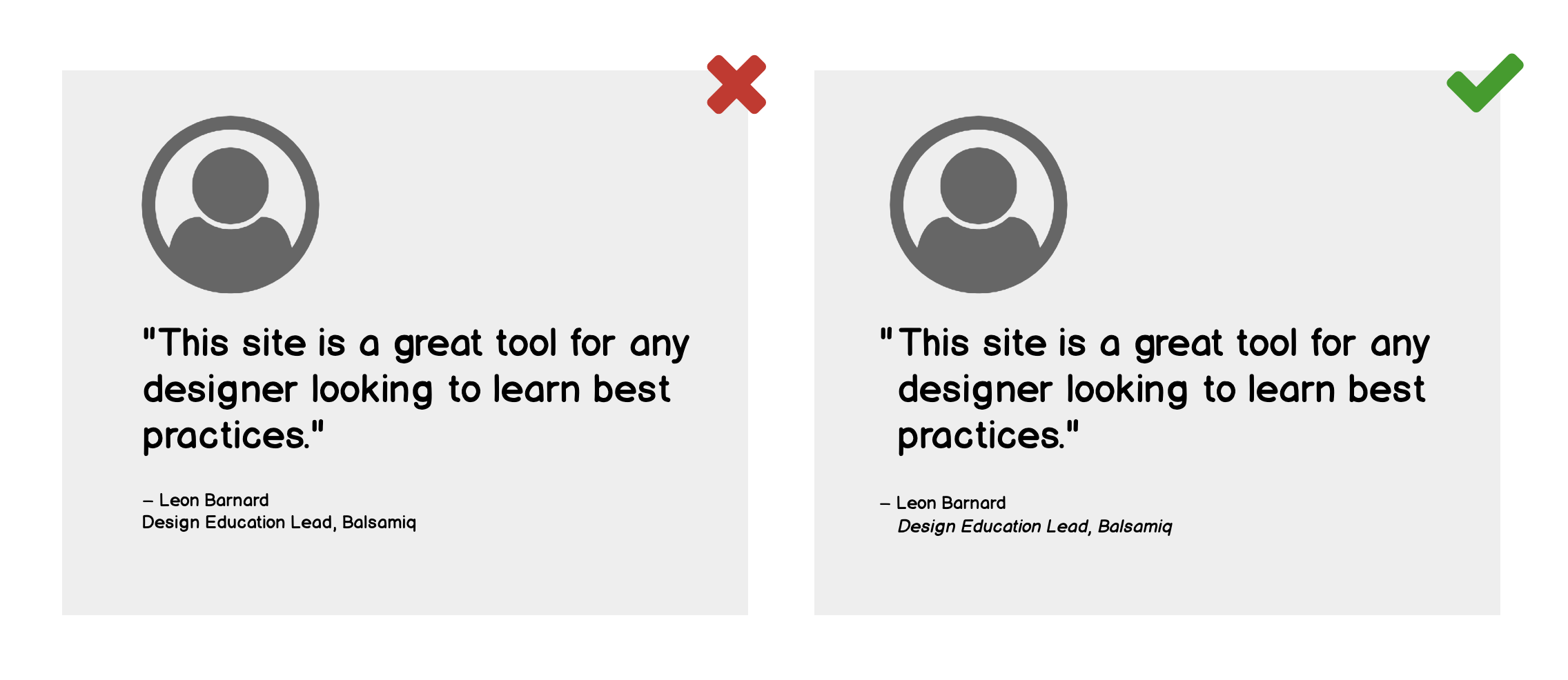
When compared with the example on the left you can see the alignment on the right is with the text and not the quotation marks and it makes it much easier to scan.
You can see this better in an example with more content. Aligning text with text and not with the icons will allow people to scan the icons and headline text easier. It’s also easier for the user to read.
![]()
Horizontal alignment

Horizontal alignment for images and text boxes is also important. It’s easier to scan across the top of a page when it all aligns.
Note: Ideally, you’d want the x-heights to be aligned, not the tops of letters. You don’t want to align the top to the highest letter, rather align it where the majority of the content is placed.
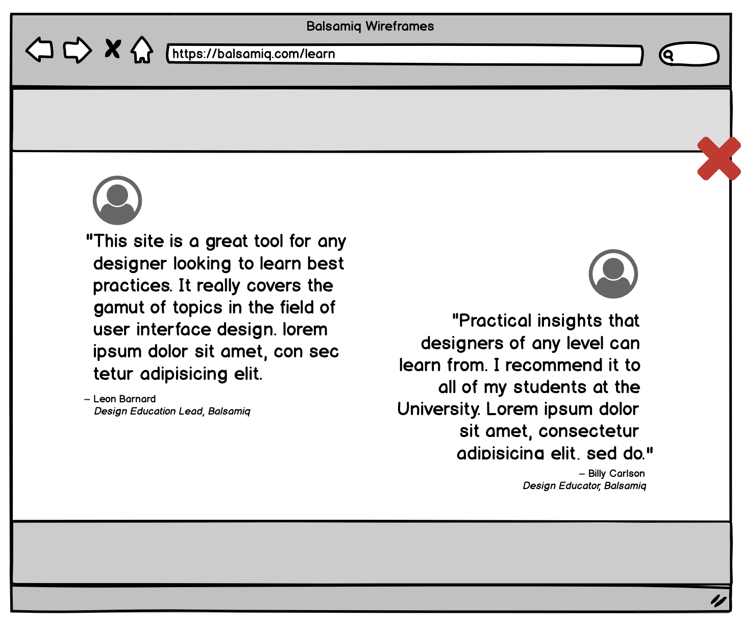
Another form of horizontal alignment is when content blocks are cascaded but the content still falls in the same eye-line. If that sight line is interrupted you will naturally want to jump to the next piece of content. This makes it hard to focus on the first bit of content. When you have things side-by-side it adds a nice visual interest to each text box, but overlapping can cause disruptions to comprehending the content.
If you have places where the text runs across the page, try to give some vertical space between things so the user can easily look at each area separately.
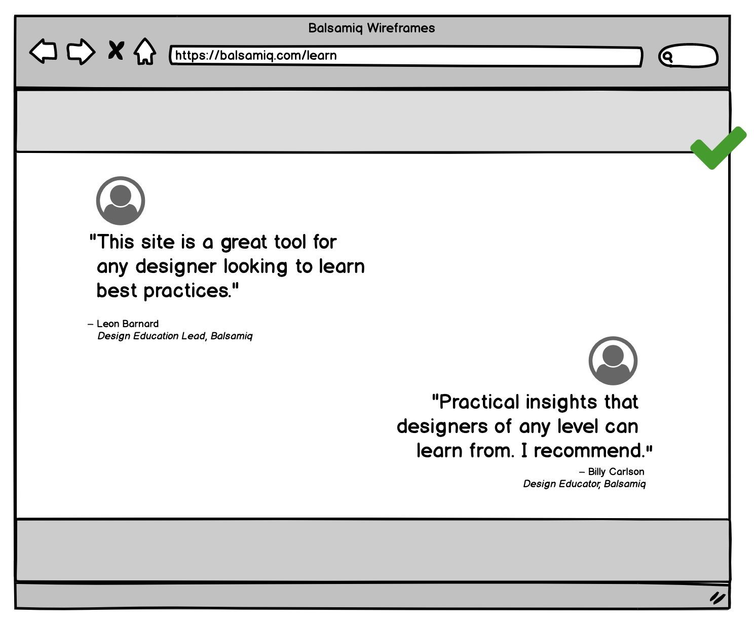
You may be tempted to squish things together so the pages don't feel as long, but in reality when people are reading websites, they don’t mind long pages. We do mind when things are too close; our brains chunk them together and we can't focus as easily.
Putting it all together
Let’s look at a full web page that doesn’t have good alignment and a page with good alignment, to compare. There are fewer places for your eye to get lost in the more aligned version.

Your brain loves patterns. Did you ever notice that most content-heavy websites are symmetrical? Look at this overlay. Everything aligns nice and neat. This is a useful exercise when creating wireframes for a web page to see how well everything aligns.

Conclusion
This article only scratches the surface of what there is to learn about visual hierarchy and alignment. But even implementing lessons from these basic examples will improve what you’re working on. Be sure to constantly analyze your design to see what areas your eyes are naturally drawn to. Take notice when you feel like you're interrupted or distracted when scanning your site.
All of these are the clues you need to understand how others will also perceive it. Better yet, ask friends to review your work and ask them the same questions. Find areas that need improvement and fix them. Your site will be better for it.
To dive deeper into this topic, see our video lesson on Page Layout Fundamentals.

