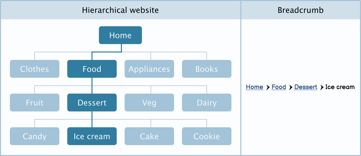
Breadcrumbs are a secondary form of navigation that allows users to navigate a hierarchically structured website.
Applies to:

Use breadcrumbs for hierarchical navigation
Breadcrumbs are a chain of links used on websites with hierarchical navigation.
To create successful hierarchical navigation, pages should only have one parent category. If more categories are needed, use tags instead.
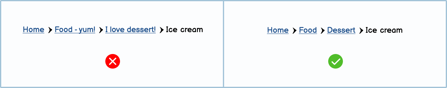
Because breadcrumbs use page names as part of their structure, it’s recommended to keep parent page names as specific and short as possible.
Etymology The term ‘breadcrumbs’ comes from the beloved tale of Hansel and Gretel and how they used a trail of breadcrumbs to find their way back home.
Best practices
There are a few best practices when it comes to breadcrumbs.
Breadcrumbs should show hierarchical navigation and not navigation history
While it can be tempting to show the user’s previous steps in a breadcrumb, this is not the best practice. Breadcrumbs should show website hierarchy.

Breadcrumbs should never replace primary navigation
Breadcrumbs are only a secondary form of navigation and should never be the only navigation method available to users. Make sure you have a menu bar or other primary navigation method to allow users to navigate more freely.

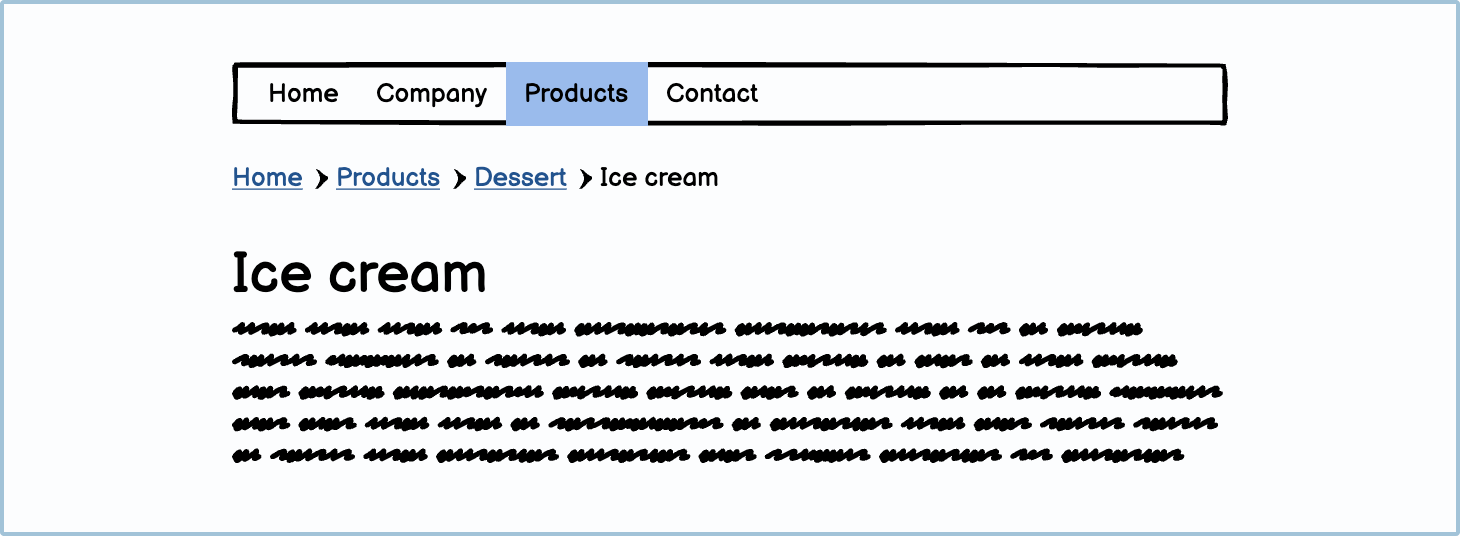
Breadcrumbs should sit above the content but below the main navigation
Navigation, regardless of the type, is usually expected to sit above the content. The main navigation is always at the very top, followed by breadcrumbs. This allows users to orientate themselves as they move throughout the website.
Consider condensing breadcrumbs when they get too long.
When your breadcrumbs get too long for their allocated space, consider condensing them by using an ellipsis (...).

Breadcrumbs should show the currently selected page
Breadcrumbs should show the current page, even if the title is repeated elsewhere on the page, as this helps users orientate themselves. Something to note is that the current page shouldn’t be a link.

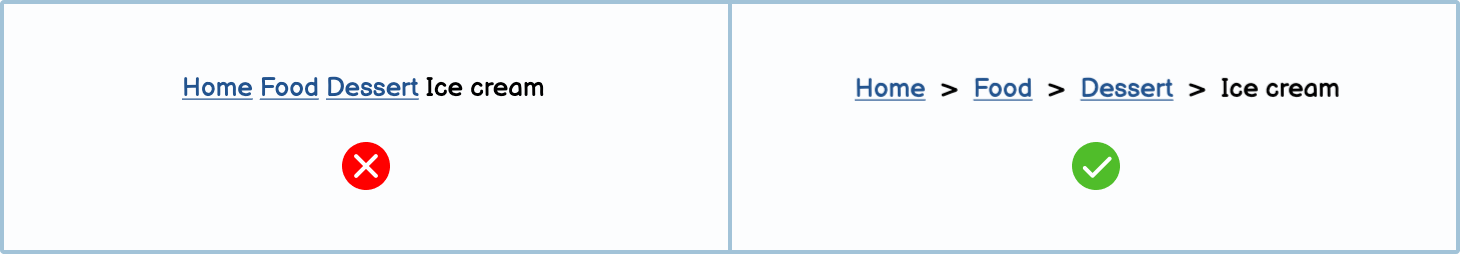
Separate links with an inactive character
To avoid users getting confused about where the start and end of a link is, always separate them with a special character. The most common are the greater than symbol (>) and the forward slash (/).
Variations
Try making your own breadcrumb variations in Balsamiq.
DIY components
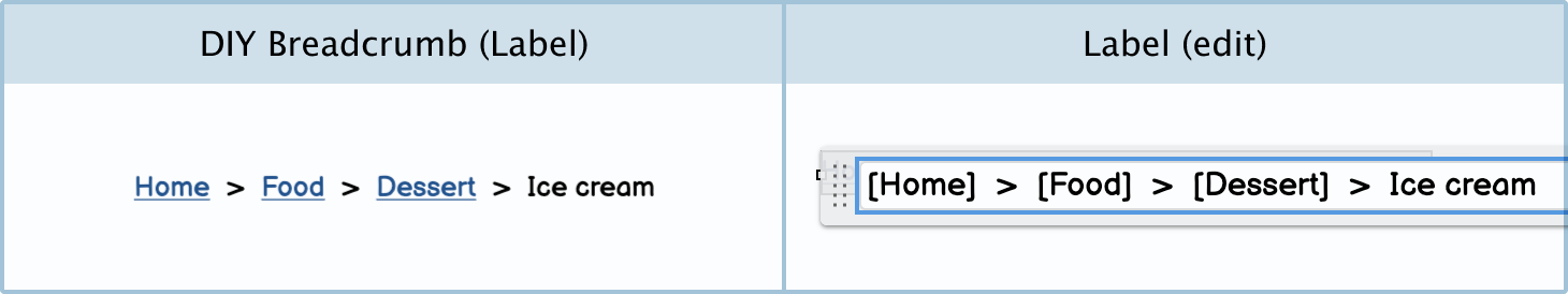
You can make your own custom breadcrumb Components in Balsamiq.
Condensed breadcrumb: The condensed breadcrumb can be used when your breadcrumb gets too long.

DIY breadcrumbs: You can create your own breadcrumb using a label component.