Images are one of the most commonly used media types due to their relatively quick loading speed, their versatility, and how easy they are to make.
Applies to:

Images in wireframes
One of the benefits of wireframing is creating and showing concepts and designs as quickly as possible. At best, trying to find the perfect image to add to your wireframe takes time. At worst, it can confuse your audience if the image isn't quite right.
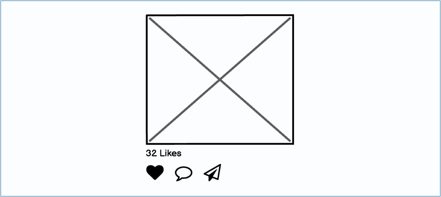
Due to this, designers use a box with a cross through it to indicate that something is an image in their designs, unless they know for sure which image will be used. This makes creating layouts a lot quicker and easier.
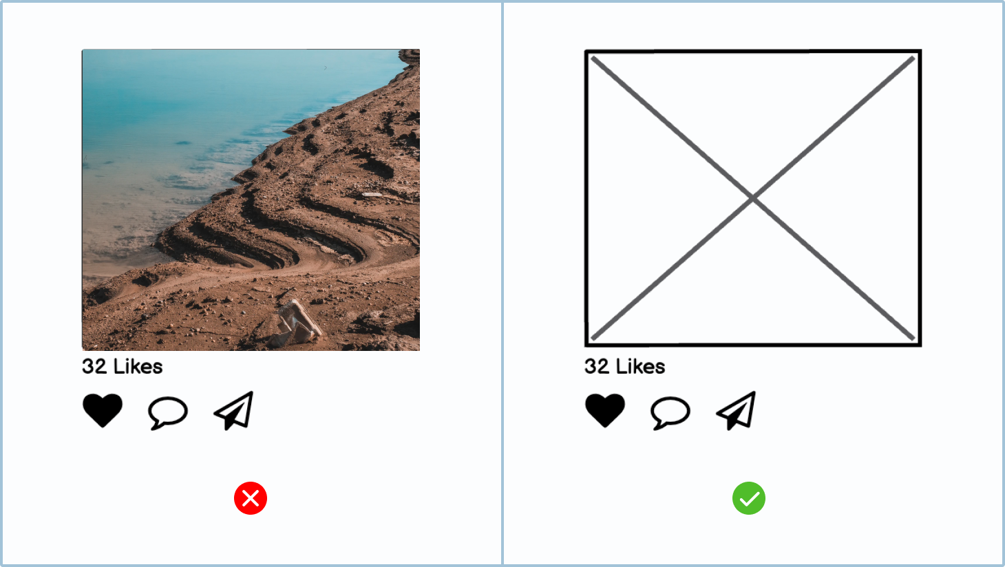
Image placeholders and actual images in wireframes
Depending on the situation, you may need different levels of detail for your wireframe images.
Placeholders
Most images in wireframes are placeholders, depicted by a rectangle with a cross. This can mean one of two things:
- Specific images will be chosen later in the product’s design process.
- The images will be added by users, so the designers don’t need to show specific images.
How to in Balsamiq By holding down the i key and dragging, you can quickly create a placeholder image. Learn more about basic drawing UI elements in Balsamiq.
Images showing a rough idea
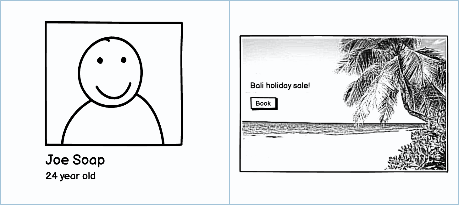
In some wireframes, you need more than a rectangle with a cross through it to describe what you are envisioning. For a user’s profile picture, you may want to have a sketch of a person. For a photography repository, you may want to show what kind of images you are expecting to be there. You may have an idea of an image for the landing page but can't find the perfect one. In these instances, you will want to use a rough sketch to show reviewers what your idea is.
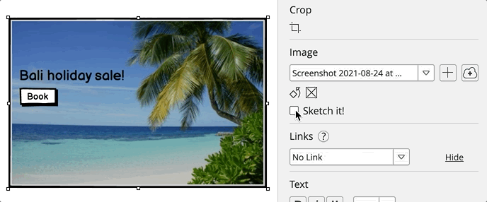
How to in Balsamiq In Balsamiq, you can use the "Sketch it!" checkbox in the property inspector to quickly make a sketch or rough version of an image.
Wireframes showing the final image
In some instances, you may have a strong idea of what the final image should be. In this case, it is fine to use an actual image.
How to in Balsamiq You can add your own images to your wireframes by clicking on the plus icon in the property inspector.

Uses
As mentioned earlier, there are many different uses for images. Below are some of the most common.
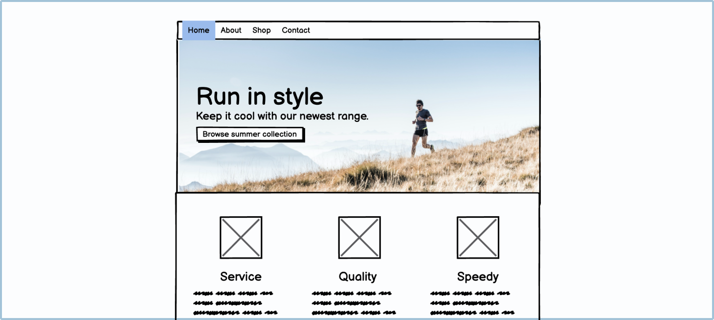
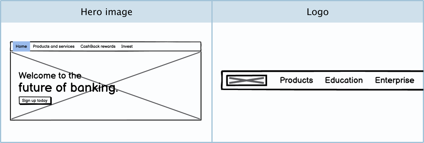
Hero image: A hero image is a large image that some website homepages show at the top of the page. It will usually have a headline on top of it.
Logo: A logo represents a company’s identity. If you don’t have the company’s logo on hand, you can use an image placeholder as a representative in your wireframe.
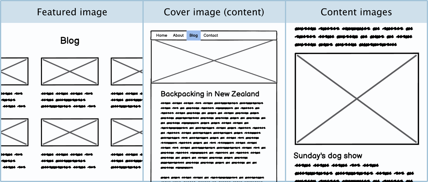
Featured image: The featured image is an image representing a blog post or product listing.
Cover image (content): A cover image will usually be a full-width image at the top of a page in an article or blog post. It can also be used to break up sections of an article.
Content images: Blog posts, recipes, news articles, etc. will often have pictures in between bodies of text.
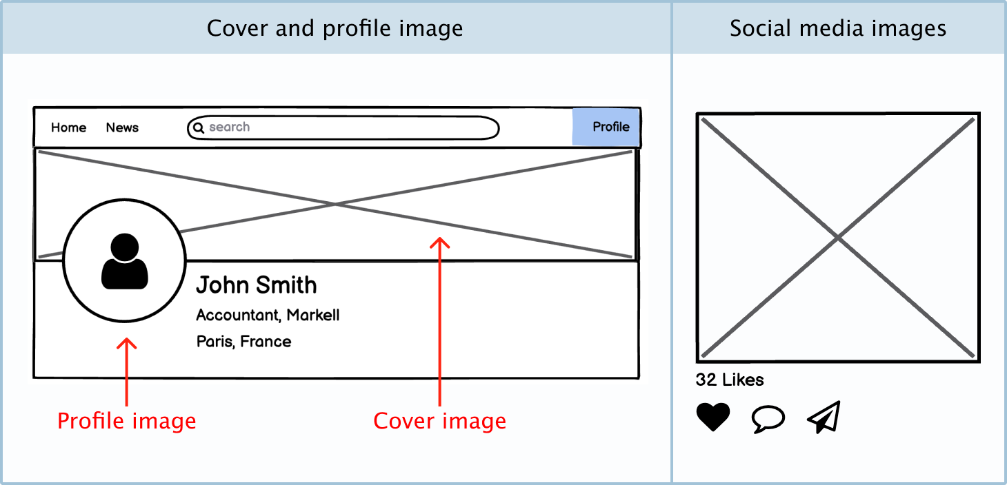
Profile picture: A profile picture is a photograph or representative image of a user.
Cover image (profile): On a profile page, the user may have the option to add a wide image at the top of their page.
Social media images: Users on social media platforms will often share pictures and photos.