The on/off switch element allows you to toggle a setting on or off.
Applies to:

Styles
When creating an on/off switch, you can choose to have the toggle on the left or right of the label.
Left-aligned
Left-aligned on/off switches have the toggle on the left-hand side of the label. This is sometimes found on desktop interfaces.
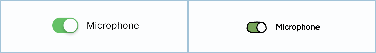
Right-aligned
Right-aligned on/off switches have the toggle on the right-hand side of the screen. This is particularly common on touch screens, as it makes it easier for most users to reach it.
How to in Balsamiq You can change the color using the Color picker. Try to keep all your on/off switch colors the same throughout your wireframes.

Labels
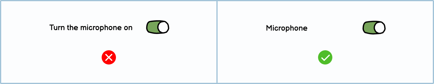
Like most other input fields, the clearer the label, the easier it is for the user to understand.
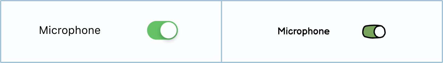
States
On/off switches change their state or appearance so that users know what the current setting is.
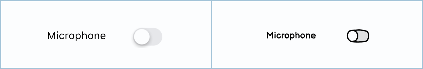
Off
When the on/off switch is in the off state, the setting will be turned off.
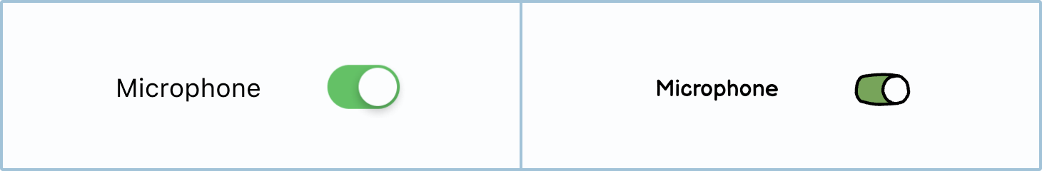
On
When the on/off switch is in the on state, the setting will be active.
How to in Balsamiq You can change the state of an on/off switch by using the State toggle in the element panel.

Best practices
There are a few best practices when it comes to on/off switches.
On/off switches vs. radio buttons
On/off switches are very similar to radio buttons in that they both are single selectors: there can only ever be one option selected. However, unlike radio buttons, an on/off switch can only have 2 options, which usually relate to something being active or inactive.
When you should use on/off switches:
- If there are only 2 options.
- If the 2 options relate to something being "On" or "Off" or being "Active" or "Disabled".
- If you want the action to be instant. When you toggle an on/off switch, it should instantly make the change. Whereas with a radio button you have to click a 'save' or 'submit' button to implement and confirm the radio button’s action.

When you should use radio buttons:
- If there are more than 2 options.
- If the options aren’t referring to something being on or off.
- If you want the user to confirm the setting by clicking save or submit.
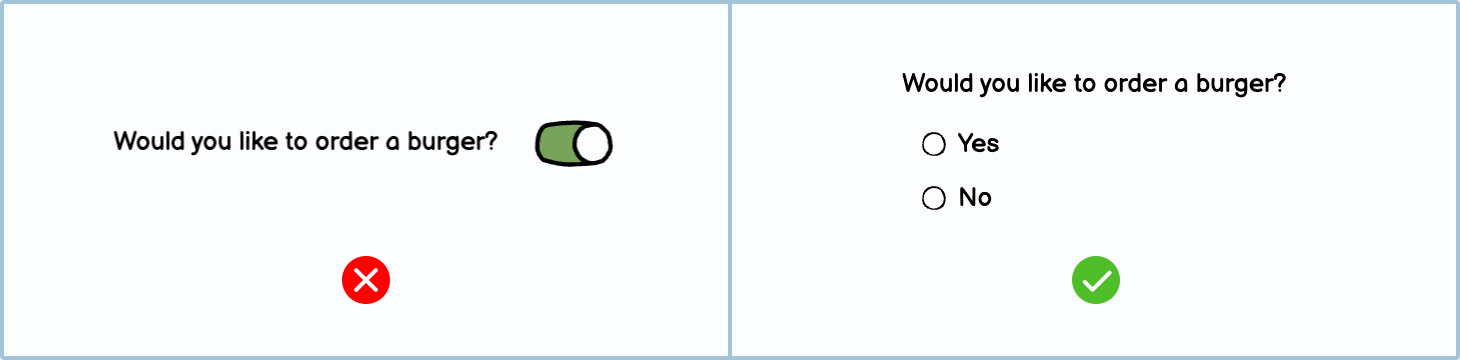
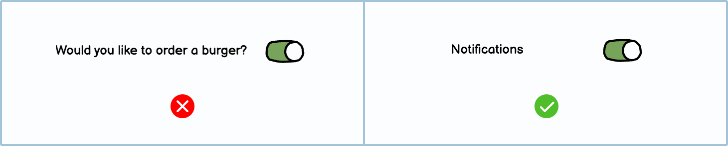
Only use on/off switches for settings
On/off switches are usually used in settings areas and not in forms. If you have a yes/no question that doesn’t relate to settings, use a radio button instead.
On/off switches on phones
Since approximately 90% of the population is right-handed, it's become customary to put elements on the screen's right-hand side. Given this, consider putting the switches in reach of their thumb on the right-hand side.

Variations
You can choose to use other variations of on/off switches.
DIY Components
Make your own Components in Balsamiq using other pre-made elements.
Toggle button: Using a circle button and an icon, you can create a toggle button. The user can click the buttons on and off to set whether they should be active or not. Consider adding labels below, as some users may not understand what the icons mean.
On/off switch with an icon: You can add an icon to your on/off switch to make it more attractive.