Wireframes
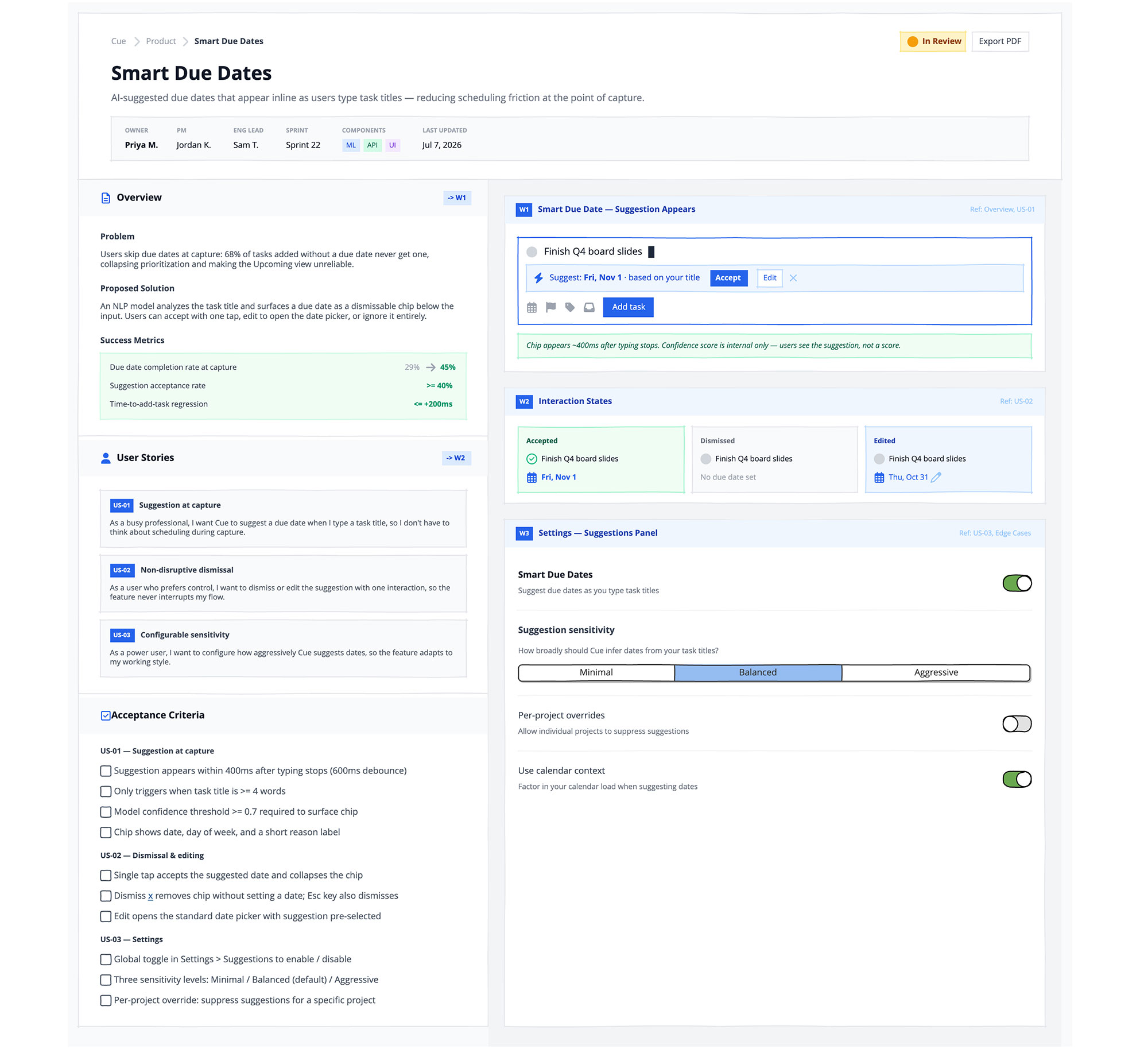
This example is a single board that functions as a complete feature specification document.
The left column carries the written spec: problem, proposed solution, success metrics, user stories, and acceptance criteria.
The right column shows the wireframe states that correspond to each section — the moment the suggestion appears, the interaction states (accepted, dismissed, edited), and the settings panel where the feature can be configured.
Each wireframe card is cross-referenced to its section in the spec, so there's no ambiguity about which screen belongs to which requirement.
Recreate this in Balsamiq AI
Paste this prompt into Balsamiq AI to generate a similar flow, then edit any line to make it yours.
Swap the brand name, change the colors, add or remove steps and fields.
Build a single wireframe board for Cue, a fictional task management product. The board represents a Feature Specification / PRD document — a handoff artefact that combines written requirements with embedded wireframe snippets, designed to make engineers happy. This is not a product UI — it's a document that lives inside a product. Think Notion meets Linear spec, but as a low-fidelity wireframe.

Use 1440px board width. The background is #F9FAFB. The board has no sidebar or navigation — it reads top-to-bottom and left-to-right like a document.

Section 1 — Full-width Document Header

The header is a white rectangle with a #E5E7EB bottom border. Inside, lay out three rows stacked with 16px gap.

Row 1 — breadcrumb + status + actions. On the left, a breadcrumb in #9CA3AF at 12px: "Cue › Product › Smart Due Dates", using fa-chevron-right (size 16, #D1D5DB) as separators, with the final crumb "Smart Due Dates" in #374151 bold. On the right, an In Review badge — #FEF3C7 background, #FDE68A border, a filled amber fa-circle (size 16, #F59E0B) icon, bold #92400E text — followed by a white outlined "Export PDF" button.

Row 2 — document title + subtitle. The title "Smart Due Dates" is 28px bold #111827. Below it, a single line of 14px #6B7280 body text: "AI-suggested due dates that appear inline as users type task titles — reducing scheduling friction at the point of capture."

Row 3 — metadata strip. A #F9FAFB rectangle with #E5E7EB border, 20px left/right padding, 12px top/bottom, containing 6 metadata columns in a horizontal row with 32px gap. Each column is a small stack: a 9px all-caps #9CA3AF label, then a 12px #111827 value below it. Columns: OWNER (Priya M., bold), PM (Jordan K.), ENG LEAD (Sam T.), SPRINT (Sprint 22), COMPONENTS (three small colored inline badges — ML in #DBEAFE/#1D4ED8, API in #D1FAE5/#065F46, UI in #F3E8FF/#6D28D9, each 10px), LAST UPDATED (Jul 7, 2026).

Section 2 — Two-column Document Body

Immediately below the header, the board splits into two columns with no gap between them.

The left column is 460px wide, white, with a #E5E7EB right border. It contains three stacked spec sections separated by #E5E7EB horizontal dividers.

The right column fills the remaining width (flexGrow: 1) with a #F3F4F6 background and 24px padding all around. It contains three wireframe cards stacked with 24px gap between them.

Each spec section on the left has a section header row: #F9FAFB background, 28px left padding, 20px right padding, 16px top/bottom. The header shows a blue section icon (size 16, #2563EB) + bold 14px #111827 section title on the left. Sections that have a matching wireframe show a small reference badge on the right — #DBEAFE background rectangle, no border, 7px left/right padding, 2px top/bottom, with bold 10px #1D4ED8 text (e.g. -> W1). The wireframe cards on the right use matching W1/W2/W3 labels to cross-reference.

Left column — Section A: Overview -> W1

Use fa-file-lines (size 16, #2563EB) for the section icon.

The body has 28px left/right padding, 16px top, 20px bottom, and three sub-sections at 14px gap.

Problem — bold #374151 12px label, then a 12px #4B5563 paragraph: "Users skip due dates at capture: 68% of tasks added without a due date never get one, collapsing prioritization and making the Upcoming view unreliable."

Proposed Solution — same pattern: "An NLP model analyzes the task title and surfaces a due date as a dismissable chip below the input. Users can accept with one tap, edit to open the date picker, or ignore it entirely."

Success Metrics — label, then a #F0FDF4 card with #D1FAE5 border inside. The card shows three rows, each a horizontal space-between layout: a #374151 11px metric name on the left, a #059669 bold 11px target on the right. Rows: "Due date completion rate" / "29% → 45%" (the arrow rendered as a fa-arrow-right at size 16, #9CA3AF, flanked by gray "29%" and green "45%"), "Suggestion acceptance rate" / ">= 40%", "Time-to-add-task regression" / "<= +200ms".

Left column — Section B: User Stories -> W2

Use fa-user (size 16, #2563EB) for the section icon.

The body has 28px left/right padding, 16px top, 20px bottom, with three #F9FAFB + #E5E7EB bordered story cards stacked at 10px gap. Each card has 12px padding and 5px internal gap.

Each card's header row shows a small filled #2563EB rectangle badge (white text, 9px bold, 5px left/right, 2px top/bottom) with the story ID, then a bold 11px #374151 story title. Below, an 11px #4B5563 body sentence in "As a… I want… so that…" format.


US-01 — Suggestion at capture: "As a busy professional, I want Cue to suggest a due date when I type a task title, so I don't have to think about scheduling during capture."
US-02 — Non-disruptive dismissal: "As a user who prefers control, I want to dismiss or edit the suggestion with one interaction, so the feature never interrupts my flow."
US-03 — Configurable sensitivity: "As a power user, I want to configure how aggressively Cue suggests dates, so the feature adapts to my working style."

Left column — Section C: Acceptance Criteria -> W3

Use fa-square-check (size 16, #2563EB) for the section icon. No right-side badge on this header — the -> W3 reference is implied via the W3 wireframe card.

The body has 28px left/right padding, 14px top, 20px bottom. Three groups stacked at 12px gap, each with a bold 11px #374151 group label followed by checkbox controls.

US-01 — Suggestion at capture:

Suggestion appears within 400ms after typing stops (600ms debounce)
Only triggers when task title is >= 4 words
Model confidence threshold >= 0.7 required to surface chip
Chip shows date, day of week, and a short reason label

US-02 — Dismissal & editing:

Single tap accepts the suggested date and collapses the chip
Dismiss [x] removes chip without setting a date; Esc also dismisses
Edit opens the standard date picker with suggestion pre-selected


US-03 — Settings:

Global toggle in Settings > Suggestions to enable / disable
Three sensitivity levels: Minimal / Balanced (default) / Aggressive
Per-project override: suppress suggestions for a specific project

Use checkbox controls in their default unchecked state. Labels are 12px #4B5563.

Right column — W1: Smart Due Date — Suggestion Appears

Each wireframe card is a white rectangle with #E5E7EB border. The card header is #EFF6FF with 16px left/right, 10px top/bottom padding. Header left: a filled #2563EB rectangle badge with white "W1" label (9px bold), then bold 12px #1E40AF card title "Smart Due Date — Suggestion Appears". Header right: 10px #93C5FD text "Ref: Overview, US-01".

The card body has 20px padding and a 14px gap. It contains a simulated task input field and an annotation note.

The input field is a white rectangle with a #2563EB border (to show focus state). Inside: a top row showing a gray fa-circle circle icon (size 16), the task title text "Finish Q4 board slides" in 14px #111827, and a thin blinking cursor (a 2×18px #1E293B filled rectangle). Below that row, nested inside the same card, is the suggestion chip — a #EFF6FF background rectangle with #BFDBFE border, full-width, 10px left/right padding, 7px top/bottom, containing: a fa-bolt icon (size 16, #2563EB), then 12px #1D4ED8 italic text "Suggest: Fri, Nov 1 · based on your title", then a filled #2563EB "Accept" button (white 11px bold text), then an outlined white/"#BFDBFE" border "Edit" button, then a fa-xmark icon in #93C5FD (size 16). Below the chip, a bottom action row shows fa-calendar, fa-flag, fa-tag, fa-inbox icons (size 16, #9CA3AF) with a filled blue "Add task" button on the right.

The annotation is a #F0FDF4 / #A7F3D0 bordered rectangle with 12px padding and 11px #065F46 italic text: "Chip appears ~400ms after typing stops. Confidence score is internal only — users see the suggestion, not a score."

Right column — W2: Interaction States

Card header follows the same pattern as W1, but title is "Interaction States" and ref text is "Ref: US-02".

The card body shows a horizontal row of three mini state cards (each flexGrow: 1) inside 20px padding with 12px gap.

Accepted — #F0FDF4 background, #A7F3D0 border. Header label: bold 10px #065F46 "Accepted". Below: a row with fa-circle-check (size 16, #10B981) + 11px task title. Below that: a row with fa-calendar (size 16, #2563EB) + bold 11px #2563EB "Fri, Nov 1".

Dismissed — #F9FAFB background, #E5E7EB border. Header label: bold 10px #6B7280 "Dismissed". Below: a row with gray fa-circle + 11px task title. Below that: 11px #9CA3AF "No due date set".

Edited — #EFF6FF background, #BFDBFE border. Header label: bold 10px #1E40AF "Edited". Below: gray fa-circle + task title. Below that: fa-calendar (size 16, #2563EB) + 11px #2563EB "Thu, Oct 31" + fa-pen icon (size 16, #93C5FD).

Right column — W3: Settings — Suggestions Panel

Card header follows the same pattern, title "Settings — Suggestions Panel", ref "Ref: US-03, Acceptance Criteria".

The card body is 20px left/right padding, 16px top, 20px bottom, with rows separated by #F3F4F6 horizontal rules.

Row 1 — Smart Due Dates toggle. Left side is flexGrow: bold 13px #111827 label "Smart Due Dates", then 11px #6B7280 subtext "Suggest due dates as you type task titles". Right side: a switch control in the on state.

Row 2 — Sensitivity. Bold 13px #374151 label "Suggestion sensitivity", then 11px #6B7280 subtext "How broadly should Cue infer dates from your task titles?", then a button-bar control with three options: Minimal / Balanced / Aggressive, with Balanced (index 1) selected.

Row 3 — Per-project overrides. Same left/flexGrow + switch layout. Label "Per-project overrides", subtext "Allow individual projects to suppress suggestions". Switch is off.

Row 4 — Calendar context. Label "Use calendar context", subtext "Factor in your calendar load when suggesting dates". Switch is on.

Constraints:

No real product or company names — use Cue, Prism, Summit, Bloom, etc.
All people names are fictional (Priya M., Jordan K., Sam T.).
Icon sizes must snap to valid Balsamiq values: 16, 24, 32, 48, 64, 128.
layout.wrap must be boolean true if used — never the string "wrap".
The left column is a fixed 460px wide — not flexGrow. The right column uses flexGrow: 1 to fill the rest.
The -> W1 / -> W2 / -> W3 badge references on the left must match the W1 / W2 / W3 labels on the right card headers — this is the cross-reference system that makes the document useful.
Try editing it: change #F9FAFB for your brand color — then regenerate.
Open Balsamiq AI