Wireframes
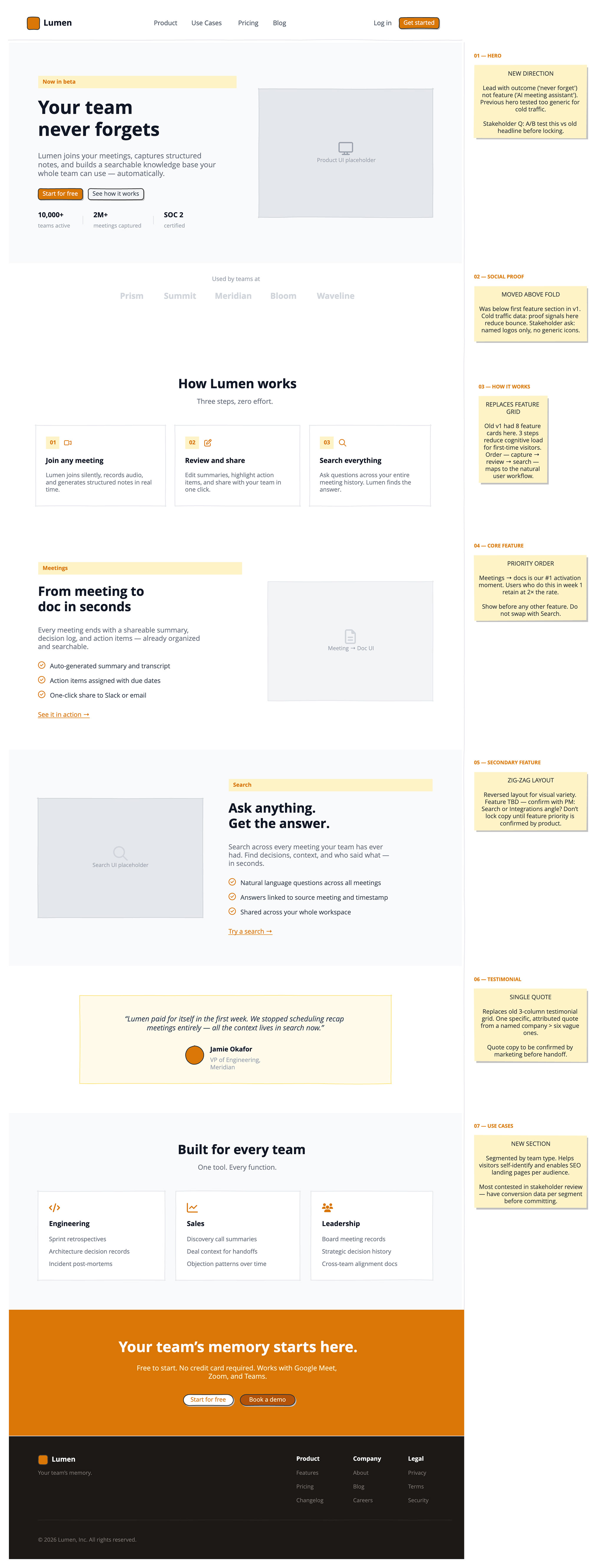
A single long-scroll wireframe covers the full homepage structure: a hero section with a clear value proposition, a social proof bar, three alternating feature sections, a customer testimonial, a use cases panel, and a final call-to-action band.
Annotations run alongside each section explaining the strategic intent.
The fast way
Recreate this in Balsamiq AI
Paste this prompt into Balsamiq AI to generate a similar flow, then edit any line to make it yours.
Swap the brand name, change the colors, add or remove steps and fields.
Prompt for Balsamiq AI
Prompt generates AI designs. Results may vary.
Create a single long-scroll board, 1280px wide, white background. This is a structural annotation board — every major section is a two-column row: page content on the left (flexGrow to fill available space) and a 280px annotation panel on the right, separated by a 1px vertical line in #E5E7EB. The annotation panel contains a small amber label (e.g. "01 — HERO") and a sticky note with a #FEF3C7 background explaining the design rationale. Nav and footer are full-width with no annotation column.
The product is Lumen, a fictional AI meeting notes and team knowledge tool. The amber accent color is #D97706 throughout.
Nav — full-width, white, 64px tall, horizontal padding 40px. Left: a small amber rounded square logo mark (28×28, #D97706) + "Lumen" in bold #111827. Center: text links "Product", "Use Cases", "Pricing", "Blog" in #4B5563, 14px, spaced 32px apart. Right: "Log in" text link + "Get started" amber button with rounded corners. A 1px #E5E7EB horizontal rule runs below the nav.
Hero section (annotated row) — left panel on a #F9FAFB background, 72px top/bottom padding, 64px horizontal padding. Two columns inside: left column (flexGrow) contains a small amber pill badge reading "Now in beta" (text #D97706, bg #FEF3C7), then a large 48px bold headline "Your team\nnever forgets" in #111827 at 380px width, then a 16px body paragraph in #6B7280 at 400px width, then two buttons side by side — "Start for free" (amber #D97706, white text, rounded) and "See how it works" (#F3F4F6 bg, #374151 text, rounded). Below the buttons, a metrics strip with three stats separated by light gray pipes: "10,000+ / teams active", "2M+ / meetings captured", "SOC 2 / certified" — stat numbers in bold #111827 15px, labels in #9CA3AF 12px. Right side: a 380×280 placeholder rectangle in #E5E7EB with a gray fa-display icon (size 32) and "Product UI placeholder" label in #9CA3AF. Right annotation panel: label "01 — HERO", sticky note "NEW DIRECTION\n\nLead with outcome ('never forget') not feature ('AI meeting assistant'). Previous hero tested too generic for cold traffic.\n\nStakeholder Q: A/B test this vs old headline before locking."
Logo strip (annotated row) — white background, 24px padding. Center-aligned label "Used by teams at" in #9CA3AF 13px, then a row of five fictional company names — Prism, Summit, Meridian, Bloom, Waveline — in bold #D1D5DB 18px, spaced 48px apart. Right annotation: label "02 — SOCIAL PROOF", sticky note "MOVED ABOVE FOLD\n\nWas below first feature section in v1. Cold traffic data: proof signals here reduce bounce. Stakeholder ask: named logos only, no generic icons."
How it works (annotated row) — white bg, 64px padding. Centered heading "How Lumen works" in bold #111827 28px, subhead "Three steps, zero effort." in #6B7280 15px. Below: three equal cards side by side, each with a white background, 1px #E5E7EB border, 24px internal padding. Each card has: a small amber number pill (bg #FEF3C7, text #D97706) + an amber FA6 icon beside it (fa-video / fa-pen-to-square / fa-magnifying-glass at size 18, color #D97706), then a bold card title in #111827 15px, then a 13px description in #6B7280. Card 1: "01" + video icon, "Join any meeting", "Lumen joins silently, records audio, and generates structured notes in real time." Card 2: "02" + edit icon, "Review and share", "Edit summaries, highlight action items, and share with your team in one click." Card 3: "03" + search icon, "Search everything", "Ask questions across your entire meeting history. Lumen finds the answer." Right annotation: label "03 — HOW IT WORKS", sticky note "REPLACES FEATURE GRID\n\nOld v1 had 8 feature cards here. 3 steps reduce cognitive load for first-time visitors. Order — capture → review → search — maps to the natural user workflow."
Feature 1: Meetings (annotated row) — white bg, 64px padding, two columns with 56px gap, vertically centered. Left column (flexGrow): small amber tag "Meetings" (bg #FEF3C7, text #D97706), then 30px bold headline "From meeting to\ndoc in seconds" in #111827 at 360px, then 15px body in #6B7280 at 360px, then three check-list rows with fa-circle-check icons in #D97706 size 16 — "Auto-generated summary and transcript", "Action items assigned with due dates", "One-click share to Slack or email" — each in #374151 14px, then an amber underlined text link "See it in action →" at 14px. Right: 360×260 placeholder rectangle in #F3F4F6 with gray border, fa-file-lines icon size 32 in #D1D5DB, "Meeting → Doc UI" label in #9CA3AF. Right annotation: label "04 — CORE FEATURE", sticky note "PRIORITY ORDER\n\nMeetings → docs is our #1 activation moment. Users who do this in week 1 retain at 2× the rate.\n\nShow before any other feature. Do not swap with Search."
Feature 2: Search (annotated row) — #F9FAFB background, same layout but flipped (zig-zag). Left side: 360×260 placeholder rectangle in #E5E7EB with gray border, fa-magnifying-glass size 32 in #D1D5DB, "Search UI placeholder" label. Right column (flexGrow): small amber tag "Search", 30px bold headline "Ask anything.\nGet the answer." in #111827, body paragraph in #6B7280, three check items (fa-circle-check amber) — "Natural language questions across all meetings", "Answers linked to source meeting and timestamp", "Shared across your whole workspace" — then amber underlined text link "Try a search →". Right annotation: label "05 — SECONDARY FEATURE", sticky note "ZIG-ZAG LAYOUT\n\nReversed layout for visual variety. Feature TBD — confirm with PM: Search or Integrations angle? Don't lock copy until feature priority is confirmed by product."
Testimonial (annotated row) — white bg, 64px padding. Centered quote card 680px wide with #FFFBEB background and 1px #FDE68A border, 48px horizontal / 40px vertical padding. Inside: italic quote text in #374151 16px centered at 520px width: "Lumen paid for itself in the first week. We stopped scheduling recap meetings entirely — all the context lives in search now." Below: a small amber circle avatar (40×40, #D97706) next to two lines — "Jamie Okafor" in bold #111827 14px, "VP of Engineering, Meridian" in #9CA3AF 13px. Right annotation: label "06 — TESTIMONIAL", sticky note "SINGLE QUOTE\n\nReplaces old 3-column testimonial grid. One specific, attributed quote from a named company > six vague ones.\n\nQuote copy to be confirmed by marketing before handoff."
Use cases (annotated row) — #F9FAFB background, 64px padding. Centered heading "Built for every team" bold #111827 28px, subhead "One tool. Every function." in #6B7280. Below: three equal white cards with 1px #E5E7EB border, 24px padding. Card 1: fa-code icon amber size 24, "Engineering" bold #111827, three use-case lines in #6B7280 13px — "Sprint retrospectives", "Architecture decision records", "Incident post-mortems". Card 2: fa-chart-line icon, "Sales" — "Discovery call summaries", "Deal context for handoffs", "Objection patterns over time". Card 3: fa-users icon, "Leadership" — "Board meeting records", "Strategic decision history", "Cross-team alignment docs". Right annotation: label "07 — USE CASES", sticky note "NEW SECTION\n\nSegmented by team type. Helps visitors self-identify and enables SEO landing pages per audience.\n\nMost contested in stakeholder review — have conversion data per segment before committing."
CTA band — full-width, solid amber #D97706, 64px padding, all centered. Bold white headline 32px "Your team's memory starts here." Then #FEF3C7 body text 15px "Free to start. No credit card required. Works with Google Meet, Zoom, and Teams." at 520px width. Two pill buttons: "Start for free" (white bg, #D97706 text) and "Book a demo" (#B45309 bg, #FEF3C7 text).
Footer — full-width, #1C1917 bg, 64px horizontal / 40px vertical padding. Top row: left side — amber roundRect logo (22×22) + "Lumen" bold white 15px, then "Your team's memory." in #78716C 12px below. Right side: three columns of links — Product (Features / Pricing / Changelog), Company (About / Blog), Legal (Privacy / Terms / Security) — column headers in bold white 13px, links in #78716C 12px, 10px gap between items. A 1px #292524 horizontal rule below the top row. Bottom: "© 2026 Lumen, Inc. All rights reserved." in #78716C 12px.
Try editing it: change "Lumen" to your product name, or swap #D97706 for your brand color — then regenerate.
Open Balsamiq AI