Wireframes
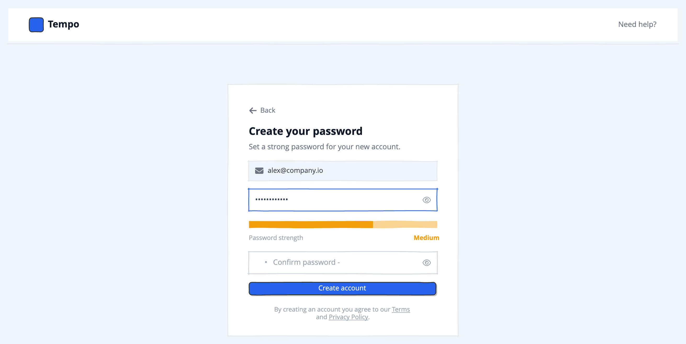
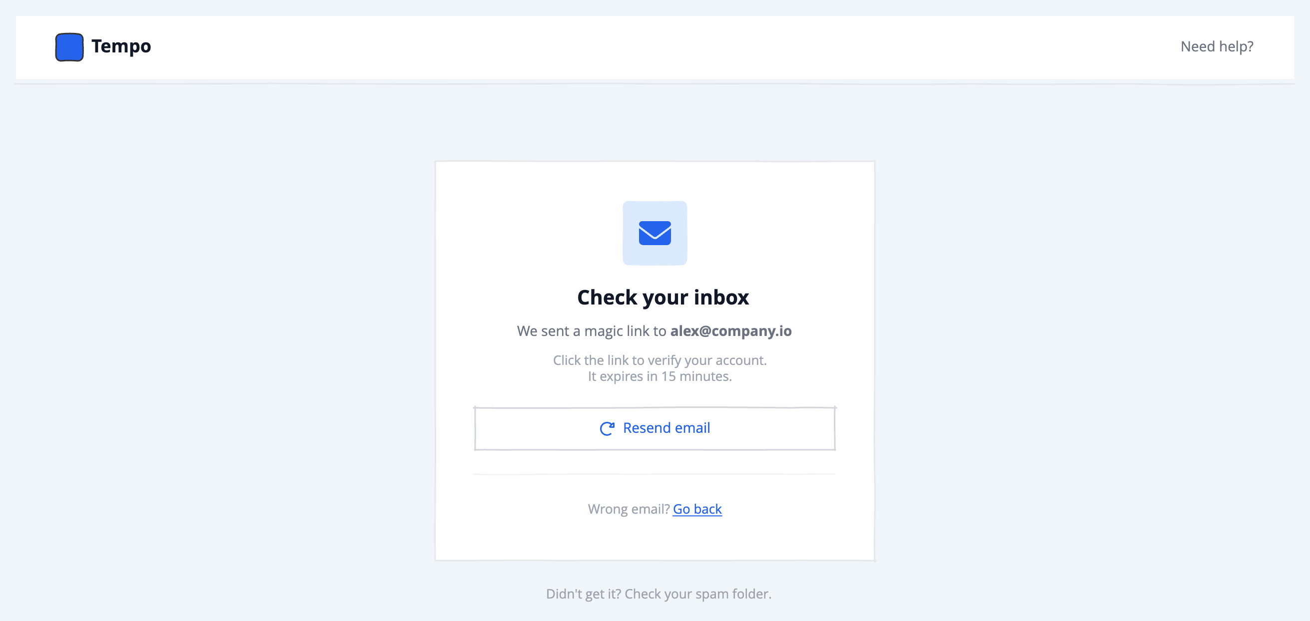
Three wireframes cover the essential steps: the initial sign-up screen with email and social login options, the password creation step, and the email verification confirmation screen.
The fast way
Recreate this in Balsamiq AI
Paste this prompt into Balsamiq AI to generate a similar flow, then edit any line to make it yours.
Swap the brand name, change the colors, add or remove steps and fields.
Prompt for Balsamiq AI
Prompt generates AI designs. Results may vary.
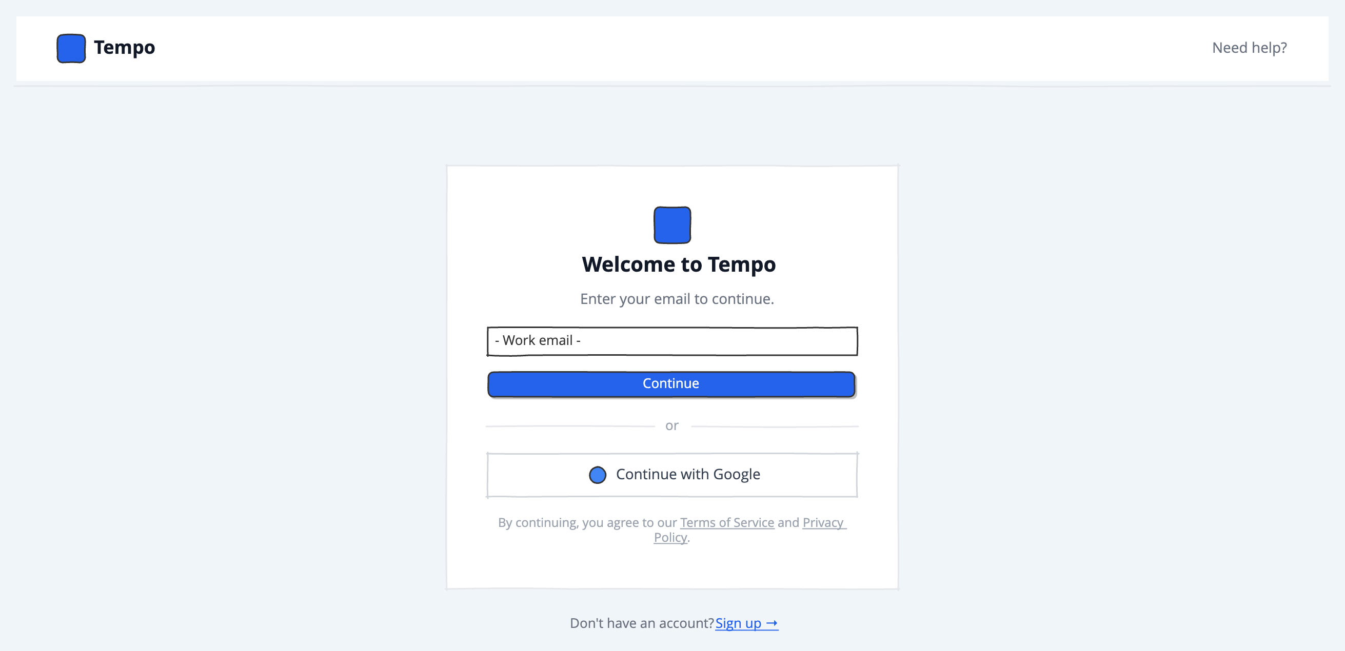
Create three separate boards in sequence for a fictional team planning tool called Tempo. The accent color throughout is blue (#2563EB). Every screen shares the same slate-gray page background (#F1F5F9) and the same minimal white navigation bar at the top. The screens are meant to be linked as a clickable prototype: Screen 1 flows to Screen 2 on "Continue", Screen 2 flows to Screen 3 on "Create account".

Shared navigation bar (identical on all three screens)
A white bar, 64px tall, with a thin light gray border (#E5E7EB) along the bottom. On the left, a small blue rounded-square shape sits next to the word "Tempo" in bold dark gray (#111827), 18px. On the right, a plain "Need help?" text link in medium gray (#6B7280), 14px. No other elements.

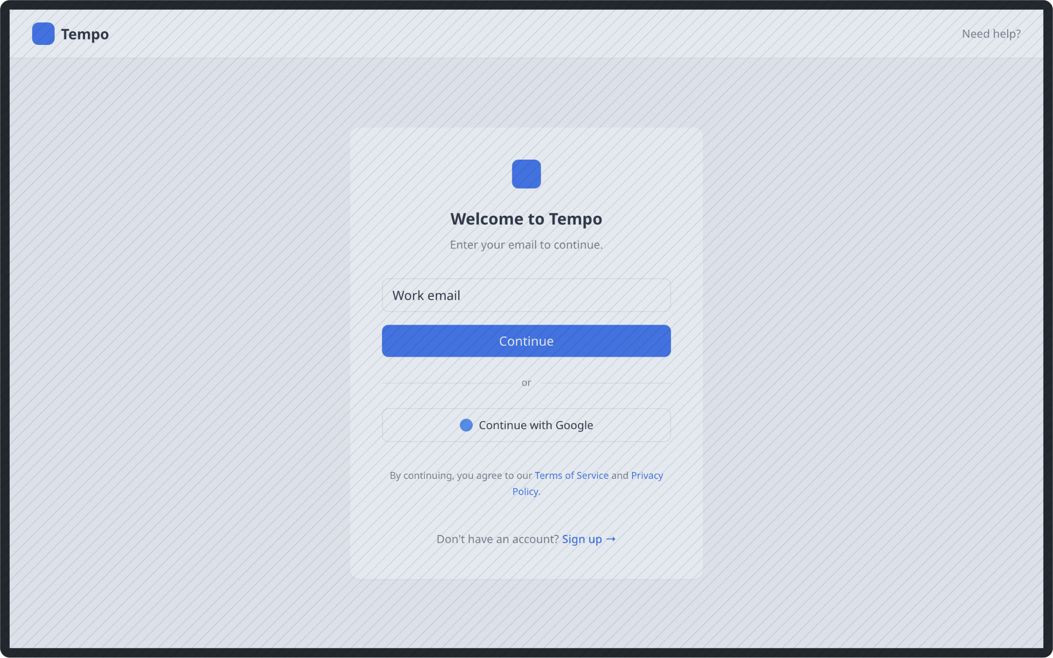
Screen 1 — Sign in (email entry)
The page background is slate gray (#F1F5F9). Below the nav, all content is centered horizontally with 72px of space above and below the card.
The white card is 440px wide with a solid light gray border (#E5E7EB) and 40px of padding on all sides. Inside, from top to bottom:
A small blue rounded-square logo mark (36px) centered at the top of the card. Below it, the headline "Welcome to Tempo" in bold dark gray (#111827), 22px, centered. Below that, "Enter your email to continue." in medium gray (#6B7280), 14px, centered.
A standard text input field with placeholder text "Work email", full card width.
A solid blue button (#2563EB) with white text "Continue", full card width, slightly rounded corners.
A horizontal divider row: a light gray line (#E5E7EB) on either side of the word "or" in light gray (#9CA3AF), 13px. The lines expand to fill the remaining space.
A bordered white rectangle (gray border #D1D5DB) acting as a social auth button. Inside: a small solid blue circle (16px, #4285F4) representing a Google logo placeholder, followed by "Continue with Google" in dark gray (#374151), 14px. Content is centered horizontally.
A line of small print in light gray (#9CA3AF), 12px, centered: "By continuing, you agree to our Terms of Service and Privacy Policy." — with "Terms of Service" and "Privacy Policy" underlined to suggest they are links.
Below the card (outside it, 24px gap), a centered row: "Don't have an account?" in gray (#6B7280), 13px, followed by an underlined blue "Sign up →" link (#2563EB), 13px.

Screen 2 — Create password
Same background, same nav, same 440px white card centered with 72px padding above.
Inside the card, from top to bottom:
A small row in the top-left of the card: a left-arrow icon in gray (#6B7280) next to the word "Back" in gray (#6B7280), 13px. This sits flush left, not centered.
A left-aligned headline "Create your password" in bold dark gray (#111827), 22px. Below it, "Set a strong password for your new account." in medium gray (#6B7280), 14px.
A gray-tinted context pill: a light gray rectangle (#F1F5F9) with a gray border (#E5E7EB), containing a small envelope icon in gray and the text "alex@company.io" in dark gray (#374151), 13px. This confirms the email from the previous screen.
A fake password input field: a white rectangle with a blue border (#2563EB, indicating it's focused/active), containing a row of bullet dots "••••••••••••" in dark gray on the left (taking all remaining space) and a show/hide eye icon in light gray (#9CA3AF) on the right.
A password strength section directly below: a thin progress bar at 66% filled in amber (#F59E0B), full card width. Below the bar, a row with "Password strength" in light gray (#9CA3AF), 12px, on the left and "Medium" in amber (#F59E0B), 12px bold, on the right.
A second fake input field for confirm password: same white rectangle with gray border (#D1D5DB, unfocused), containing "Confirm password" placeholder text in light gray on the left and a show/hide eye icon in gray on the right.
A solid blue button (#2563EB) with white text "Create account", full card width, slightly rounded corners.
A line of small print in light gray (#9CA3AF), 12px, centered: "By creating an account you agree to our Terms and Privacy Policy." — with "Terms" and "Privacy Policy" underlined.

Screen 3 — Check your inbox
Same background, same nav, same card width and positioning.
Inside the white card, all content centered:
At the top, a rounded-corner light blue square (#DBEAFE background), 64px, containing a centered envelope icon in blue (#2563EB) at 32px. This acts as a branded illustration placeholder.
The headline "Check your inbox" in bold dark gray (#111827), 22px, centered.
Two lines of body text, both centered: "We sent a magic link to alex@company.io" in medium gray (#6B7280), 14px — with the email address in bold to distinguish it. Below that, "Click the link to verify your account. It expires in 15 minutes." in lighter gray (#9CA3AF), 13px.
A "Resend email" button: a white rectangle with a gray border (#D1D5DB), centered content, containing a small circular-arrow icon in blue (#2563EB) and "Resend email" in blue (#2563EB), 14px. This is an outlined secondary button, not filled.
A thin light gray divider line (#F3F4F6).
A centered row: "Wrong email?" in light gray (#9CA3AF), 13px, followed by an underlined blue "Go back" link (#2563EB), 13px. This is the escape hatch for users who entered the wrong address.
Below the card (outside it, 24px gap), a centered line of light gray text (#9CA3AF), 13px: "Didn't get it? Check your spam folder".
Try editing it: change "Tempo" to your product name, or swap #2563EB for your brand color — then regenerate.
Open Balsamiq AI