The process of wireframing mobile applications is similar to that of wireframing websites, but there are some key differences to be aware of. There are different terms and design patterns, and new modes of interaction. If you are creating a native app from an existing web product, you will have to translate an experience where the user uses a mouse and clicks around to one where they can tap, swipe and pinch-to-zoom to navigate. Not to mention that you’ll have less space to work with!
Most users are already familiar with design patterns that are unique to phones. Swiping left or right to navigate through a photo gallery, for example. It’s important to leverage this knowledge and use established patterns while designing your mobile app.
In this article I’ll outline some things I’ve learned in order to help you transition from web design to app design.
Mobile UI concepts and terminology
Before diving in let’s take a moment to learn a bit about what makes designing for mobile unique.
Even though web design and app design are pretty similar, there are differences in how apps are developed, and that brings with it different names for some UI elements. It’s helpful to understand these terms when starting to wireframe because it will allow you to better communicate with the development team.
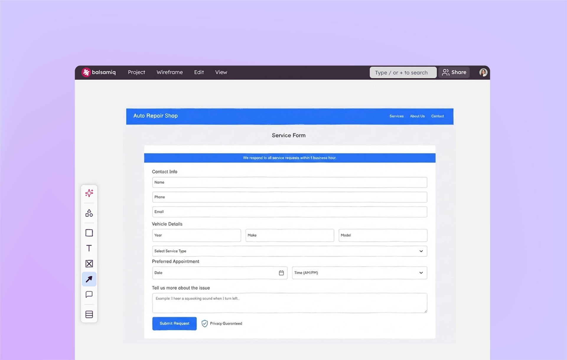
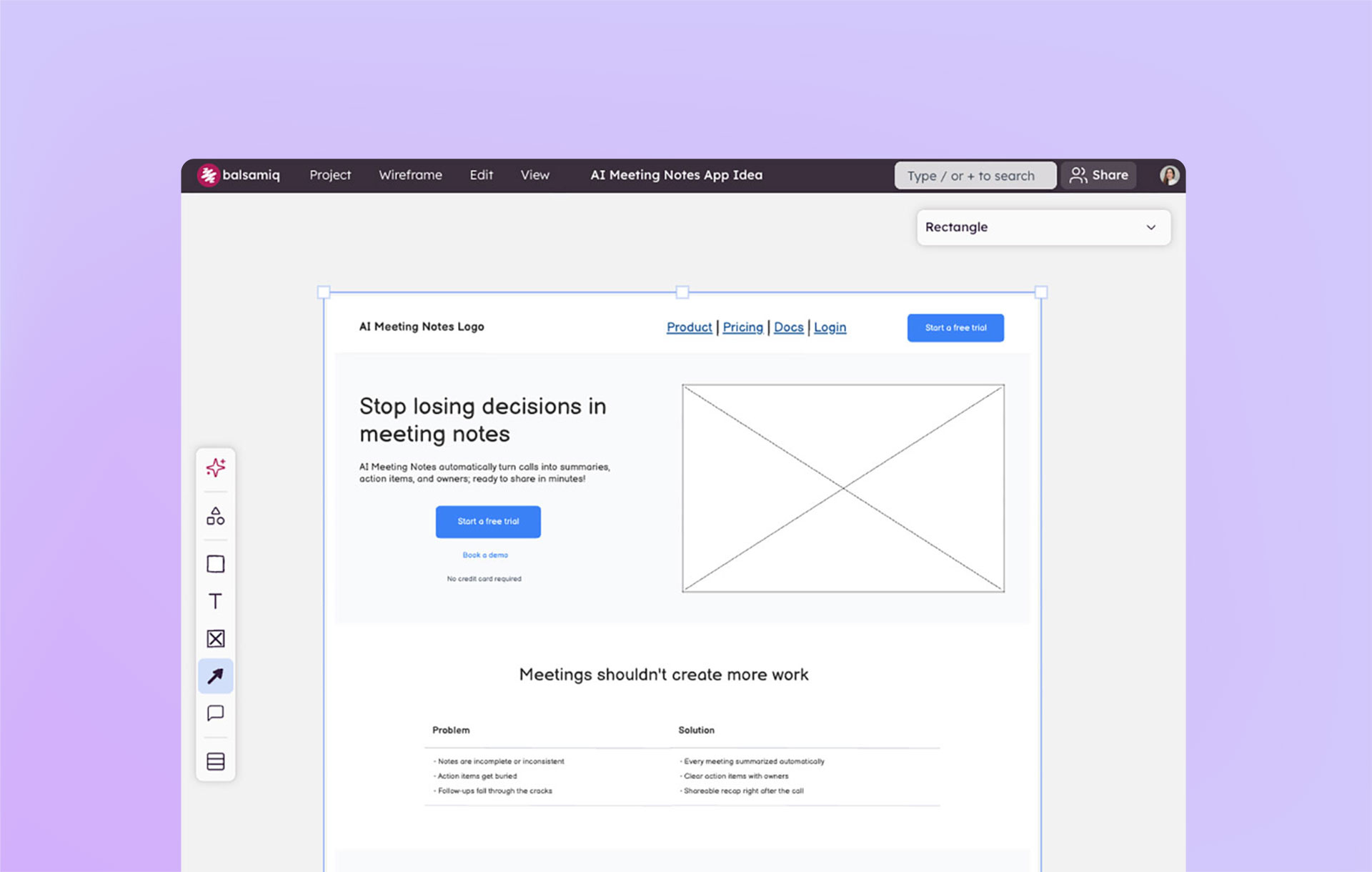
The first thing you need to remember is that when designing a mobile application you aren’t designing pages, you are designing screens.
Beyond that, here are some common mobile design elements you should become familiar with.

The navigation bar (or navbar) sits on top of the app screen and allows for navigation of screens within one tab.

The tab bar sits at the bottom of the app screen and provides the ability to quickly switch between different sections of the app.

A segmented control is a horizontal set of two or more buttons that allows the user to switch views within a screen. Similar to tabs on a webpage, they allow the user to view different sets of information without leaving the screen.
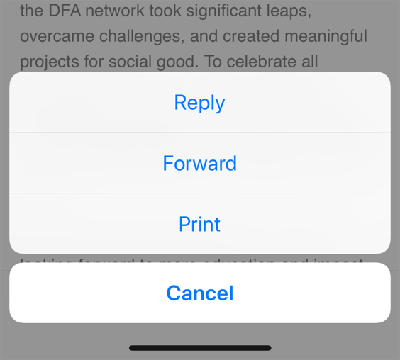
An action sheet is similar to a pop-up alert. They rise from the bottom of the screen after the user taps a button. The action sheet then presents a series of options for the user to choose from.
Design patterns
When I started my first native mobile app design project, I designed it too much like a website. While testing the first prototype it just didn’t feel right. It wasn’t a smooth experience. I hadn’t done much competitive analysis or research, but just dove in with my knowledge of using apps for years and designing countless websites.
I then took a step back and luckily stumbled upon a few websites that focused solely on presenting native mobile application design patterns. Seeing how different apps used similar patterns opened my eyes to the issues I was experiencing with my app.
Design patterns are common in every type of design. They are similar to content blocks; they’re reusable and you can mix and match them to build your app. Look for some links to my favorites at the end of this article.
Common native mobile interactions
When you design for a native mobile application you have more possible types of interactions to work with. Here are a few common ones to consider.
Tap and Double Tap - Pretty much the same as clicking with your mouse.
Swipe - A swipe is used for scrolling up or down long pages. Also for deleting content in a list.
Flick - A shorter swipe of your finger. Think of swiping through images on your phone's photo library.
Press and Hold - Press and hold interaction is most commonly used to rearrange apps on a phone's home screen. Think of it as an interaction that allows for initiating other actions.
Pinch to Zoom - This was a very novel interaction when introduced by Apple. It allows users to zoom in and out of images by pinching two fingers together or away from each other. It has now become ubiquitous as a way to interact with images on touch screens.
There is also 3D Touch, where the device can detect the level of pressure your finger is pressing and activate different interactions based on that pressure, but it is not supported in all apps or on all devices.
Tips for designing your mobile application
Screen trees and user flows
Before creating wireframes, it’s good to start your project by creating a screen tree and/or user flows. These will serve as a guide to help you figure out what wireframes you’ll need to create and how they should be connected.
A screen tree is the mobile equivalent of a site map. You can create one in Balsamiq using the site map feature, or simply use a pencil and paper and sketch them out.

User flows are a way to break down each task or goal you want your users to accomplish in your app, while highlighting the alternative paths they can take. They make it easy to validate if the path you’ve created allows the user to complete their task. User Flows may not be linear — they typically contain decision nodes, paths, and loops that show all possible interactions with the product.

With a screen tree or user flow in hand, you’ll have a list of the wireframes you’ll need to create. You can start by creating placeholders or very basic wireframes for each and then adding detail as you iterate and develop your content and templates.
Know your navigation
The navigation structure of your app is really important. This is where a lot of first-time app designers struggle. I know I did. Applications are not like websites. There isn’t a top-level navigation with easy access to pages. You have to design a clear and simple path of how to get around and get back to the beginning. You should spend a lot of time designing and testing the flow of your screens to make sure it’s logical and easy to use.
Testing your navigation
The best way to know if your navigation works well is to create clickable prototypes by creating wireframes for a user flow and linking them together. Linking together static pages is fine at this point. You are simply testing how it all flows together. You don’t need to add the ability to swipe or long-press yet.
Test it. Does it feel right? Show it to other people and have them navigate your app. Does it make sense to them? This is easy to do and may have a big impact on the usability of your app. Working on the navigation early in the design process will save you headaches and complaints from users later.
Designing for the right screen resolutions

As you can see in the diagram above, there are lots of different screen sizes just for iPhones. The same goes for Android, which has multiple device manufacturers, all with different size options.
But don’t worry too much, because both Apple and Android have created ways to help make applications work on multiple screen sizes automatically. It’s similar to developing a responsive web page. It’s not perfect, but it means that you won’t have to create a design for every screen for every screen size. Just be sure to check your design on a few different screen sizes during development and make any necessary changes to the UI.
Tips for designing for different phone screen sizes
- Start with the middle screen size when designing. This will help ensure that it will work for the larger and smaller sizes as well. You will still have to adjust the larger and smaller designs, but it will be easier than starting too small or too big.

Understand how the content will layout on each size. Smaller phones will not show as much, and larger phones will show much more! Make sure that you don’t have important information cut off from the smaller size, or become less prominent with the larger format.

Finally, try not to worry too much about making the design perfect for every device size. If you have access to analytics, find out which device sizes are most common and target the best experience for it. Be sure that it works for the rest, though.
Tips for improving your mobile application wireframes
I’ve found it useful to break up wireframes by either the user flow or by tabs in your app. This will help you keep everything organized. However, you should still link your entire app together as a prototype, to make sure the user experience is consistent and flows together properly.
Adding gesture images helps convey your intent for interactions with users and developers. I typically make my first version of wireframes with gesture images to show my intent, but after client approval I hide them. I use this version to create the clickable prototype.

- If your app will be in both Android and iOS, create both versions at the same time, following their respective design guidelines. Doing this in the wireframe stages, again, will be much easier than doing it further down the road. Also, this will help ensure that your app will offer the same UX across platforms.

That’s it! I hope you feel more prepared for your next mobile app project. I have included some resources I found valuable through my journey of creating mobile applications. Best of luck and happy wireframing.
Resources