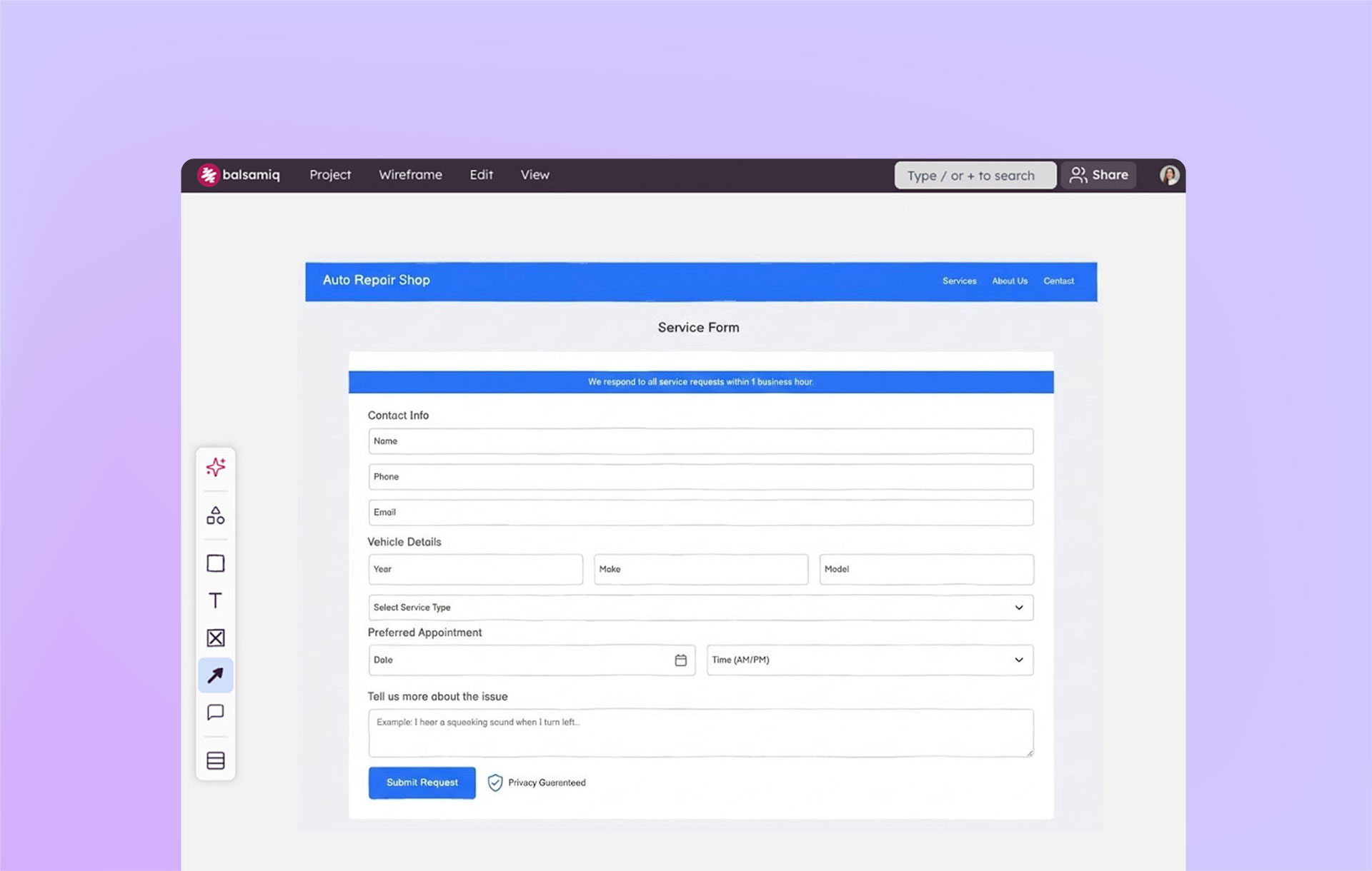
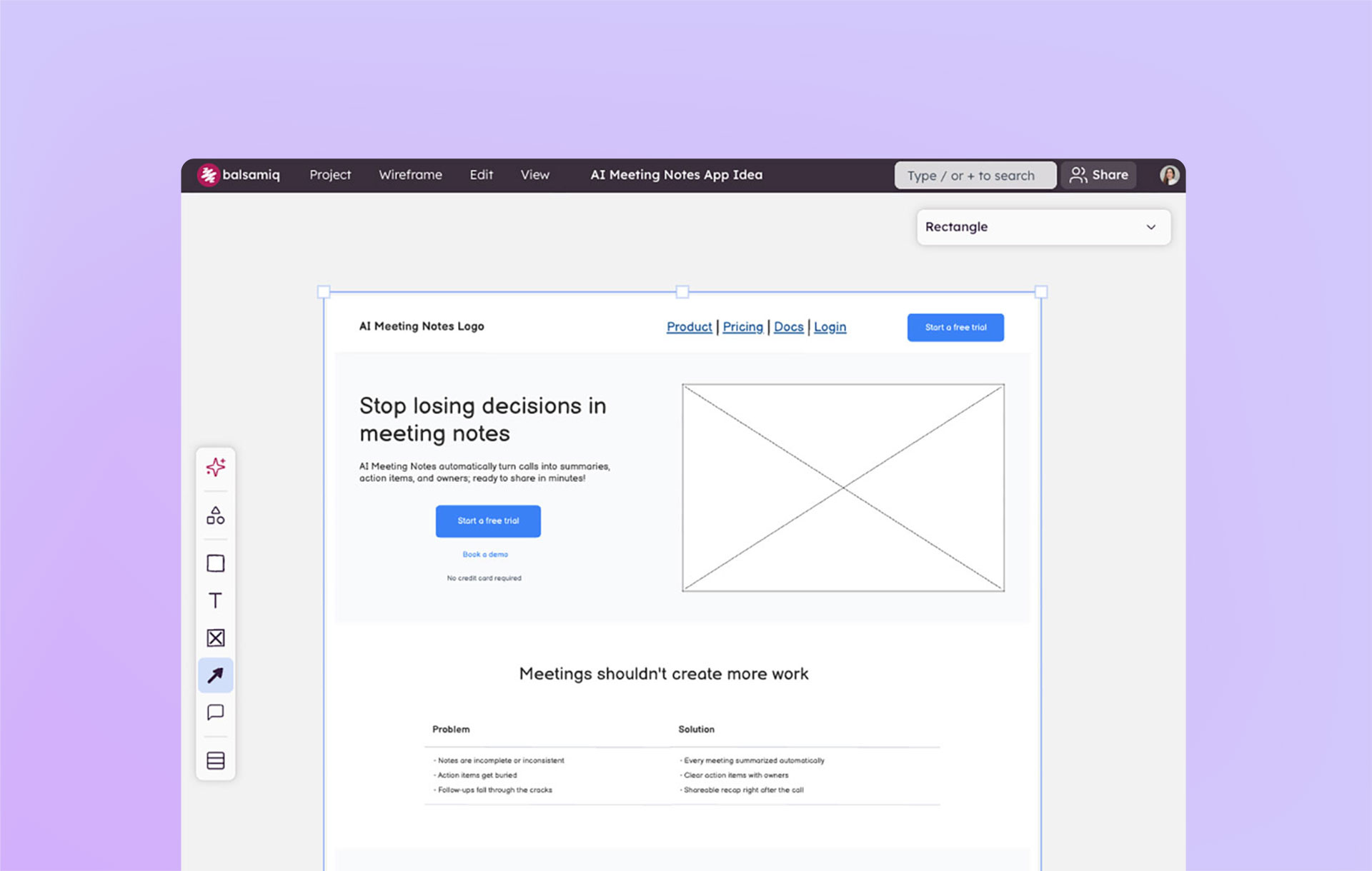
Responsive layouts on the web are exciting. Many Balsamiq users are doing responsive layouts on their projects or are planning to. We've been talking with the community about how Balsamiq can work with responsive web design concepts, and we thought we'd explore some techniques that might help.
Here's how we see Balsamiq fitting in with responsive layout design scenarios.
We believe wireframes can show how web content will flexibly adapt to different grid widths and indicate rules for presentation. Some of the capabilities in Balsamiq could make it easier for you to communicate how your design would work with responsiveness in mind. The basic ideas are based on techniques we've used and have seen over the years working with teams making wireframes. Other techniques we'll explore show how far you can go using the features of Balsamiq.
Creating a responsive design wireframe system
We like systems for communicating ideas. Let's start by looking at one way you might specify how your interface and content will work with different layouts.
1. Identify your content
One thing you do when building a web app or site is establish templates and designate areas of content within them. But you will need to know what UI and content are required before you can start to sketch out a template for the screen.
Let's say we're working on a news-style website that includes an articles section, a gallery of photos, and a store. If we take inventory of this small site, it looks like this:
High-level content outline
- Home
- Articles
- Blog Entry
- Tag Listing
- Gallery
- Tag Listing
- Store
- Product Listing
- Search
- Articles
Each of the views above represents a possible unique template. But there are parts of the template that might be more variable than others.
Starting from the outside in, we might look at the things that persist from view to view and change the least. Working our way in, we find the elements that are variable, and might need to be fleshed out for each section of the site.
Interface elements
1. Header (Required) 1.1 Brand (Required) 1.2 Global Navigation (Required) 1.3 Tools Navigation (Required)
2. Hero (Optional) 2.1 Hero Feature 2.2 Hero Call to Action
3. Ad
4. Body (Required) 4.1 Article Feature 4.2 Article Listing (Required)
5. Sidebar (Optional) 5.1 Sidebar Feature
6. Footer (Required)
This describes a single type of view at a very high level. You may have many templates like this, or you may have one block that has many sub-templates or layouts. It's boring stuff, but it's got to be figured out. We'll stick to designing a single view and template for this example. We'll show the design of the homepage.
2. Select your target screens/layouts
Start with the grid system of your choice, and figure out what screen sizes you're going to target. In this example, I'll work with default Bootstrap responsive fixed grid with the following layouts.
Layouts
- Default Min-width: 780px
- Tablet Portrait (to landscape and desktop) Min-width: 768px / Max-width: 979px
- Smartphone Max-width: 480px
I created a Symbol library with some helper templates that you can use. Just search for "Bootstrap" using search.
3. Wireframe zones on thumbnail templates
We'll start with a master template that represents the common elements of the site and identify the zones of UI/Content on the page. Christina Wodtke refers to these as Zones in her IA book, and others refer to these as Zone Diagrams or Page Schematics. They're just boxes and labels that indicate, at a high level, the types of content that will appear in a page or view. Let's place boxes for the zones where we want them to lay out on our grid.
The idea is to use that Content Outline above and roughly decide where they will go in the layout. Use boxes with labels to show where you think these interface sections will go roughly, and along the way you will get a sense for how you want the boxes to wrap as you work with the smaller layouts.
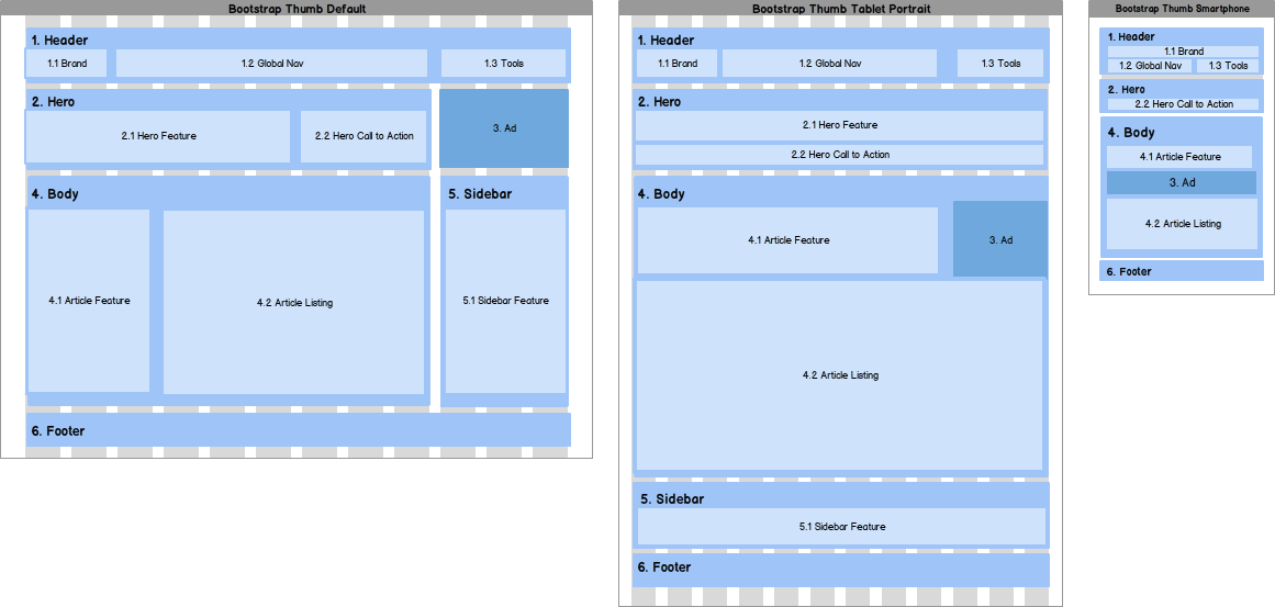
Now we have the start for how our responsive layout system should work between the 3 screen dimensions we targeted above. From here we can work our way in to identify how boxes should lay out within the template.
If you're curious to see another example of this style of wireframe, you can see a thumbnail image of the layout system.
Detailed wireframing
We think the best idea is to start with the high-level layout of UI boxes as above, and then focus on one target layout first. You can fill in the boxes with content on the page, and then move the boxes around on one of the target layout grids following the first pass you made at the high-level template. Then if you need, work on the placement of boxes on the layouts, making changes as you know more about what your boxes will look like.
Then you can start to explore how each block will look in the other layouts. It's easiest to do the common elements first, if you can imagine parts like the header and footer being re-used consistently, then knock them out first in every layout.
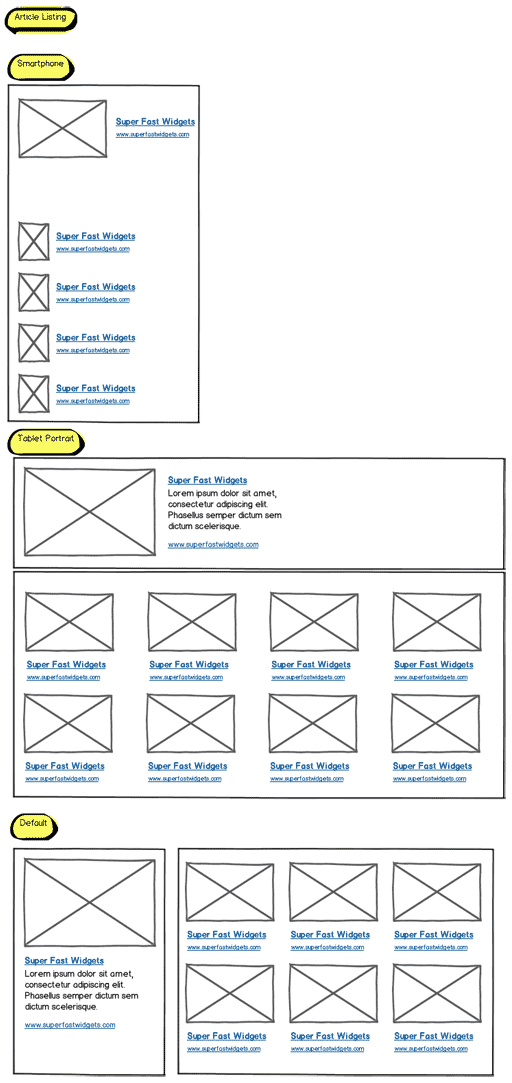
Then you can work your way into the more complicated and variable boxes. Start with a single view, for example the homepage. I've done a variation of this on projects in the past where I identify how a class of content will look in different contexts. For instance, an article might have different sizes and orientations. There might be a Large format with featured article and a listing of briefer article items, a medium format for a featured article with fewer lines of text and the briefer listing of articles, and a small format for listing all articles briefly.
Here's an example of what I'm talking about, using the article listing block:
Now, let's take that idea and use some of the hidden, powerful features of Balsamiq, namely Symbols and Group Cropping. I'm going to use 2 different techniques that might be interesting to explore:
Technique #1:
- Create a single Symbol
- Place it in each target grid layout
- Override the inner layout in each instance
Technique #2:
- Create a single Symbol that has all of the inner layouts
- Use crop to put it in place on each target grid layout
Using either of these techniques, you can lay out a page that starts to give an idea of how the content flexes with your target screen resolutions. In the example below, I used Technique #1 to make the header symbol and Technique #2 to make the Article Listings.
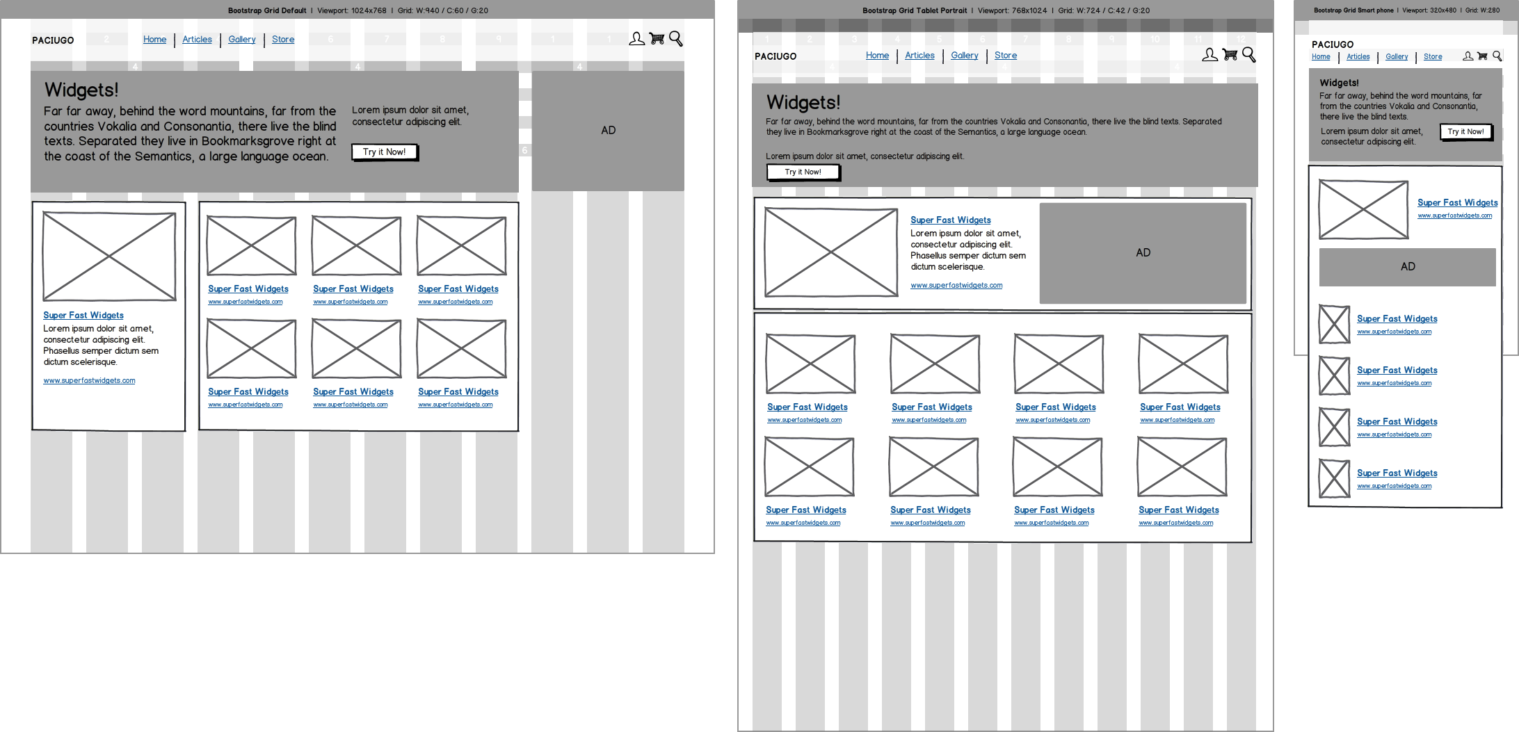
The simplest scenario would be to make separate symbols, but this is just one idea for people to experiment with.
Real-world examples
Superstar Balsamiq expert, Jeffrey Nolte of the New York consultancy Nolte, was kind enough to share a project he worked on. His project shows how a responsive design adapts to 3 target layouts — Default, Portrait Tablet, and Smartphone. Jeffrey documented all layouts for a view on a single page, so developers knew how the system should adapt.
The example wireframes below show the 3 layouts for a homepage.

Below is the homepage wireframe with the grid markup visible.
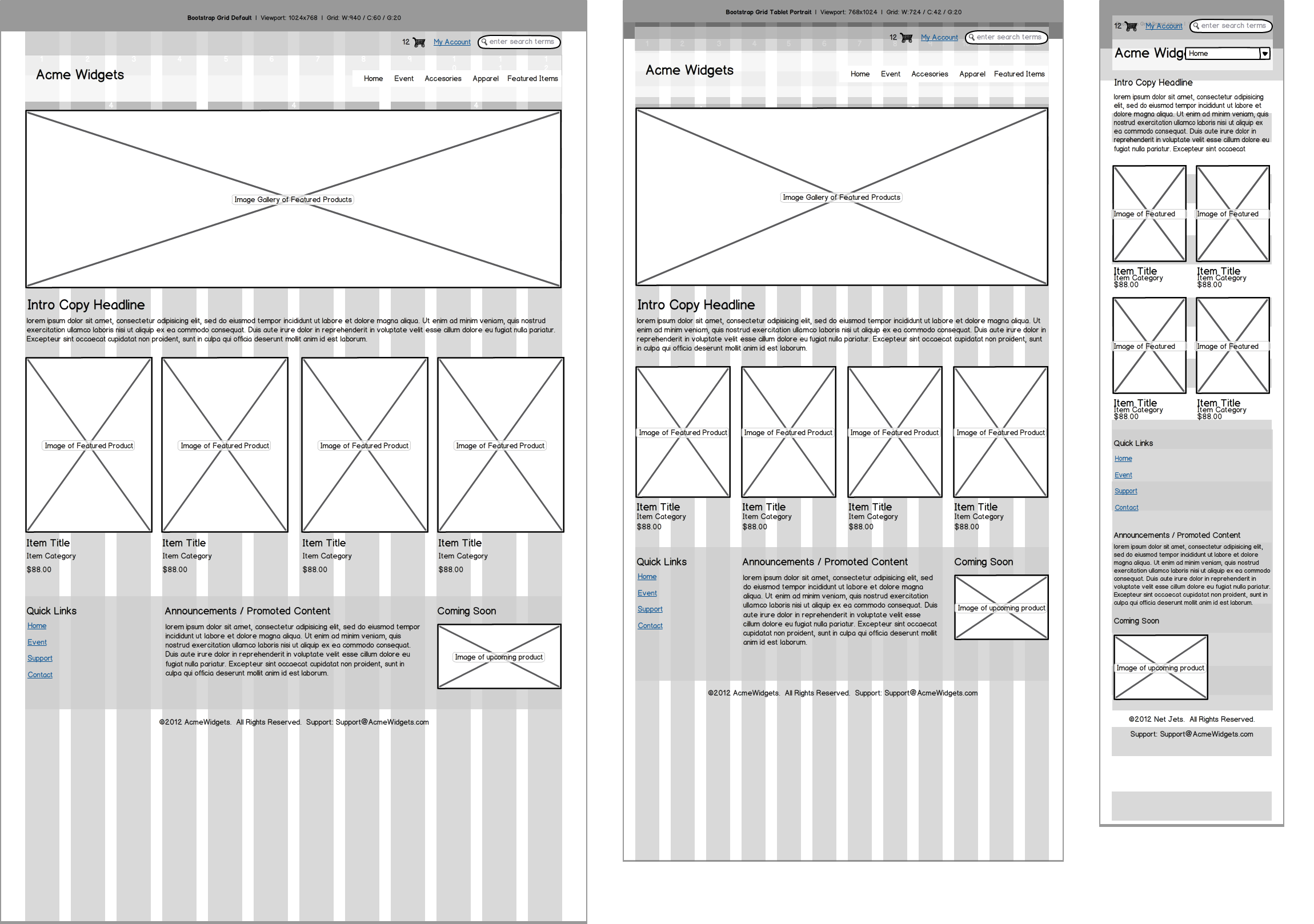
You can search for "Responsive" in search to see the entire project, so you can dig a little deeper and see how they used this system to specify the layout of an e-commerce site with product overviews, detail pages, shopping cart, checkout process, and account views. This is great work and an excellent example of how it's not too difficult to get it done if you establish a system that works for you.
You don't have to wireframe every view
Wireframing is both a process for thinking through problems and specifying interfaces. But creating wireframes doesn't usually require that you lay out every single view. You should know your website's content, or the scenarios and flows in your app well, and consider first building models for how they behave and layout using a high-level wireframe like we did.
Wireframes are effective when they're enough of an abstraction of the final product that they give you adequate information to make decisions and begin building. This point is twice as important when you're wireframing responsive layouts.

Do you need to know your data? Yes. Do you need to document how it lays out in every single view? We don't think so. Doing what's necessary to move the product forward and get consensus before building is what we see wireframes being useful for. Maybe this system would work well enough for you to the point where you can start building the real thing and work with real data in code.


