The fast way
Recreate this in Balsamiq AI
Paste this prompt into Balsamiq AI to generate a similar flow, then edit any line to make it yours.
Swap the brand name, change the colors, add or remove steps and fields.
Prompt for Balsamiq AI
Prompt generates AI designs. Results may vary.
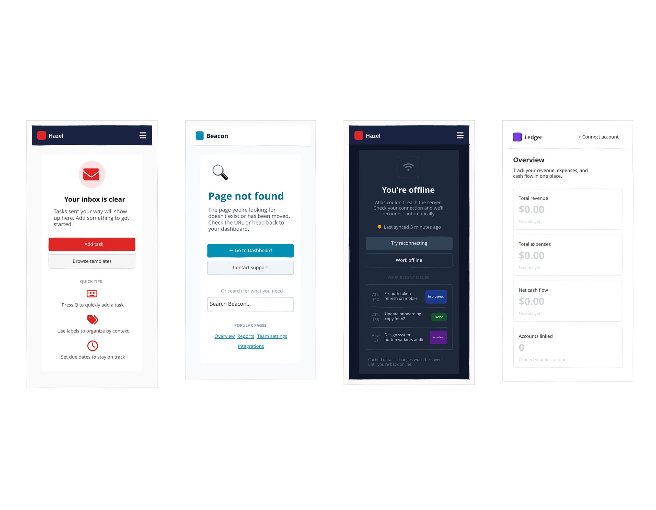
Create 4 desktop wireframe screens showing empty states and error screens for 4 different products. These are UI screens, not diagrams or flowcharts. Each screen is 1280px wide with a distinct visual identity.

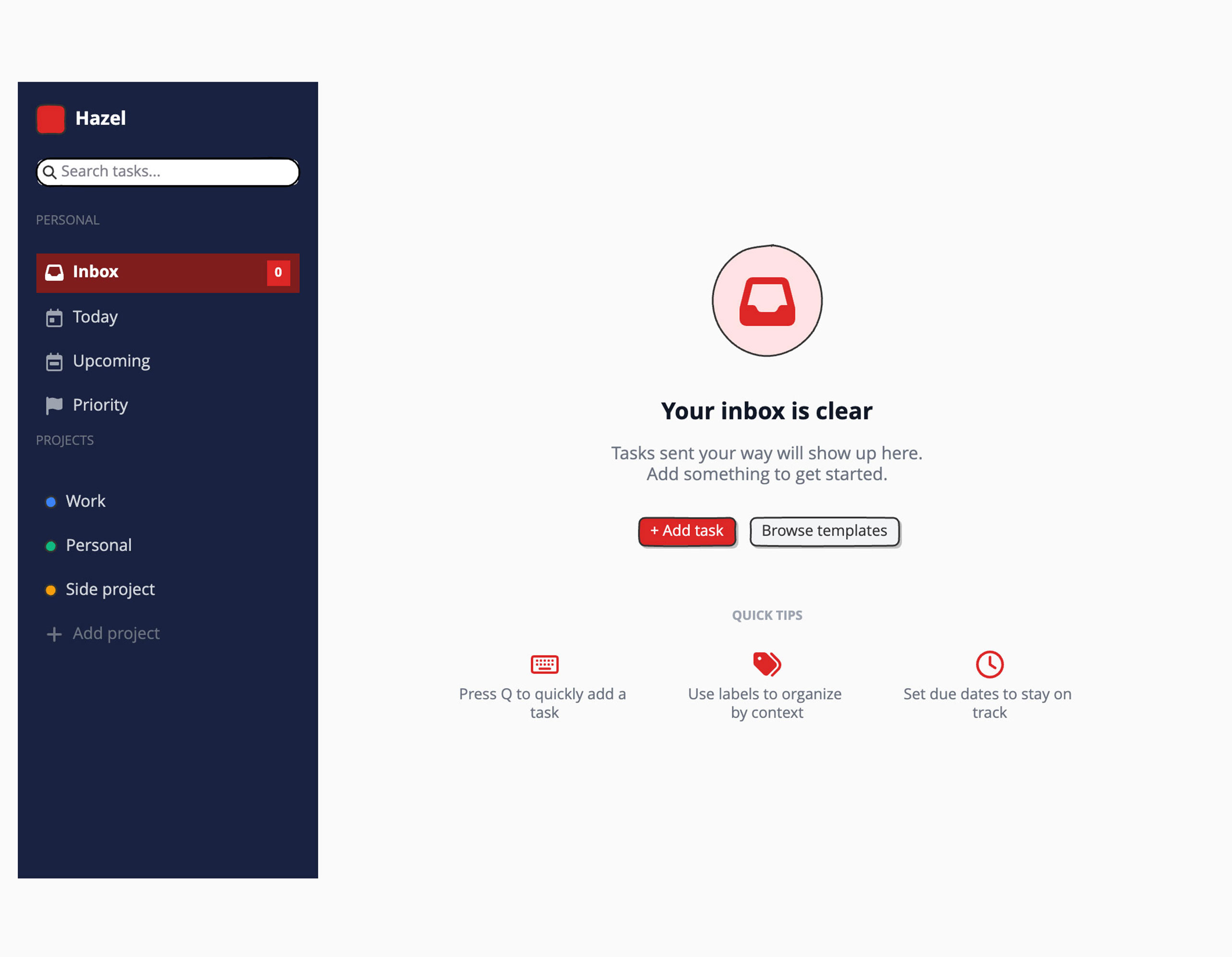
Screen 1 – Hazel (task management app) — Empty Inbox
Dark sidebar (near-black #1C0A00, 260px) with a red rounded-square logo and "Hazel" wordmark in white. Sidebar nav items: Inbox (active, dark red pill background with red "0" badge), Today, Upcoming, Priority — then a Projects section with 3 color-coded project items (blue, green, amber dots). Main content area on a light gray background, vertically centered: a soft red circle with an inbox icon inside it, headline "Your inbox is clear" in dark gray, subtext "Tasks sent your way will show up here. Add something to get started." in gray, then two buttons side by side — "Add task" (red #DC2626, filled) and "Browse templates" (light gray). Below the buttons, a row of 3 tip cards with small red icons: keyboard shortcut tip, labels tip, due dates tip.

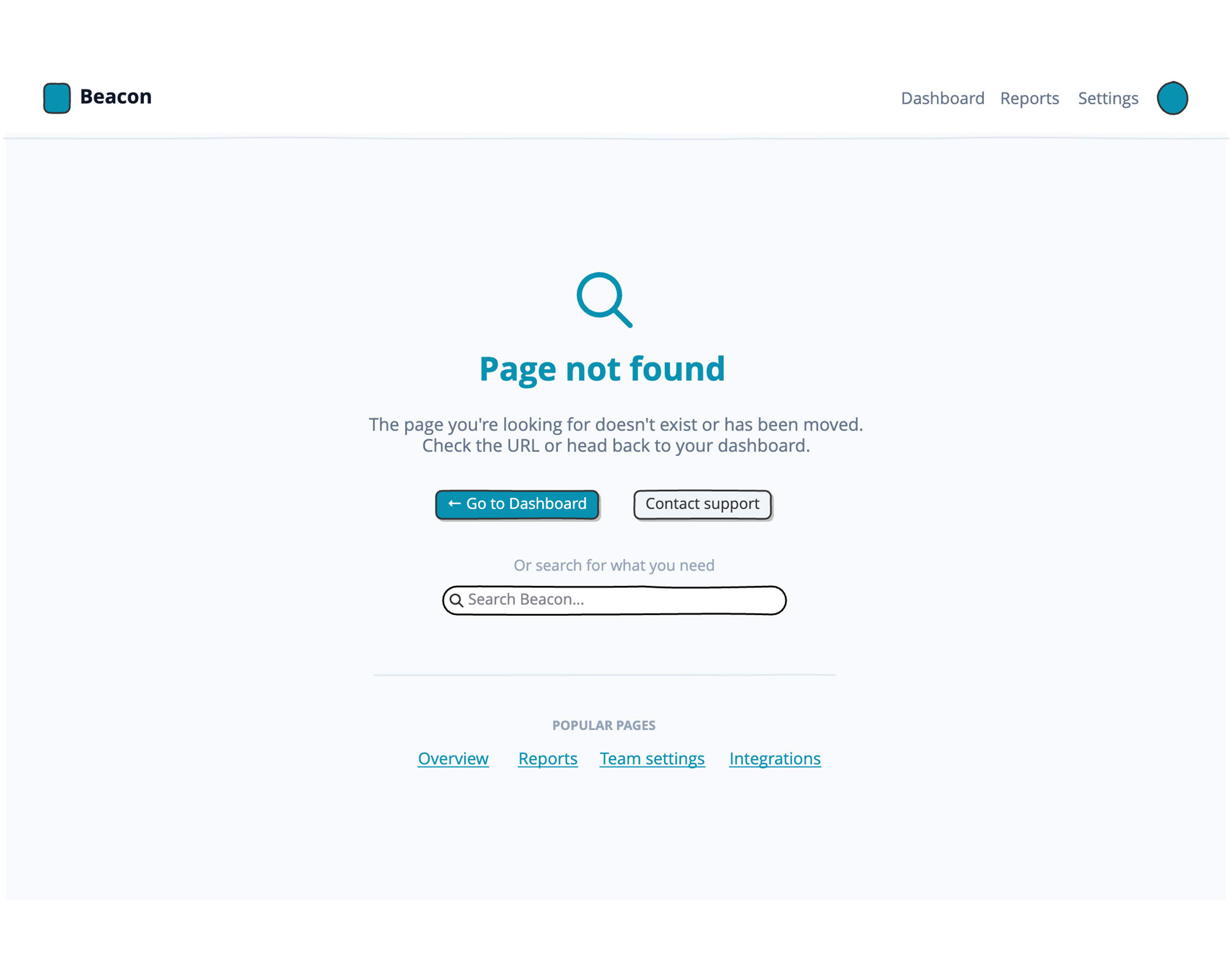
Screen 2 – Beacon (SaaS analytics dashboard) — 404 Not Found
White top navigation bar with a teal rounded-square logo, "Beacon" wordmark, right-side nav links (Dashboard, Reports, Settings) and a teal user avatar. Page background is very light gray. Center of page: a very large "404" numeral in pale gray (#E2E8F0), with a teal magnifying glass icon overlapping it. Below: "Page not found" headline in dark navy, subtext "The page you're looking for doesn't exist or has been moved." Two buttons: "Go to Dashboard" (teal #0891B2, filled) and "Contact support" (light gray). Below the buttons, a search box labeled "Search Beacon..." and a row of 4 underlined teal text links: Overview, Reports, Team settings, Integrations.

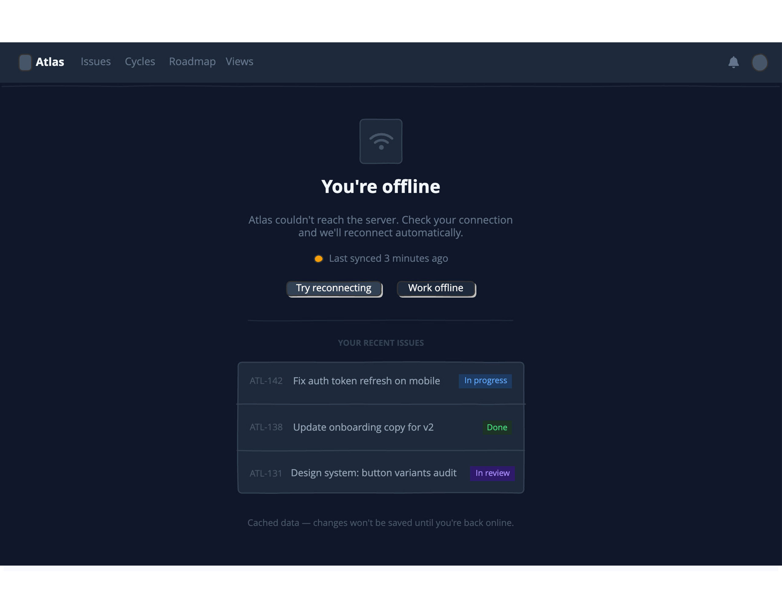
Screen 3 – Atlas (internal project tracker) — Connection Lost
Dark mode throughout (#0F172A background). Slim dark top bar (#1E293B) with a gray rounded-square logo, "Atlas" wordmark in white, nav links in muted gray (Issues, Cycles, Roadmap, Views), and a bell icon + avatar on the right. Centered on the page: a dark card (#1E293B) with a gray wifi icon inside it, headline "You're offline" in white, subtext "Atlas couldn't reach the server. Check your connection and we'll reconnect automatically." in gray. A small amber dot with "Last synced 3 minutes ago" below it. Two buttons: "Try reconnecting" (dark gray filled) and "Work offline" (ghost). Below a divider: a section labeled "Your Recent Issues" showing a dark bordered card with 3 issue rows — each row has an issue ID (e.g. ATL-142), a title, and a colored status badge (In Progress in blue, Done in green, In Review in purple). A caption at the bottom: "Cached data — changes won't be saved until you're back online."

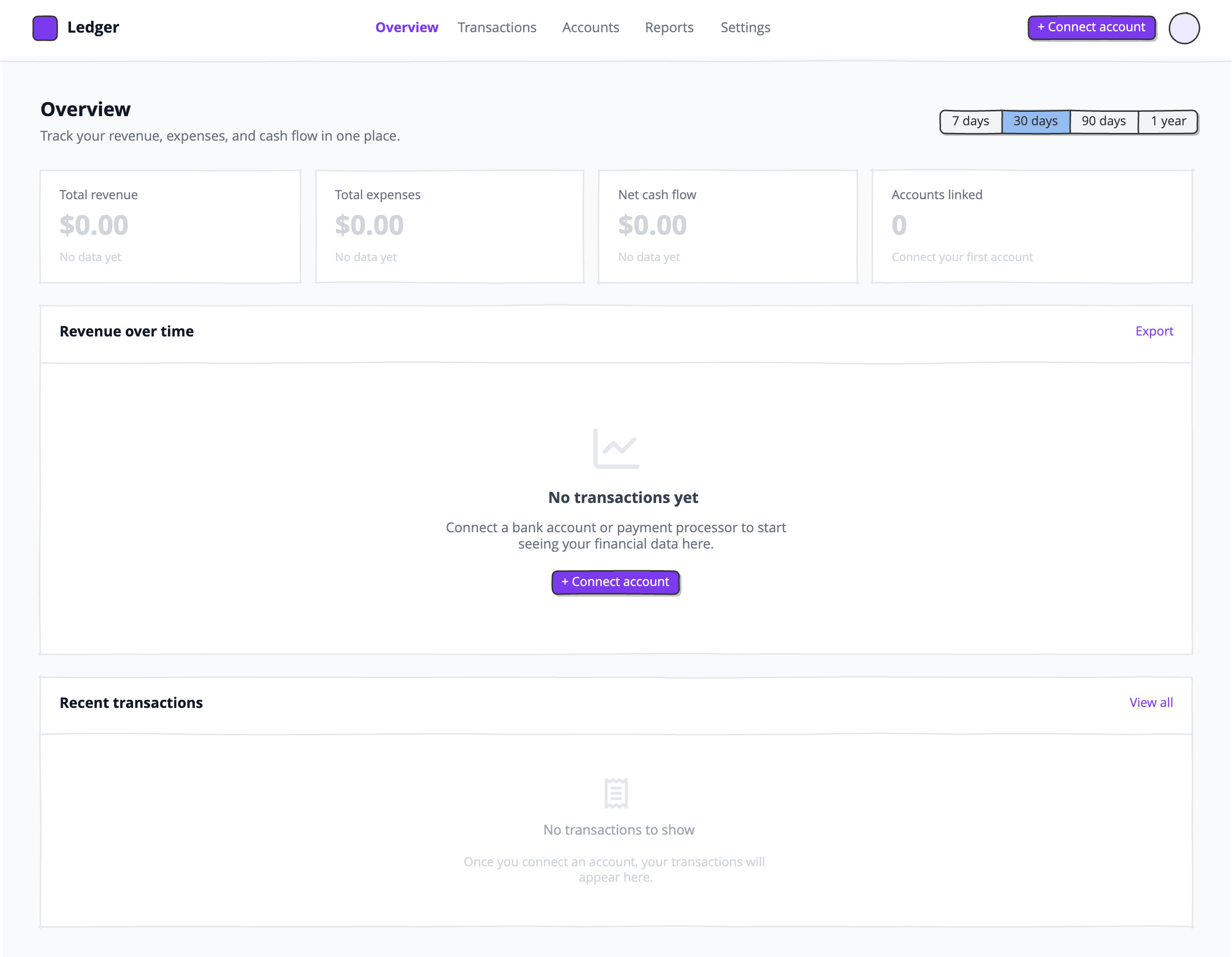
Screen 4 – Ledger (finance and payments app) — Empty Analytics
White top navigation with a purple rounded-square logo (#7C3AED), "Ledger" wordmark, center nav tabs (Overview active in purple, Transactions, Accounts, Reports, Settings in gray), and a purple "Connect account" button on the right. Page background is light gray. Content area with page title "Overview" and subtitle, and a 7d / 30d / 90d / 1yr button-bar on the right. A row of 4 stat cards (white, bordered): Total revenue, Total expenses, Net cash flow, Accounts linked — all showing "$0.00" or "0" in pale gray with "No data yet" beneath each. Below: a full-width white card titled "Revenue over time" with a large empty center showing a pale gray line-chart icon, "No transactions yet" headline, a short description, and a purple "Connect account" button. Below that: another white card titled "Recent transactions" with an empty state showing a receipt icon, "No transactions to show" text, and a short explanation.
Try editing it: change "Hazel" to your product name, or swap #1C0A00 for your brand color — then regenerate.
Open Balsamiq AI