Wireframes
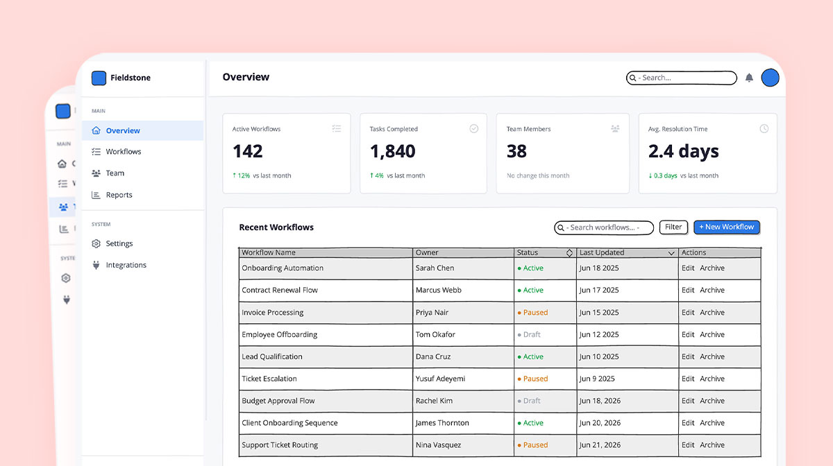
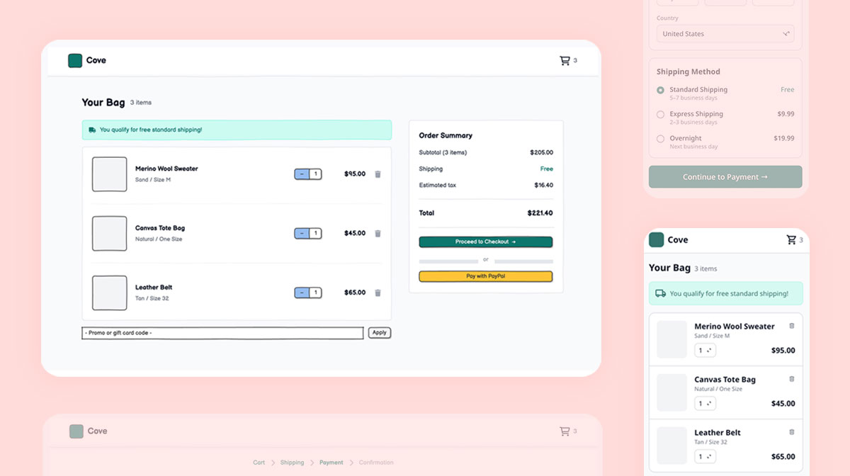
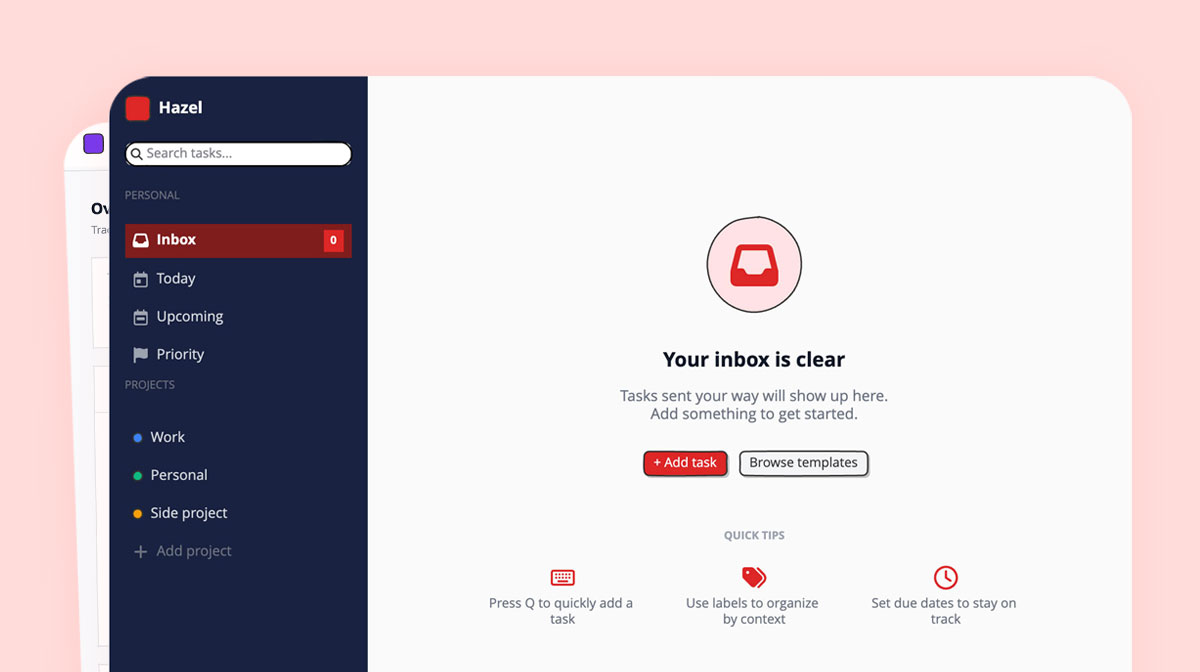
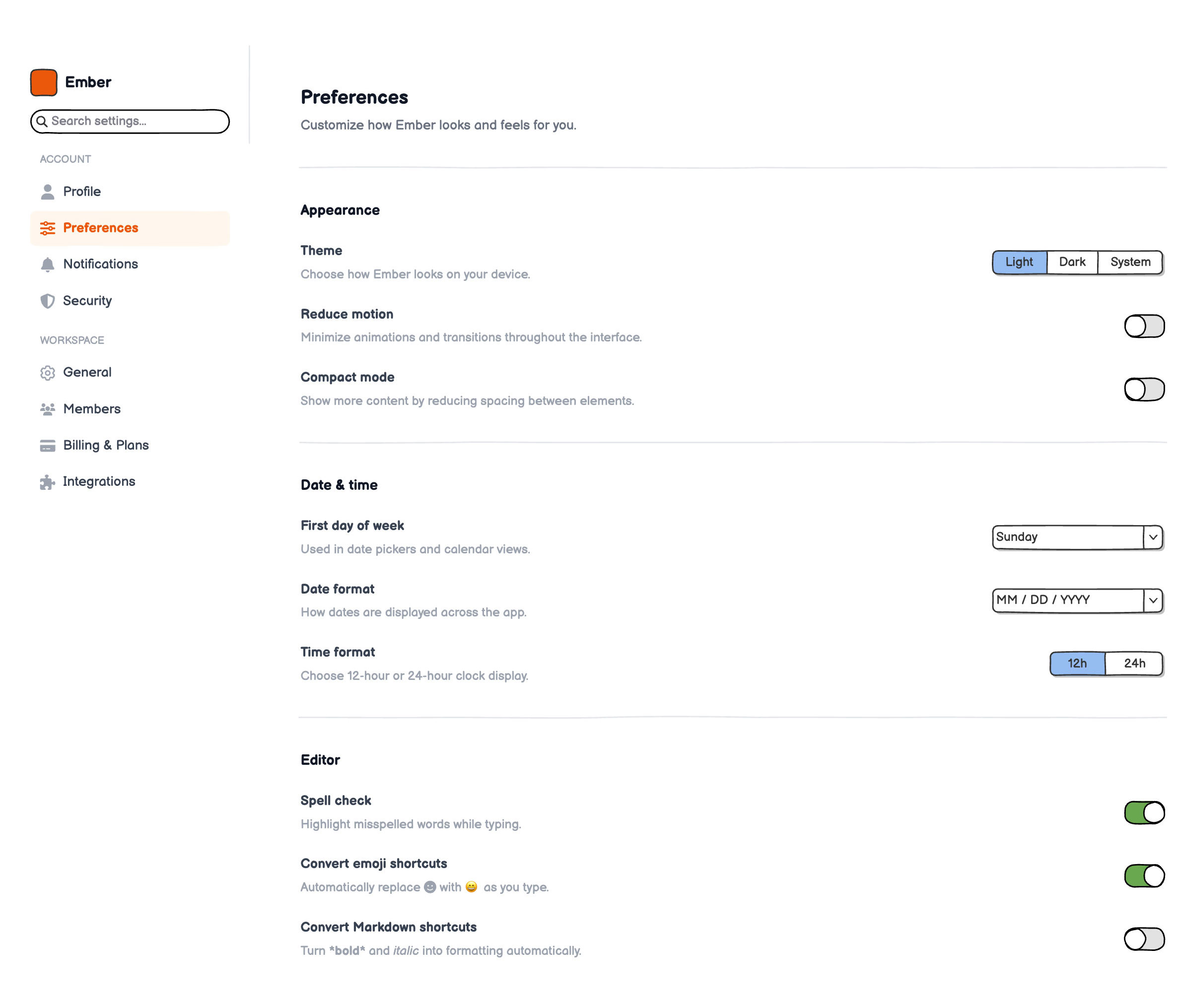
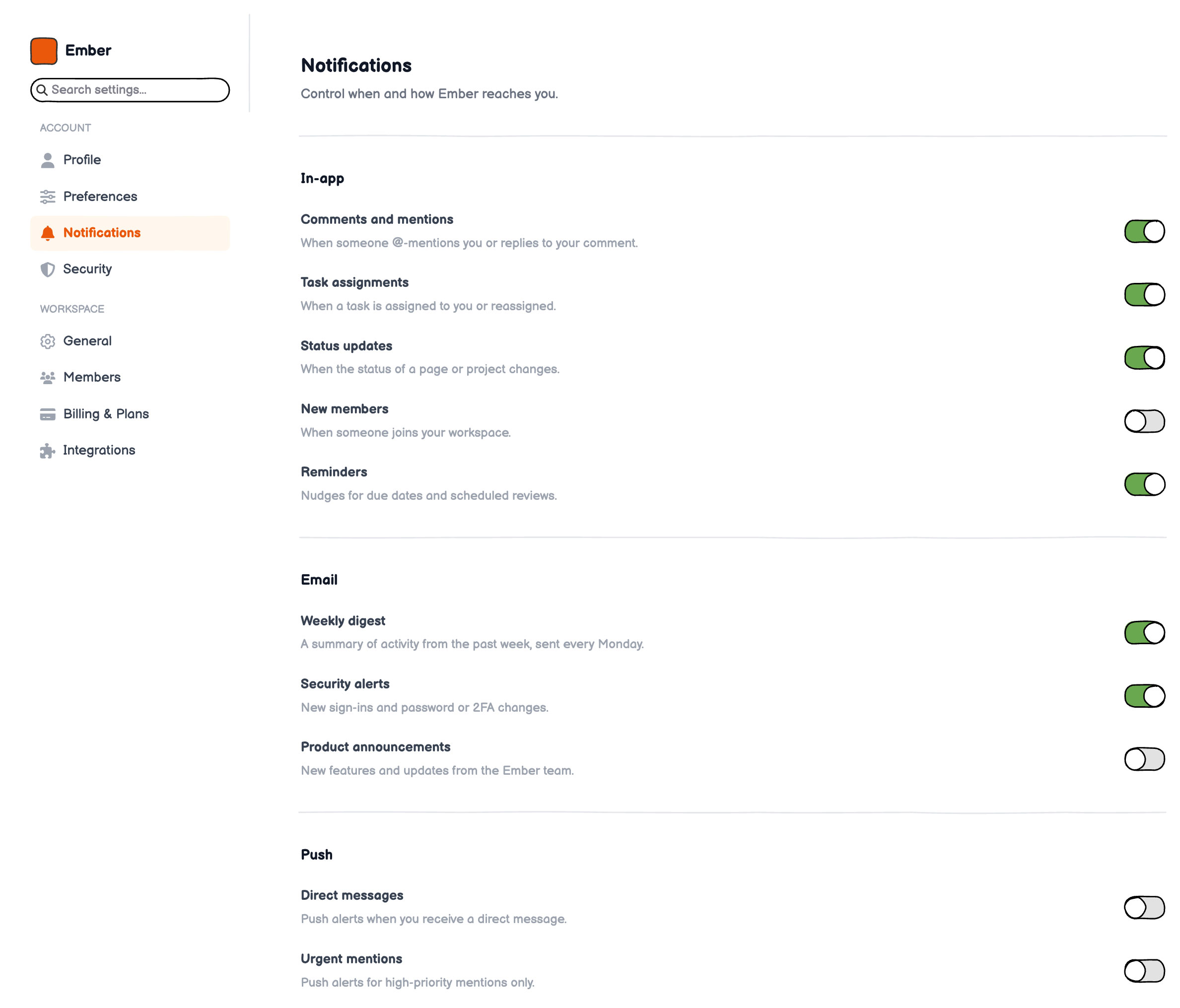
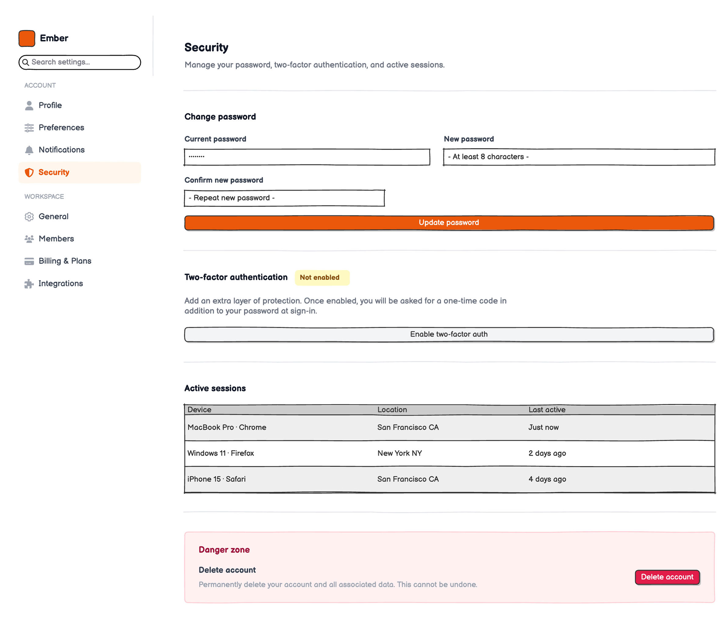
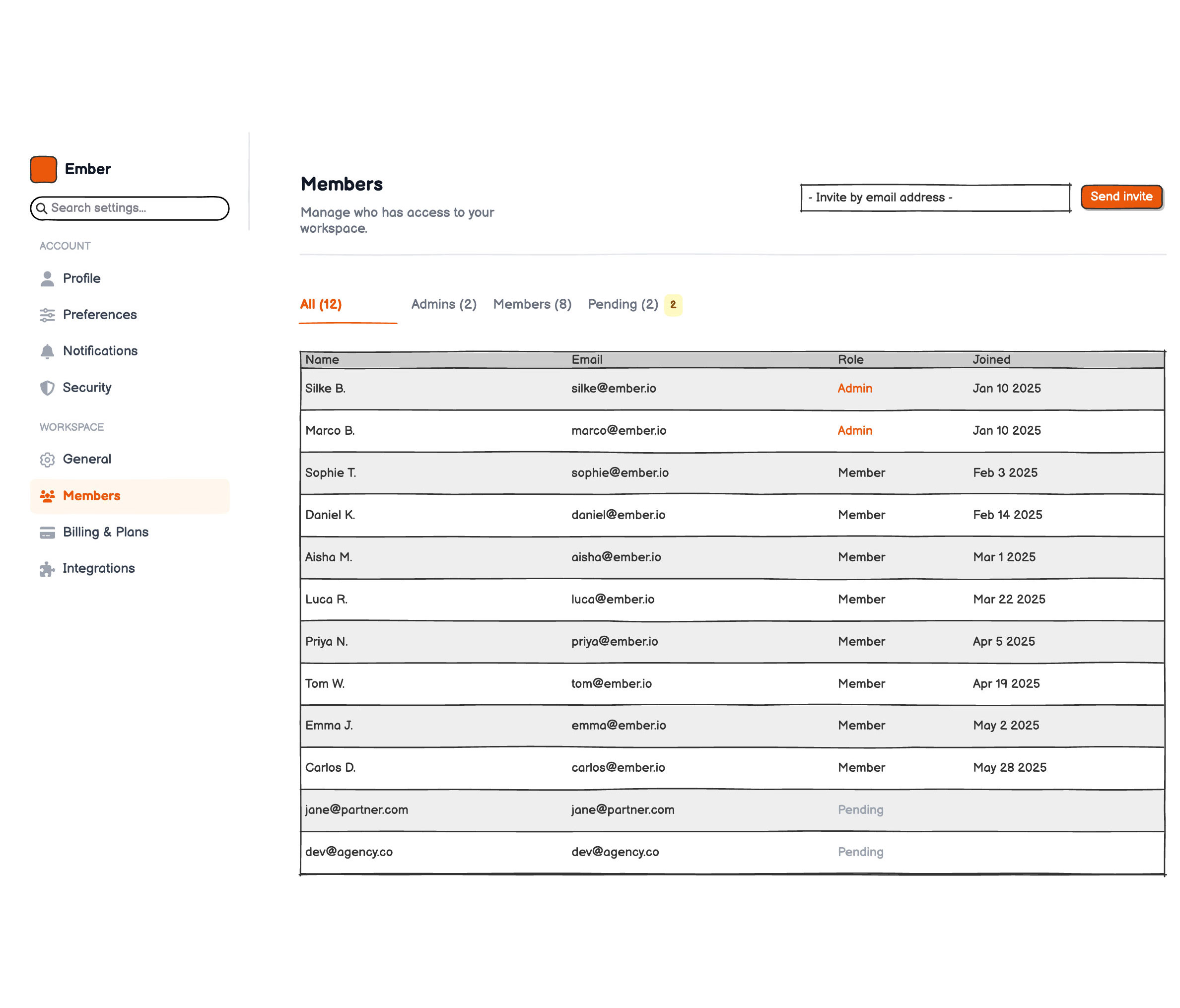
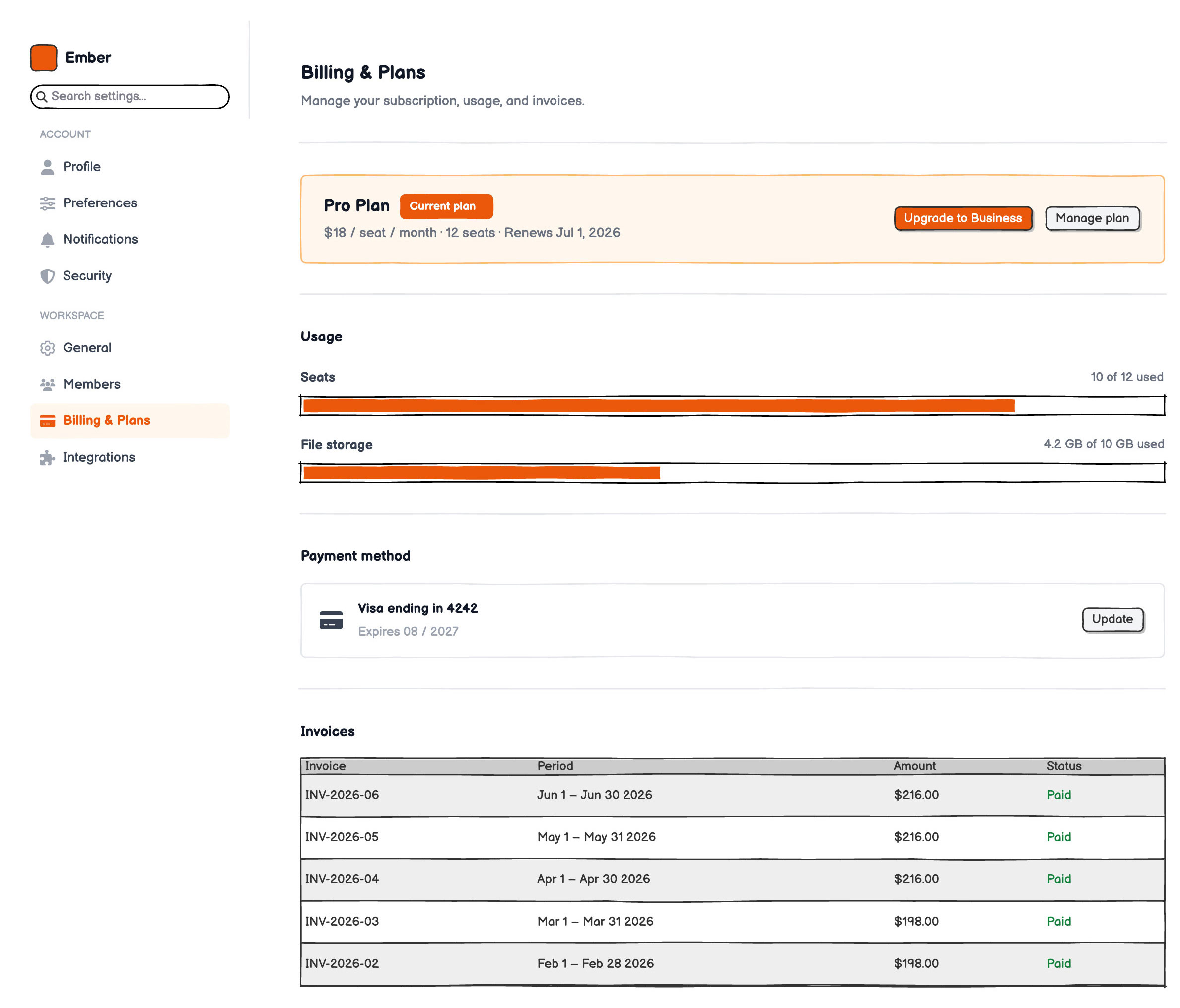
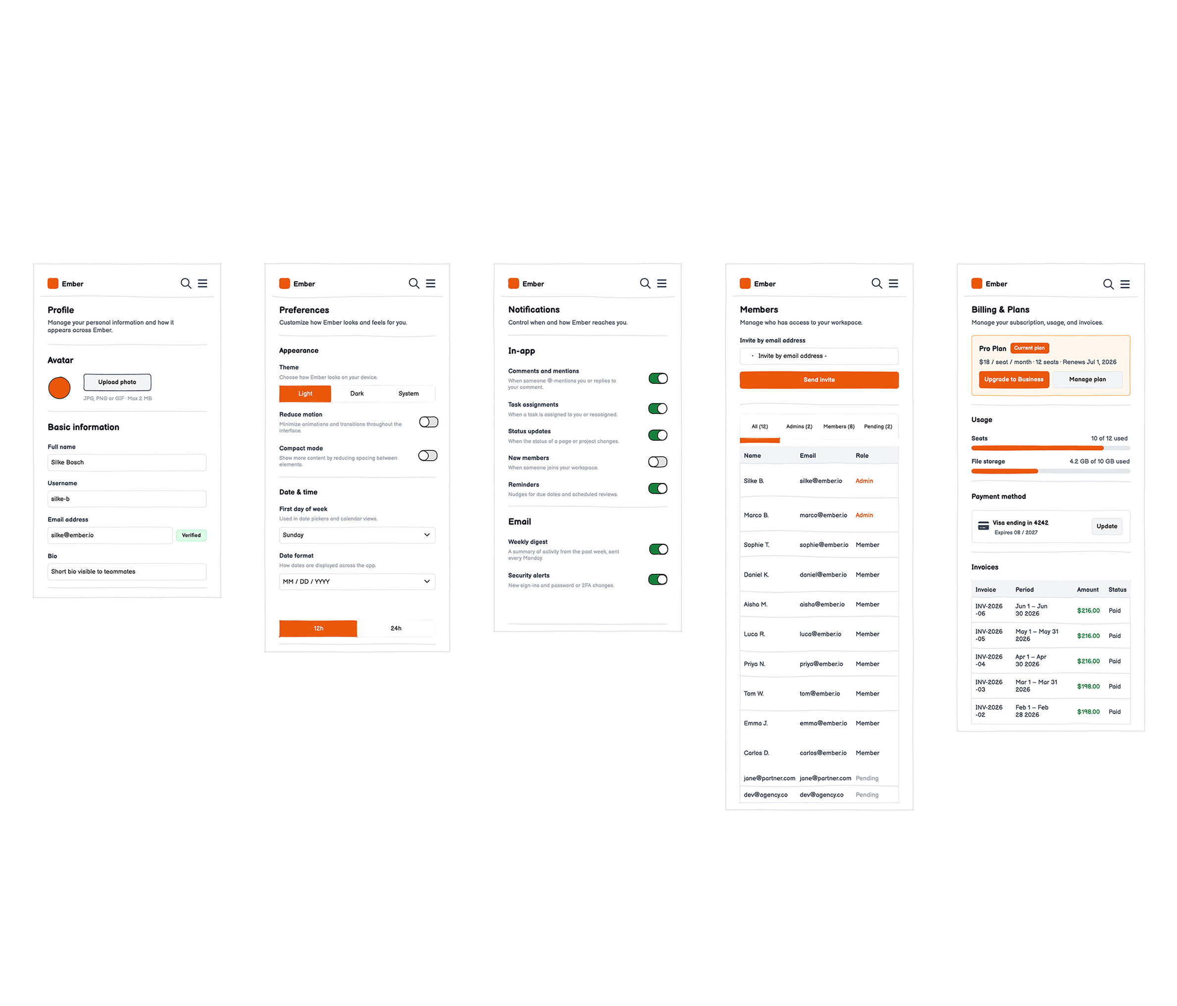
Six wireframes cover the most common settings categories: user profile, general preferences, notification toggles, password and security, team members and permissions, and billing details.
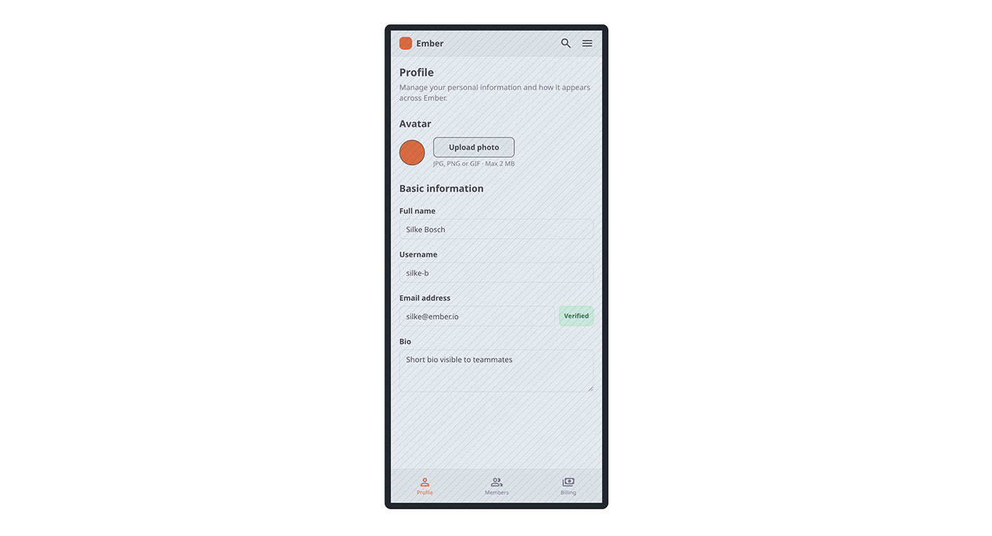
A mobile layout is also included to show how the sidebar navigation adapts to a smaller screen.
The fast way
Recreate this in Balsamiq AI
Paste this prompt into Balsamiq AI to generate a similar flow, then edit any line to make it yours.
Swap the brand name, change the colors, add or remove steps and fields.
Prompt for Balsamiq AI
Prompt generates AI designs. Results may vary.
Create 6 desktop wireframe screens for a SaaS app called "Ember" — Settings & Account Management. Each screen is 1280px wide. Do not create a diagram or flowchart — these are 6 separate UI screens.
Shared layout for all 6 screens:

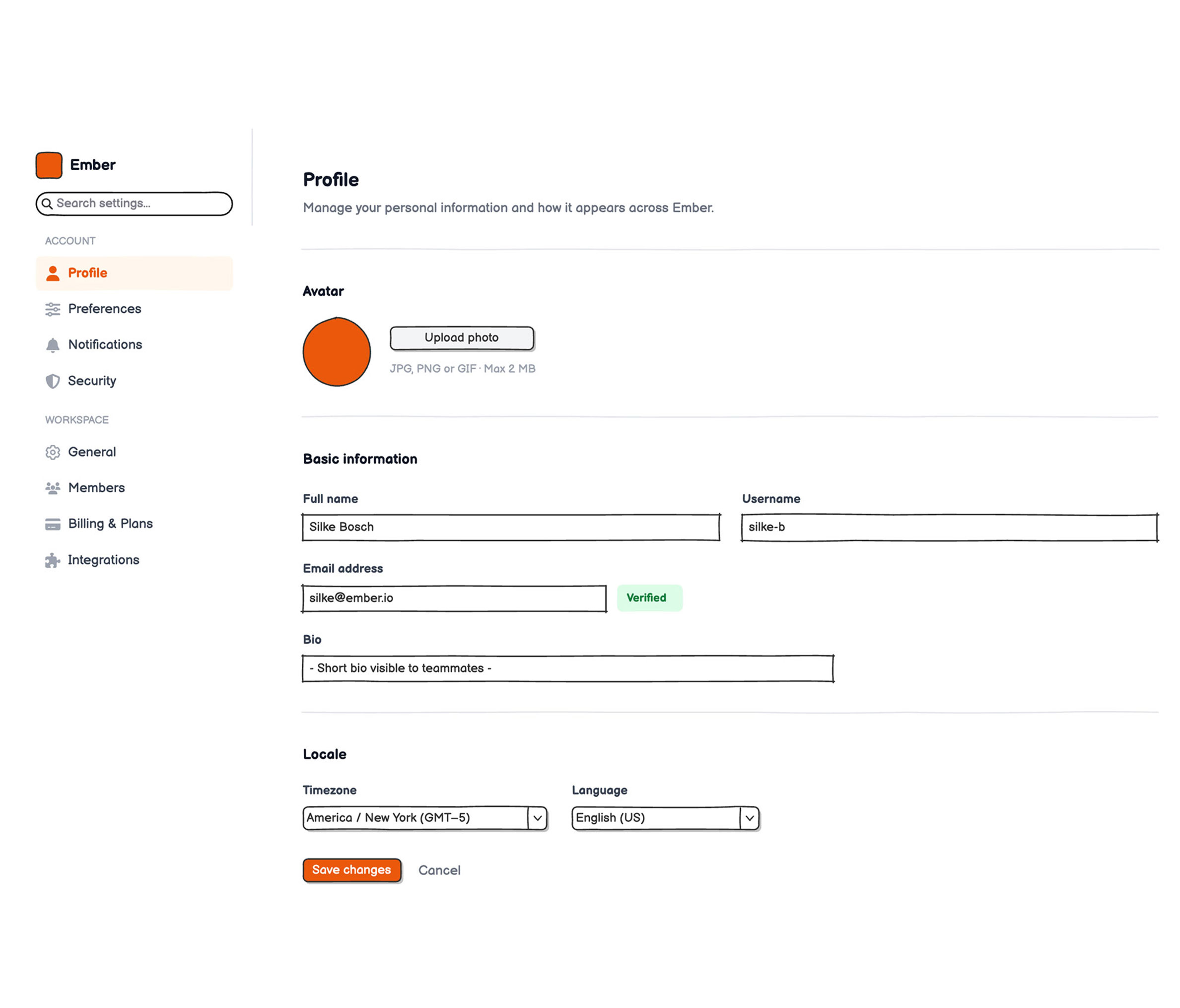
Left sidebar (240px, white) + vertical divider + content area (flexGrow, padding 48/80/40/48). Sidebar has: Ember logo (orange rounded square + bold "Ember"), search box "Search settings...", then two nav groups — ACCOUNT (Profile, Preferences, Notifications, Security) and WORKSPACE (General, Members, Billing & Plans, Integrations). Active item gets orange #EA580C text/icon on #FFF7ED background. Inactive items: gray #374151 text, gray #9CA3AF icons.

Screen 1 – Profile (Profile active in sidebar)

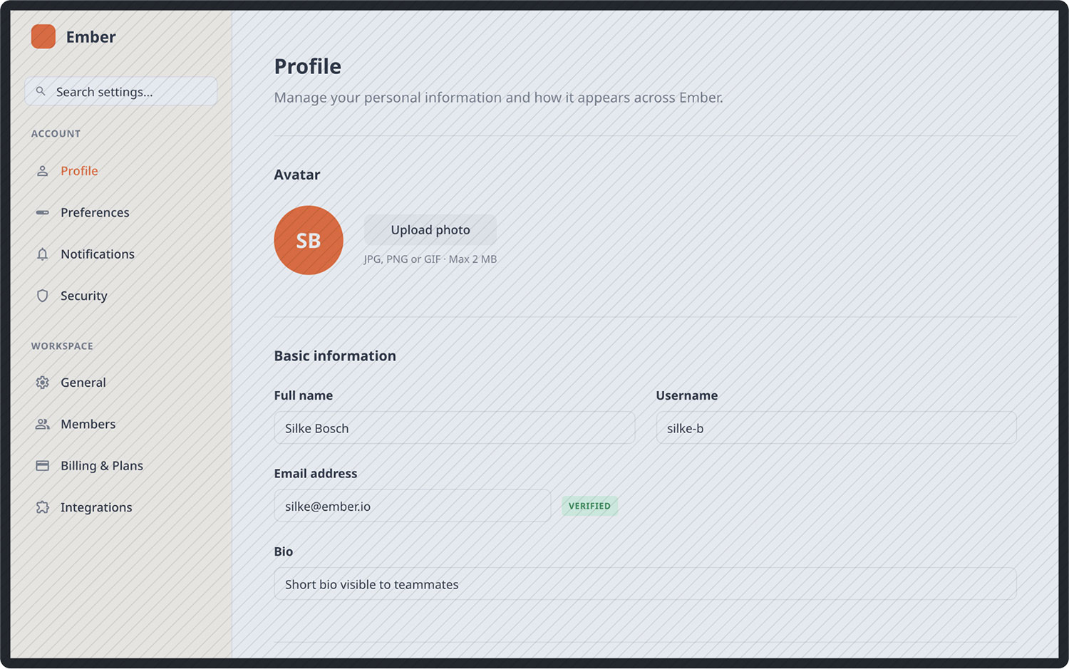
Page title "Profile". Avatar section: 72×72 orange circle + "Upload photo" button + hint "JPG, PNG or GIF · Max 2 MB". Basic information: "Full name" input "Alex M." and "Username" input "alex-m" side by side; "Email address" input "alex@ember.io" with green "Verified" badge; "Bio" textarea placeholder. Locale: "Timezone" and "Language" closed dropdowns. Footer: "Save changes" button (orange) + "Cancel" button (gray).
Screen 2 – Preferences (Preferences active)

Page title "Preferences". Appearance section: "Theme" button-bar (Light / Dark / System, Light selected), "Reduce motion" toggle row (off), "Compact mode" toggle row (off). Date & time section: "First day of week" dropdown, "Date format" dropdown, "Time format" button-bar (12h / 24h). Editor section: "Spell check" toggle (on), "Convert emoji shortcuts" toggle (on), "Convert Markdown" toggle (off). Footer: Save/Cancel.
Screen 3 – Notifications (Notifications active)

Page title "Notifications". In-app section with 5 toggle rows: Comments & mentions (on), Task assignments (on), Status updates (on), New members (off), Reminders (on). Email section: Weekly digest (on), Security alerts (on), Product announcements (off). Push section: Direct messages (off), Urgent mentions (off). Footer: Save/Cancel.
Screen 4 – Security (Security active)

Page title "Security". Change password section: 3 stacked inputs (Current password, New password, Confirm new password) + "Update password" button. Two-factor authentication section: yellow "Not enabled" badge + description + "Enable 2FA" button. Active sessions: data table with 3 rows (MacBook Pro / Chrome / Active now; Windows / Firefox / 2 hours ago; iPhone / Safari / Yesterday). Danger zone: red-tinted card with "Delete account" red button.
Screen 5 – Members (Members active, under WORKSPACE)

Page title "Members". Invite row: email input + orange "Send invite" button. Tab bar: All (active, orange underline) / Admins / Members / Pending (yellow badge "2"). Members data table with columns Name, Email, Role, Joined — show ~5 rows with fictional names and emails, mix of Admin and Member roles.
Screen 6 – Billing & Plans (Billing & Plans active)

Page title "Billing & Plans". Plan card (orange tinted #FFF7ED background): "Pro Plan" with "Current plan" orange badge, "$18 / seat / month", Upgrade + Manage plan buttons. Usage section: Seats progress bar (10/12 used) and Storage progress bar (4.2/10 GB used). Payment method card: Visa ending 4242, expires 08/2027, Edit button. Recent invoices data table: 5 rows with dates, amounts, and green "Paid" status.
Try editing it: change "Ember" to your product name, or swap #EA580C for your brand color — then regenerate.
Open Balsamiq AI